RaceStudio 3 Analysis
RaceStudio 3 Analysis (hereafter RS3A) is the analysis tool included in the RaceStudio 3 software. To launch it, click the RS3A icon in the top-left toolbar, highlighted below.

Follow this link to download the Official RS3 Analysis Manual.
Why Two ‘Analysis’ Icons?
RaceStudio 2 Analysis (RS2A) is the analysis tool included in the RaceStudio 2 software. It has been widely used for years and remains popular with many users.
We continue referencing RS2A to help customers gradually transition to RS3A. To launch RS2A, click its dedicated icon in the top-left toolbar, highlighted below.

Introduction to RaceStudio 3 Analysis
RaceStudio 3 Analysis (RS3A) provides automatic and precise data-video integration. In addition, more data is available more quickly thanks to the new “.xrk” format, which contains more information than the old “.drk” format. RS3 software can also better exploit the capabilities of the “.xrk” format. RS3A is faster at retrieving information, and each view has been designed to be intuitive and user-friendly.
What does RS3A offer when I log in?
As explained in the Registration, Feedback, and Support section, RS3 includes a new “log in” feature that provides dedicated services and cloud sharing. Available services include, for example, weather conditions (for the past year) and forecasts, while cloud sharing allows you to share data and profiles across your PCs, friends, coaches, and other collaborators.
What about my previous data?
RaceStudio 2 Analysis remains available for legacy use. With RS3A, you can import and analyze your previous data. Entire folders or single files can be imported by browsing your PC.
What do I see first?
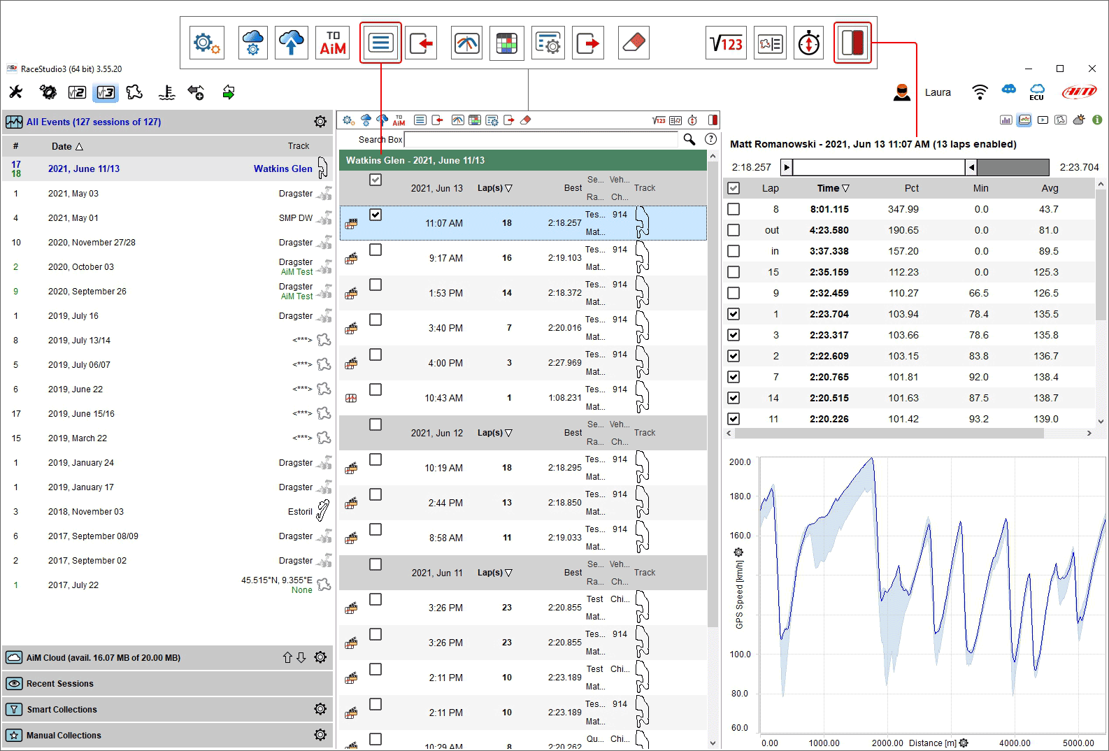
The first page displayed when running RS3A is the Database page. The central column shows session data and videos, while grouping criteria and collections appear on the left, and a session preview is displayed on the right.
What are RS3A session collections?
RS3A allows you to organize sessions into collections.
Recent sessions collect the most recently accessed sessions, making it easier to return to important sessions.
Smart collections group sessions according to rules you define, such as all sessions from a specific racer, track, or championship.
Manual collections allow you to group sessions freely by dragging and dropping them into the desired collection.
What is the preview feature?
RS3A features a preview window on the right that shows relevant session information without opening the session for full analysis. The displayed information changes according to the session mode selected using the toolbar above the preview column.
What about the Analysis window?
The Analysis window displays, in a single view:
Channel tables
Web-based map of the circuit
Graphs of RPM, speed, and other channels (which can be customized via profiles)
Video of the session, if available
All views can be customized and saved as a Profile, which can then be applied to any session. Pressing the space bar allows you to hide or unhide different panels of the view.
Can I synchronize graphs with my videos?
Yes. RS3A allows you to center the video on the page with the corresponding graphs, and cursors are automatically synchronized with the video.
RaceStudio 3 Analysis Database
All imported data is copied into a database, to allow a quicker availability of bigger quantities of data. The xrk files saved by AiM devices contain more information, if compared to drk files. The technology embedded in our database lets us take all the benefits of this information.
Populate RS3A Database
The RS3A database gets populated in two ways.
Automatically while downloading;
Manually adding sessions.
Automatically while downloading
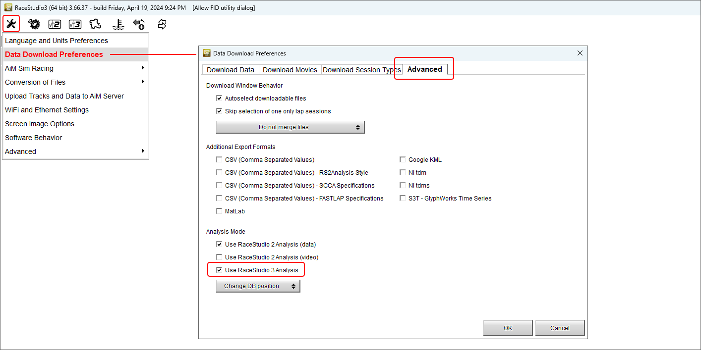
Since the public beta release of July 9th 2020, RaceStudio 3 enables by default the flag that adds all downloaded sessions into the analysis database. In case it doesn’t happen on your PC please ensure you flag “Use RaceStudio 3 Analysis” checkbox in the last tab on the right of “Data Download Preferences” panel you can reach through the setting icon on the top left toolbar as shown below.
RS3A is typically run after data download and this means that the software database populates automatically but previous data can also be imported from an external drive.
In this case at the very first time the software database is empty and this dialog window is prompted.
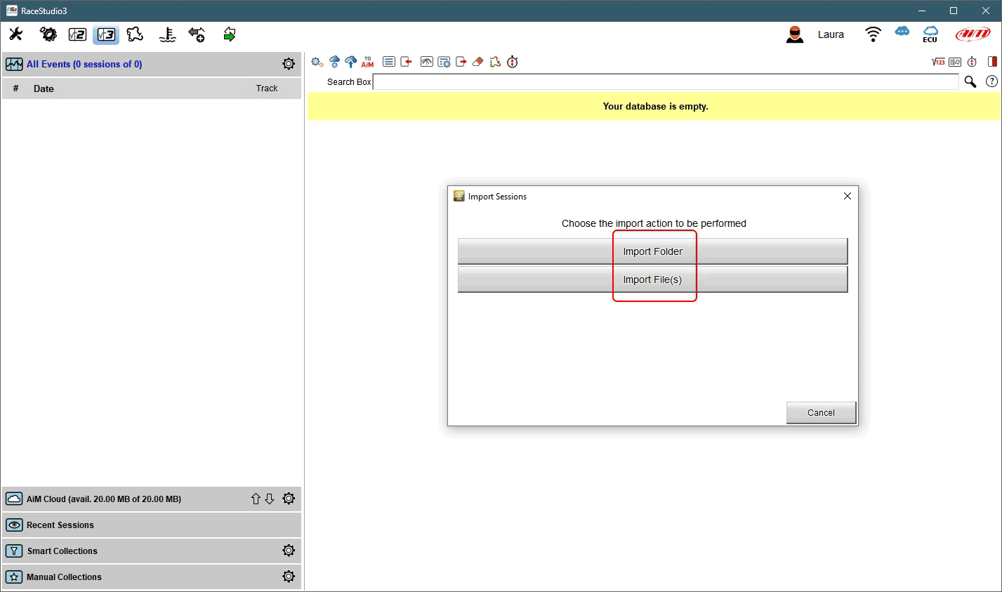
It is possible to import single files or entire folders of data. Pressing one of the buttons highlighted browse windows is prompted: select the file/folder to import and press OK. A window with a progress bar appears. In case the files are already in the database or if there is any issue the software warns you.
Manually adding sessions
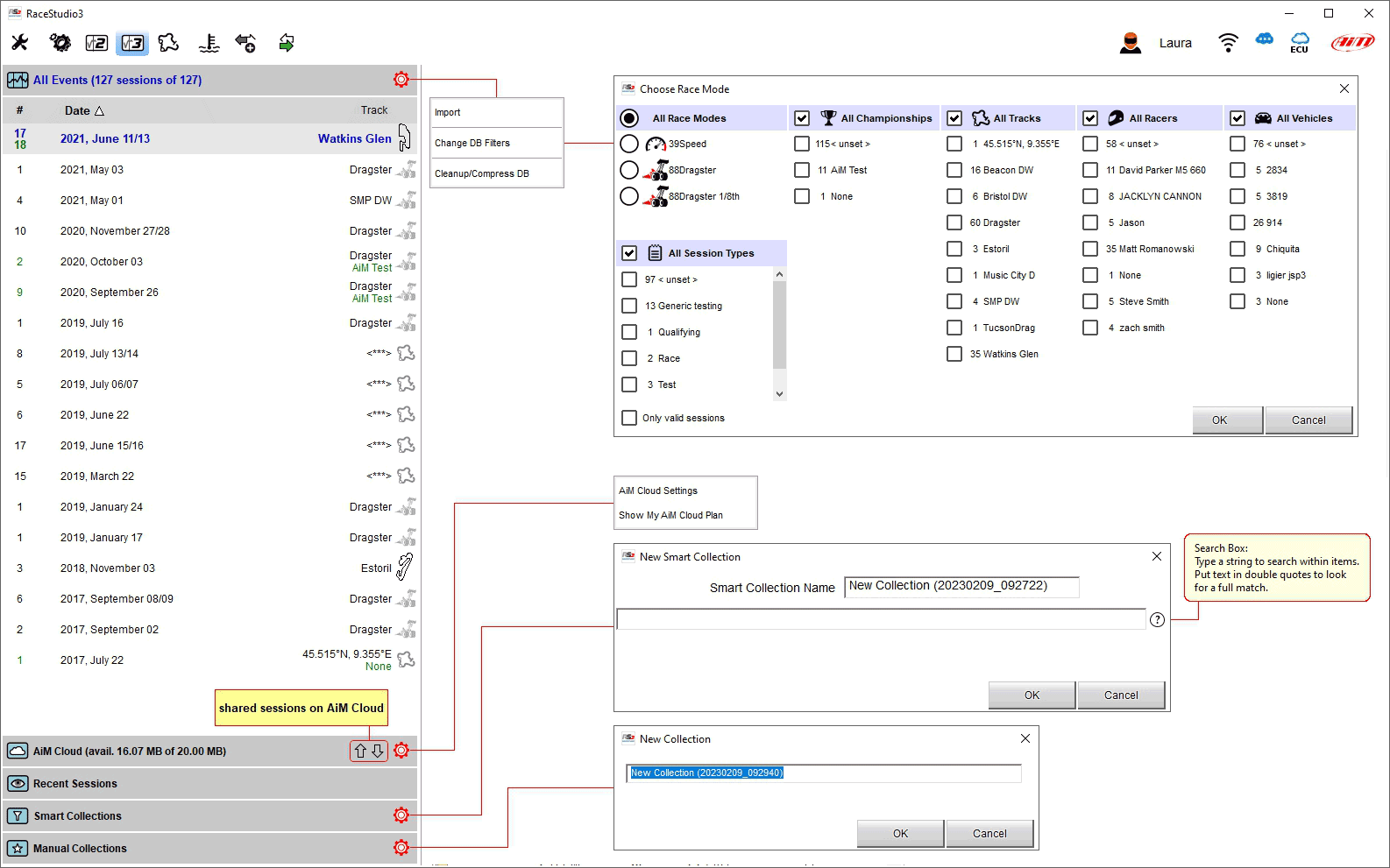
Import menu is available clicking the cogwheel icon top of the left column in the main database page.
Selecting the menu you’ll be prompted “Import” dialog window.
Selecting “Import Folder” you will be importing all data into a specific folder and all its subfolders.
Selecting “Import File(s)” you’ll be in control of which files will be added.
In both cases, upon confirmation, a new dialog will be shown, witnessing the import progression.
During the import process the database engine will automatically recognize which data and video files are linkable and will propose them as linked. For this to be happening automatically you need a recent firmware in the SmartyCam (capable of a data stream embedded in video) and your SmartyCam must have been connected to the device while logging.
Sessions database window
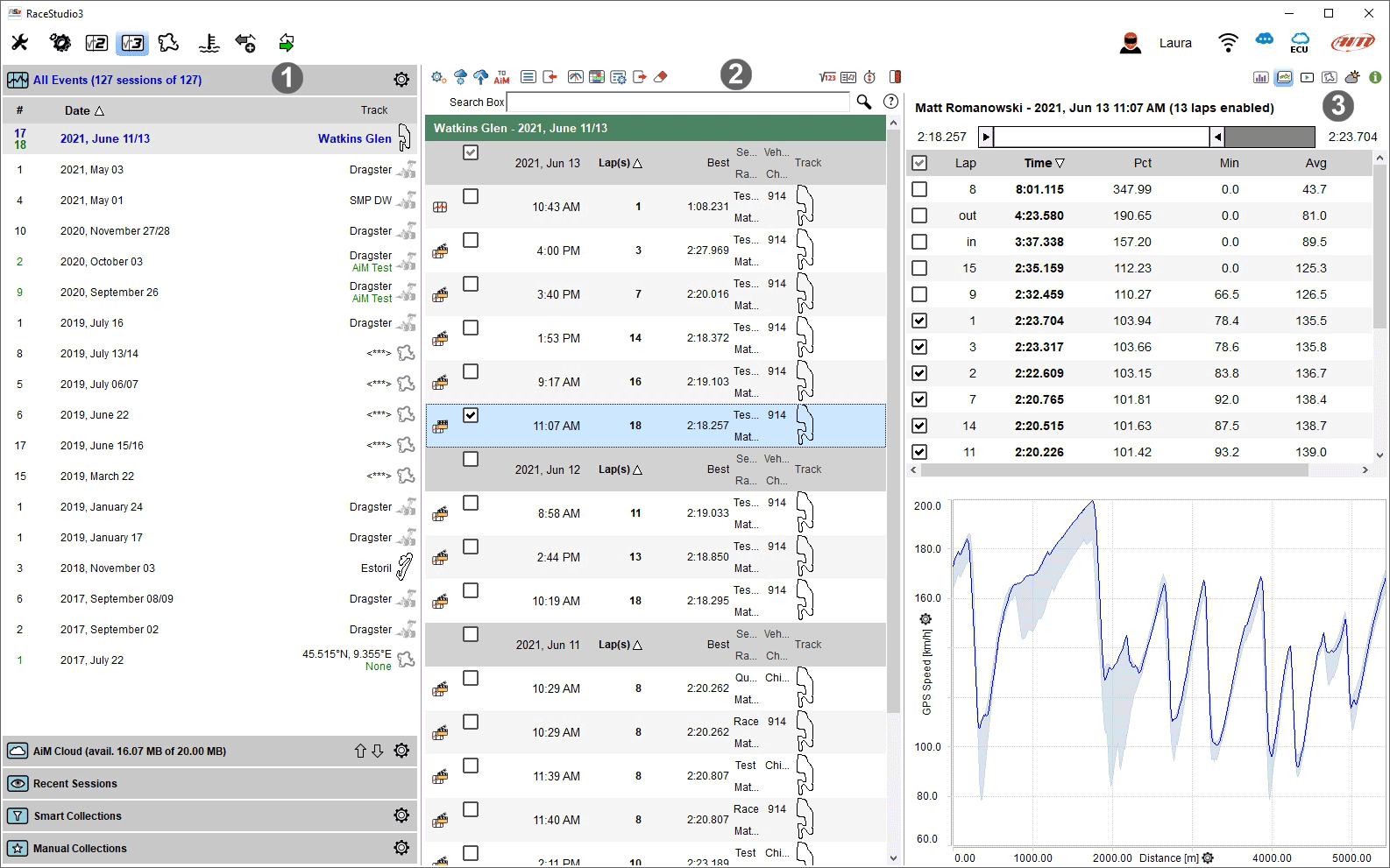
RS3A home page is divided in three parts:
Sessions database filtering column on the left: all available sessions with grouping criteria and collections where the desired one can be selected (1)
Sessions Main List central: data and video of the selected session (2)
Preview of the Selected Session right: the selected session data preview (3)
Sessions database filtering column
Being the RS3A database page divided in three, we’re introducing here the leftmost one. Even if the database has different view modes, this part is always to be meant as a left aligned column.
The selection column works like an accordion, with some items:
All Events;
AiM Cloud;
Recent Sessions;
Smart Collections;
Manual Collections.
All Sessions
Once the database has been populated all sessions are shown by default in “All Events” item; sessions are grouped into events (by week) on the same track/race; this means that it features a row for each week on a specific track and for each championship. In case you’re having data of racers from different categories they’ll be separated in different rows.
Clicking the cogwheel you’re prompted a dialog window in which you can choose if you want the RS3A to permanently (until you change this setting again) filter session per: race mode, racer, track, vehicle, …
AiM Cloud
shows all sessions uploaded on AiM cloud
allows to enter cloud settings and shows the related icons
shows your current AiM Cloud Plan and allows you to enter AiM Cloud plan settings
Recent sessions
This database remembers the last 30 sessions you have interacted with; the very first time it is empty. This part of the accordion is aimed at prompting you the last 30 sessions you interacted with.
The last 30 recorded, to find the most recent.
The last 30 analyzed… where is that thing that I “just” saw?
The last 30 imported, to find for example an old session that a friend just shared with you.
Smart collection
Sessions that populate the collection follow specific, custom, criteria.
As shown by the tooltip that appears clicking on the question mark you can fill in a text to be used as search string and the sessions corresponding to that string are automatically included in the new smart collection; default collection name is day and time but it can be named as wished.
You can, clicking on its cogwheel, create a smart collection, that lets you retrieve all the sessions that follow a certain rule, for example all the sessions whose vehicle-racer-track-championship fields contain a given string.
Once this part of the accordion is shown, you’ll see a search edit box in it. Inserting a search string in this edit box, the database will automatically prompt you all the sessions that match the entered text. This way you can quickly test some search strings before creating a collection.
Manual Collection
Sessions need to be added to the collection by the user.
You can, clicking on its cogwheel, create a collection of your own. You can add sessions into this collection in order to retrieve them later.
This feature can for example be useful to save all sessions in which you notice something you want to show to someone else; for example all the sessions in which you overtake someone or all the sessions in which you notice a different temperature range.
To add sessions to the collection you need to drag the session from the database and drop it over the collection on the left.
click the setting icon on the right
a dialog window is prompted: name it and the collection appears below the Manual Collection label
click “All sessions” to show all available session and drag and drop the sessions you want to include in it.
Sessions Main List
When you select an event or any row in the filtering column on the left, the central column shows all the sessions that refer to the left row. The session view can be list or agenda and the different preview window can be shown right, bottom or hidden. By default all sessions are grouped by date; click on any column header to change the order criteria.
The following image show: list/right view.
The following image show: agenda/bottom view.
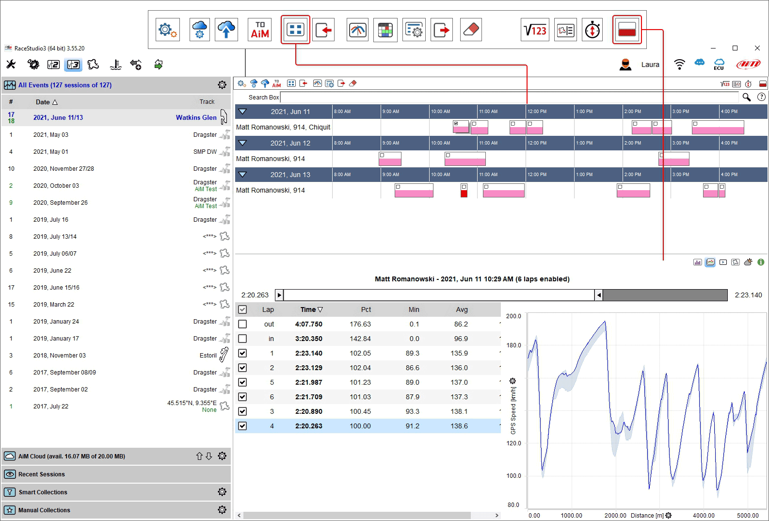
Top of “Selected session” column is a toolbar, shown here below and deeply explained in the following page.

From left to right the buttons indicate:
 Choose what to see: allows you to choose what sessions to show; available options are:
Show movies only when linked to data; appears only if the selected session contains video
Show all sessions
 Show Profiles: recalls a profile manager panel (see Analysis Profiles)
 Send a request to AiM support: it activates a dialog window where to insert an object and a message addressed to AiM support team that makes easier and quicker for AiM service to investigate the problem;
Please note: selected session(s) will be attached to the message; if no session is selected the panel is not prompted
Send a request to AiM support: it activates a dialog window where to insert an object and a message addressed to AiM support team that makes easier and quicker for AiM service to investigate the problem;
Please note: selected session(s) will be attached to the message; if no session is selected the panel is not prompted
Change DB line up: switch the view from list  to agenda
  and vice-versa; by default “group by day” checkbox is enabled.
 Import new session(s) into database: windows explorer window is prompted: browse it to find the session(s) to import
 Open selected session(s) for analysis
 Open selected session(s) for report (see Data Tech Reports)
 Change properties for the selected session(s): in the panel prompted you can fill the desired information and a comment too
 Export selected session(s): windows explorer window is prompted: browse it to choose where to export the selected session(s)
 Erase the selected session
 AiM Cloud settings:
 Upload Files to your AiM cloud drive
 Math channels: opens math channels dialog window (see Analysis Math Channels)
 Open Track Map and Sector Selector: the track map with sectors is prompted; you can manage them
 Open Predictive Reference Laps Manager: reference laps of all tracks stored in the PC are prompted and you can manage them
Preview Windows placement:
 preview windows can be placed below the sessions list
 on the right of it
or hidden.
The selected session is shown in the central column and RS3A automatically recognizes which data it includes matching each session to the dedicated icon.
Here below all icons are explained.
 Session including only data
 Session including only video
 Session including data and video
 Session coming from a Sim racing
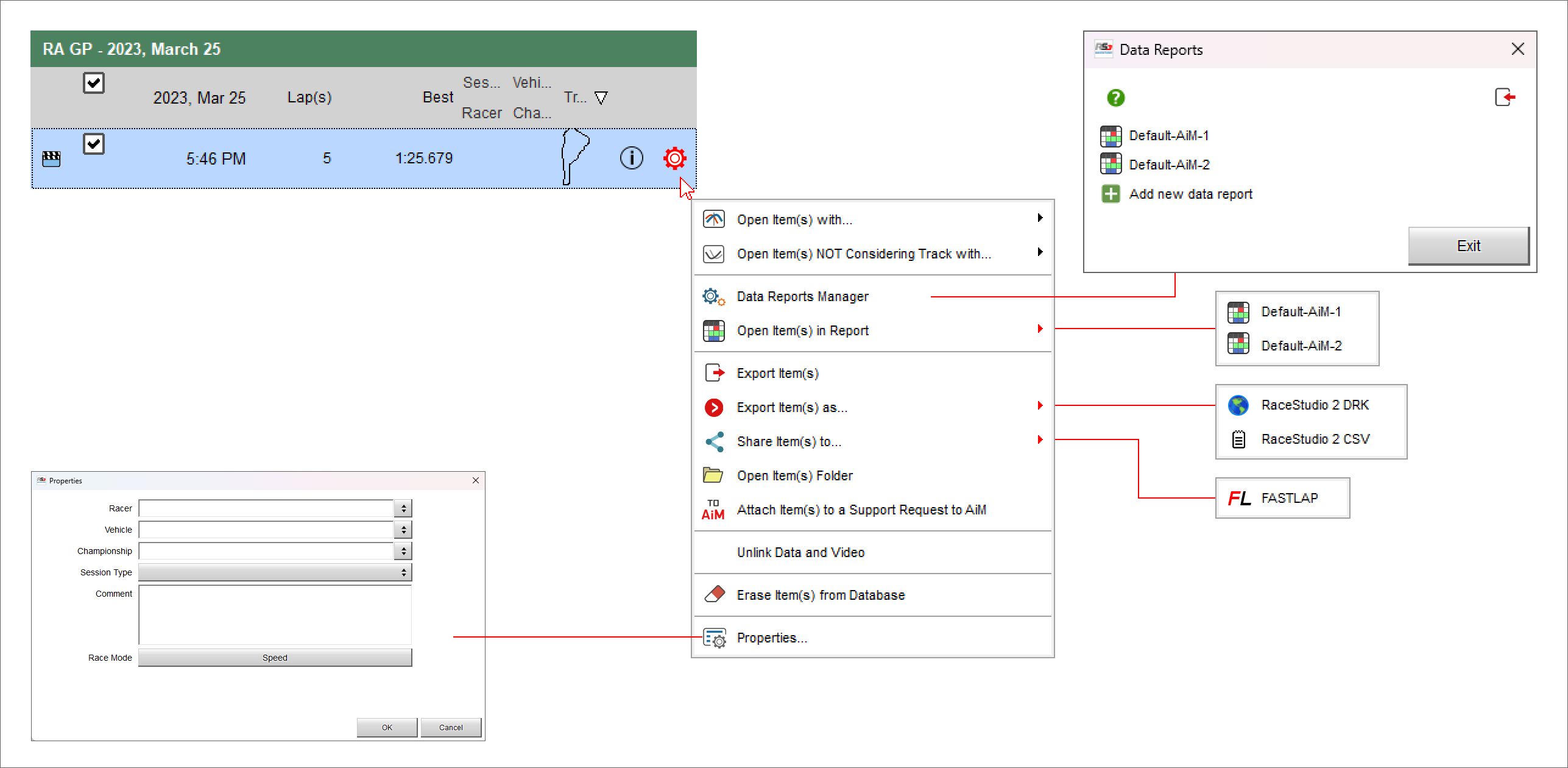
As shown here below, mousing over a session a setting icon is prompted that allows to:
Open a session
Open a session NOT considering Track (this can be very useful to compare similar sections of different tracks)
Manage data reports (see Data Tech Reports)
Open items in reports (see Data Tech Reports)
Export items
Export item(s) as RaceStudio 2 .drk format or as Race Studio 2 .csv format
Open Item(s) Folder
Attach the session to a support request to AiM team
Unlink Data and Video
Erase Item(s) from the PC database
Modify session properties
Data preview of the selected session is shown right of the page. It changes according to the key pressed on the keyboard placed top right of the view straight above the data and highlighted in red here below.
The toolbar buttons show different preview and if the session has no video in it the corresponding button is hidden.
 shows laps summary preview
 shows laps report preview
 shows video preview
 shows map preview
 shows weather info preview
 shows advanced info preview
Analysis Search Bar
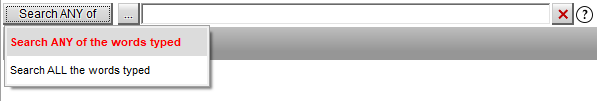
The sessions list feature also a search bar to refine the list of shown sessions against:
racer contains
vehicle contains
championship contains
track contains
comments contain
logger name
logger identification number
You can enter multiple words in the search bar, selecting if you want either of the above criteria matching ANY of these words or ALL these words.
Preview for Selected Sessions
Preview feature, allows users to check some sessions information without opening the session for analysis. The preview window prompts different dedicated information, for each session mode: on track racing, oval racing, performances, dragsters…
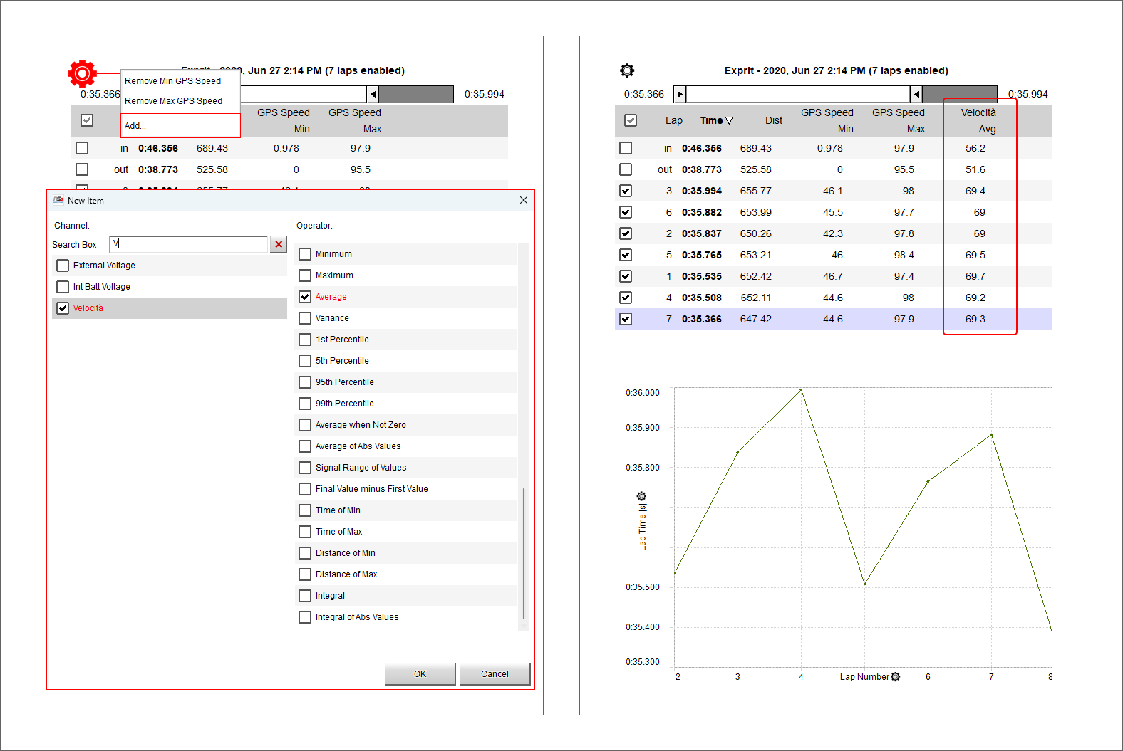
Laps summary preview
Laps summary preview shows by default all the laps except for the first and the last one (left image below) and the related max/min lap time values are indicated side of the top sliding bar and in the bottom graph.
Sliding the top bar only laps in a fixed lap time range are shown (right image below). This range is shown in the bottom graph too. It is possible to add/remove channels to the central table using the setting icon top left of the sliding bar.
The bottom graph shows, by default, Lap time on the ordinate axis and lap number on the X axis.
The graph can be zoomed in/out through the mouse wheel.
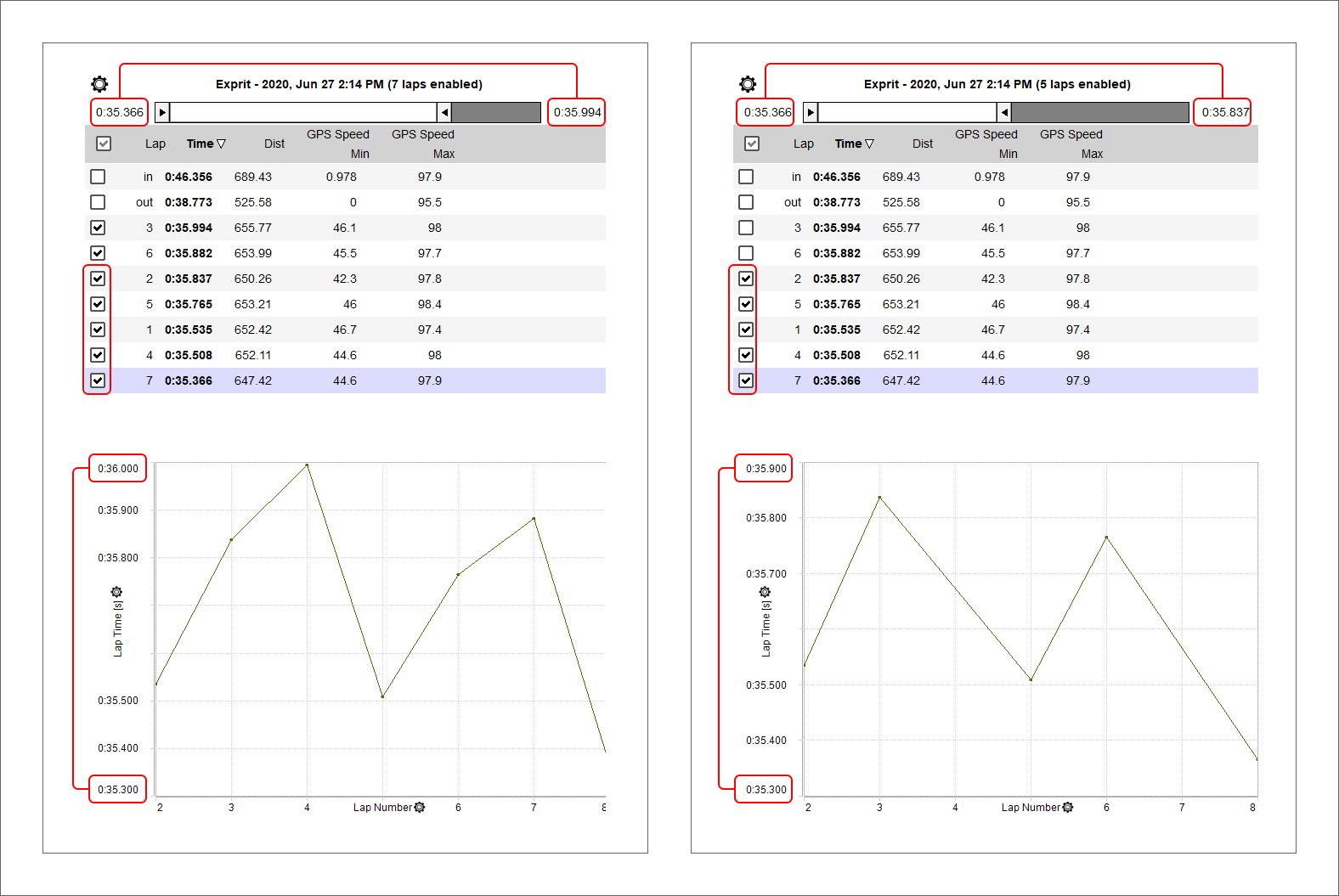
This view allows to add/remove a channel in the table top of the graph and to change the channel plotted on “Y” axis
As shown here below on the left, to add a channel:
Click the setting icon and select “Add”
Select the desired channel in the list or search for it filling in “Search Box”
Click “OK”
The channel appears in a new column as shown here below on the right.
When the desired channel has been added the software allows you to perform the following actions:
remove the added channel clicking the top left setting icon and selecting the channel to remove
change the channels plotted on the graph clicking the setting icon on the axis and selecting the channel to plot
Laps report preview
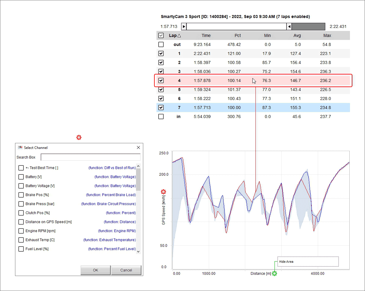
Laps report is the view shown by default when you enable a session in the central column. By default it shows the laps ordered by lap time and sliding the top bar you can select only laps in a fixed lap time range as well as show them in the graph. Mousing over the laps list the line of the lap you are mousing over becomes red in the graph.
The graph shows, by default, GPS Speed on the Y axis and Distance on the X axis. To change the channel plotted on the Y axis click the related setting icon (red below) and select the channel to plot in the dialog window that is prompted (left in the image below).
The graph has a sort of grey/light blue shadow that highlights the range set with the top sliding bar. To hide this background click the setting icon on the X axis (green below) and then click “Hide Area”.
The graph can be zoomed in/out using ctrl+the mouse wheel.
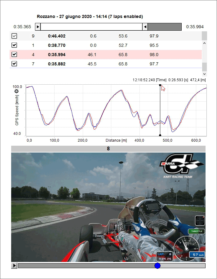
Video Preview
Video preview works mostly like the previous two. Pressing “Play” button bottom left of the preview, the video plays and the cursor on the central graph moves simultaneously. Clicking on a point in the graph the video goes to that point.
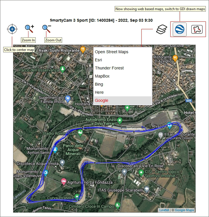
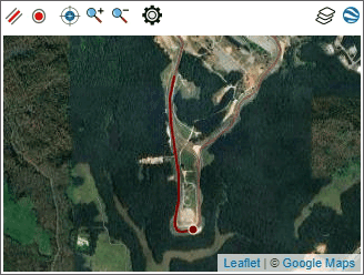
Map Preview
Map preview shows the track map and you can:
center the map in the window
zoom in/out the map using the related buttons or with the mouse wheel
change the map tile provider choosing among the options shown here below (in the example Google Maps is being used)
switch among web based maps and GDI drawn map; the top right button in the image below changes according to the view
Weather Preview
The weather preview shows all information about the weather conditions in the date of the race, from midnight to midnight. Mousing over the graph the weather conditions during the day are shown.
Please note: this information are available for 12 months from the day they are recorded only.
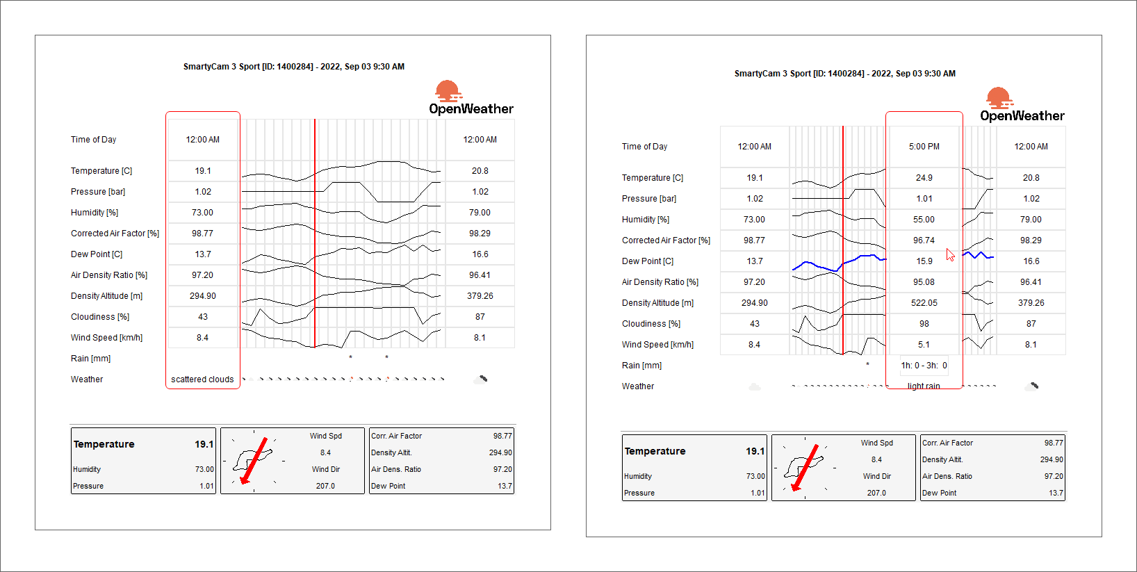
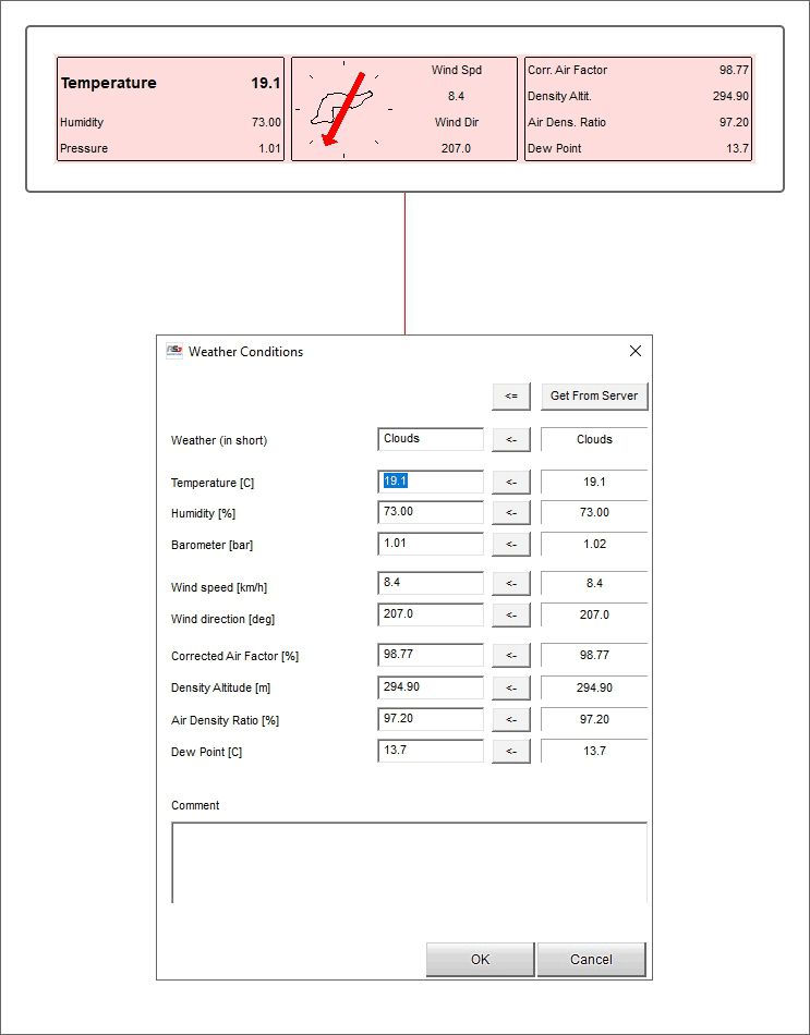
Weather information come from AiM server that connects to the nearest OpenWeather station according to your GPS coordinates. Double clicking on the panels bottom of the preview a weather conditions panel is prompted. If you have more accurate information here you can fill them in. In a second moment you can replace them (one or all) with the information coming from AiM server: use “<-“ to replace the single piece of information and “<=” to replace all information.
Advanced Info preview
Advanced info preview shows all the information about the session according to the logger in use.
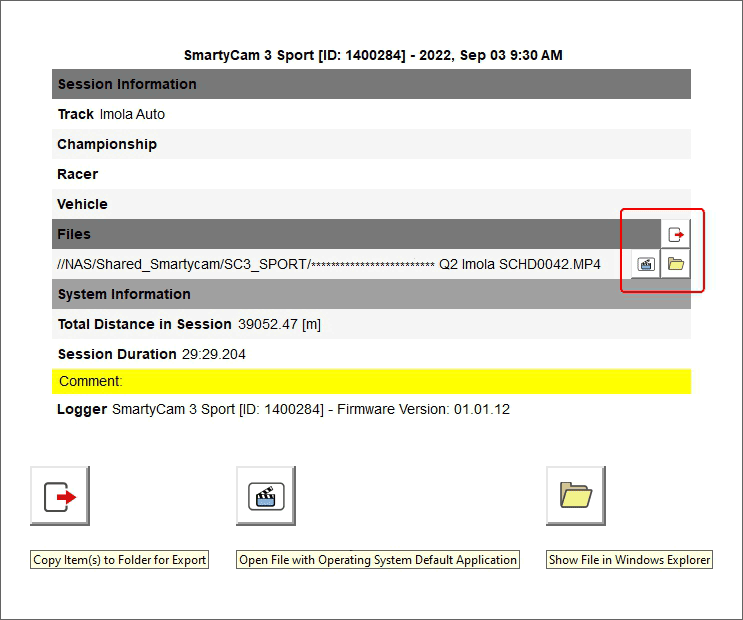
You can also see the files containing the data in their folder clicking “Show file in Windows Explorer”. If a SmartyCam HD is connected to the logger two explorer windows will open: one for the racing data, the other for the video .MOV file except files are saved in the same folder and in this case they appear both selected.
RS3A Database Position
By default, RS3A database is created in a specific folder in RaceStudio 3 user folders. You can decide to move it using a folder of your choice. In "Advanced" tab of Data Download preferences panel you’ll find a “Change DB position” button that allows you to:
choose a new path for the database
open current Database path
be redirected to an online help page.
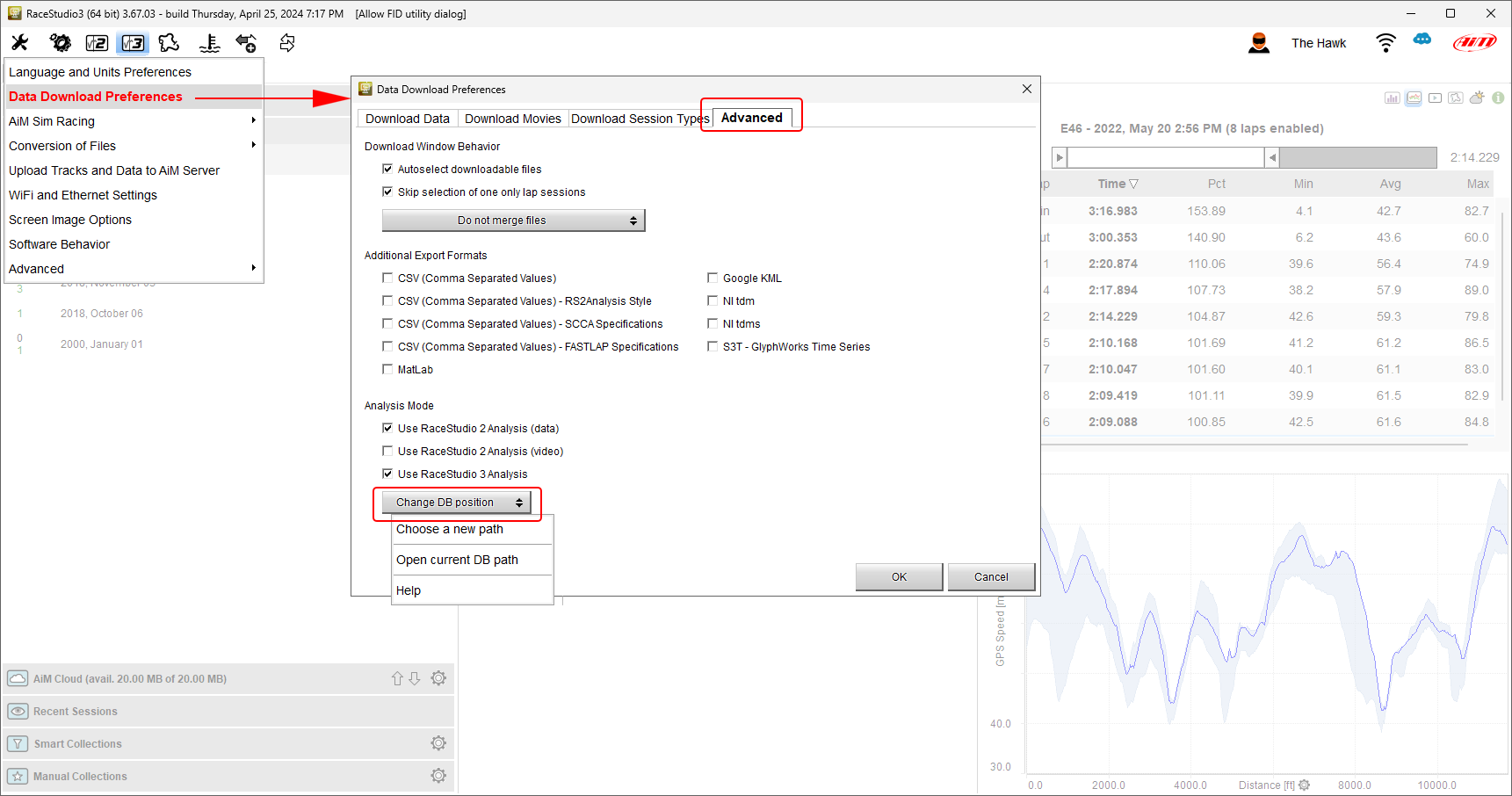
Once a new path is chosen, RaceStudio 3 will, in case the folder is empty, create a new database allowing you to start from scratch, to copy there your current database or to use a database already available in the folder.
For any change in database position to be applied it is necessary to restart RaceStudio 3.
You can choose to place your database also in a removable drive or in a network drive. Depending on connection and drive speed it could become a little slow. If at RaceStudio 3 startup either the removable drive or the network drive are not available, RaceStudio 3 warns you and switches to the default database position.
In case you have two PCs on the same network, you could think to place the database in a folder shared among both PCs. AiM firmly discourages this practice. This because the database does not support more than one simultaneous write access.
Data Analysis Window
The first thing you see when you open data for analysis is AiM default profile. As a brief introduction, let’s say that a profile is made of a set of visualization properties you want data to be displayed with and a set of windows showing your data.
What exactly is a profile is described in the dedicated chapter (see Analysis Profiles). You’ll learn, reading this manual, how to customize shown data according to your needs; this is called “creating your profile”. You’ll also learn how to manage more than a single profile, to save time while doing several types of analysis.
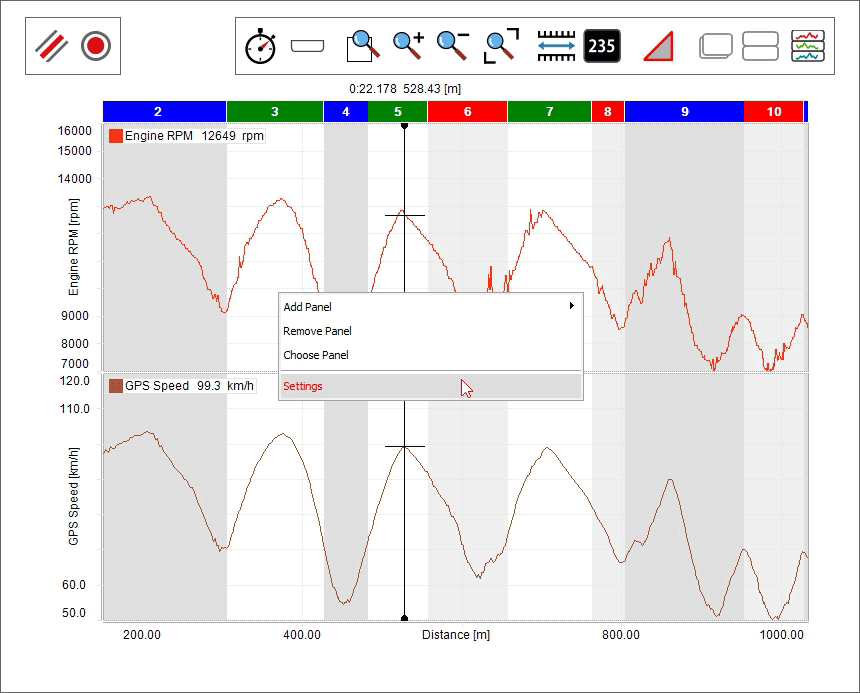
In the upper part of the analysis window, you’ll find a toolbar and some tabs. Most of the buttons of the toolbar show a tab. Each tab is a “layout”. Properly, a profile is made of layouts. You can decide which layouts must be shown.
Each tab contains windows, each window being a “panel”. Properly, a layout is made of panels. Each panel features its own settings window, in which you can customize what the panel shows.
Hovering the mouse for fraction of a second between the panels you’ll see a splitter line. Dragging and dropping it you can resize the panels.
This profile-layouts-panels is aimed at a better use of the space on the screen.
RS3A Top Toolbar
The main analysis top toolbar divides in two (left and right). The left part mostly affers which layout windows are shown, the right part mostly affers shown data.
Here below is the top left toolbar.

Here follows explanation of all icons functions.
 Allows changing the settings of Analysis Profiles (some of these settings might add other icons here)
 Shows Time-Distance Layout
 Shows Data-Movies Layout (if available)
 Shows Track Split Report Layout
 Shows Scatter Layout
 Shows Histogram Layout
 Shows Split Times Report Layout
 Shows Channels Report Layout
 Shows the Log Sheets Layout
 Shows the Track Map Layout
 Shows Suspension Analysis Layout (if available)
 Shows Frequency Analysis Layout
 Allows to add or show a Custom layout
Top right keyboard is shown here below.

 Sessions selection (see Data of Laps and Sessions)
 Laps selection (see Data of Laps and Sessions)
Introduces you to all Analysis Math Channels functionalities
 Introduces you to all Track Maps in Analysis functionalities
 Manages predictive reference laps
 Open these Help pages
Getting Useful Information
A profile is made of layouts. You can show, using the top toolbar icons, one of the available layouts.
We’ll see in the next paragraphs a description for every layout and the information you can get from it.
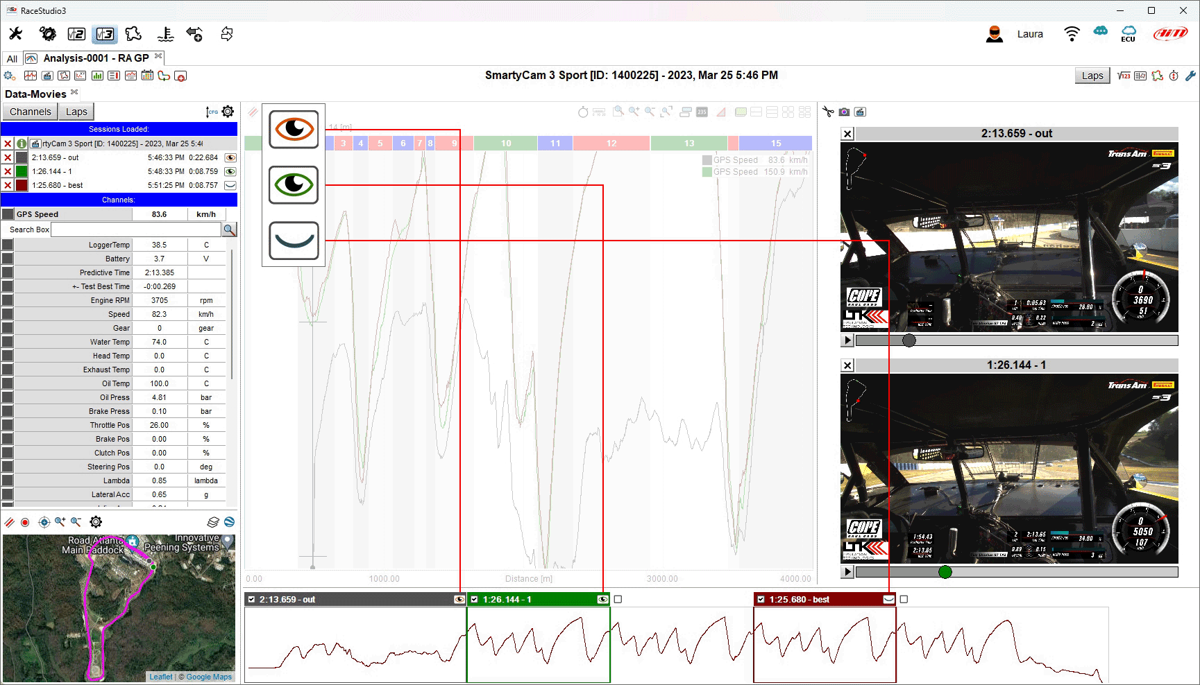
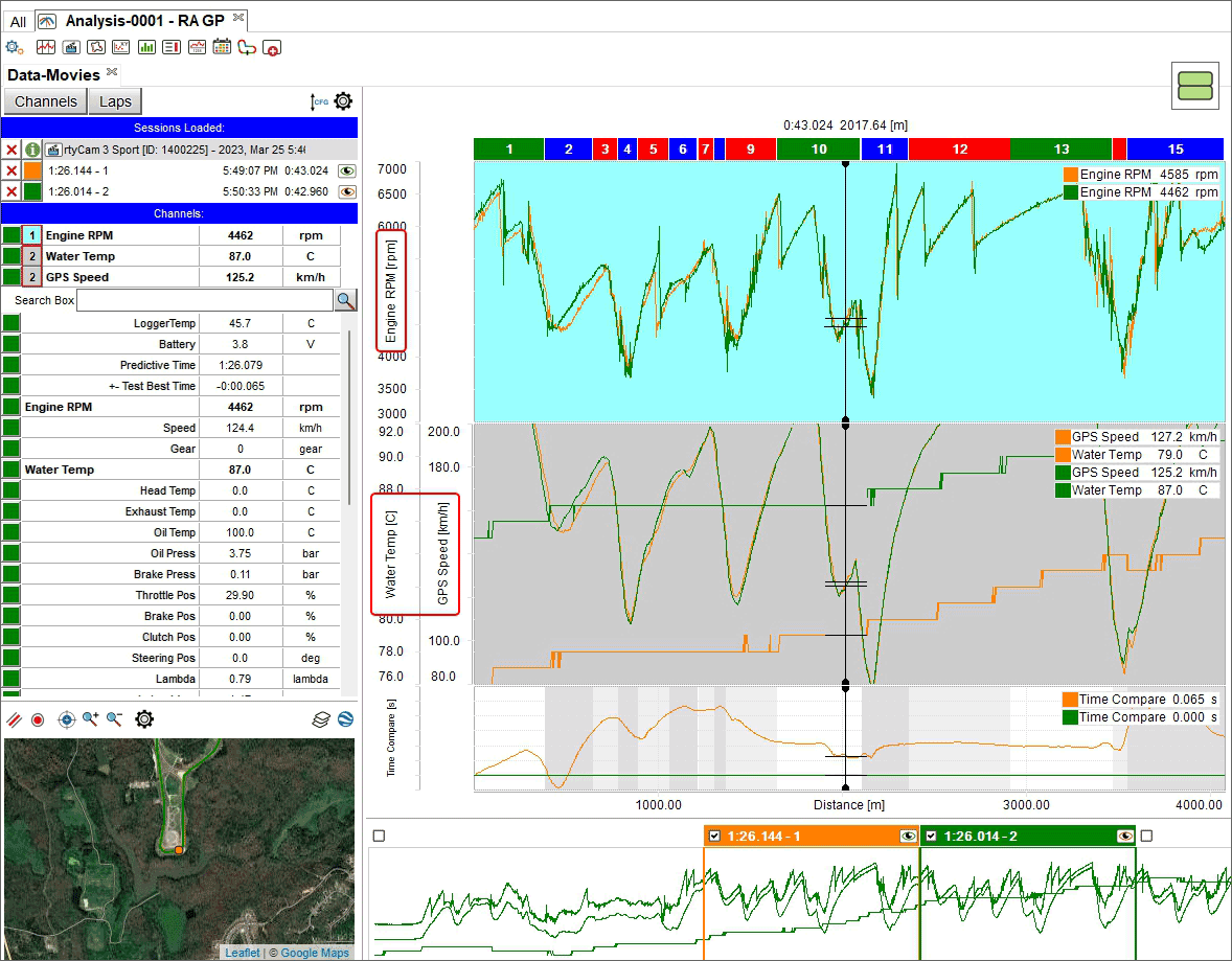
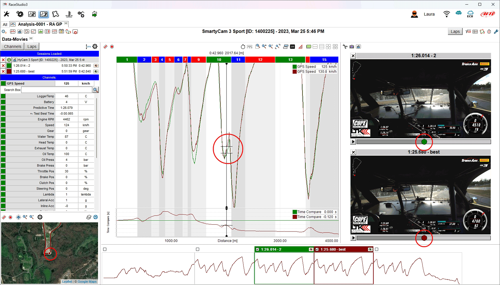
Data-Movies Layout
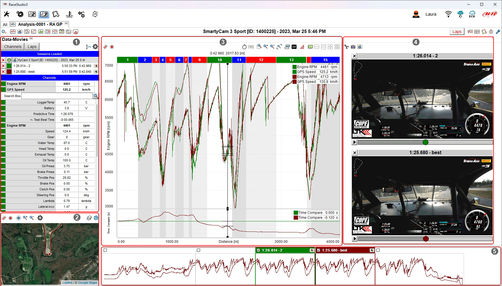
This layout comes by default with a Channels and Laps List Panel (1), a Track Map Panel (2), a Time-Distance Panel (3), a Movies Panel (4) and a StoryBoard Panel (5).
Please follow the above links to learn how every panel works.
The very first time you open this layout you’ll find the best lap already shown, and the data cursor placed in the middle of the lap.
In the channels list you’ll see the list of the shown channels, on top, a search bar in which to look for other channels (useful in case the session you’re analyzing features many channels), the list of all channels, and a bottom list in which you can add comments to the session. Clicking on the "Laps" button just above the channels list, you’ll be switching to the list of all session laps.
Clicking on the channels in the complete list you can show/hide them. In the laps list you can do the same. While shown channels will affect what’s shown in this layout only, shown laps will be for all layouts.
Shown laps and shown channels feature a colored square, clicking on which you can select its color. This color choice will affect all layouts.
Laps can be shown/hidden doubleclicking the laps themselves in the story board. Some laps in the story board feature a greyed background (normally the "in" and "out" laps), it means that such laps are not considered as valid by the algorithm computing the best lap. The story board allows also to drag shown laps moving them to other laps.
The track map shows the (GPS) driven line of the shown laps. Clicking on the driven line trace you can move the cursor. The cursor is in common with all other panels in this and all other layouts. The track map can be zoomed separately by data zoom.
The time-distance plot shows the graphical representation of the values of the shown channels/laps. Also here, clicking on the plot you can move the cursor. To add a channel to the plot, click on it in the list of all channels. Using the mouse wheel on this panel you’ll be able to zoom data in and out, the zoom level being in common with all other panels of this and all other layouts.
The cursor movement will trigger the movie panel to show the correct frame that refers to the specific cursor point. You can move forward and backward the cursor in the movie panel, and you’ll see it move in all other panels of this and all other layouts.
In all the panels the right click (or context menu) will guide you into the main command and setting options.
By default, pressing the space bar you can toggle the shown status of channels list and track map.
For more information on how data and videos are synchronized, please see Synchronizing your Data.
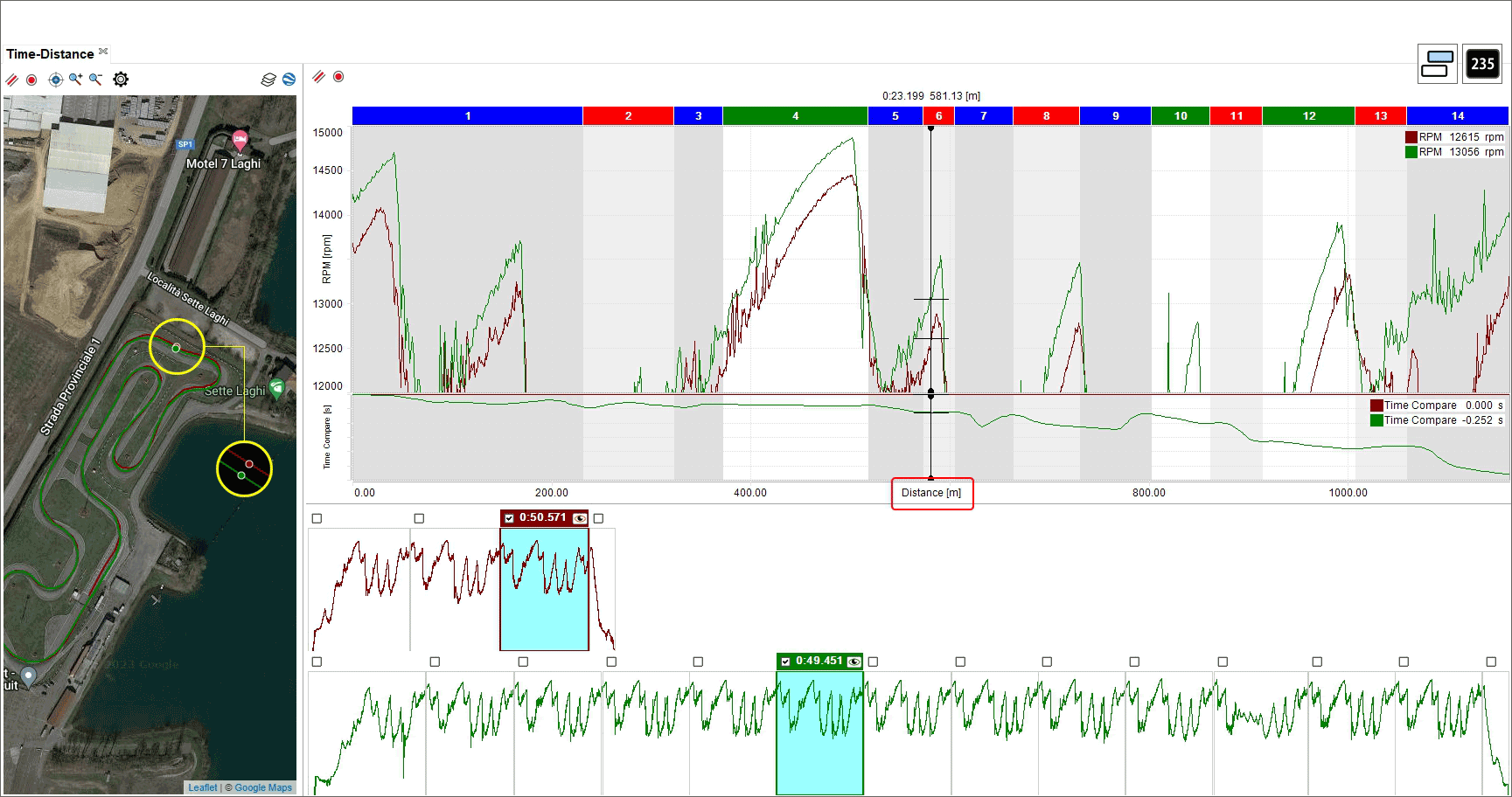
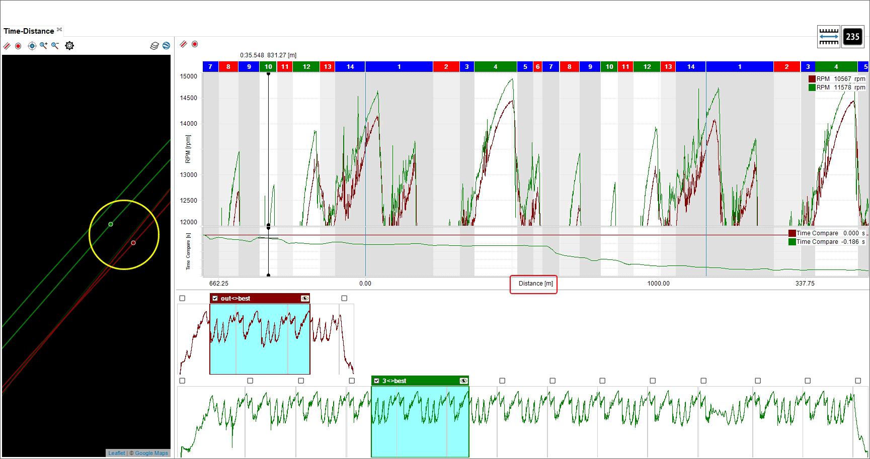
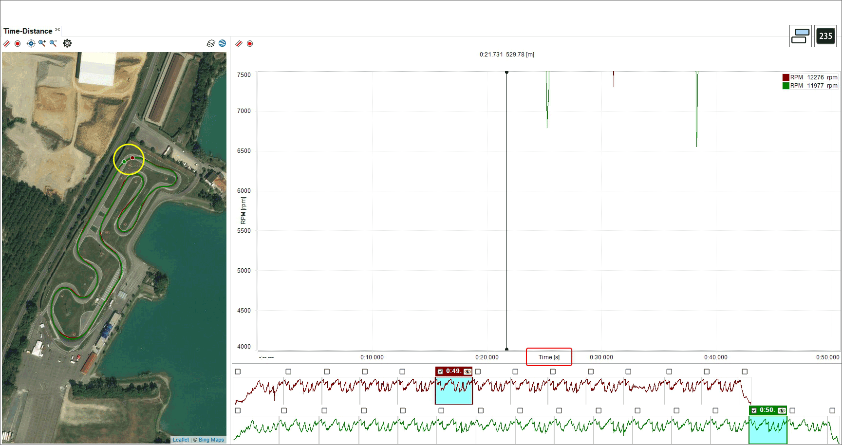
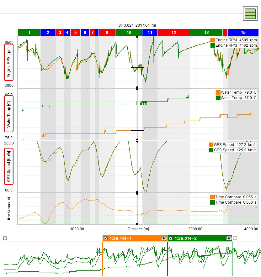
Time-Distance Layout
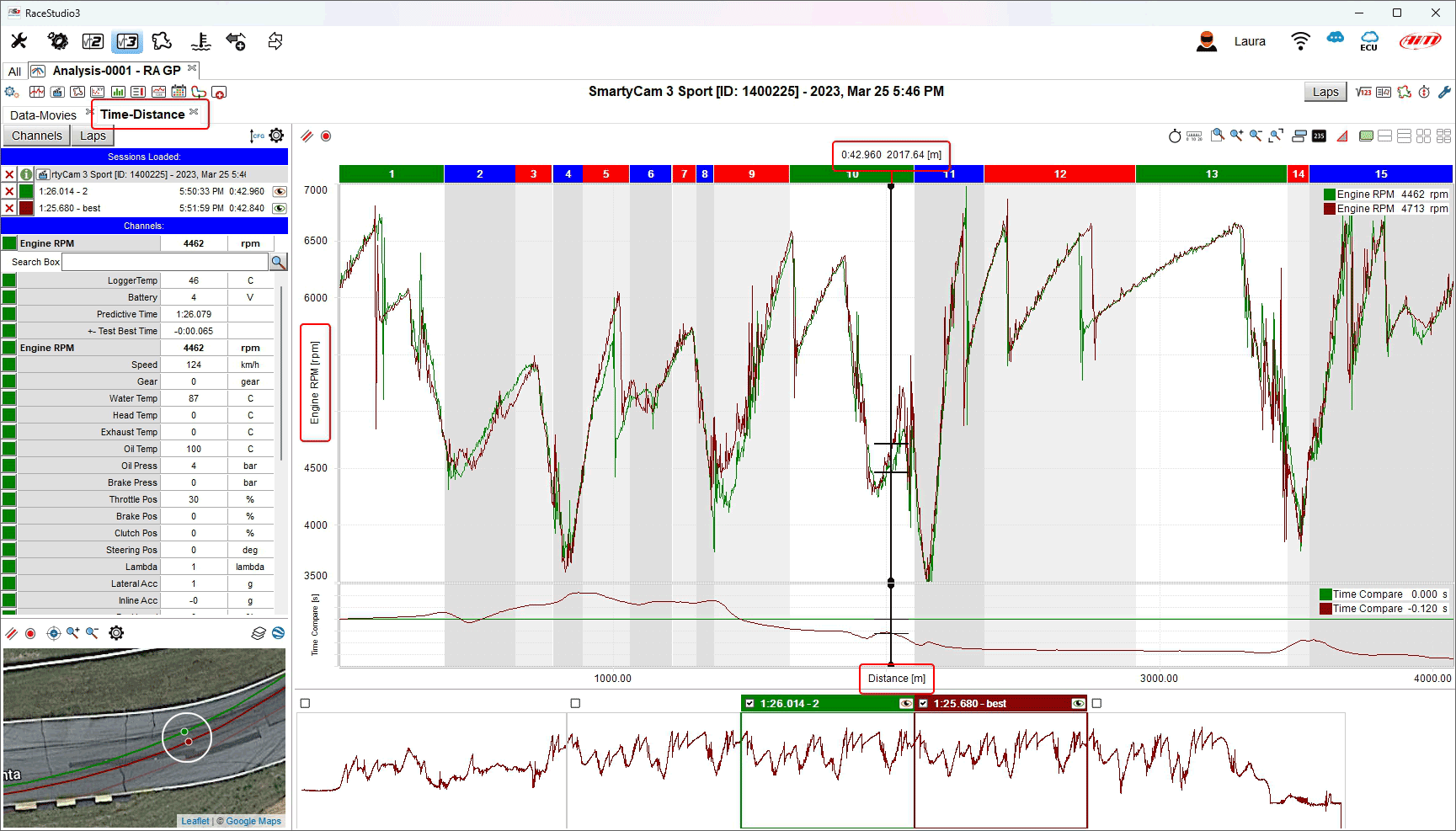
This layout comes by default with a Channels and Laps List Panel (1), a Track Map Panel (2), a Time-Distance Panel (3) and a StoryBoard Panel (4).
Please follow the above links to learn how every panel works.
The very first time you open this layout you’ll find the best lap already shown, and the data cursor placed in the middle of the lap.
In the channels list you’ll see the list of the shown channels, on top, a search bar in which to look for other channels (useful in case the session you’re analyzing features many channels), the list of all channels, and a bottom list in which you can add comments to the session. Clicking on the "Laps" button just above the channels list, you’ll be switching to the list of all session laps.
Clicking on the channels in the complete list you can show/hide them. In the laps list you can do the same. While shown channels will affect what’s shown in this layout only, shown laps will be for all layouts.
Shown laps and shown channels feature a colored square, clicking on which you can select its color. This color choice will affect all layouts.
Laps can be shown/hidden doubleclicking the laps themselves in the story board. Some laps in the story board feature a greyed background (normally the "in" and "out" laps), it means that such laps are not considered as valid by the algorithm computing the best lap. The story board allows also to drag shown laps moving them to other laps.
The track map shows the (GPS) driven line of the shown laps. Clicking on the driven line trace you can move the cursor. The cursor is in common with all other panels in this and all other layouts. The track map can be zoomed separately by data zoom.
The time-distance plot shows the graphical representation of the values of the shown channels/laps. Also here, clicking on the plot you can move the cursor. To add a channel to the plot, click on it in the list of all channels. Using the mouse wheel on this panel you’ll be able to zoom data in and out, the zoom level being in common with all other panels of this and all other layouts.
In all the panels the right click (or context menu) will guide you into the main command and setting options.
By default, pressing the space bar you can toggle the shown status of channels list and track map.
For more information on how data is synchronized, please see Synchronizing your Data.
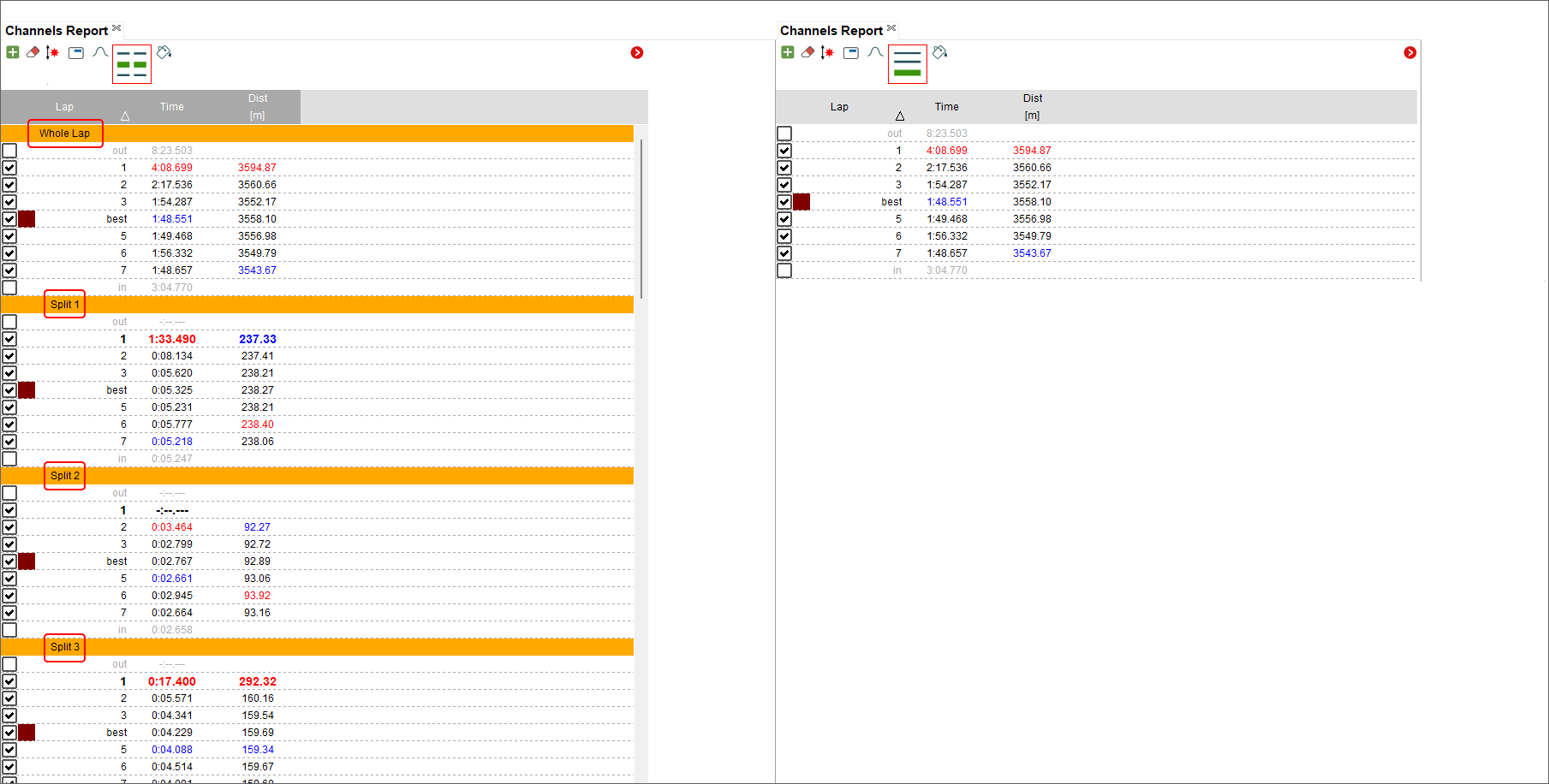
Split Times Report Layout
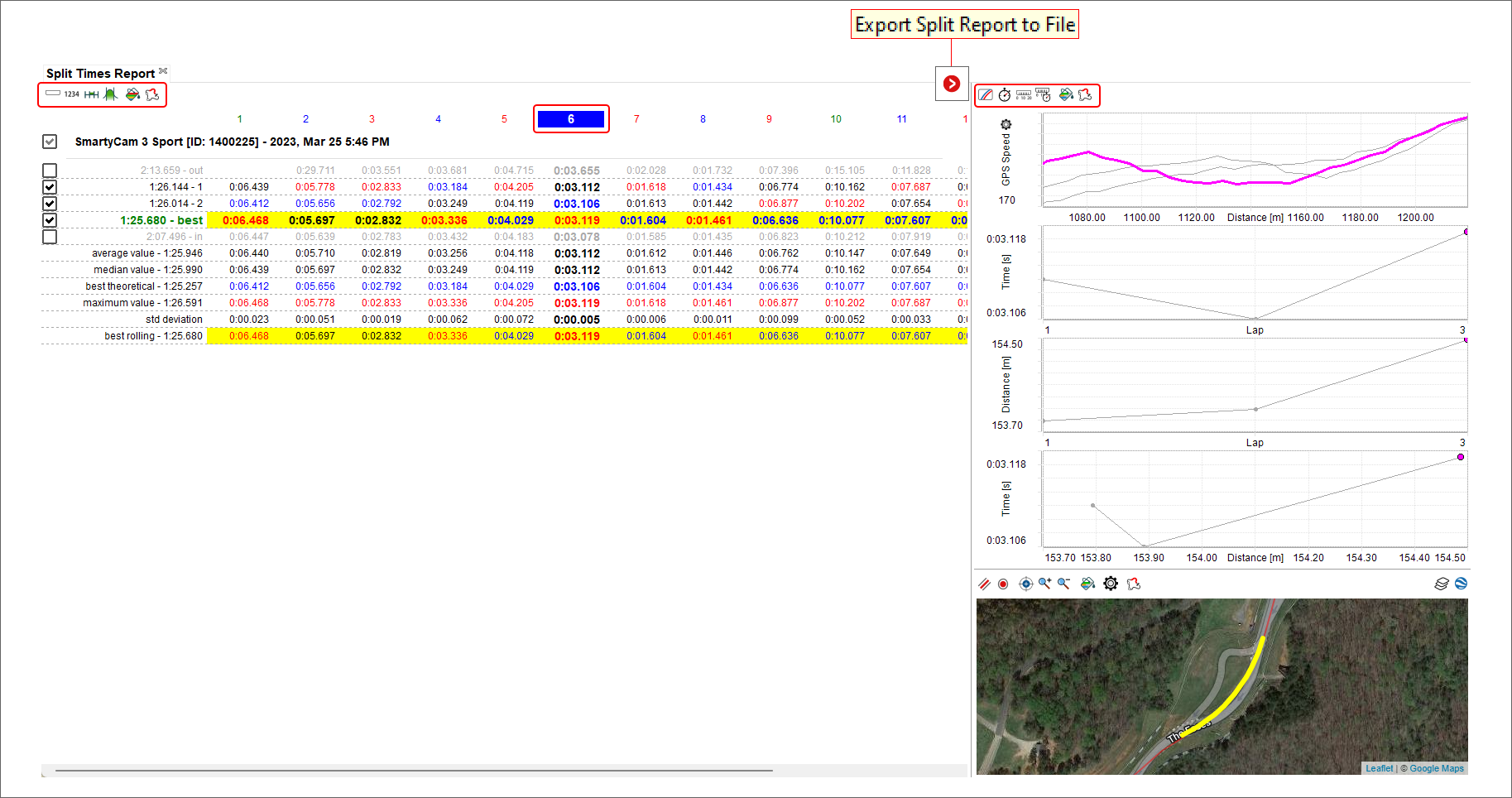
This layout comes by default with a Split Report Panel (1), a Split Details Panel (2) and a Track Map Panel for Selected Split (3).
Please follow the above links to learn how every panel works.
The split report divides every lap in N segments, offering you the measurement of the time spent in every segment, lap after lap.
It automatically computes which is your best theoretical time, made out of all the best segment times of every segment.
It automatically computes which is your best rolling time, i.e. a lap time you indeed made on track but not necessarily from start/finish line to start/finish line.
In the split report rows, each lap can be enabled/disabled checking/unchecking the corresponding checkbox. By default, "in" and "out" laps are not enabled.
One of the segments can be the selected one. Click on the cell with the segment number at the top of the table to do it. The whole column will be having a bold font making it evident.
Data of the table can be exported into a local file, for example comma separated values files.
The split details panel will generate some graphs on the selected segment.
On top, by default, the speed trace of all laps within the segment. This normally allows an immediate understanding of slow segments, as they’re generally associated with low speeds. Bottom of it, the scatter plot of segment times vs the segment driven distances, that could allow the identification of a faster driven line. Bottom of it, the scatter plots of segment times and segment distances vs the lap number, useful to identify trends of a vehicle changing behaviour.
The track map for selected split will, as well, show GPS traces for the segments of the enabled laps. This can be helpful as a different representation of similar data.
Channels Report Layout
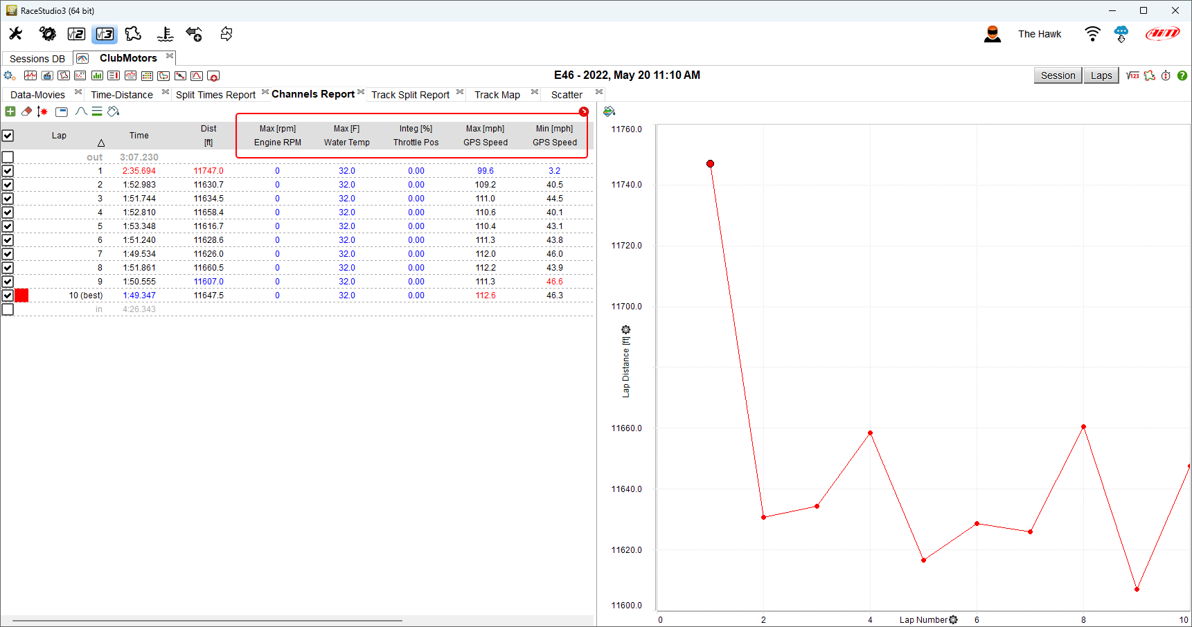
It comes by default with a Channels Report Panel (1) and a Channels Report Graph Panel (2).
Please follow the above links to learn how every panel works.
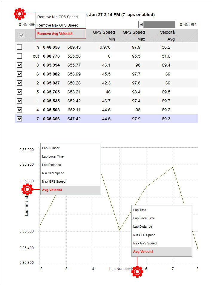
This layout offers you some statistics computed on session channels, lap by lap and, if you enable it, also segment by segment.
Shown values can be minimum, maximum, averages… of a channel, in a lap or a segment.
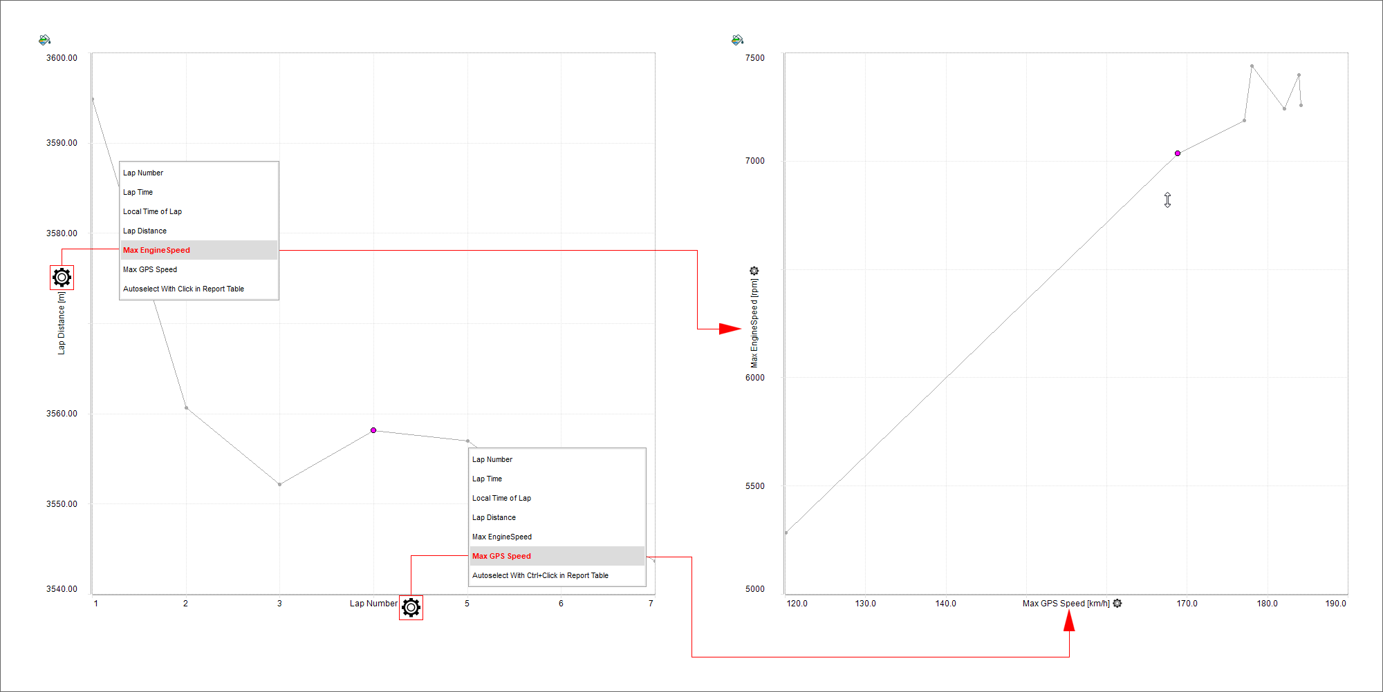
The channels report table offers you the numerical value, while the channels report graph offers you a plot of the values.
The graph, by default, is a scatter plot of the values versus the lap number. Clicking on the cogged wheel icon along the axes you can change what’s in the plot. Another way to change what’s in the vertical axis of the plot is to click a column in the table. To change the horizontal axis, just ctr+click a column in the table.
While passing the mouse over the table, the row that’s currently under the mouse pointer is drawn as bold, and the graph reflects the hot tracking making its related point a little bigger.
This layout offers a magic wand shaped icon that suggests you three possible table populations basing upon the channels available in your sessions:
Vehicle health: mainly through temperatures, pressures and battery level
Racer performances: mainly through average throttle opening, average steering angle value, average brake pressure (the racer inputs)
Vehicle performance: mainly through longitudinal and lateral acceleration variations and max speed
Track Split Report Layout
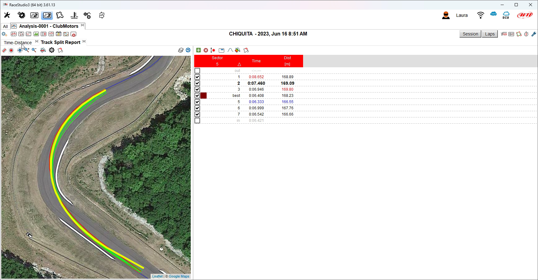
It comes by default with a Track Map Panel for Selected Split (1) and a Channels Report Panel for Selected Split (2).
Please follow the above links to learn how every panel works.
This layout allows for a detailed analysis on what is happening within a segment. The track map shows the GPS driven lines, while the report table shows numeric values.
While passing the mouse over the table, the row that’s currently under the mouse pointer is drawn as bold, and the track map reflects the hot tracking making its related trace a little bigger.
Hitting the space bar you can toggle the visibility of the table.
Each lap can be enabled/disabled checking/unchecking the corresponding checkbox in the table.
Scatter Layout
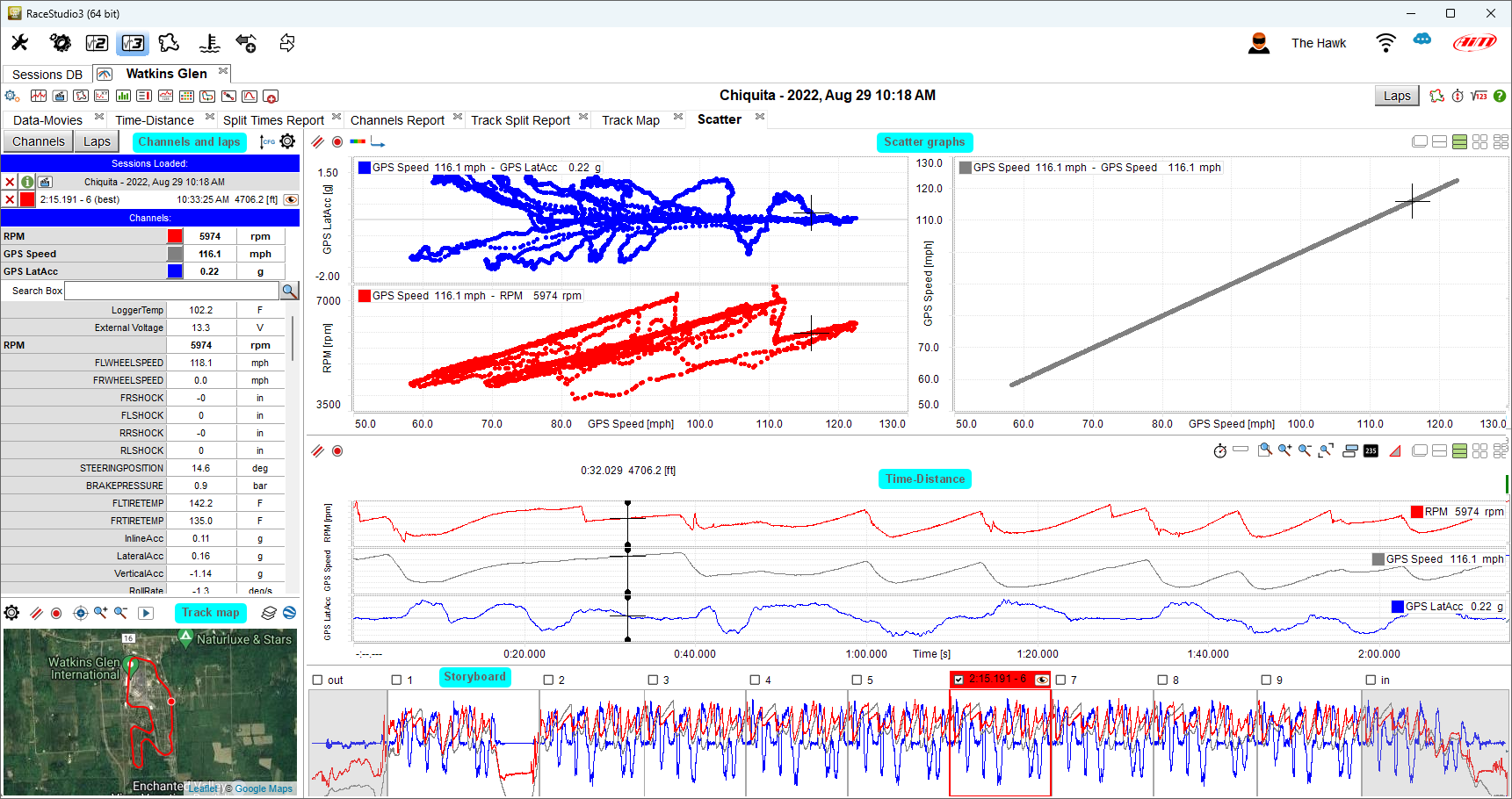
This layout comes by default with a Channels and Laps List Panel (1), a Track Map Panel (2), a Scatter Panel (3), a Time-Distance Panel (4) and a StoryBoard Panel (5).
Please follow the above links to learn how every panel works.
The aim of this layout is to create a channel plot not versus time/distance but versus another channel. A typical example is the G-G diagram (the vehicle fraction circle), in which you show longitudinal (inline) acceleration of the vehicle as vertical axis and lateral acceleration of the vehicle as horizontal axis.
In the channels list you’ll see the list of the shown channels, on top, a search bar in which to look for other channels (useful in case the session you’re analyzing features many channels), the list of all channels, and a bottom list in which you can add comments to the session. Clicking on the "Laps" button just above the channels list, you’ll be switching to the list of all session laps.
Clicking on the channels in the complete list you can show/hide them. In the laps list you can do the same. While shown channels will affect what’s shown in this layout only, shown laps will be for all layouts.
Shown laps and shown channels feature a colored square, clicking on which you can select its color. This color choice will affect all layouts.
Laps can be shown/hidden doubleclicking the laps themselves in the story board. Some laps in the story board feature a greyed background (normally the "in" and "out" laps), it means that such laps are not considered as valid by the algorithm computing the best lap. The story board allows also to drag shown laps moving them to other laps.
The track map shows the (GPS) driven line of the shown laps. Clicking on the driven line trace you can move the cursor. The cursor is in common with all other panels in this and all other layouts. The track map can be zoomed separately by data zoom.
The time-distance plot shows the graphical representation of the values of the shown channels/laps. Also here, clicking on the plot you can move the cursor. To add a channel to the plot, click on it in the list of all channels. Using the mouse wheel on this panel you’ll be able to zoom data in and out, the zoom level being in common with all other panels of this and all other layouts.
In all the panels the right click (or context menu) will guide you into the main command and setting options.
By default, pressing the space bar you can toggle the shown status of channels list and track map.
Clicking on the scatter plot the cursor in time/distance or in time compare graph goes to the closest corresponding point.
Histogram Layout
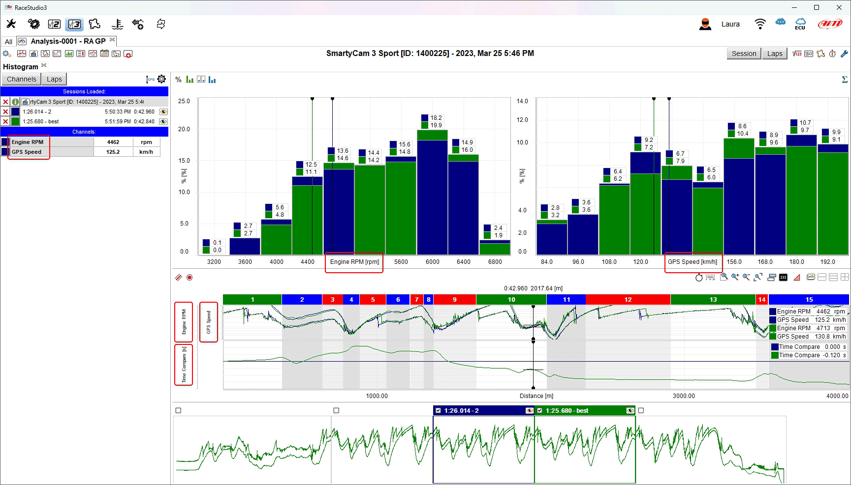
This layout comes by default with a Channels and Laps List Panel (1), a Track Map Panel (2), a Histogram Panel (3), a Time-Distance Panel (4) and a StoryBoard Panel (5).
Please follow the above links to learn how every panel works.
In the channels list you’ll see the list of the shown channels, on top, a search bar in which to look for other channels (useful in case the session you’re analyzing features many channels), the list of all channels, and a bottom list in which you can add comments to the session. Clicking on the "Laps" button just above the channels list, you’ll be switching to the list of all session laps.
Clicking on the channels in the complete list you can show/hide them. In the laps list you can do the same. While shown channels will affect what’s shown in this layout only, shown laps will be for all layouts.
Shown laps and shown channels feature a colored square, clicking on which you can select its color. This color choice will affect all layouts.
Laps can be shown/hidden doubleclicking the laps themselves in the story board. Some laps in the story board feature a greyed background (normally the "in" and "out" laps), it means that such laps are not considered as valid by the algorithm computing the best lap. The story board allows also to drag shown laps moving them to other laps.
The track map shows the (GPS) driven line of the shown laps. Clicking on the driven line trace you can move the cursor. The cursor is in common with all other panels in this and all other layouts. The track map can be zoomed separately by data zoom.
The time-distance plot shows the graphical representation of the values of the shown channels/laps. Also here, clicking on the plot you can move the cursor. To add a channel to the plot, click on it in the list of all channels. Using the mouse wheel on this panel you’ll be able to zoom data in and out, the zoom level being in common with all other panels of this and all other layouts.
The main part (dimensions wise) of the layout shows the histogram panel. By default, hitting the space bar, only this part will result in being shown, hitting the space bar again, the hidden parts will be promptly back.
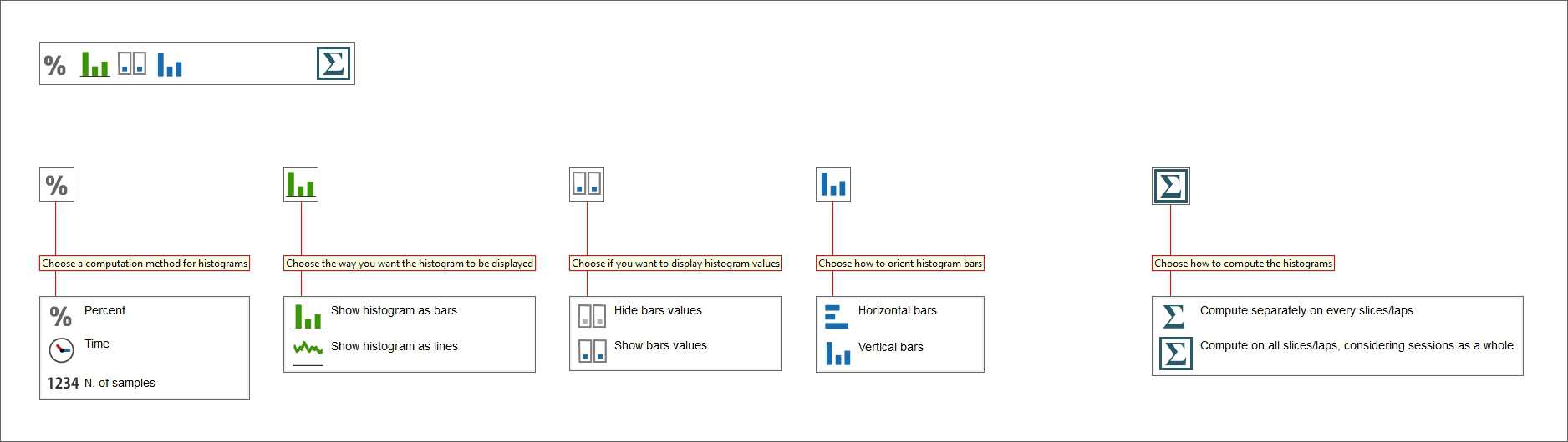
Pressing the icon shown here above you enter “Histogram” layout. Each channel has its own histogram and each lap is identified by a different colour; below the histograms is a graph of the channel on a distance base and time compare if enabled. Bottom of the graphs is the storyboard.
Using the icons on the toolbar top of the graph you can modify the graph layout and its computation. The graph can be shown in percentage, in time or as number of samples. Its layout can be in bars (horizontal or vertical) or lines, showing or hiding the values. If more laps/slices are shown they can be computed separately or as a whole.
Track Map Layout
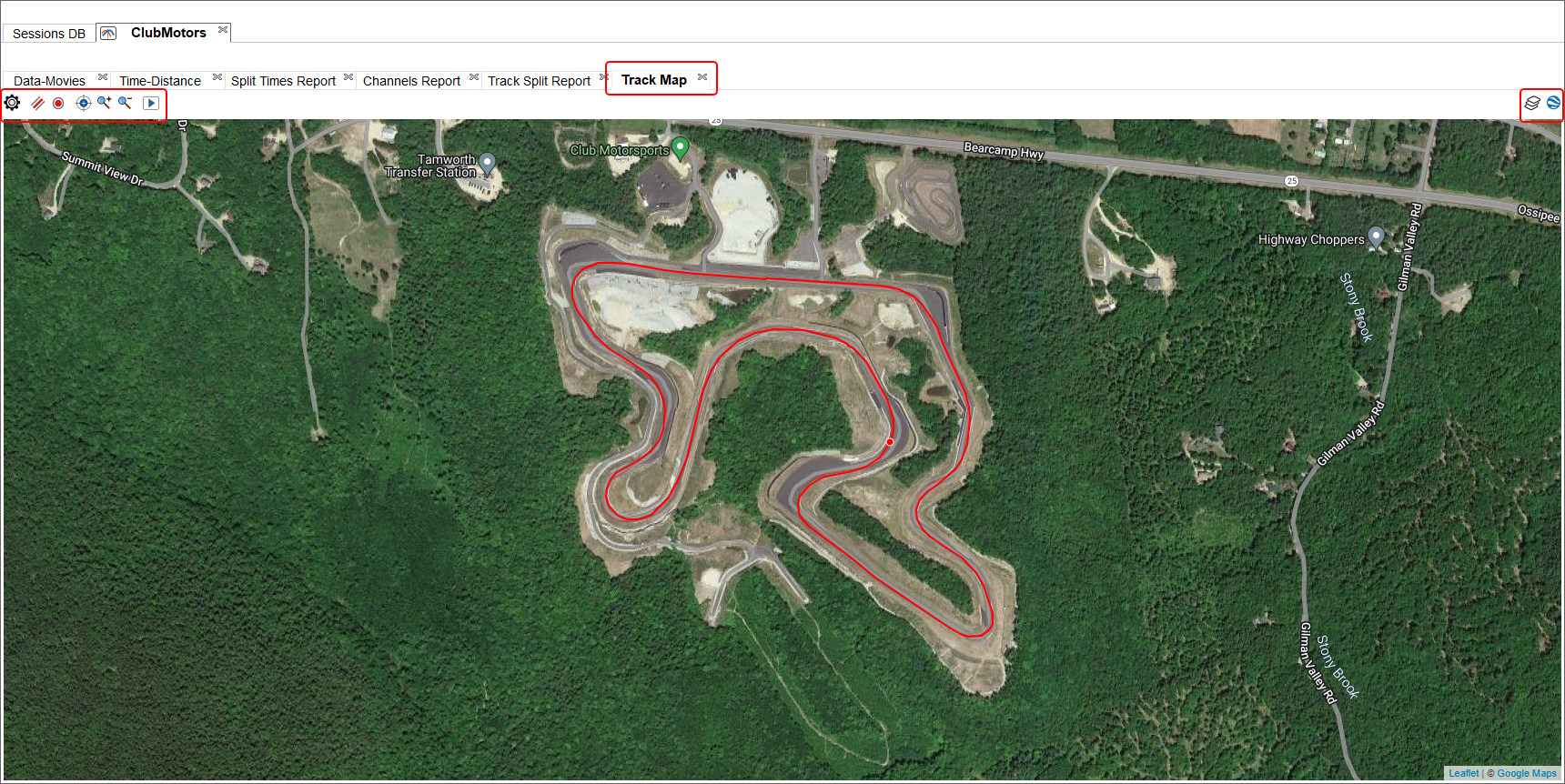
This panel comes by default with, simply, a Track Map Panel.
Please follow the above link to learn how the panel works.
This layout shows, with a screen wide view of the map, all the GPS driven traces of shown laps. As well as all other views of RaceStudio 3 in which GPS traces are shown, you can select if to draw against web based tiles or draw using OS GDI.
You can zoom in and out the map view without affecting the data zoom, this can be helpful to look into corners or straights. If you show and compare more than one lap, you will see the vehicle position as a point on the GPS traces.
You can perform a time based animation of the points over the traces.
Log Sheets Layout
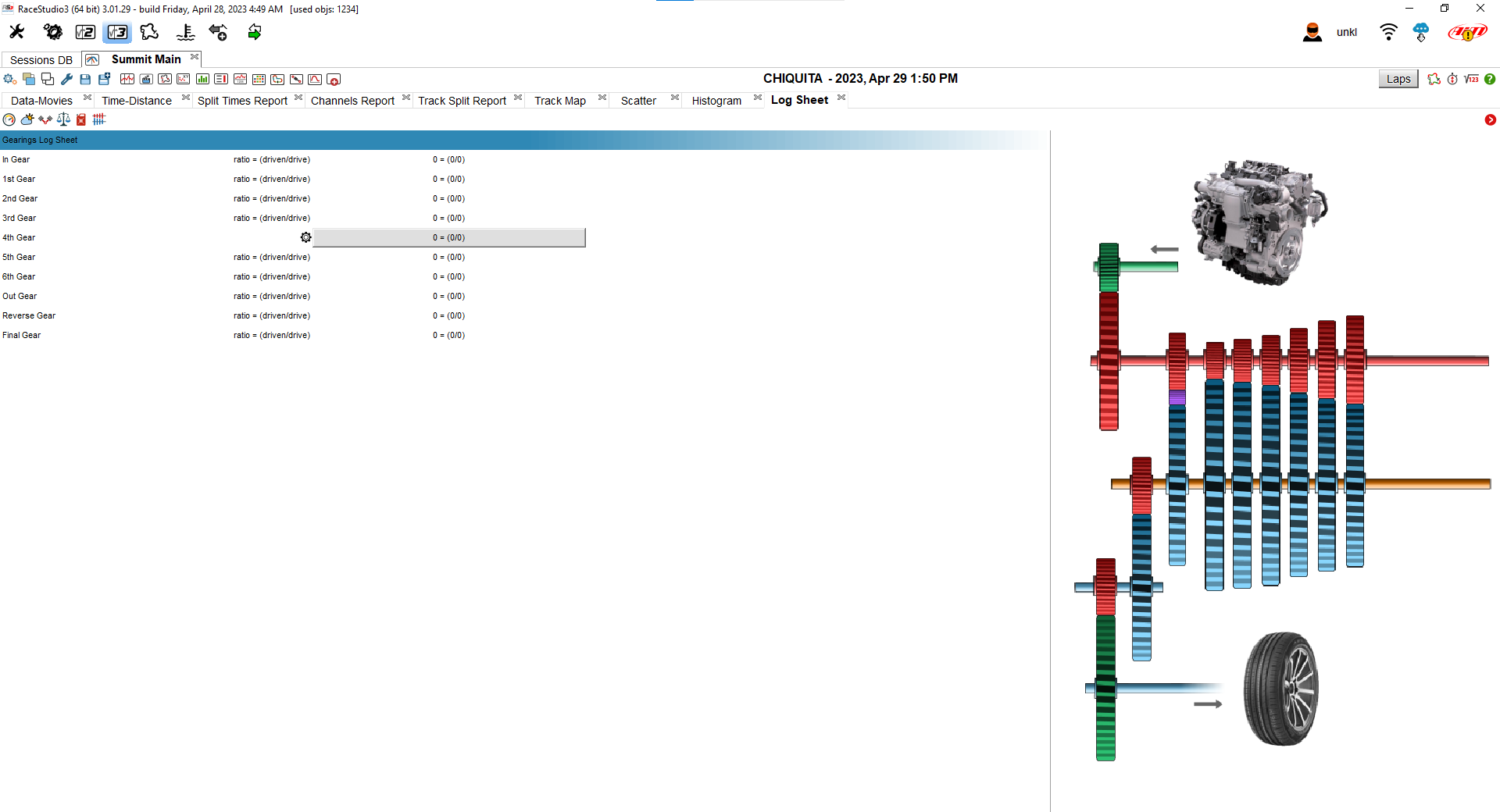
This layout comes by default with, simply, a LogSheets Panel.
Please follow the above link to learn how the panel works.
Log sheet view allows to fill in and set different information concerning the run/session, the weather and the vehicle as shown below.
Such information can be recalled and used, for example, in math channels.
Frequency Analysis Layout
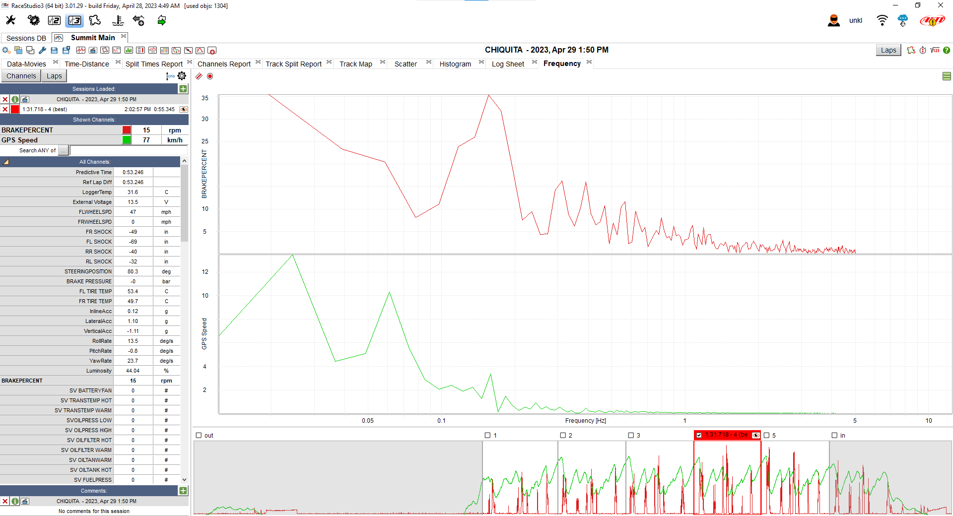
This layout comes by default with a Channels and Laps List Panel (1), a Frequency Analysis Panel (2) and a StoryBoard Panel (3).
Please follow the above links to learn how every panel works.
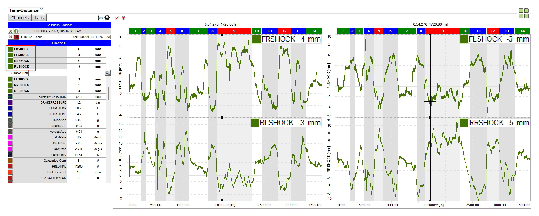
Suspension Analysis Layout
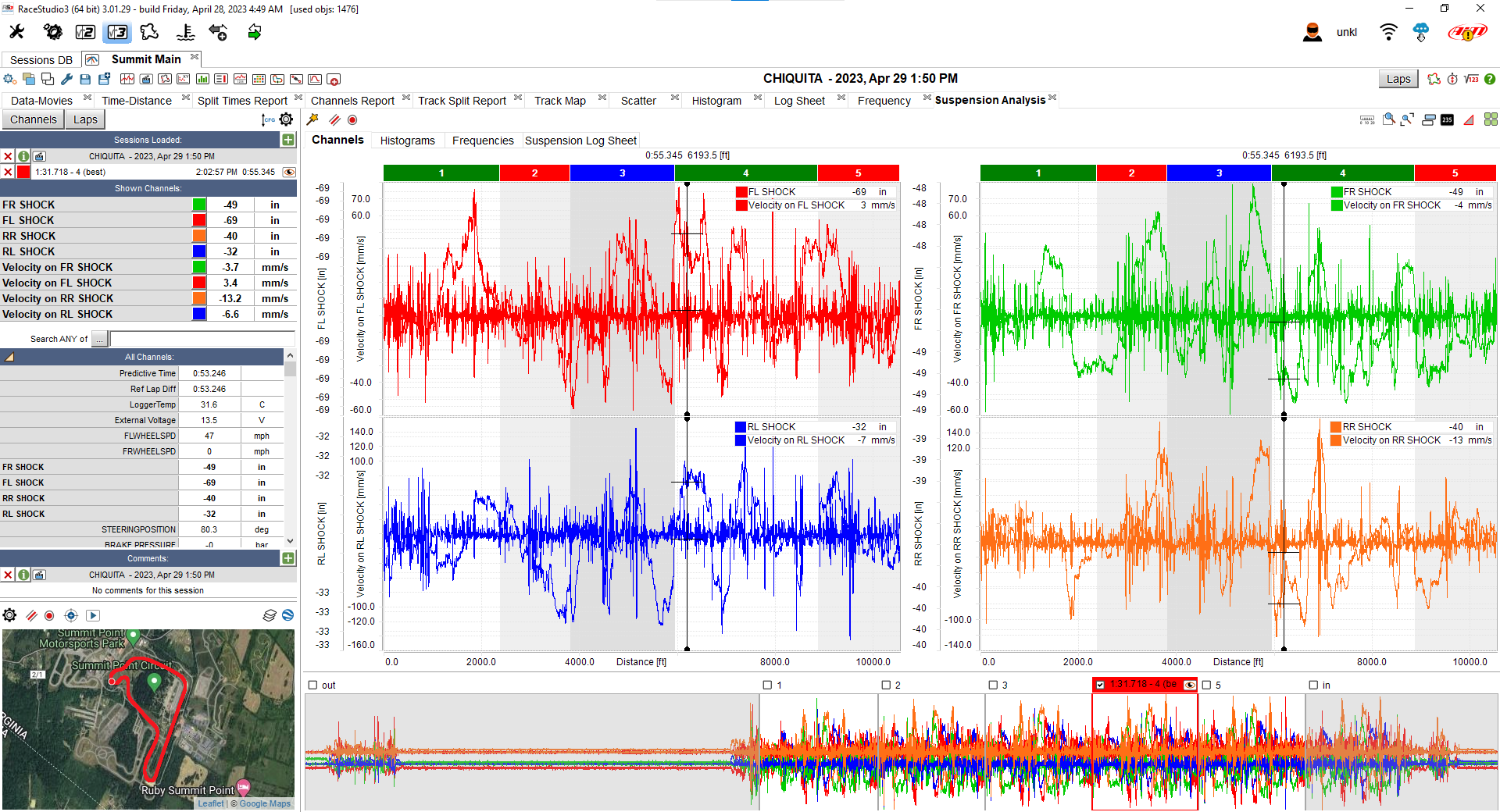
This layout comes by default with a Channels and Laps List Panel (1), a Track Map Panel (2), a Suspension Analysis Panel (3) and a StoryBoard Panel (4).
Please follow the above links to learn how every panel works.
The suspension analysis panel puts together a time/distance plot of the suspension related channels (shock positions and/or velocities), a histogram of the same channels, the frequency analysis plot of the same channels and a logsheet with the main settings related to suspension analysis.
This entire layout is not visible (as well as the icon in the main analysis toolbar) in case the session you open is not featuring any shock position or shock velocity channel. In case your session only features position channels, the first time you open this layout you’re prompted a dialog window in which you can enable the automatic addition of velocity math channels.
Custom Layouts
Here it is possible to Add/show/hide and delete custom layout. They work exactly like explained in Add/removing a panel to/from the software view.
Detailing How To…
A layout is made of panels. While modifying a layout, you can choose between available panels. Available panels (alphabetically sorted, more or less) are:
We’ll see in the next paragraphs a description for every panel and its possibilities.
Channels and Laps List Panel
Channels and laps table shows channels and laps data according to the button pressed on the top left keyboard as shown here below.
Channels view
 Top right of the panel are two buttons that allow to change the order of the channels (left icon) and set them recalling the related dialog window (right icon).
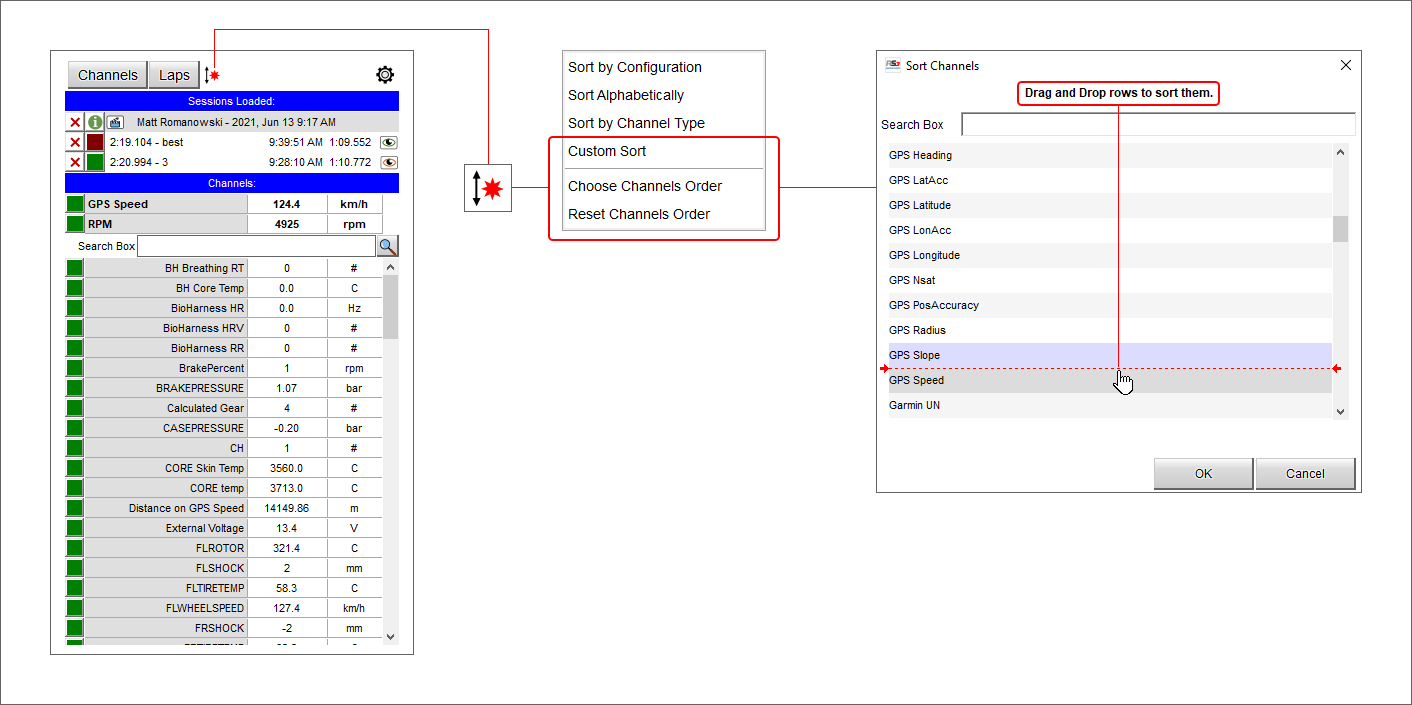
Channels can be variously ordered. Clicking the left button it changes its appearance according to the option you choose. Available options are:
 Channels are sorted by configuration (the firmware)
 Channels are sorted alphabetically
 Channels are sorted by channel type
 Channels are custom sorted. Selecting this icon two additional options are prompted in the menu:
choose channel order and
reset channels order
As shown here below you can drag and drop the voices to custom sort them in the panel or reset the channels order through the related option.
Channels can be variously set.
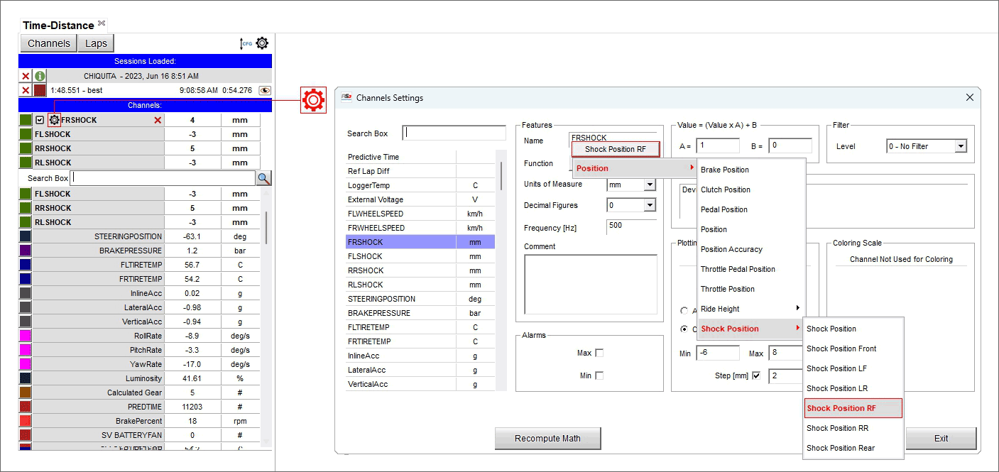
 Pressing the icons shown here on the left you recall setting dialog window shown below that allows to set each channel.
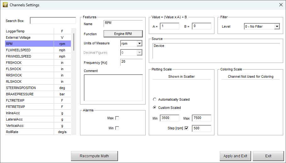
With reference to the image below, the setting dialog window allows to perform a lot of operations:
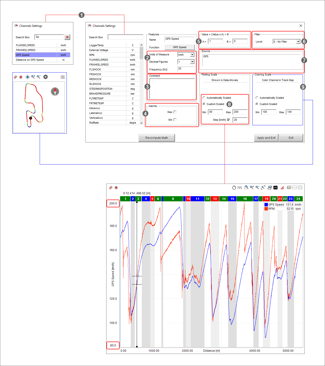
look for a channel typing it in “Search” box: the system makes an automatic selection (1)
change the unit of measure, the number of decimal figures and the sampling frequency (2)
insert a comment about the data (3)
to set an alarm for max and min values of the channel (4)
correct a channel that has been wrongly set and cannot be reset in “Value” box (5)
can filter the noises using different levels of filter (6)
specify the source of your channel (GPS in the image above) (7)
use an automatic or custom plotting scale; in the second case a range of values is needed (8)
colour the channel in the track map using max and min values as reference with “Colour per lap/slice” setting (9).
On top of Channels view, under the label "Sessions Loaded" you see the sessions currently open.
Under the label "Channels" are the channels plotted in the central graph (by default RPM if available and speed), a search box (indicated by the magnifying lens) and bottom of it all the available channels.
Mousing over any of the channel plotted in the graph a setting icon and a red cross (if the channel is shown in the graph) appear in the corresponding box. The red cross is to delete the channel from the central graph while the setting icon allows to set it and recalls the related dialog window with the channel you are setting already selected.
Mousing over any of the channels not plotted in the central graph the setting icon only appears.
Laps table
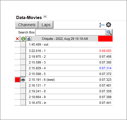
Laps table shows all laps of the session with the best one indicated by default.
Right clicking on a lap time a menu is prompted you can:
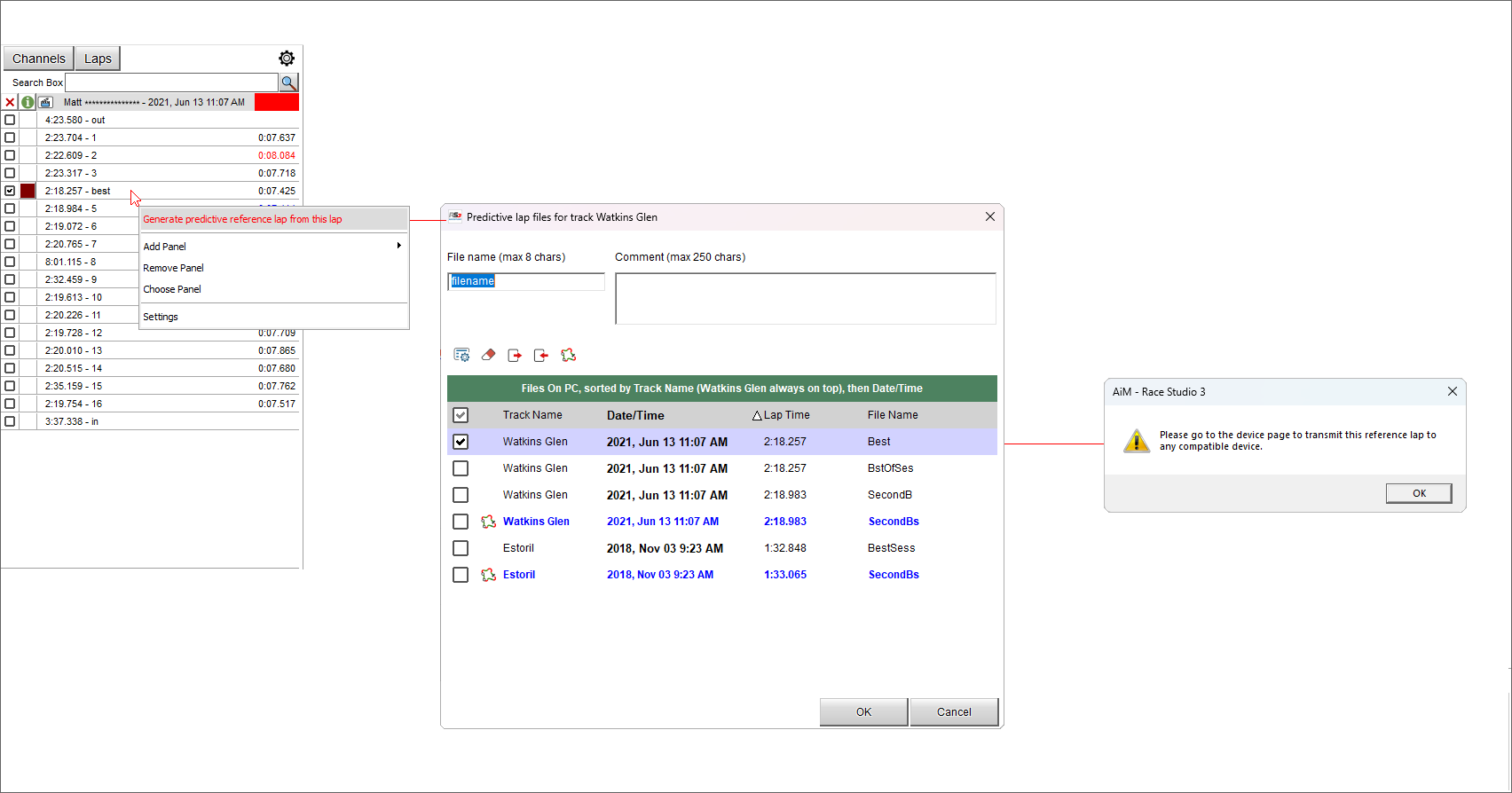
 generate a predictive reference lap from the selected lap
 add a lap in cases not foreseen by AiM start/finish lines; the selected lap is divided
 remove the selected lap
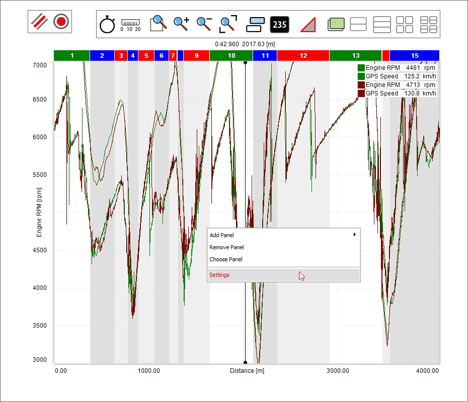
add a panel to the current view;
As shown here below the software allows the user to choose where to place the additional panel (left, right, top or bottom) and a menu is prompted where to select the panel to add.
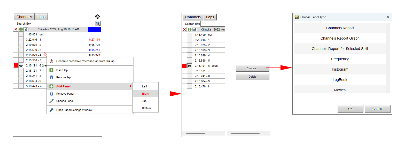
remove the selected panel
 change the current panel content selecting it in a menu that is prompted
 enter Setting options of this panel
Channels Alias
You can, using an alias, allow RaceStudio 3 into changing, automatically, a channel name into a new string, keeping trace of the original channel name.
It’s something more than a string substitution.
When you change a channel name, RaceStudio 3 will change that name for one only session.
When you insert an alias, RaceStudio 3 will keep it for all the sessions from the same logger.
Let’s consider an example to show how it can be useful. Suppose you have your set of math channels in which you reference logged channels by name, and you’re creating a math channel referencing the engine rpm channel as "Engine RPM". Suppose further that you analyze and compare data coming from two friends of yours. For one of them the rpm channel has name "RPM". For the second one the name is "ECU RPM". You would need two separate math channels sets, unless you use the ‘alias’ functionality. How to do it? Simply open the channels settings window for one only session of each logger and insert "Engine RPM" as alias.
It, automatically, will start working. For both sessions, from now on.
Generating a predictive reference lap from a recorded lap
To create a predictive reference lap from a recorded lap follow these steps:
right click on the lap and select "Generate predictive reference lap from this lap"
a dedicated panel is prompted where all available reference laps are shown
to add your lap enable it (is the first of the list)
fill in "file name" and a comment if needed and press "OK"
a new panel is prompted saying "Please go to the device page to transmit this reference lap to any compatible device"”: press "OK"
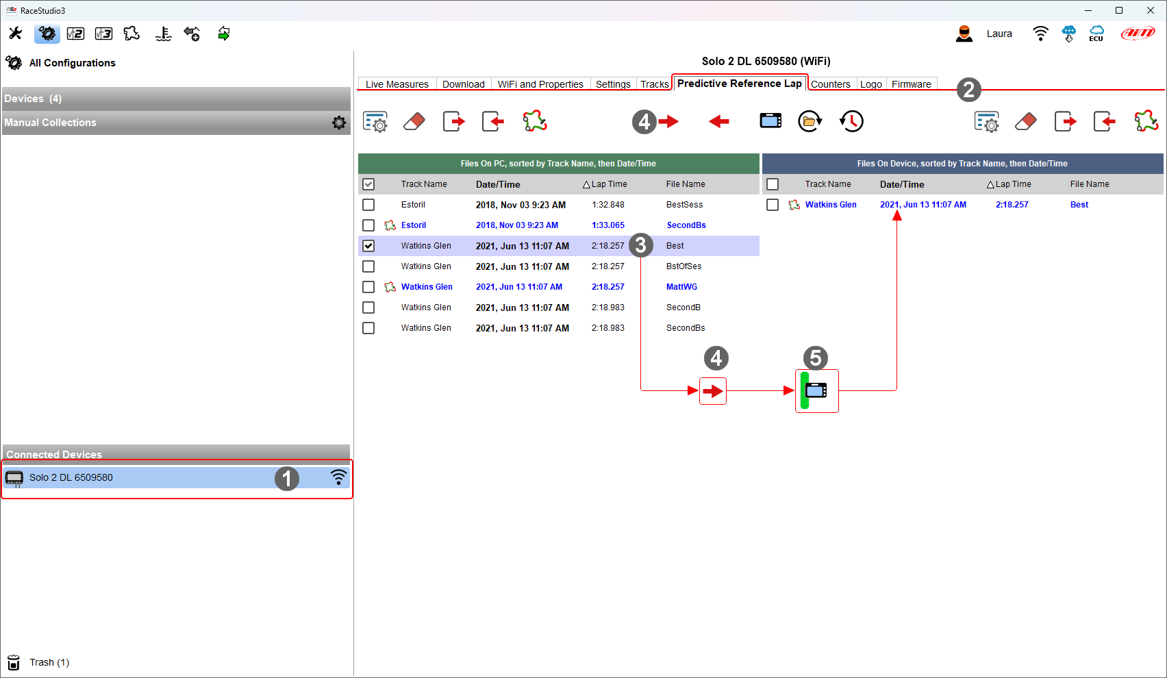
With reference to the image below, once the predictive reference lap generated connect your AiM device to RaceStudio 3 if it is not and:
click on it bottom left on the software configuration page (1)
enter "Predictive Reference Lap" tab (2)
top of the tab are three keyboards: one on the left another central and the last one on the right
select the lap to be used as reference (3)
press the first left icon on the central keyboard (4)
the software copies the lap to your device (5) and you can fix it as reference for those devices that support this functionality
Time-Distance Panel
Central in the page of the software is a graph whose appearance changes according to the icon you select in the keyboard above it as well as to the setting fixed in "setting panel".
The image here below shows the keyboard above the graph; buttons placed one above the other are switching buttons.
Here follows a short explanation of the different options activated by the buttons.
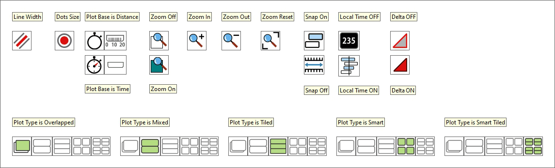
Line Width: available line widths are: 1 (default), 2, 3, 5, 7, 9
Dots Size: available dot sizes are: 1 (default), 2, 3, 5, 7, 9
Plot:
by distance: you have run distance on the X axis and RPM value on the ordinate axis
by time: you have run time on the X axis and RPM on the ordinate axis
Zoom:
Custom zoom ON: dragging and dropping the graph cursor you define the time period/run distance to zoom
The other icons allows to zoom in/out the graph and reset the zoom
Snap:
ON: the graph can show only part of the graph included in complete laps
OFF: the graph can show also part of the graph belonging to different but following laps
Local Time On/Off (useful to show different pilots in the same race):
ON: shows "Time" on the X axis, the selected time period in the storyboard and can be modified using the mouse wheel
OFF: shows distance on the X axis, the selected time period in the storyboard and can be modified using the mouse wheel
Delta ON: dragging and dropping the graph cursor the calculated time period/run distance is shown top left of the graph
Plot type can be:
Overlapped: all shown channels are shown in the same graph
- Mixed: you can decide which channel to show in which graph; a numbered box appears left of each shown channel in the channels table:
clicking it you can decide in which graph to show that channel; max allowed number of graphs is 6
Tiled: each channel has its own graph
- Smart: this plotting fits particularly channels bound to vehicle corners like dampers, brakes, wheel speed and so on; each channel is in a separate graph.
First of all you need to ensure that the channels are configured as bound to the vehicle corner
Smart Tiled: analysing two groups of channels bound to vehicle corners it is possible to show them in the graph not only smart but also tiled.
Graph settings
The graph layout can be customized using the proper setting dialog window. To do so:
place the mouse on the graph
right click on it
select "Settings"
As for all graphs you can decide line width and dots size. The other features are explained in the paragraph here below indicated.
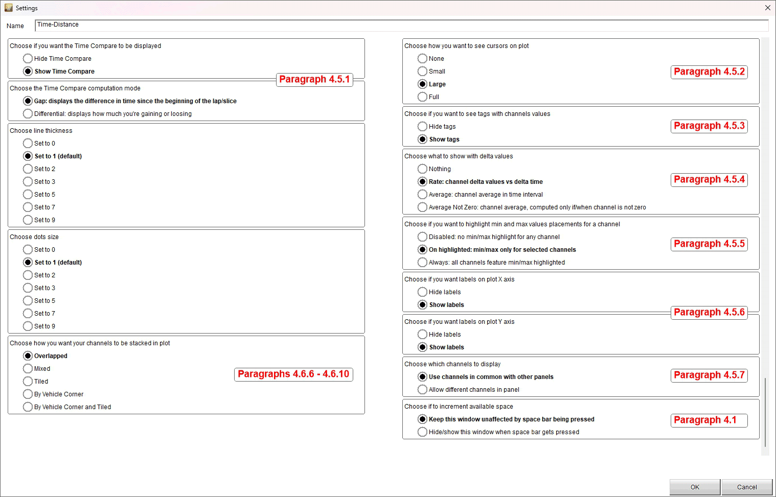
Time compare setting
As shown here below Time compare can be hidden or shown and shown as "Differential" or as "Gap".
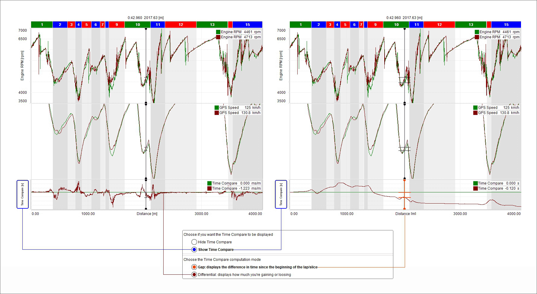
Cursor settings
As shown here below the cursor can be hidden (none) or shown as small or as large and be "full" to say crossing the graph.
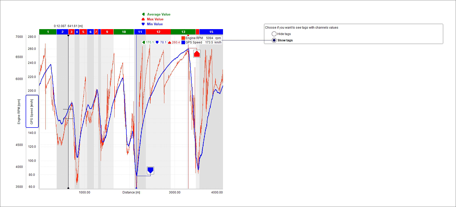
Tags settings
As shown here below the values of the channels plotted in the graph can be shown in dedicated boxes called "Channels tags" enabling the corresponding checkbox; clicking the channel tag the line of the channel whose tags has been pressed becomes thicker and max, min and average values of the channels are shown.
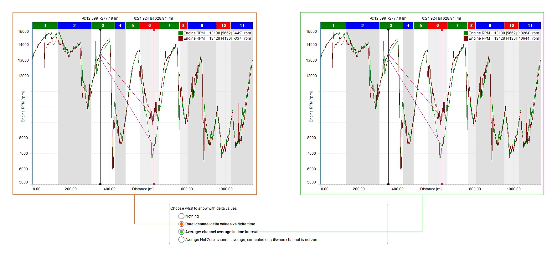
Setting graphs in delta mode and managing it
Enabling “Delta” mode you can analyse the delta of a channel in two points. Available options are:
Nothing
Rate: channel delta values vs delta time
Average: channel average in time interval
Average not zero: channel average, computed only if/when channel is not zero
To show the delta:
click "Delta" icon: shown here above
hook the graph cursor and drag it as you wish
release the cursor: the delta is shown.
Highlighting Max/Min values placements for a channel
It is possible to show max min values of the shown channels on the graph. Available options are:
Disabled (no max/min values are highlighted on the graph)
On highlighted: clicking on the tags the channel graph becomes thicker and max/min and average values are shown (left image below)
Always: max/min and average values of all channels shown in the graph are shown (right image below)
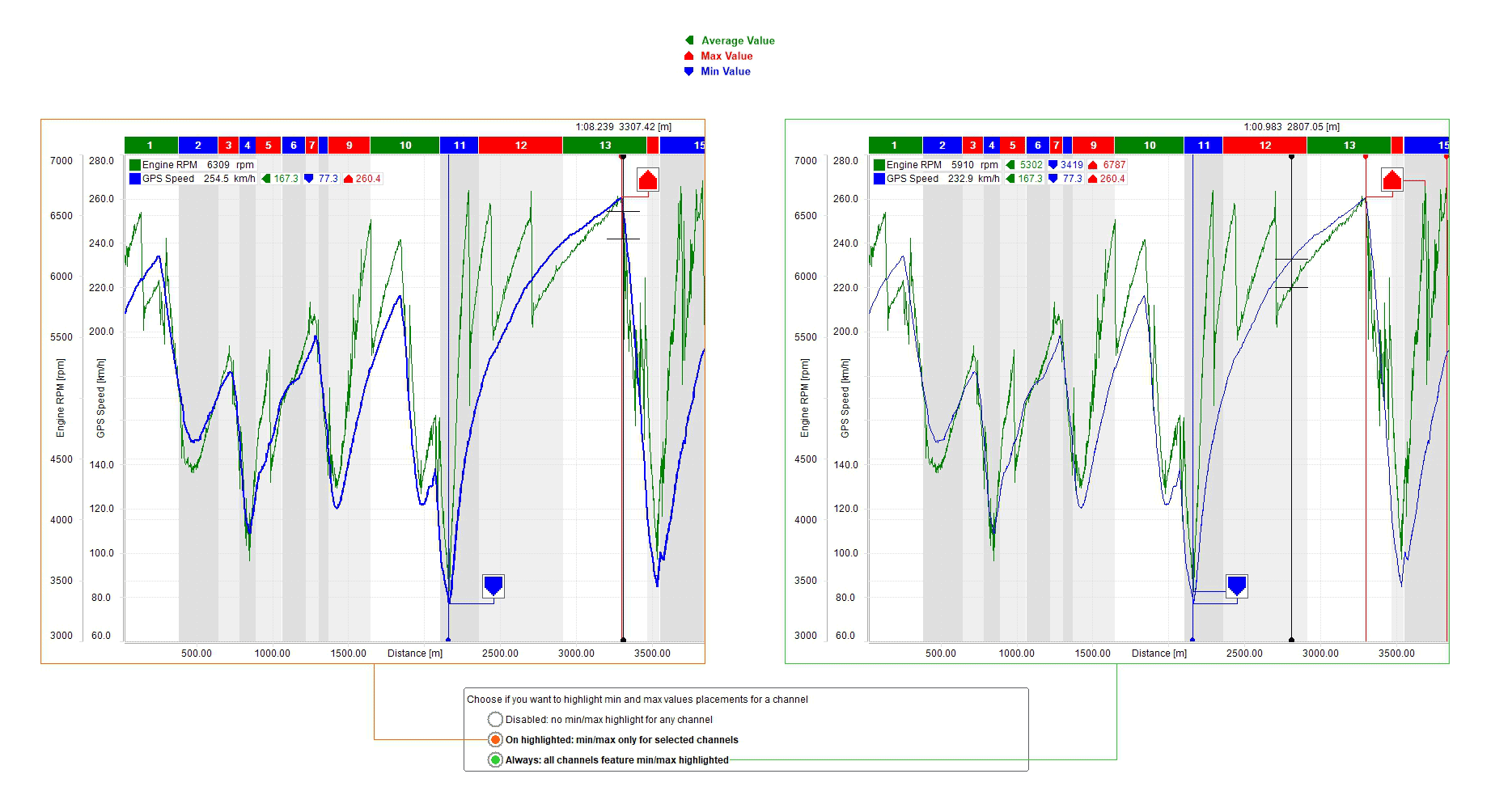
Min/Max values tags are three boxes that shows min/max and average value of the channel; the point where the min/max value has been sampled can be indicated; available options are:
always: they are always shown
on highlighted: they appear only selecting the channel tag
disabled: they are never shown
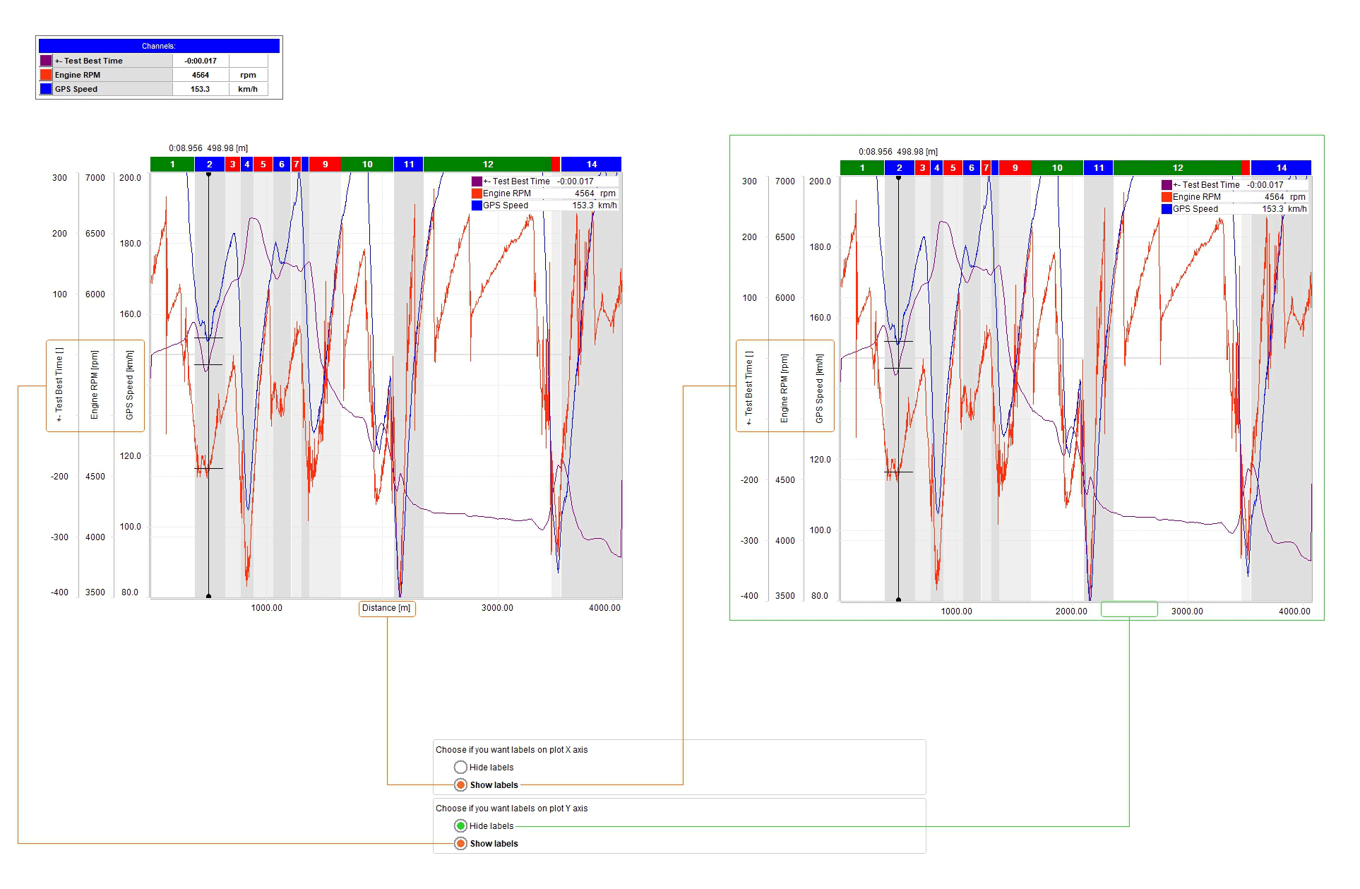
Managing labels on plot "X" and "Y" axis
The central graph can show or hide labels on the axes. You can also decide to show them on one axis only as shown here below.
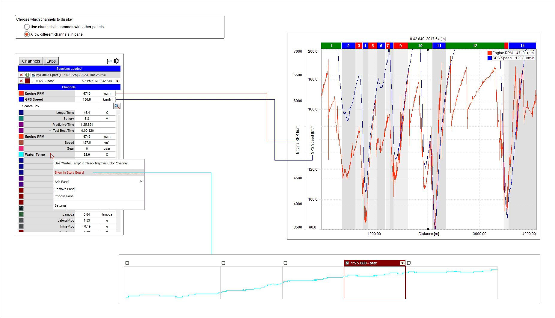
Choose which channels to display
The channels shown in the central graph and in the storyboard can be changed enabling the related checkbox in "Setting" dialog window. To show, for example, Engine RPM and GPS speed in the central graph and water temperature in the storyboard follow these instructions:
place the mouse on the storyboard
right click and select "Settings" options
enable "Allow different channels in panel" checkbox
press "OK"
go in channels table and right click on "Water temperature" channel
select the option "Show in storyboard"
As shown here below central graph shows RPM and GPS Speed while the storyboard bottom shows Water temperature graph
The time/distance keyboard working mode
As said before the central graph can be managed also using the keyboard placed above it and shown here below.

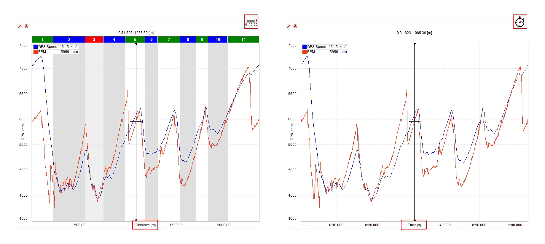
Plotting the graph by Time-Distance
As shown here below, the main difference among the graphs is the channel plotted on the X axis:
Distance plotting is shown here below on the left
Time plotting is shown here below on the right.
In distance plotting the splits are shown on the graph and it can be zoomed at a split level double clicking on the desired split. To come back to standard zoom double click on the split band or press the proper button. The graph can also be zoomed in/out with the mouse wheel.
If more laps are open for analysis each one is indicated by an icon according to its status. In the image below the icons are shown centrally:
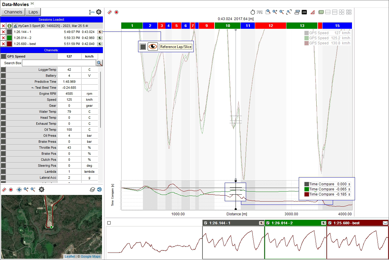
Reference lap (top icon): is the one used in time compare graph (see image in the following page)
Lap loaded with video and map (central icon)
Lap loaded but without video nor track map (bottom icon); this happens if more laps (reference slices) than these set in custom settings are open
“Time Compare” graph appears bottom of the graph view if enabled in the setting dialog window
Using a lap as reference lap(
 ) it shows in a graph the time differences among the reference lap and the other loaded laps.
Graph zooming
With the zoom buttons you can:
Activate/deactivate the custom zoom

zoom in/out and reset the graph zoom

If you want to zoom in a specific part of the graph:
click on the first left zoom icon and it activates (left image below)
hook the cursor
a magnifying lens appears: drag the cursor as desired and the selected part is highlighted in dark grey (left image below)
release the cursor and the graph is zoomed in (image here below on the right)
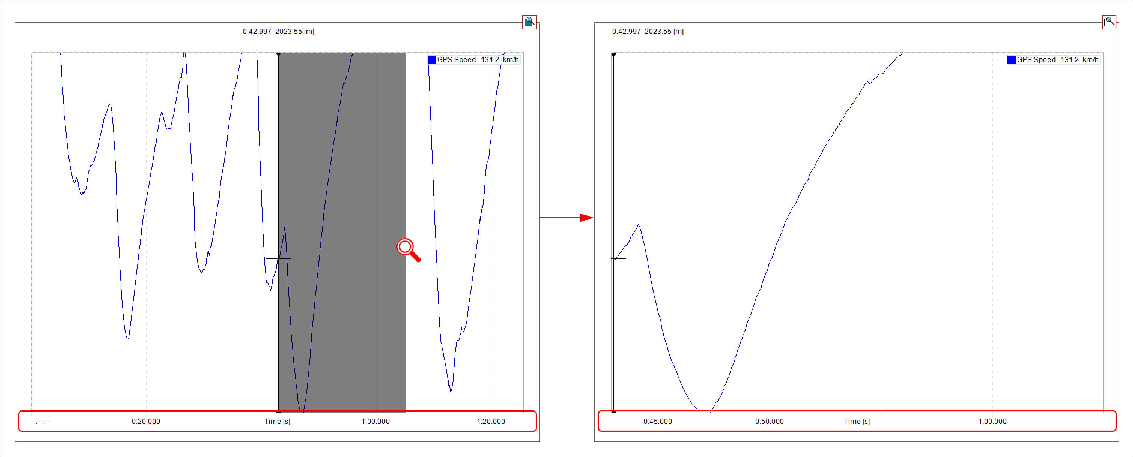
Once the graph is zoomed in the part of the track you have zoomed in is shown in the related box bottom left of the software page.
Graph Snap ON/OFF mode
Assuming you are plotting the graph by distance, as shown here below:
with Snap on (top image) zooming out the graph it shows a lap in the central graph and in the storyboard
with Snap OFF (bottom image) zooming out the graph you see in the central graph and in the storyboard the entire session.
Local Time ON/OFF (local time versus normal time)
"Local time on" mode is very useful to compare different drivers on the same track:
you can only have Time on the X axis
the track box shows the position of the drivers on the track
the boxes in the storyboard and the central graph show the part of the track that is being analysed
the graph can be zoomed in/out with the mouse wheel and
- dragging and dropping the selection in the storyboard you can see the same slice of a lap in the following lap and the related position of the drivers on the track
too as shown bottom of the image below. The storyboard can always be dragged and dropped.
In "Local timing off" mode the X axis can show "Time" or "distance", the graph can be in snap on/off mode and the storyboard selects a fixed range of time; the graph can be zoomed in/out with the mouse wheel. dragging and dropping the selection in the storyboard the slice of race shown in the graph is moved as explained before.
Local timing off and plot mode Snap on
Local timing off and plot mode Snap off
Local timing off and time on the X axis
Graph in delta Mode
Graphs plotting overlapped
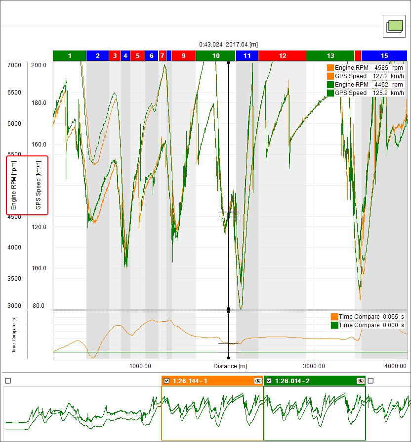
When the graph plotting is overlapped all channels are shown in the same graph and values of different channels belonging to the same lap are identified by the same colour as shown below:
a lap is plotted green and the other orange
the channels you are analysing are both indicated on the ordinate axis
the graph plot base is distance and "Time Compare" graph is enabled and shown bottom of the main graph.
Graphs plotting mixed
When the graph plotting is mixed you can decide where to plot each channel and the values of different channels belonging to the same session are identified by the same colour. In the example below:
a session is plotted green and the other orange
Engine RPM channel is plotted in graph "1" (Top)
Water Temperature and GPS Speed are plotted in graph "2" (central)
You can change the graph where a channel is plotted clicking on the box left of the channel in channels table
max allowed number of graphs is six
the channels you are analysing are both indicated on the ordinate axis
the graph plot base is distance and "Time Compare" graph is enabled and shown bottom of the other graphs.
Graph plotting tiled
When the graph plotting is tiled each channel is plotted in a graph and the channels belonging to the same session are identified by the same colour. In the example below:
a session is plotted green and the other orange
plotted channels are Engine RPM, Water temperature and GPS Speed
the channels are indicated on the ordinate axis
Graph plotting smart
This plotting fits particularly channels bound to vehicle corners like dampers, brakes, wheel speed and so on. First of all you need to ensure that the channels are configured as bound to the vehicle corner like shown here below.
Once the procedure performed for all channels bound to vehicle corners you can show them smart, to say showing a graph for each channel as shown here below.
Graph plotting smart tiled
If analysing two groups of channels bound to vehicle corners it is possible to show them in the graph not only smart but also tiled as shown here below.
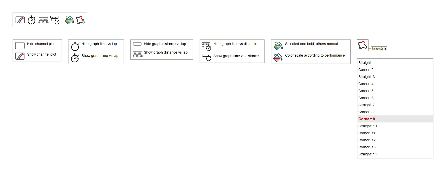
Managing track splits
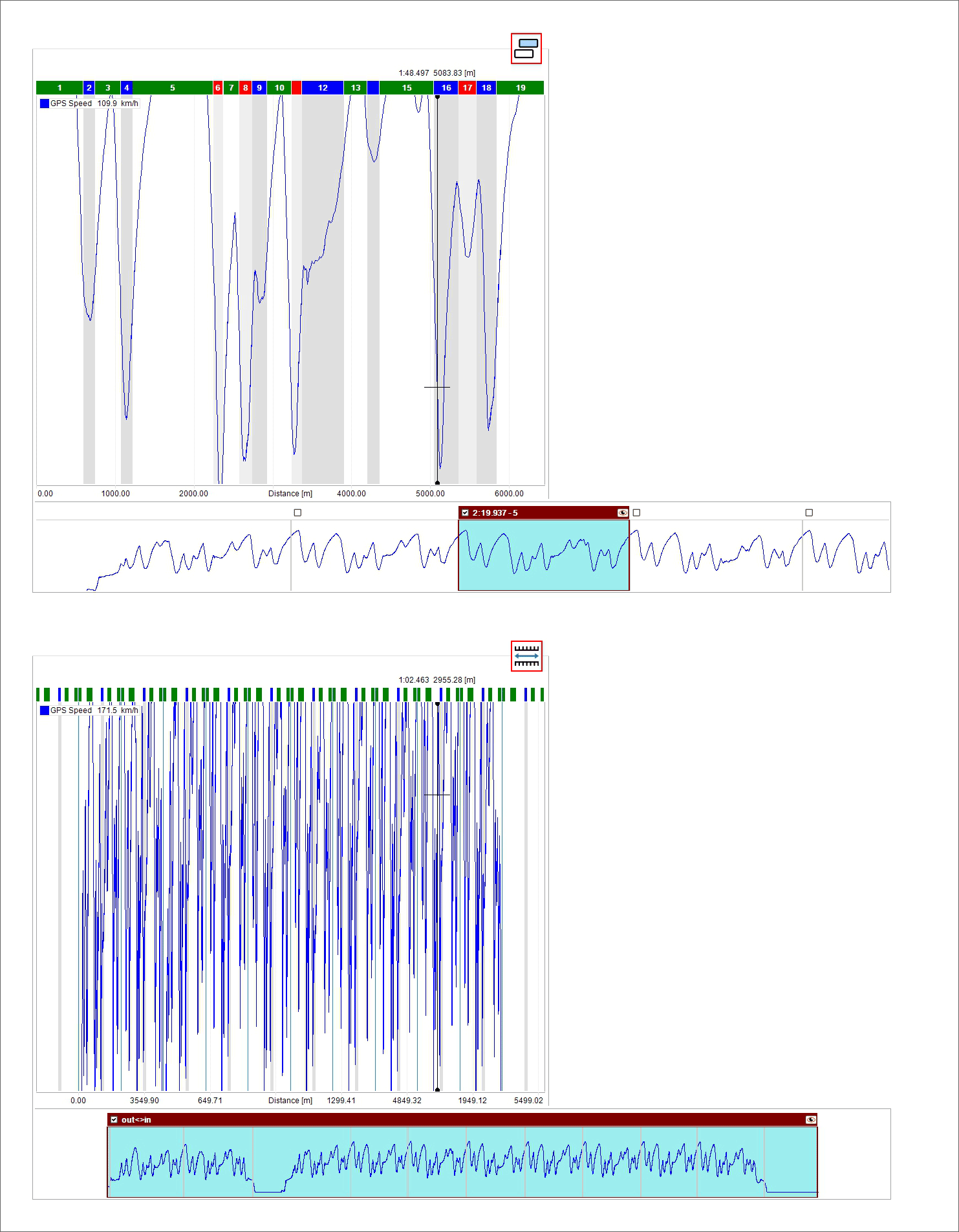
In time/distance view all splits are identified by a coloured bar top of the graph. By default splits are locked; right clicking on the bar you can unlock them; in a few seconds they will be re-locked.
Please note that all changes made in this panel are saved and shown anywhere the track is recalled. To see the changes in the track map, bottom left of the view you need to set it as “Switch to colour per split”.
Right clicking on the split bar it is possible to:
Merge more splits. Each split can be merged with previous split, with next split, with both sides split
Divide splits
Rename Split
Set split type as: corner 1, corner 2, straight
Duplicate split sequence
Add/Remove/Choose a panel
Double clicking on a split of the split bar the graph resizes at that split level and so does the track map bottom left of the software view; clicking again on the split bar the graph and the track map are resized back.
StoryBoard Panel
Bottom of the software view is the storyboard. By default it shows the graphs of all laps with best lap of the session indicated and – if more sessions are open – it shows so many rows as many sessions are open. Selecting a lap its lap time appears on the lap bar.
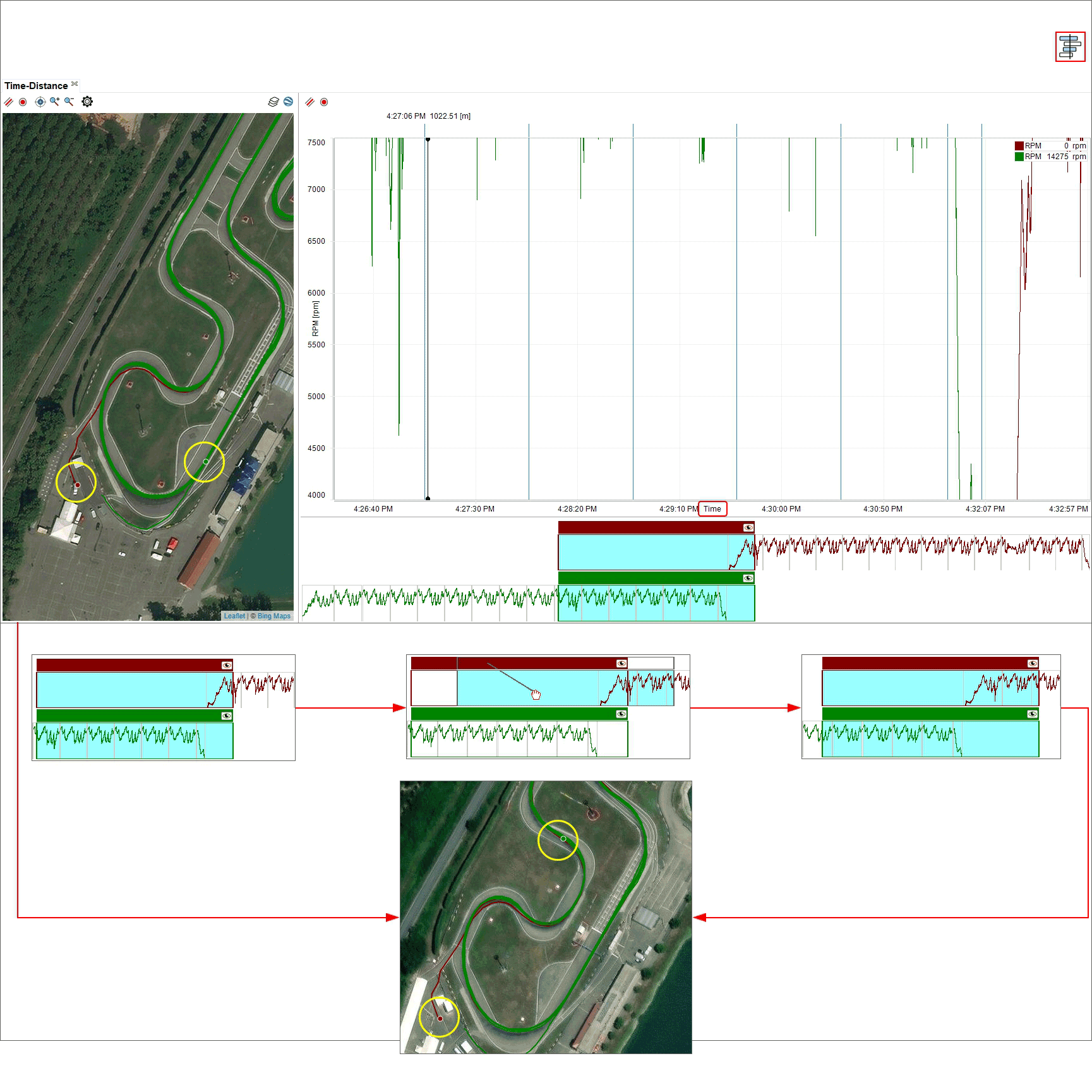
Using the setting dialog window (right click on the storyboard or press the setting icon on the top right keyboard) you can:
show different channels in the storyboard.
hide/unhide the storyboard pressing and re-pressing the space bar.
Movies Panel
Right of the software view are the videos included in the sessions. Enabling the corresponding checkbox in "Settings" dialog window videos can be hidden/unhidden when the space bar get pressed.
The session each video refers to is identified by the colour of play button in the video; it recalls the colour of the sessions in channels table top left of the software view. The position of the driver on the track is shown in the map and in the central graph.
Pressing “play” button on one video:
all video starts
the cursor in the central graph moves following the movie
the track map shows the driver moving on the track
Through the keyboard top of the videos, it is possible to:
cut and export the video chunk from the starting point to the current moment
take a snapshot and export the picture of the current videos in a default folder (browse the PC to change the destination folder)
view the video in the system default application for video files.
Split Report Panel
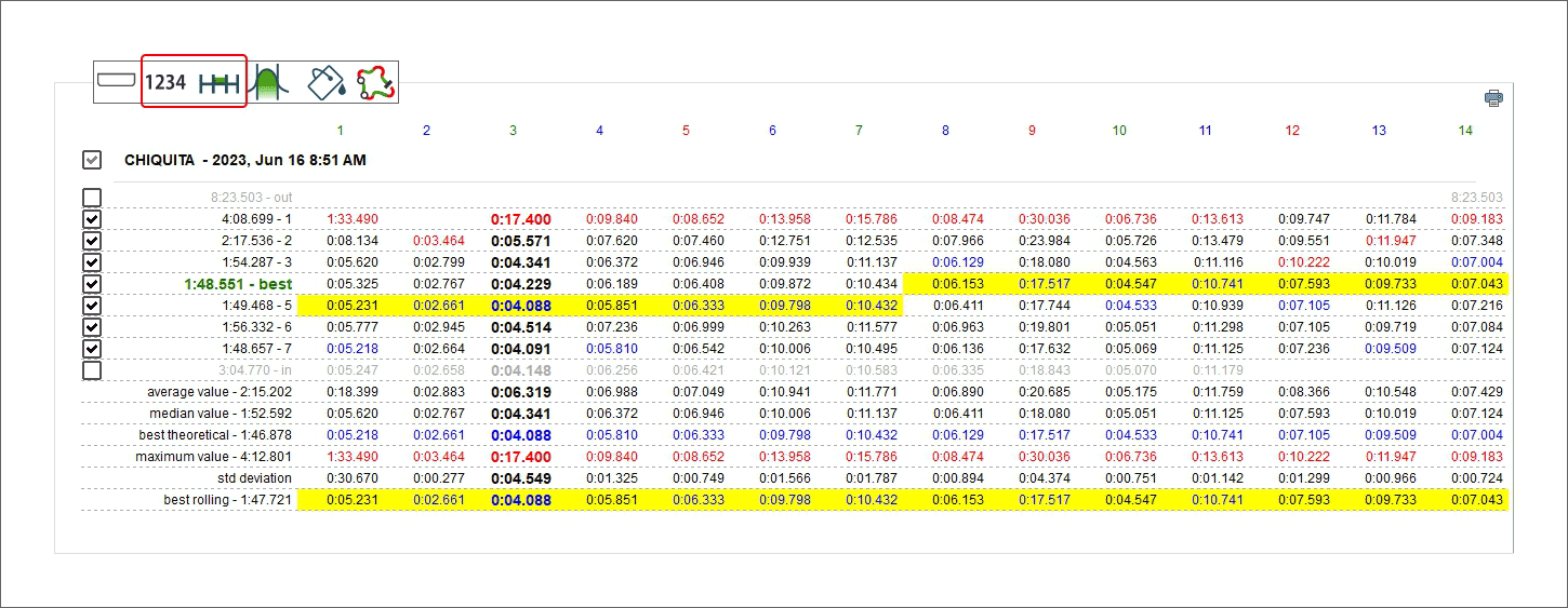
The top toolbar change and switch among different functions that show the data in various ways allowing different data analysis that will be explained in the following paragraphs. The image below shows left keyboard legenda. It manages the table left of the software view.
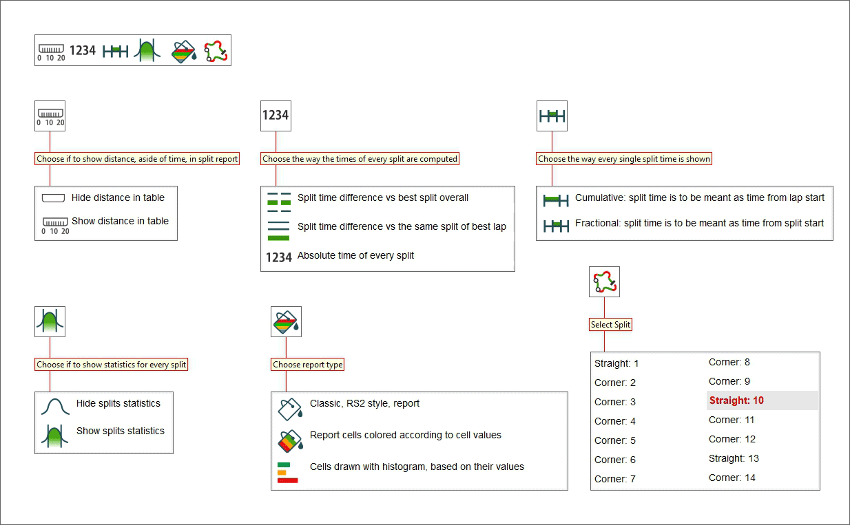
The image below shows right keyboard legenda that manages the available graphs shown below it.
Considering the table left of the software view here follow different possible layouts.
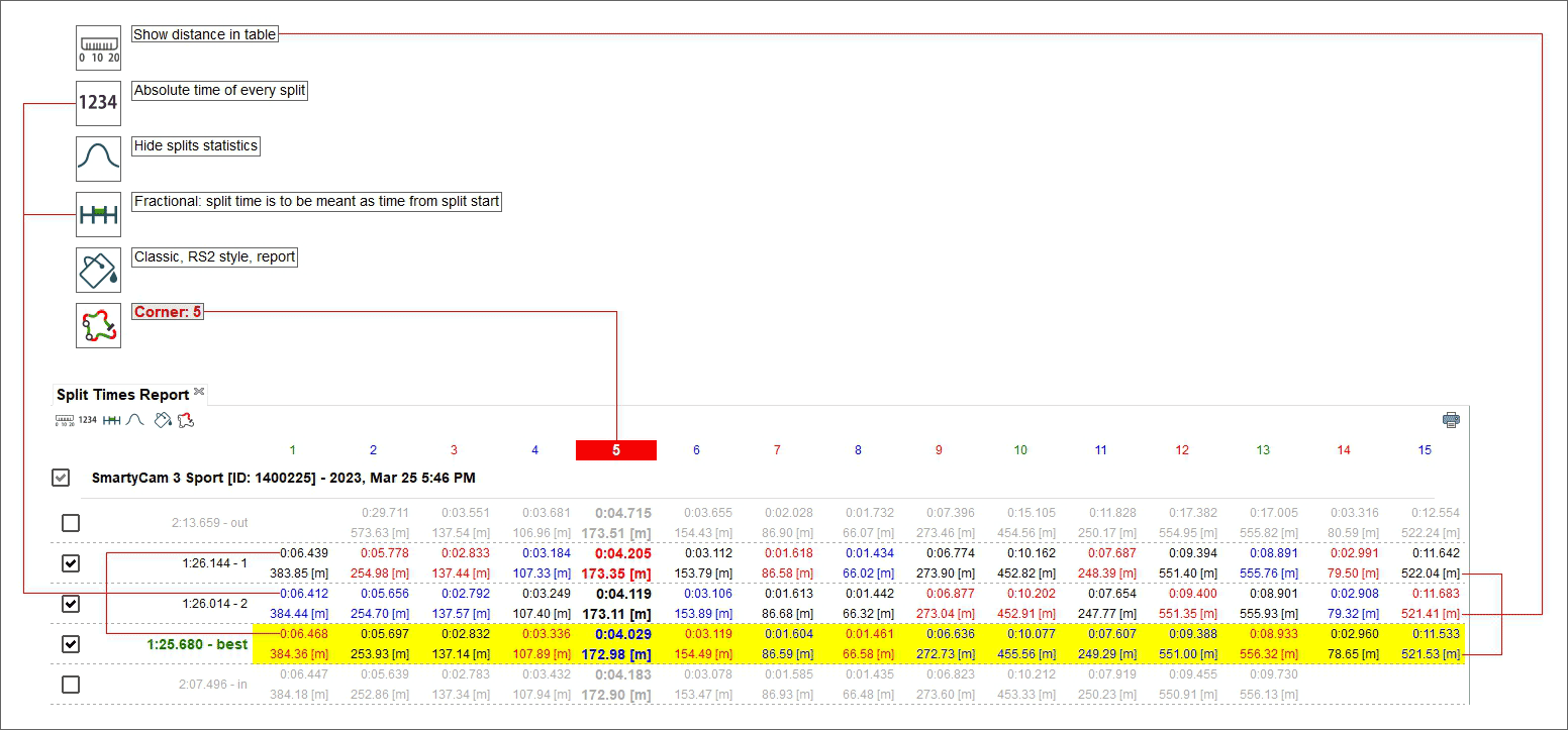
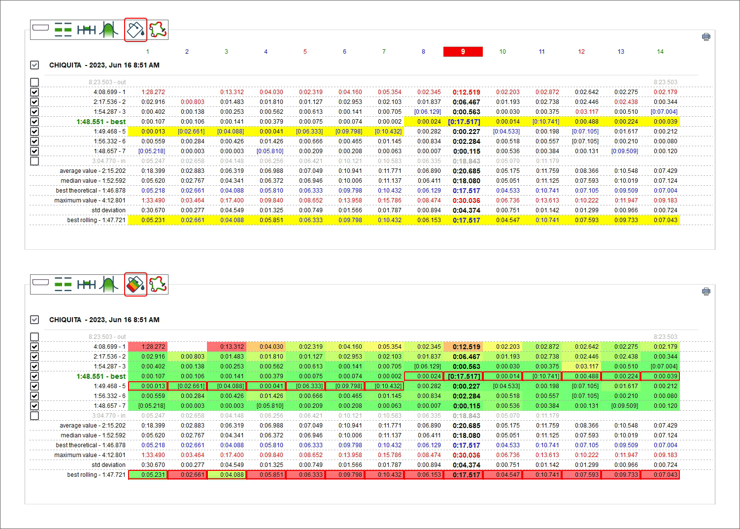
Show distance in table, absolute time of every split, fractional split time, classic RS2 style report.
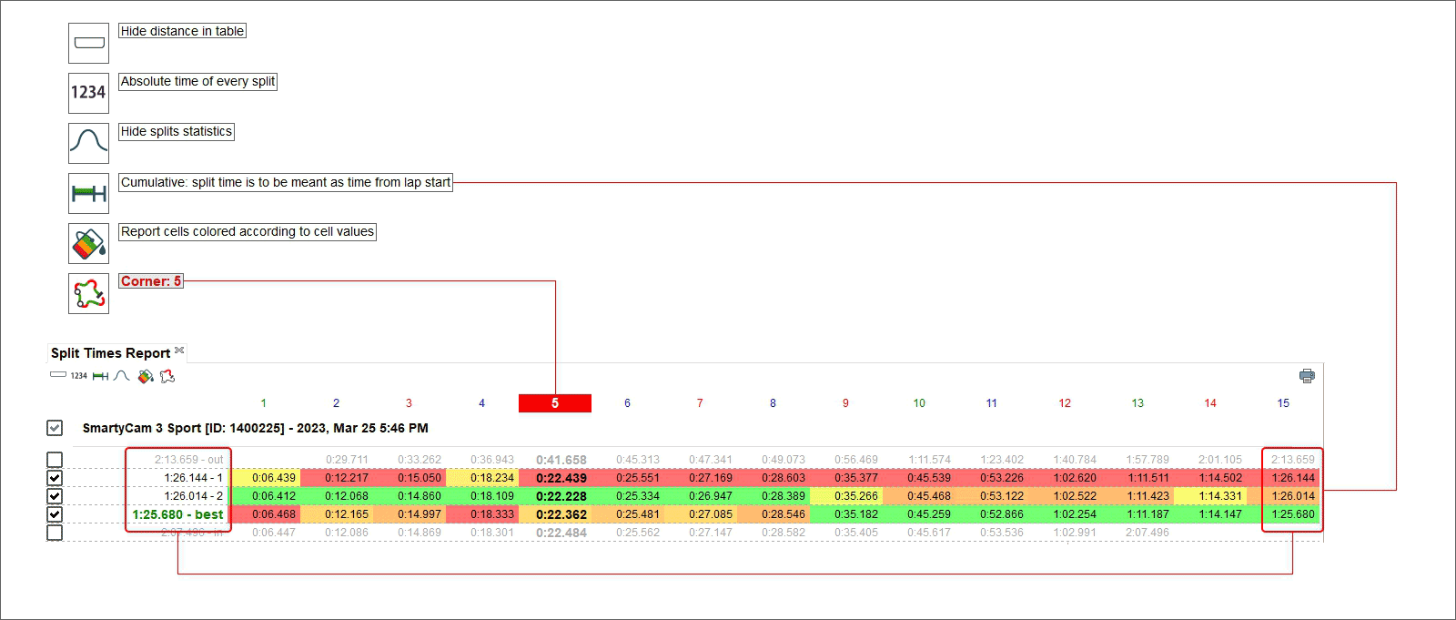
Hide distance in table, absolute time of every split, cumulative split time, reports cells coloured according to cell values (from green for better values to red for worst values).
Hide distance in table, split time difference vs the same split of best lap, show split statistics, fractional split time, cells draws with histogram based on their values.
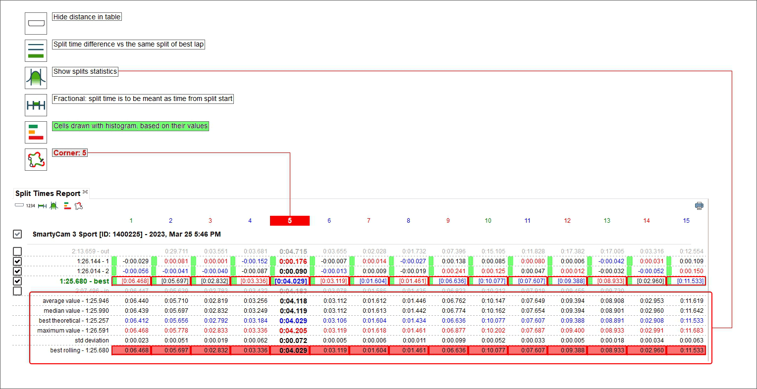
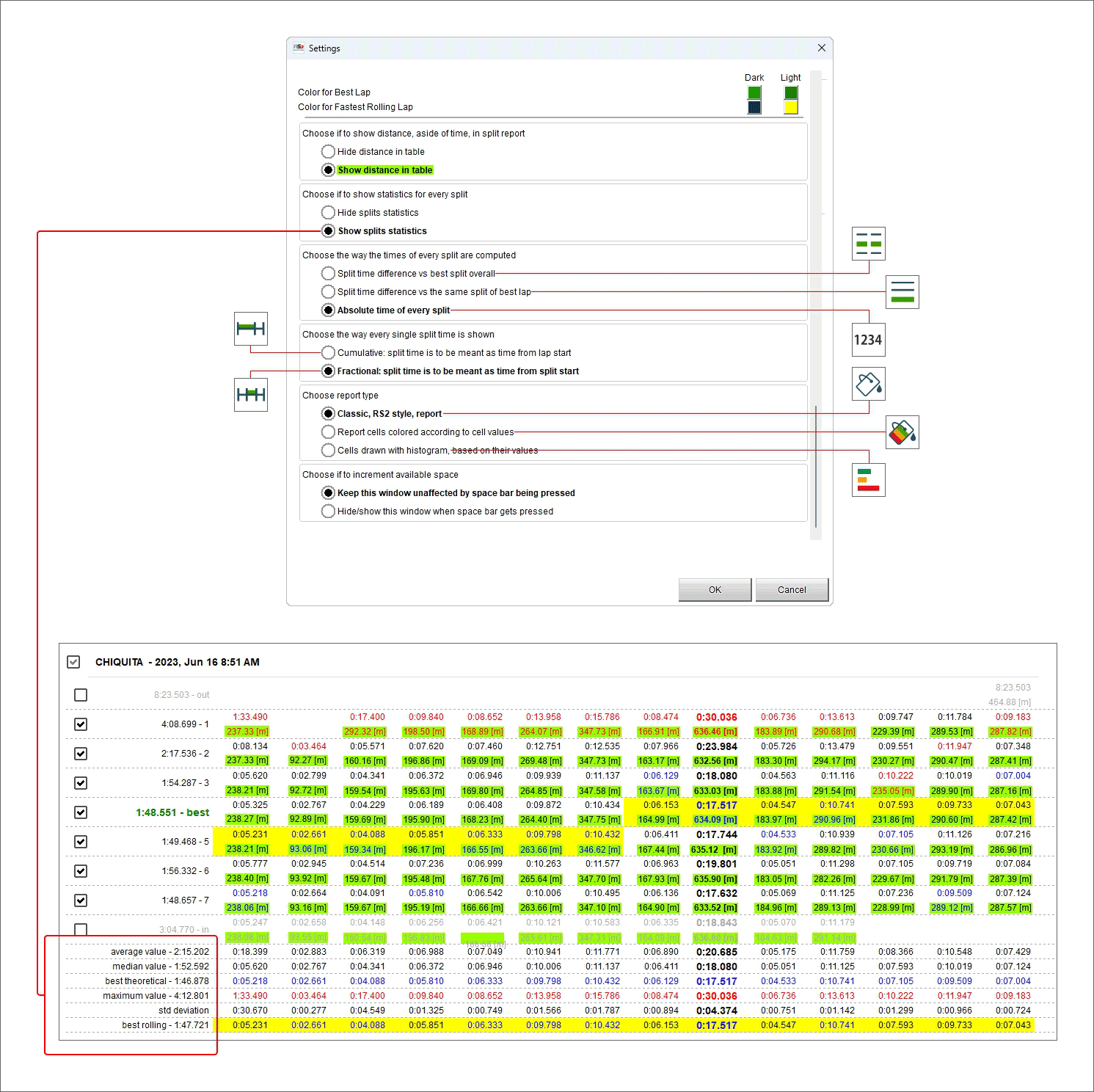
Pressing Statistics button a lot of information can be shown/hidden bottom of the laps figures, to say:
Average value: it shows the average(1) time value of each split
Median value: it shows the median (2) time value of each split
Best theoretical: this lap time is the addition of all best split times no matter what lap they belong to
Maximum value: it is the highest time obtained for each split; these values are written in red in the dedicated statistics row
- Standard deviation (in the split): this value allows to understand how constant the racer is; a low standard deviation value means the driving style follows a rule and there
are no strange behaviours in the vehicle
Best rolling: is the best lap time really made also if the splits belong to different laps assumed that they are successive.
(1) Average value is obtained summing up all items and dividing the result by the number of items
(2) Median value is the value that, ordered the items of a list, is central in the list. If the number of items is odd the median value is one while if the number of items is even the median value is obtained summing up the two central items of the list and dividing the result by two.
Statistics: average value
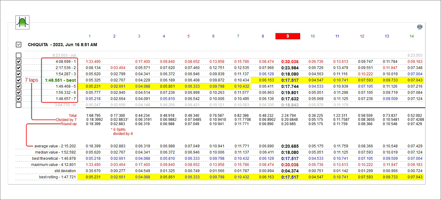
As shown below average value is obtained summing up all split times and dividing the result by the number of items. In this case 7 laps are considered except for split 2 where the time of lap 1 is missing and so that sum is to be divided by 6.
Statistics: median value
Once the items listed in an increasing order the median value is the one central in the list. If the number of items is odd the median value is one (left image) while if the number of items is even the median value is the average value of the two central items of the list (right image).
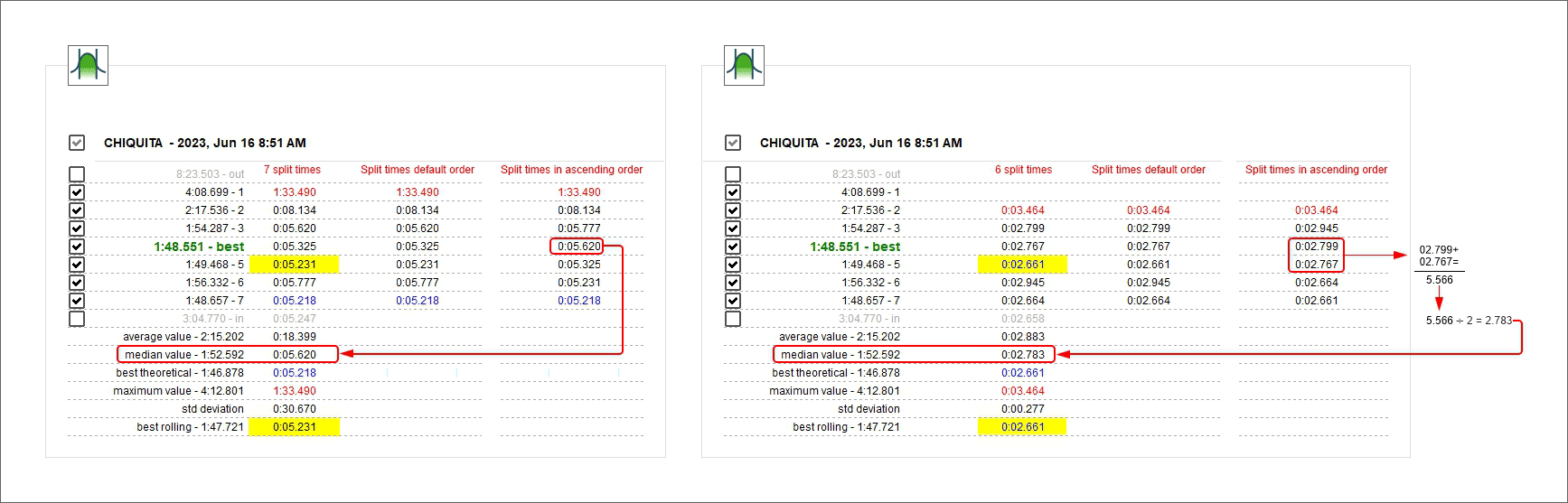
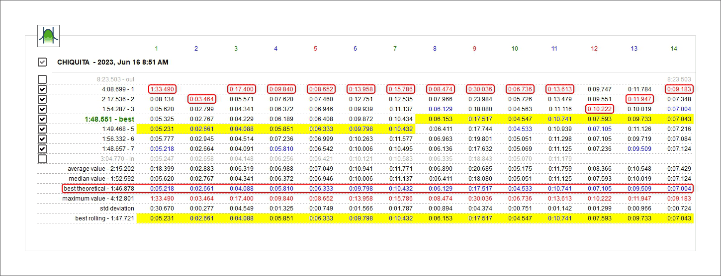
Statistics: best theoretical time
Best theoretical lap time is obtained summing all best split times of all considered laps. This is why is called theoretical. In the image below all best split times are highlighted and they are summed in the bottom best theoretical row in the statistics.
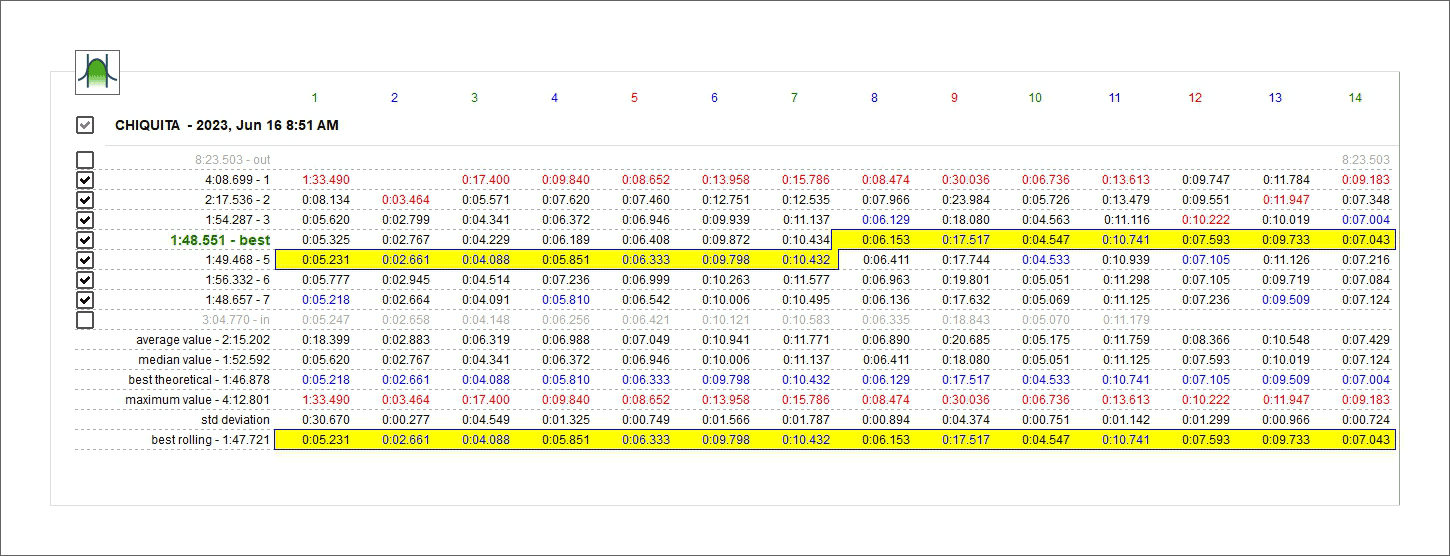
Statistics: best rolling time
Best rolling: is the best lap time really made also if the splits belong to different laps assumed that they are successive.
Absolute fractional mode
It shows all split times with lap time on the left of the row.
Absolute cumulative mode
Each split time is added to the previous split time; the last split time is the lap time.
Split time difference vs best split overall fractional mode
Shows for each split the difference between the current split time and the best time recorded for this split in the session. As shown here below the split time of the current split is in red; adding it to the best time of this split you recorded in the session you have the split time of the current split.

Refer to best split cumulative mode
The difference between the current split time and the time reached at the current split in the best lap. Split times are added and the last split of the current lap shows the difference between the current lap time and the best lap time.
Refer to best lap fractional mode
It shows the difference between the current split time and the time of the same split in best lap. Best lap time splits are shown in a square parenthesis on the related row (highlighted in the image below).
Refer to best lap cumulative mode
The difference between the current split time and the split time of the same split in best lap time is added to the difference between the following split time and the split time of that split in best lap time. The last split time is the difference between the current lap time and best lap time.
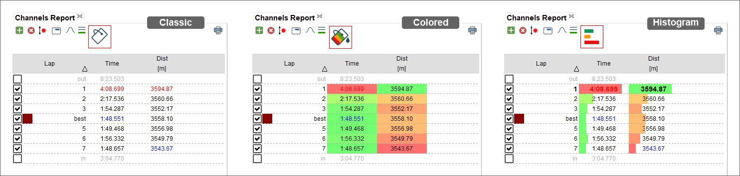
Classic/Colorize layout
Default layout is Classic: white background with best rolling lap highlighted in yellow (top image below). If you Colorize it the cells will have coloured background that go from green for good values to red for bad values and best rolling is highlighted with red squares (bottom image below).
Settings dialog window
Right clicking on the central table "Setting"” dialog window is prompted. It allows to perform the same operations performed through the top left keyboard as well as to hide the table when the Space Bar is pressed enabling the related checkbox.
Enabling the devoted checkbox in the first box (highlighted with green background in the image below) the length of each split is shown below each split time (cells highlighted with green background).
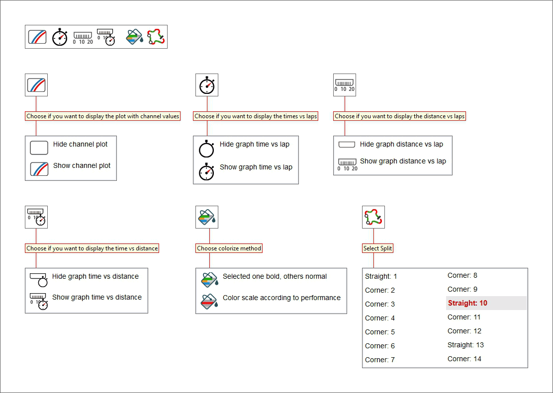
Split Details Panel
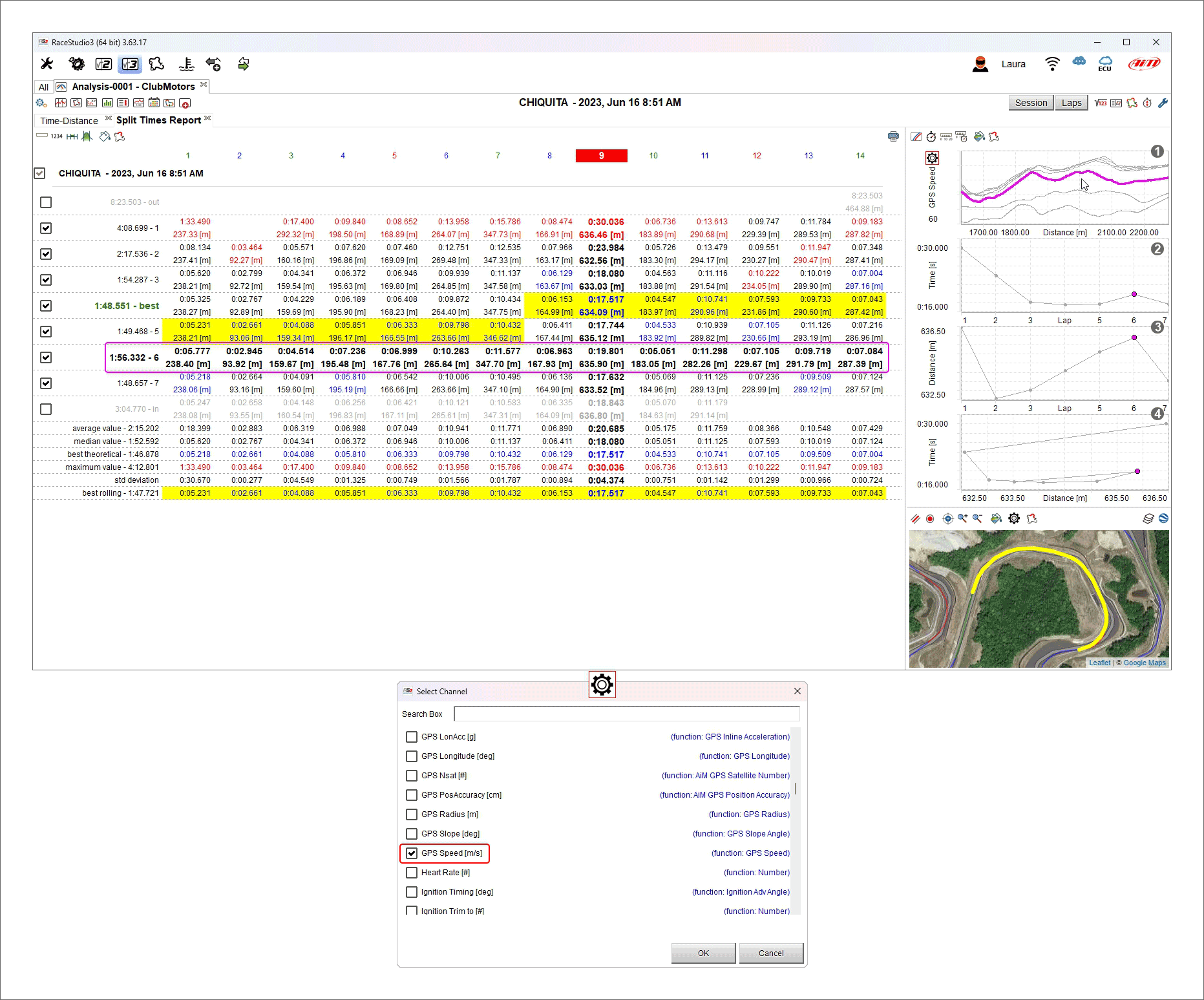
Selecting any split column the split graphs appear right of the central table. They are:
Custom channel (GPS Speed in the example below)/distance (1)
Time vs Lap (2)
Distance vs Lap (3)
Time vs Distance (4)
Each graph can be shown/hidden using the keyboard top left of the graphs.
Channel graph
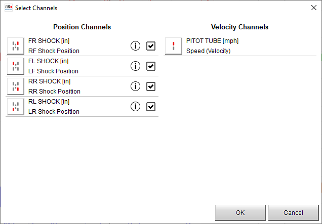
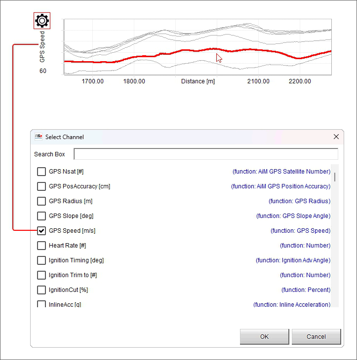
The first graph on top is a custom graph because you can choose the channel you want on “Y” axis. To do so:
click the setting icon
"Select Channel" dialog window is prompted: scroll it or search for the channel you want to set on the ordinate axis and press "OK"; default channel is GPS Speed
mousing over the graph the split you are mousing over becomes bold in the central table and vice-versa
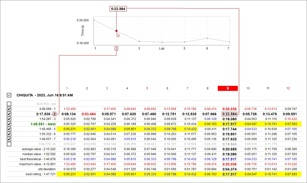
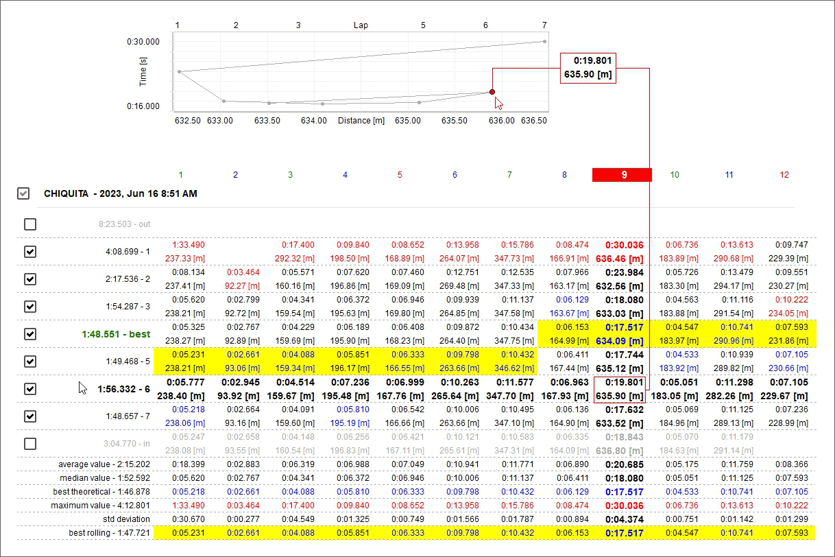
Time/Lap (number) graph
The second graph from top is Time/Lap number. It shows:
Lap number on X axis
split time of the split in each lap on ordinate axis
Mousing over the selected split it becomes bold in the central table and vice versa; in the example below split time of the 9th split in the second lap is shown.
Distance/Lap number graph
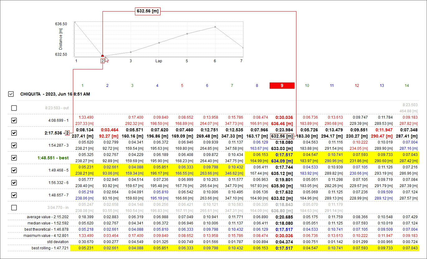
The third graph from top is Distance/Lap number. It shows:
Lap number on X axis
Run distance of the split in each lap on ordinate axis
- As shown here below, mousing over the graph the selected split it becomes bold in the central table and vice versa;
it is suggested to keep “Distance” row activated
Time-Distance graph
The bottom graph is Time-Distance and is a scatter graph. It shows:
Run distance on X axis
Split time in each lap on ordinate axis
As shown here below, mousing over the graph the selected split becomes bold in the central table and vice versa
This graph, linking the run distance with the split time is particularly useful to analyse the racer guide in cornering.
Channels Report Panel
Using the top left toolbar (shown here below) you can perform different actions, explained in the following paragraphs.

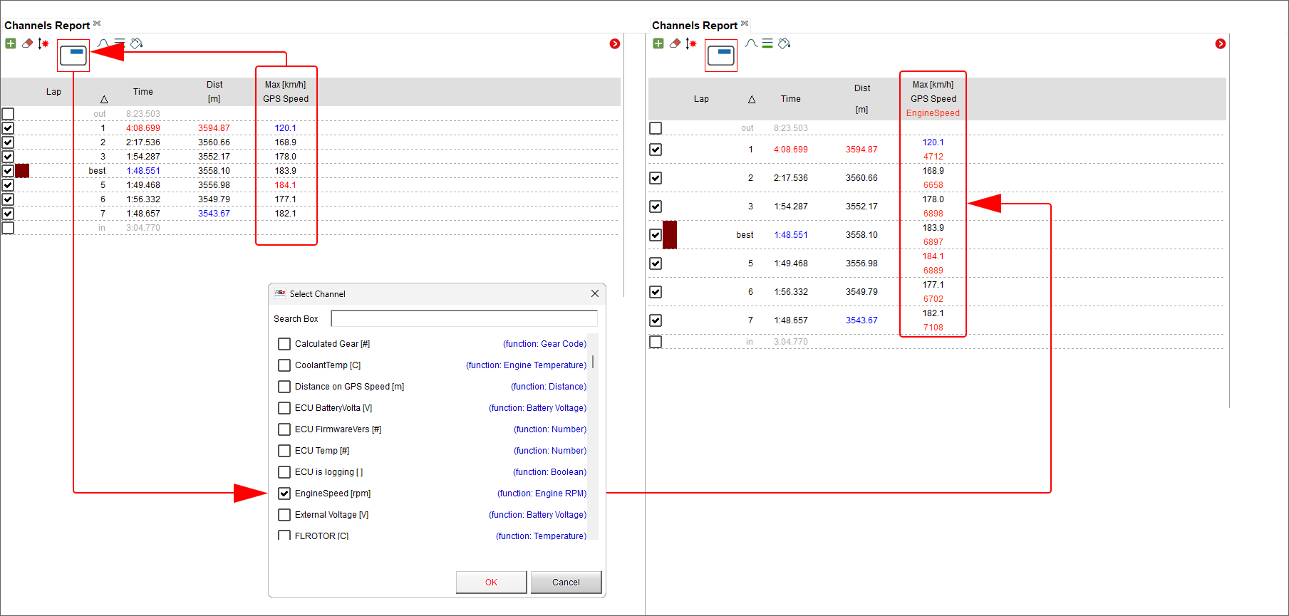
 Pressing this icon a panel that allows you to select a channel to add to the left part of the view is prompted.
 Pressing this a menu panel that allows you to select the channel to remove from the left part of the view is prompted.
 Pressing this icon a panel is prompted: it allows you to sort the columns of the left part of the view dragging and droppping them in the panel.
 Once one or more channels have been added, pressing this icon you can show the values of this channel
together with another one in the same point. To remove this view simply click the icon again and de-select the channel.
Once one or more channels have been added, pressing this icon you can show the values of this channel
together with another one in the same point. To remove this view simply click the icon again and de-select the channel.
 Bottom of channels split report table it is possible to show or hide the related statistics as shown here below.
 The table in the left part of the view can be organized in different ways: you can see data referred to all laps on top
and data referred to the single splits below (show splits - left icon beklow and left part of the image below) or data referred to all laps only
(hide splits - right icon and right part of the image below)
The table in the left part of the view can be organized in different ways: you can see data referred to all laps on top
and data referred to the single splits below (show splits - left icon beklow and left part of the image below) or data referred to all laps only
(hide splits - right icon and right part of the image below)
 Split times report can be shown in different ways; to say classic (left icon and left part of the image below),
coloured (central icon and central part of the image below) or histogram (right icon and right part of the image below)
Split times report can be shown in different ways; to say classic (left icon and left part of the image below),
coloured (central icon and central part of the image below) or histogram (right icon and right part of the image below)
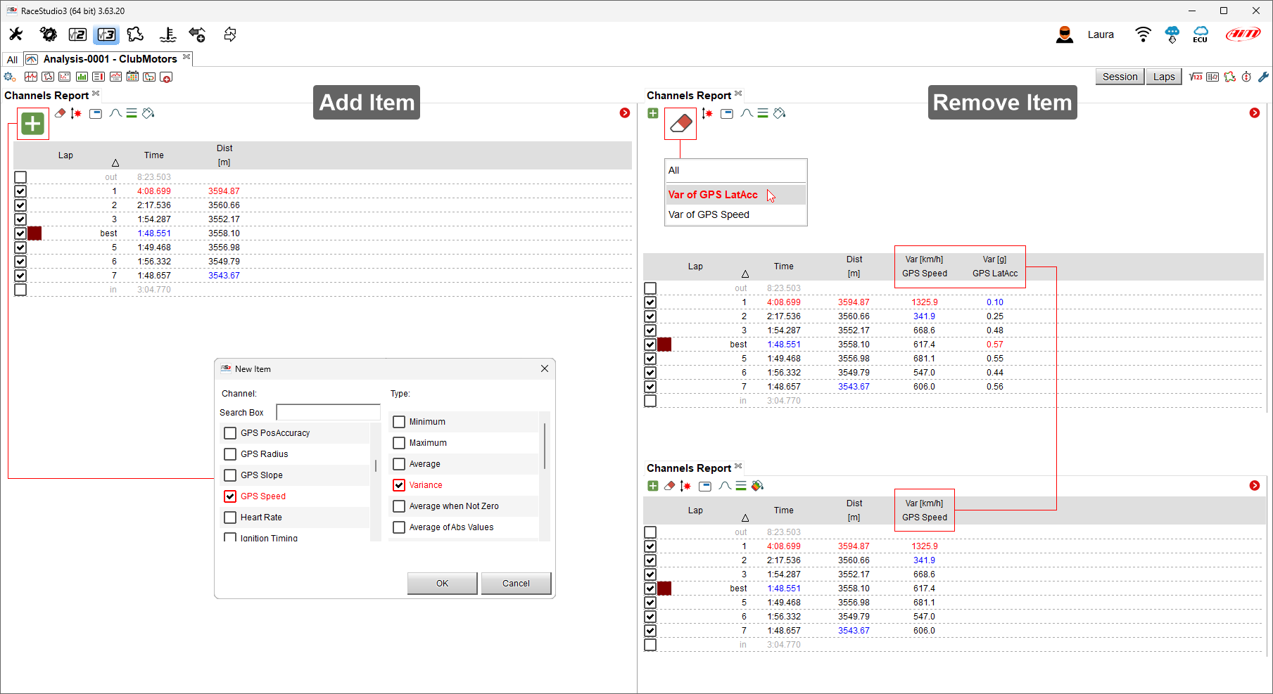
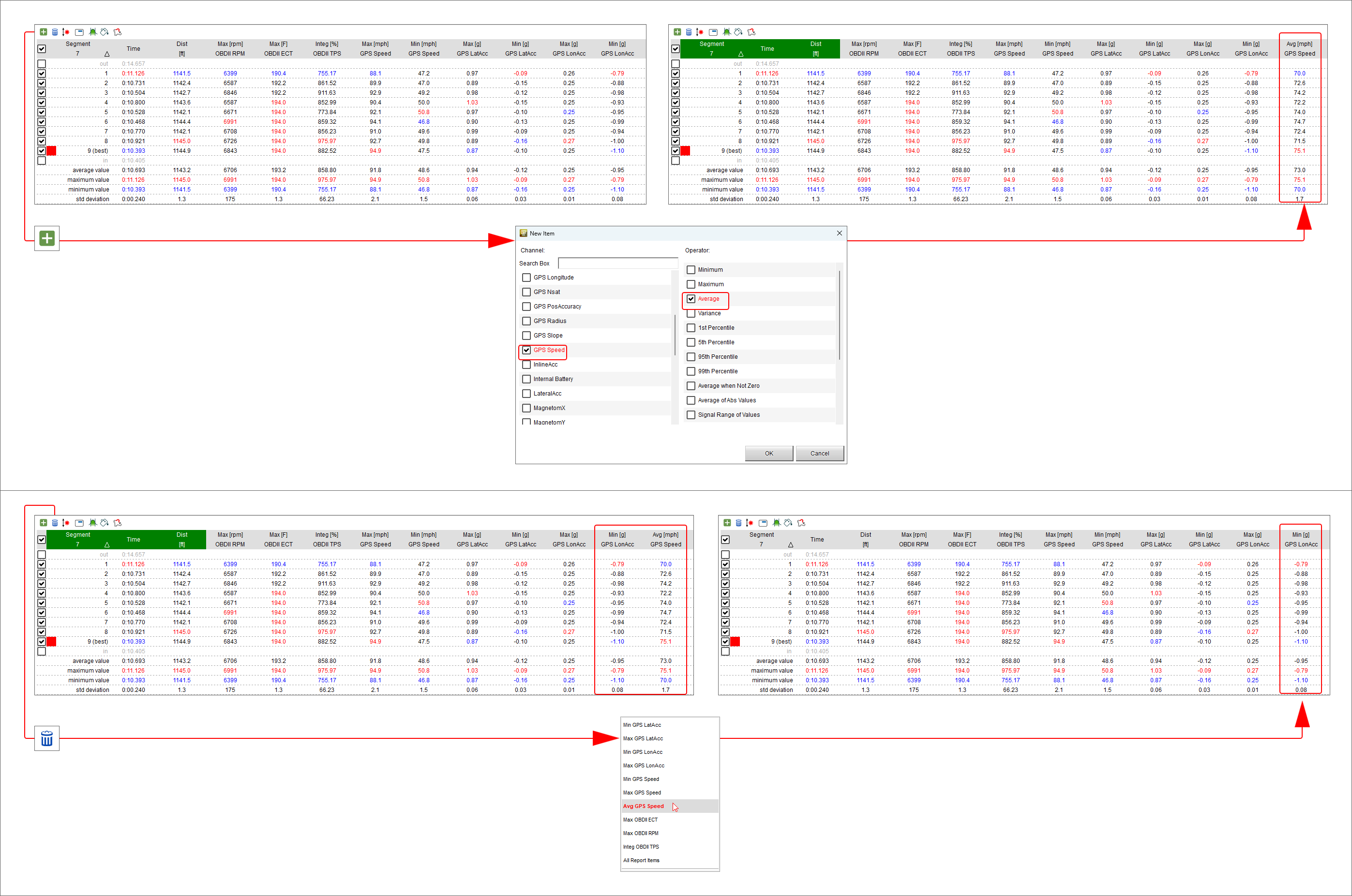
Add/remove items in the left part of "Channels Report" view
 Through these buttons it is possible to add/remove items (column) to/from the table placed left of "Channels report" view except for the first three columns from the left.
To "Add" an item:
press the related icon (+)
scroll the panel that is prompted or search for the channel
select the item do add and its type (Max/Min/Average value, Variance, Average when not zero etc..)
press "OK" and the item is added. Repeat this operation for all the items to add
To "Remove" an item:
press the related icon (the rubber)
a menu showing the items previously added Is prompted
select the one to remove
it will be removed.
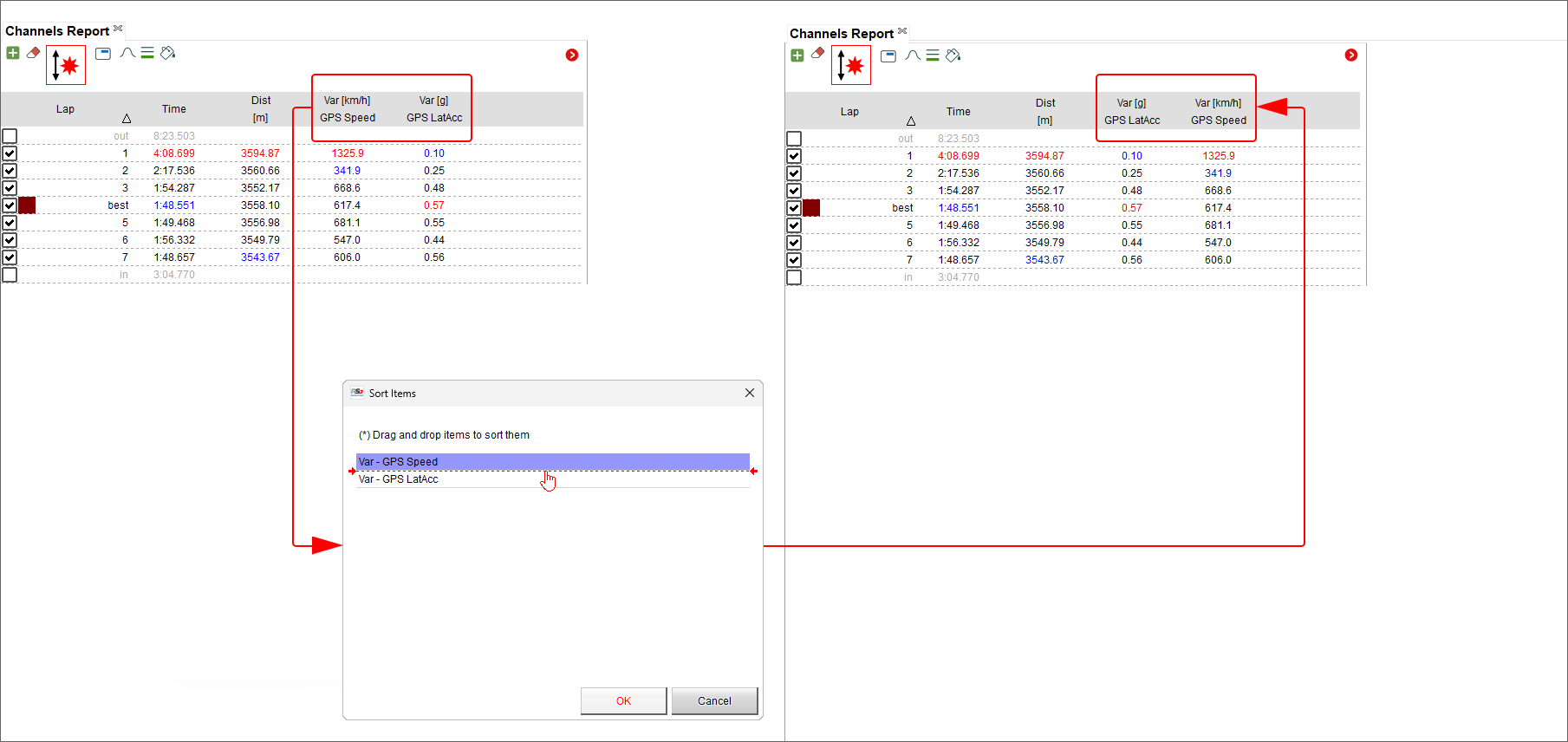
Sort items
Once added all the desired item it is possible to displace the related columns as preferred.
press the icon above
drag and drop the items as you wish
press "OK"
the columns are displaced
Managing Channels Report Side Items
Once one or more channels have been added, pressing this icon you can see the values of different channels in the same point assuming that both channels are shown as Max/Min Values.
In the example below Max GPS Speed and RPM are shown. To do so:
add the first channel
click "Side Items Icon" shown above
select the second channel
both channels are shown one below the other
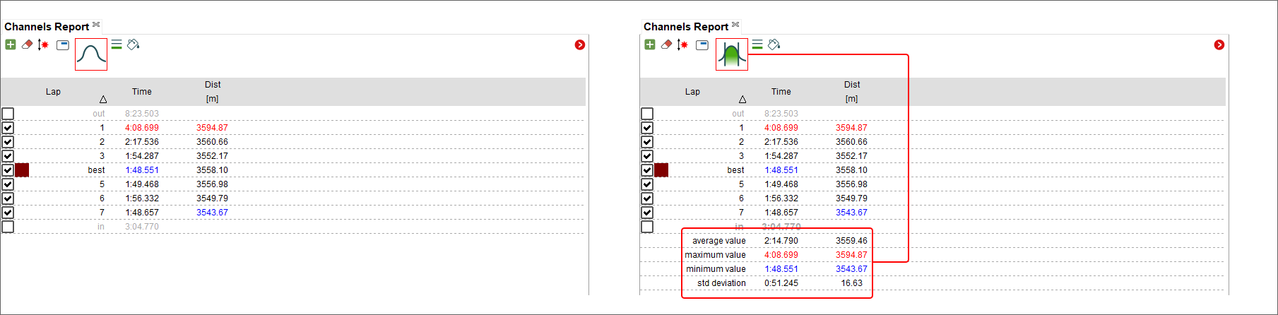
Show/Hide statistics
As for Time-Distance and Track split report Channels report too allows to show the statistics using the related buttons. They show:
max, min and average values of the channels reported
standard deviation; this is a measure of the amount of variation or dispersion of a set of values; a low standard deviation indicates that the values tend to be close to the mean (also called the expected value) of the set while a high standard deviation indicates that the values are spread out over a wider range.
Show/Hide splits in report
With reference to the image below, data can be shown with (left table) or without (right) splits. When showing the laps with splits data concerning the whole laps are on the coloured bar and all splits follows.
Managing report type
Channels report table can be shown in different ways as shown here below. The visualization can be:
Classic
Coloured according to cell values: each cell is coloured according to its value from green to red where green stays for good performance and red for bad performance
Histogram: allows to see at a glance the difference between the laps/splits
Channels Report Graph Panel
Right of "Channels Report" layout is a "Custom"” graph whose channels on the “X”axis and on the “Y" axis can be changed according to the user preferences. To change the channel on the axes:
click the setting icon of the axis to change
a selection menu is prompted
select the channel to be shown
click out of the panel
Channels Report Panel for Selected Split
The toolbar shown here below allows you to add/remove, sort channels as well as manage side items, show/hide statistics, devcide the report type and select the segment to show in the left part of the view.

Adding/Removing/Sorting items
 These icons allow you to add/remove columns/channels to/from channel report right of the software view.
For each channel it is possible to decide the type of value (Max, min, average, variance etc…) to show.
Once the channel(s) added you can remove it through the related icon shown here above and selecting the channel to remove in the panel that is prompted.
The image below show how to add a column on top and how to remove it bottom.
These icons allow you to add/remove columns/channels to/from channel report right of the software view.
For each channel it is possible to decide the type of value (Max, min, average, variance etc…) to show.
Once the channel(s) added you can remove it through the related icon shown here above and selecting the channel to remove in the panel that is prompted.
The image below show how to add a column on top and how to remove it bottom.
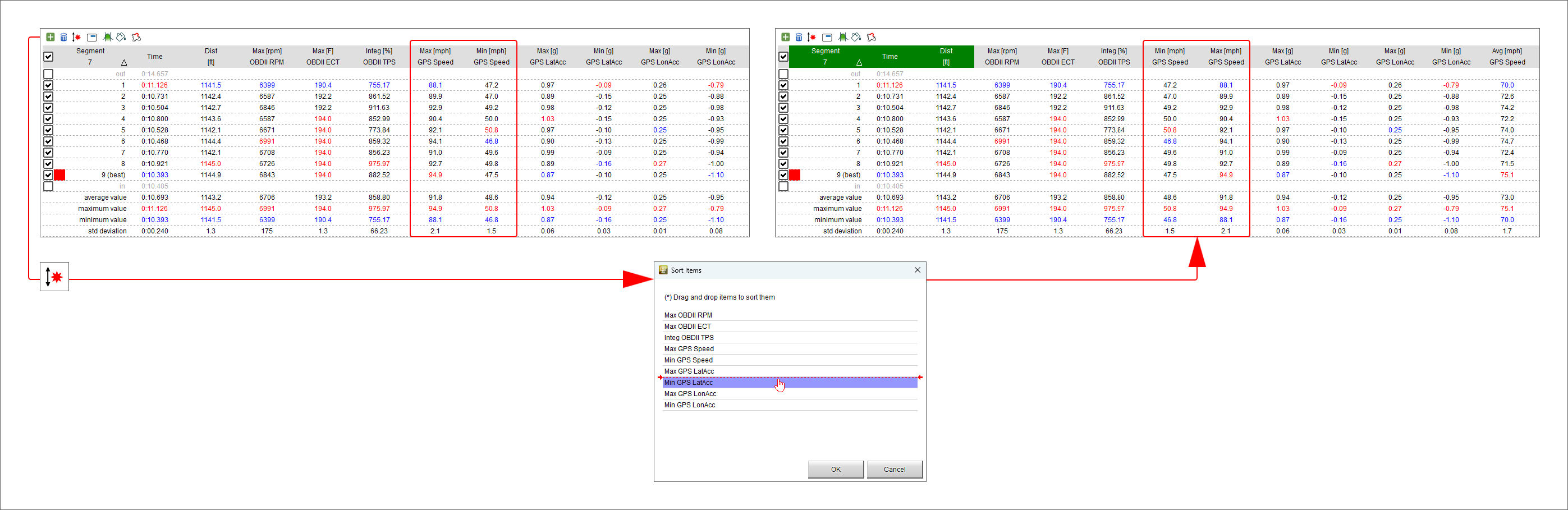
 This icon allows you to sort the channels dragging and dropping them in the "Sort Items" panel as shown here below.
In the example below Min GPS Speed and Max GPS Speed have been displaced.
This icon allows you to sort the channels dragging and dropping them in the "Sort Items" panel as shown here below.
In the example below Min GPS Speed and Max GPS Speed have been displaced.
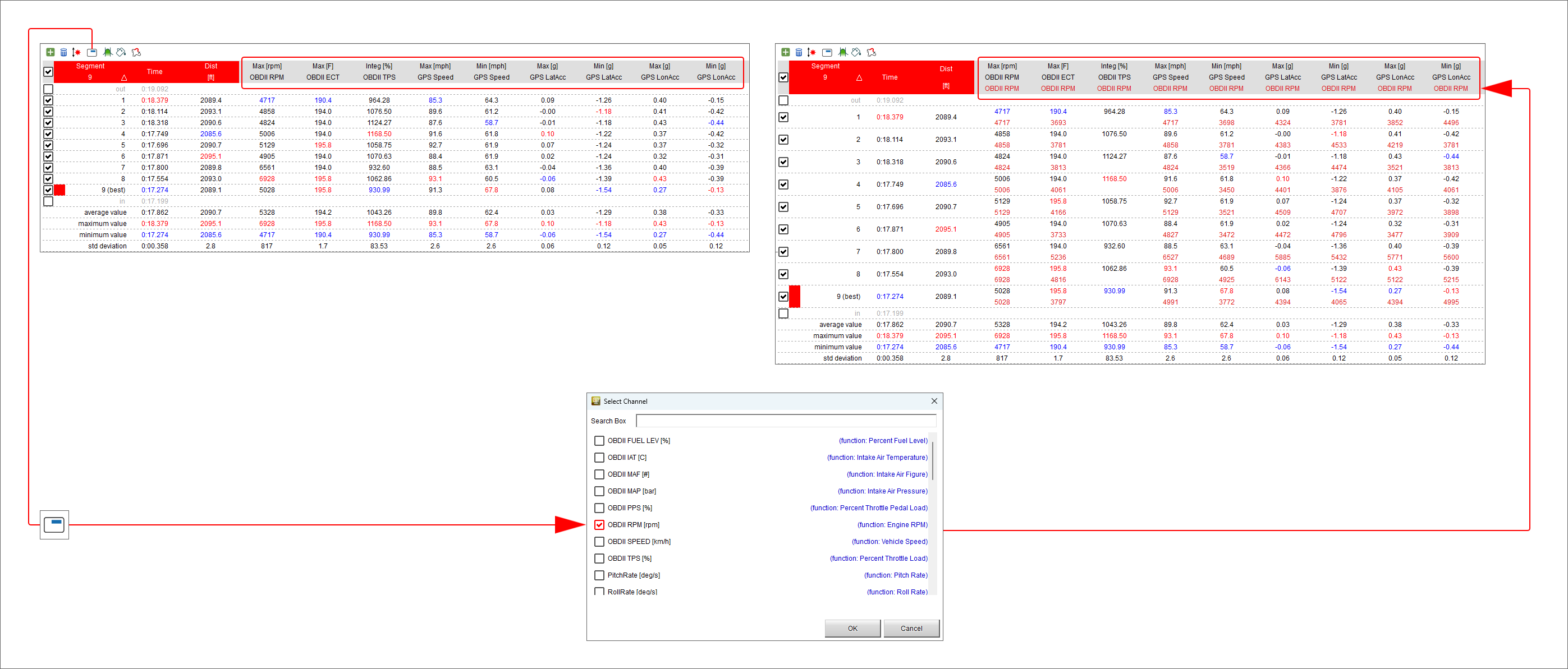
Managing Track Split Report Side Items
 Once one or more channels have been added, clicking the icon shown here on the left it is possible to show the values of a channel together with another one in the same
point. Here below OBD RPM value is shown below the other channels (in red).
Once one or more channels have been added, clicking the icon shown here on the left it is possible to show the values of a channel together with another one in the same
point. Here below OBD RPM value is shown below the other channels (in red).
To remove this view simply click the icon again and de-select the channel.
Showing/Hiding statistics
 Bottom of channels split report table it is possible to show (left icon) or hide (right icon) the related statistics; they show:
max, min and average values of the channels reported
standard deviation; this is a measure of the amount of variation or dispersion of a set of values; a low standard deviation indicates that the values tend to be close to the mean (also called the expected value) of the set while a high standard deviation indicates that the values are spread out over a wider range.
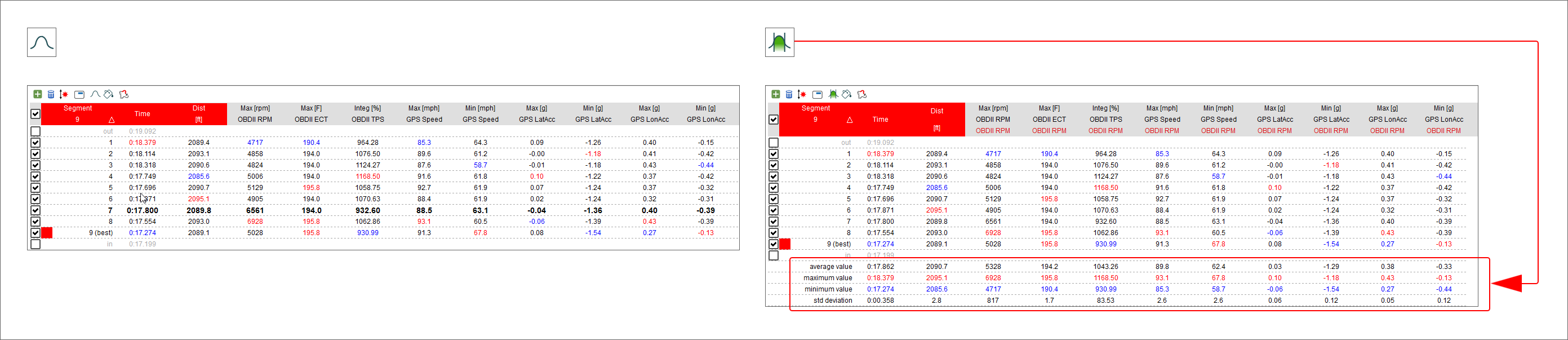
Choosing the report type
 Selecting the icons here on the left it is possible to decide how to visualize split channels report table. Available options are:
classic (left icon): it simply shows the split channel values
report cells coloured according to cell values (central icon): each cell is coloured according to its value from green to red where green stays for good performance and red for bad performance
cells drawn with histogram (right icon): each cells have a background that plots as histogram the values it contains.
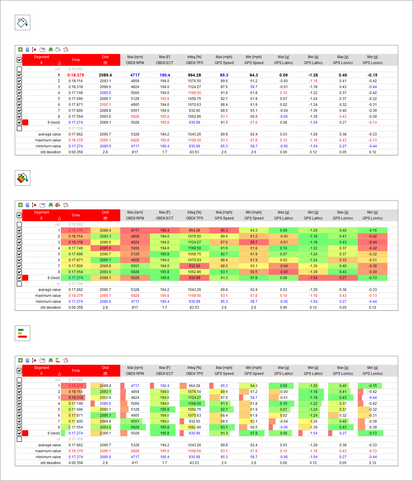
Track Map Panel
Track Map view features two top toolbars used to set the tab.
The Top Left Toolbar is shown here below.

Using the different icons you can:
 Set the map in different ways; clicking the icon here on the left a menu is prompted; through it you can perform different actions.
First of all you can decide how to colourize the map; this icon allows you to colourize the map per lap/slice
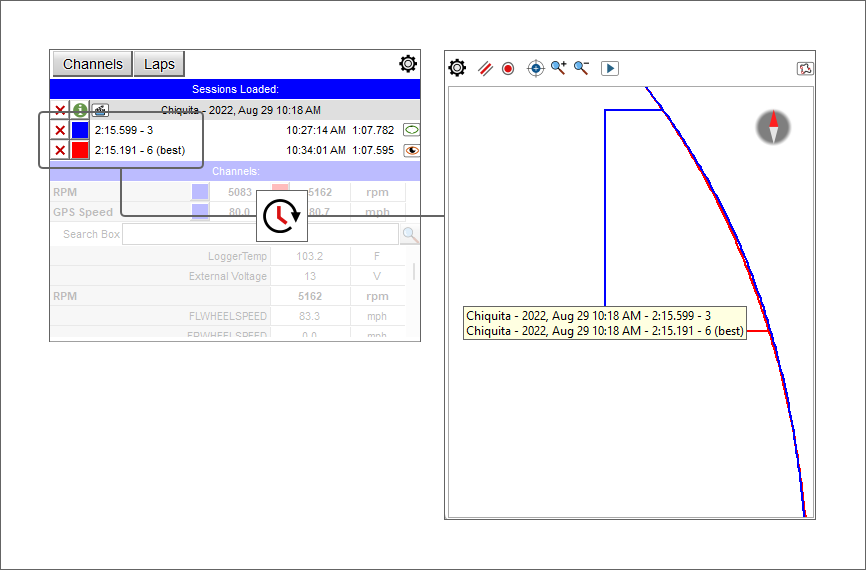
 this icon allows you to colourize the channels according to their values.
With this setting a new icon
appears in setting menu that allows you to search for the channel to colourize.
The image below shows the steps to follow.
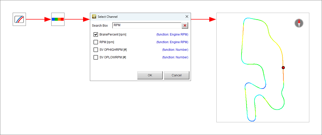
 show the track splits in different colours
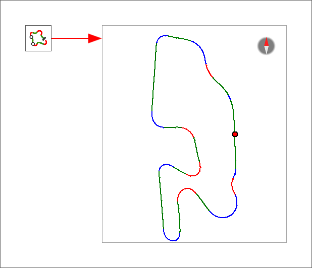
 show the track map as monochrome; clicking this icon a colour choice panel is prompted
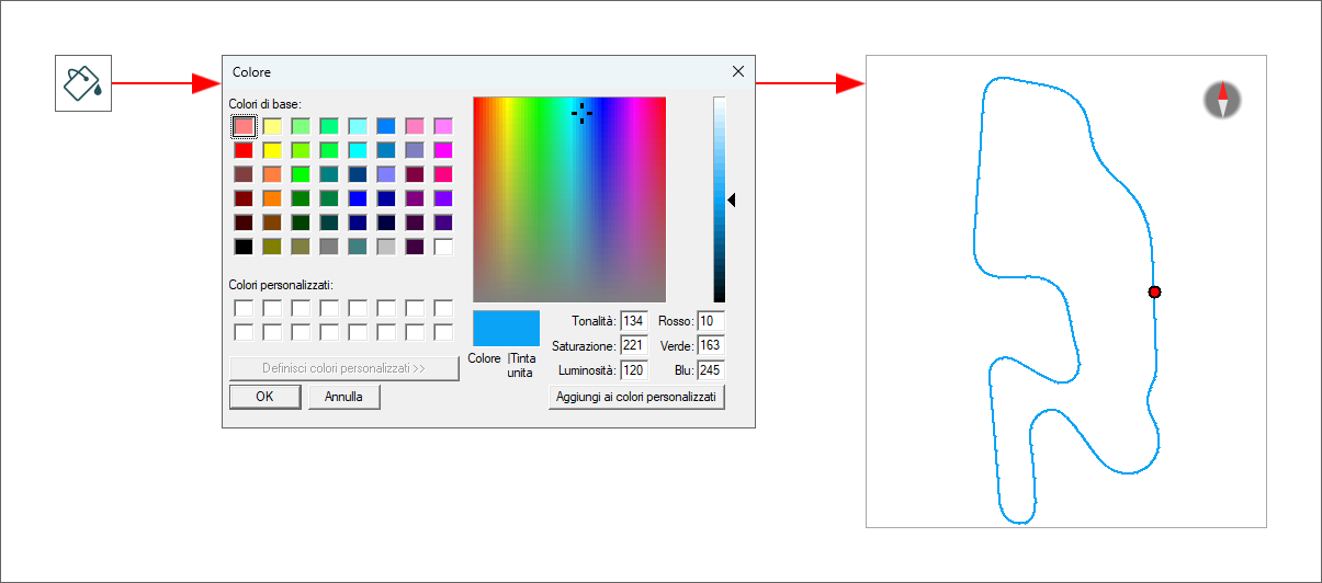
 reproduces time compare graph on the map as shown here below
Moreover, through the setting menu it is possible to show/hide both AiM start/finish lines and track line on the map.
 Decide line width and dots size of the map (default value is 2 for both)
 centre the map in the view
 zoom in/out the map
 See the vehicle moving on the track pressing "play" button.
The Top Right Toolbar is shown here below.

Its appearance changes according to the button that is pressed.
By default it shows the two buttons from the left. Pressing the central button the toolbar will only show the last button on the right.
They are used for:
 choosing the source to use for the map.
The one selected is shown bottom right of the view as highlighted in red in the image below.
 showing the map as Web based and switching it to GDI Drawn; the top right toolbar changes its appearance including the button shown here below only
 showing the map as GDI Drawn (see below). This map allows the user to use some specific settings managed by the setting icon of the top left toolbar.
Track Map Panel for Selected Split

Through the map toolbar shown here above - in addition to the usual functions (line width, dots size, centre map, zooming in/out) - it is possible to:
 choose colorize method: splits are coloured according to their performance: from green for good performance to red for bad one
 Select a split to analyse (the one current split is highlighted in bold red in the menu)
Moreover right clicking on the map the menu panel shown here below is prompted:
Here you can:
 use colorize method. With the left icon here above you can show the selected segment bold and the others normal while
using the right icon above segments are shown according to their performance from green for good performance to red for bad one;
use colorize method. With the left icon here above you can show the selected segment bold and the others normal while
using the right icon above segments are shown according to their performance from green for good performance to red for bad one;
Moreover you can show/hide on the map AiM S/F and split lines as well as track lines.
In the image below AiM Start/Finish and split lines are shown and the laps are colorized according to the performance, from green for good performance to red for bad performance.
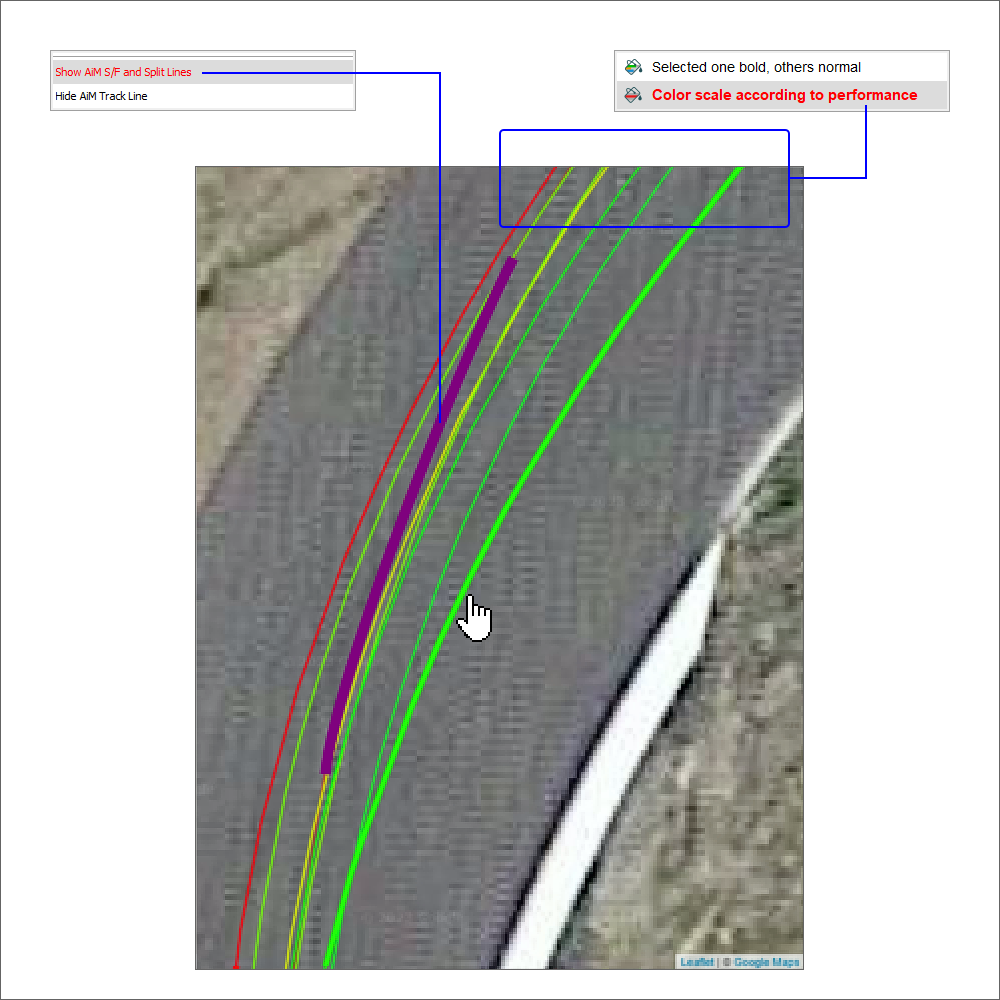
Scatter Panel

Scatter graph features a toolbar shown above top left of the panel. It allows toperform different actions:
 decide graph lines and dots size
 choose the channel to colourize according to its value (left icon) or reset it (right icon).
To select the channel to colourize according to its value click the proper icon, select the channel in the panel that is prompted and click "OK". The graph shows the channel colourized according to its value. Clicking reset icon the graph comes back to its default appearance
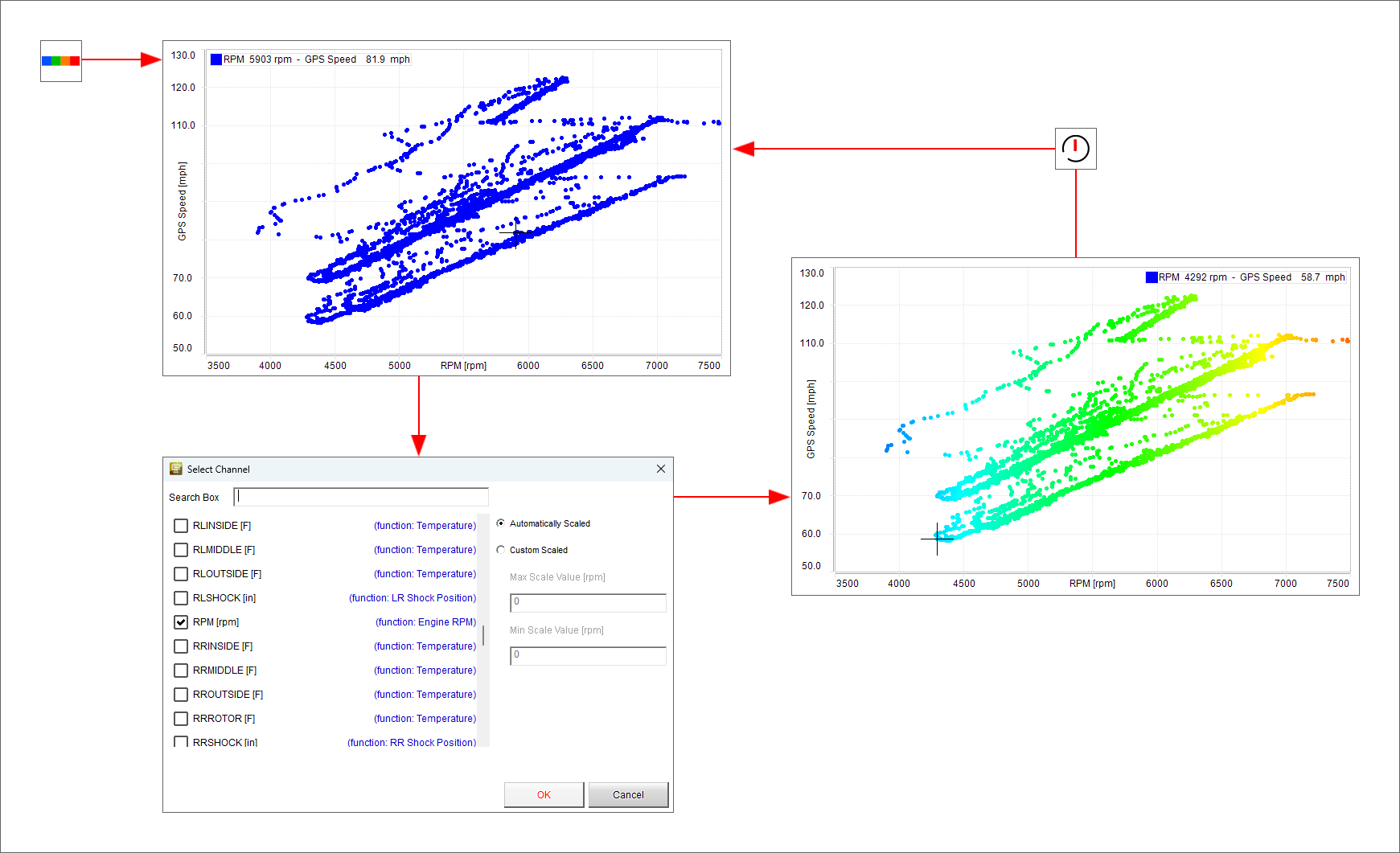
 choose the channel to show on "X" axle
Scatter layout allows to view a channel graph in function of another channel too. To show this graph follow these steps:
from default setting clik "Choose X Channel" icon
a choice panel is prompted: look for the channel you want to place on X axle (RPM in the example below) and press OK
the channel is placed on X axle
click "Colourize" icon

a choice panel is prompted: look for the channel you want use to colourize the graph (RPM in the example below) and press OK
the graph is colourized
In the example below the graph has been colourized using GPS and Engine RPM channels. When RPM value is higher the graph is red; on the contrary where RPM value is lower the graph is green.
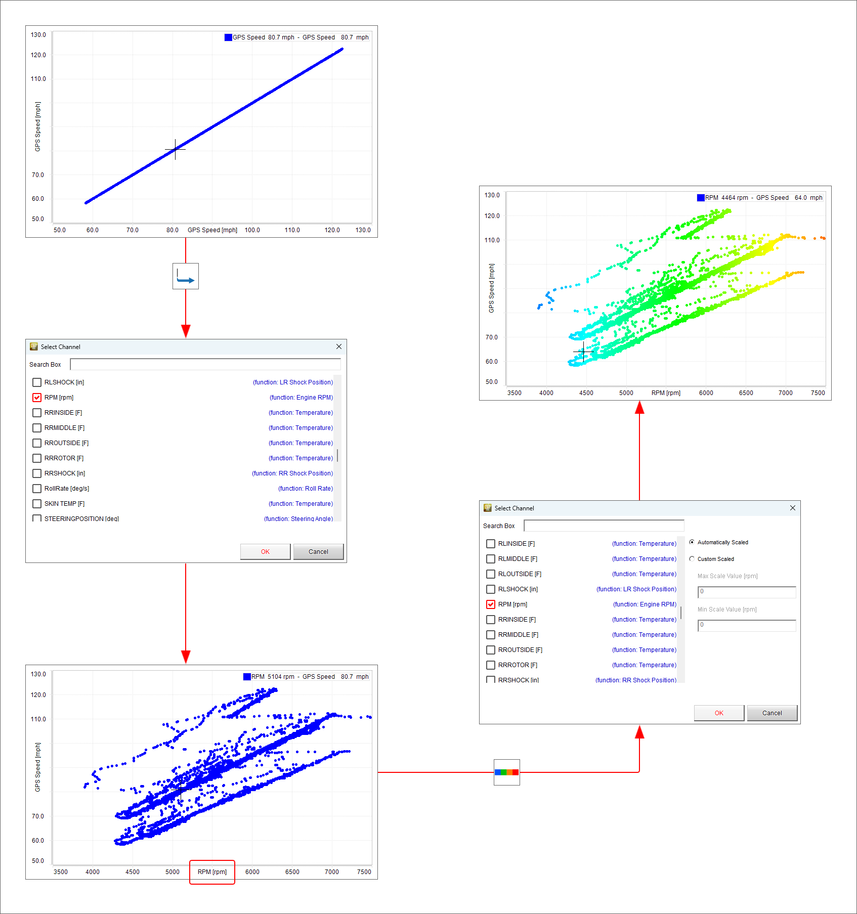
Another feature provided by scattery layout is circular plotting grid that can be very useful when analyzing accelerations. To show it:
from default channel list search for an acceleration channel (GPS LonAcc in the example below) (1)
from default setting clik "Choose X Channel" icon
a choice panel is prompted: scroll up to lateral acceleration channel, select it and press OK (2)
the channel is placed on X axle (3)
right click on the graph, select "Settings" option and "Open Panel Settings Window" (4)
scroll the panel up to "Plot grid" option, select "Use circular grid" and press "OK" (5)
the circular grid is shown as in the image below (6)
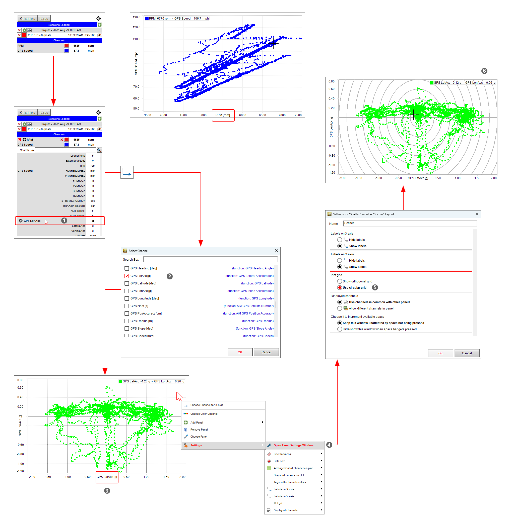
Histogram Panel
The following images show the main options.
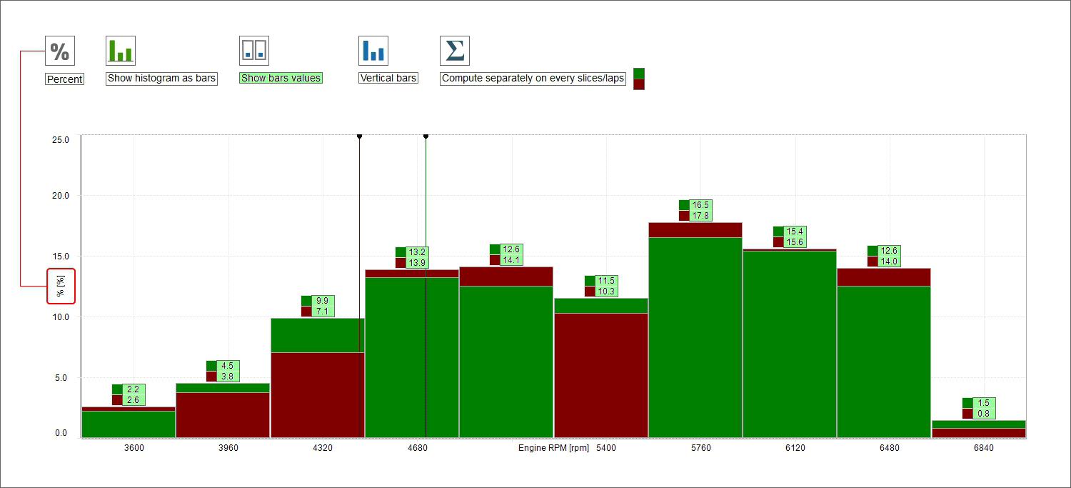
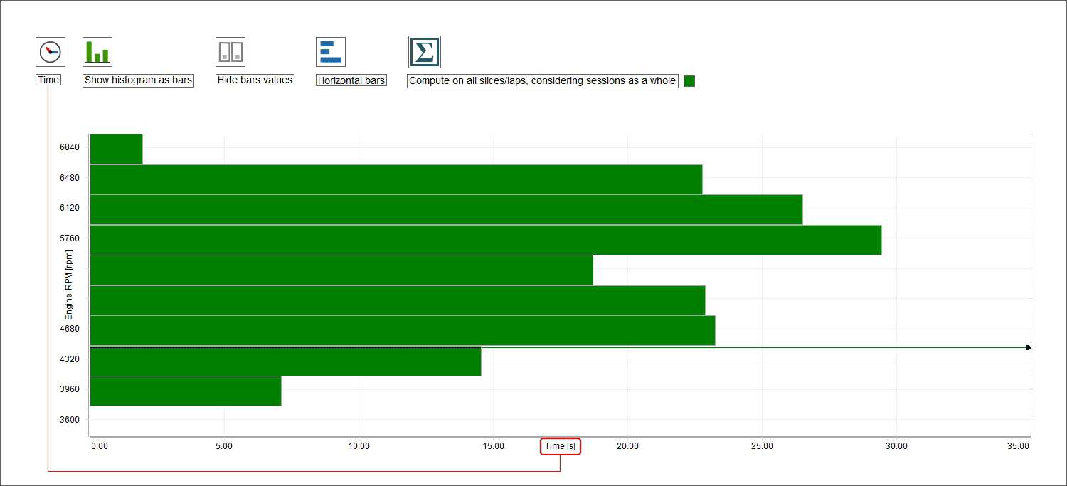
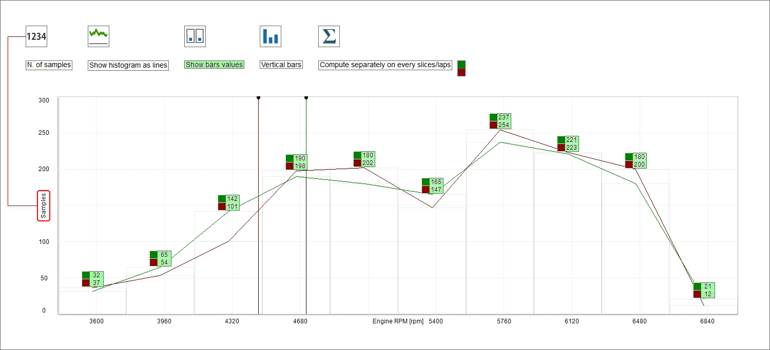
Frequency Analysis Panel
LogSheets Panel
Log sheet general information
By default the view opens on "General Information" where it is possible to fill in information concerning the run and the vehicle through the related panels.
mousing over the view a grey box appears in correspondence of each row
click on it and the related panel appears
fill it in
press "OK"
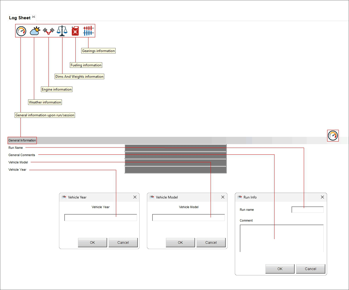
Log sheet weather
Weather information come from AiM server that connects to the nearest weather station according to your GPS coordinates. Mousing over the view a grey box and a setting icon appear in correspondence of each row.
Clicking on the setting icon you can set specific condition of each parameter.
Double clicking on the grey boxes a weather conditions panel is prompted. If you have more accurate information here you can fill them in. In a second moment you can replace them (one or all) with the information coming from AiM server. Use "<-" to replace the single information and "<=" to replace all information.
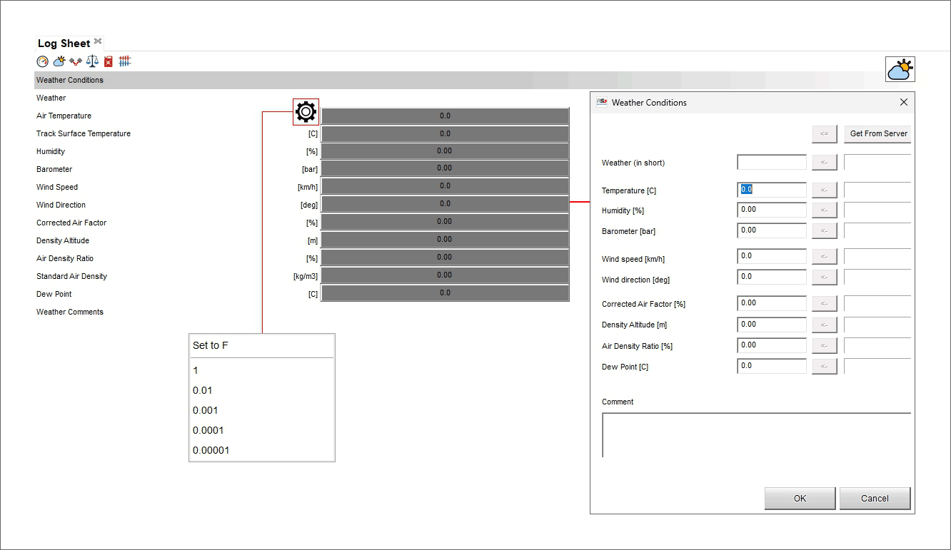
Log Sheet Engine Information
In this view it is possible to fill in all information concerning the engine installed on the vehicle. Mousing over the lines where a Measure is to be filled in a setting icon is shown and clicking it a menu is prompted: here you can choose the number of decimal places.
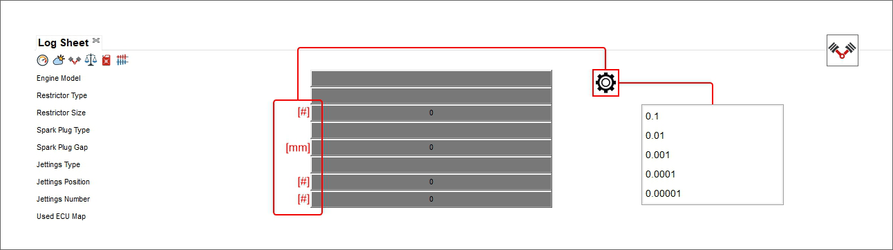
Log Sheet Dims (dimensions) and Weights information
Here you can fill in information concerning the vehicle dimensions and weights; mousing over the lines where a measure is to be filled in a setting icon is shown and clicking it a menu is prompted. Once set the parameter and the number of decimal places, clicking on the grey boxes right of the measure unit a panel is prompted where the measures can be filled in.
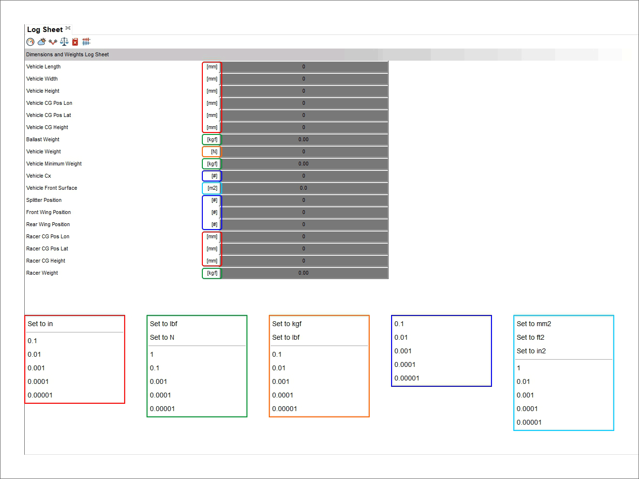
Log Sheet fuel Information
Here you can fill in information concerning the vehicle fuel information; mousing over the lines where a measure is to be filled in a setting icon is shown and clicking it a menu is prompted. Clicking on the grey boxes right of the measure unit a panel is prompted where the measures can be filled in and/or converted.
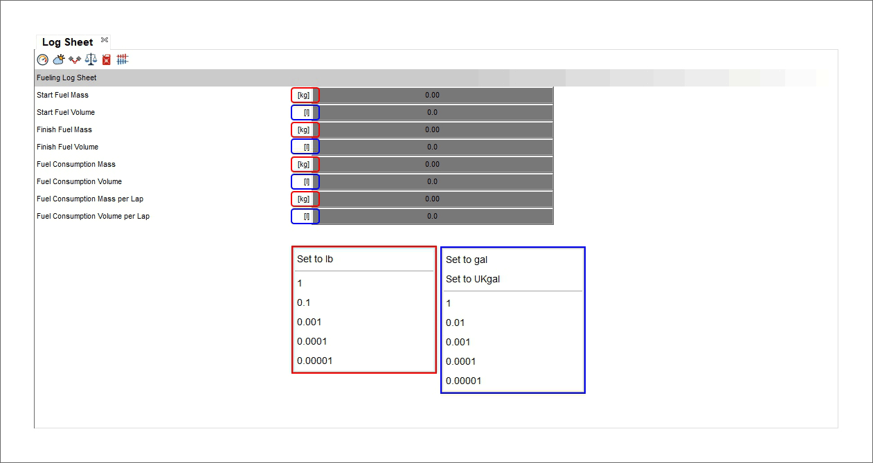
Log Sheet gearings information
Here you can fill in all the information concerning the gear management. Mousing over the rows in the left the image on the right highlights the item you are mousing over making the all view very user friendly.
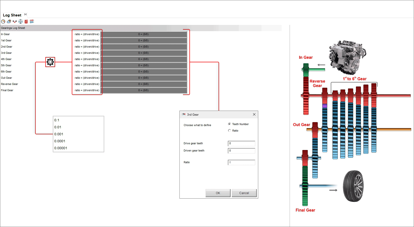
Suspension Analysis Panel
Fine Tuning the Analysis
Add/removing a panel to/from the software view
Say we open a layout with the only movie panel in it, and we want to add a time/distance panel below the movie panel. In this case we need to right click on the movie panel, and select “Add”, then “Bottom”.
A new placeholder panel window will appear. Click the “Choose” button to pick the panel of the desired type.
Choose the type in the prompted window.
The desired panel window will substitute the placeholder.
Remember to save the profile.
To add a panel: - right click on the view
select “Add Panel” option
select the desired position (bottom in the example)

Choose the window to add in “Chose window type” dialog window (histogram in the example below).
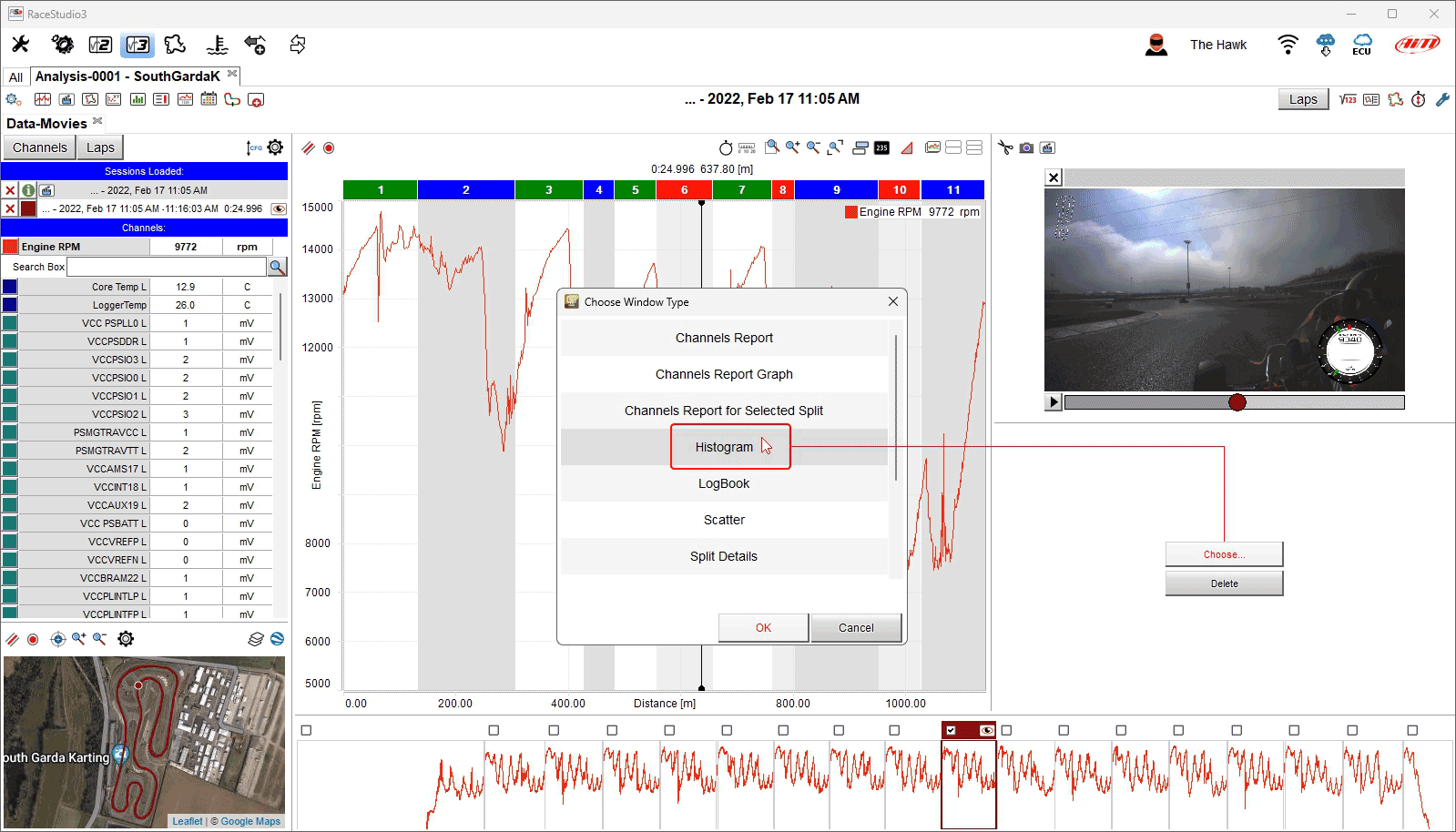
Press "OK" (image above) and the window is added (image below).
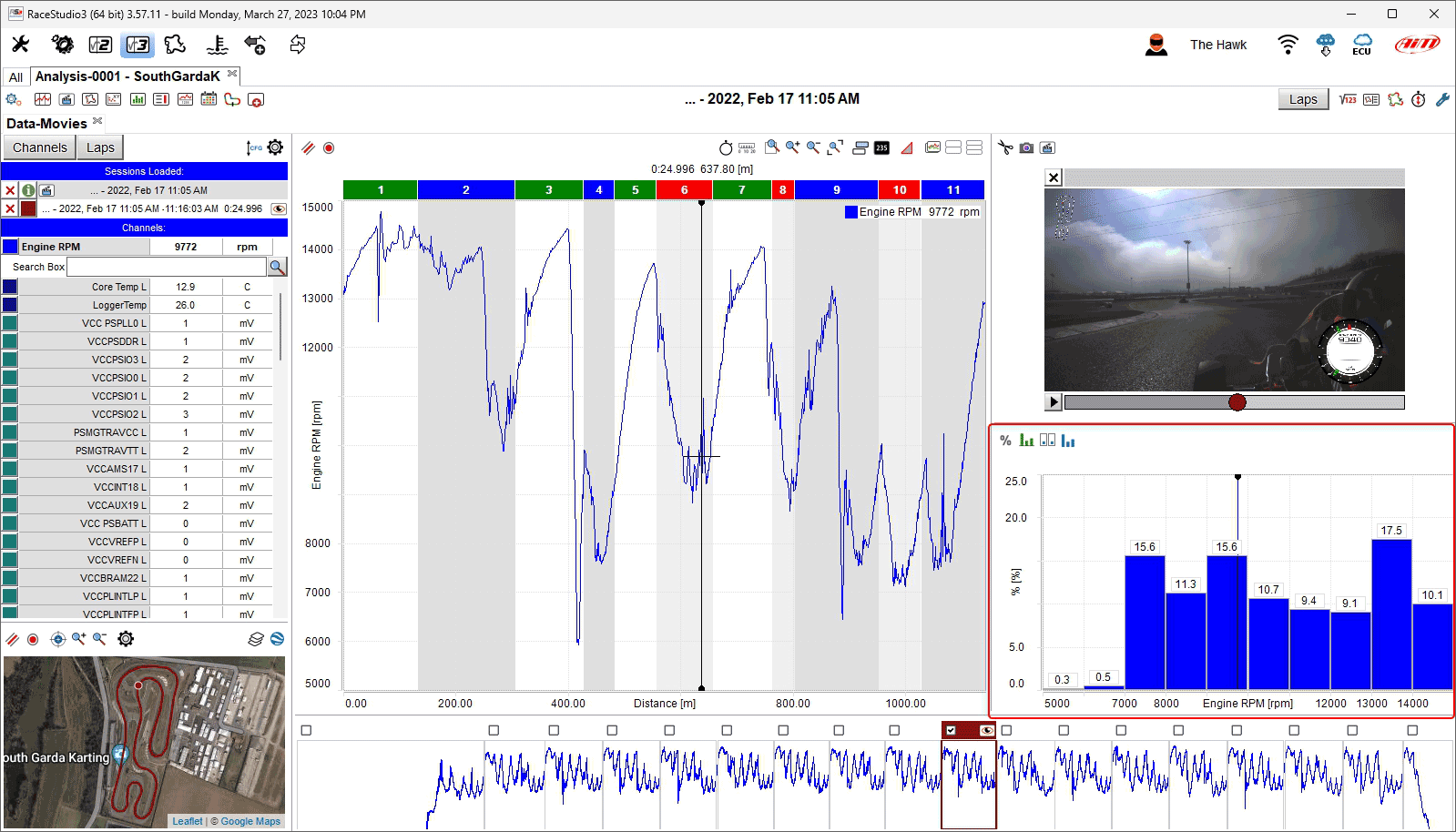
To remove a window place the mouse on the window to remove right click on it and select "Remove Window" option.
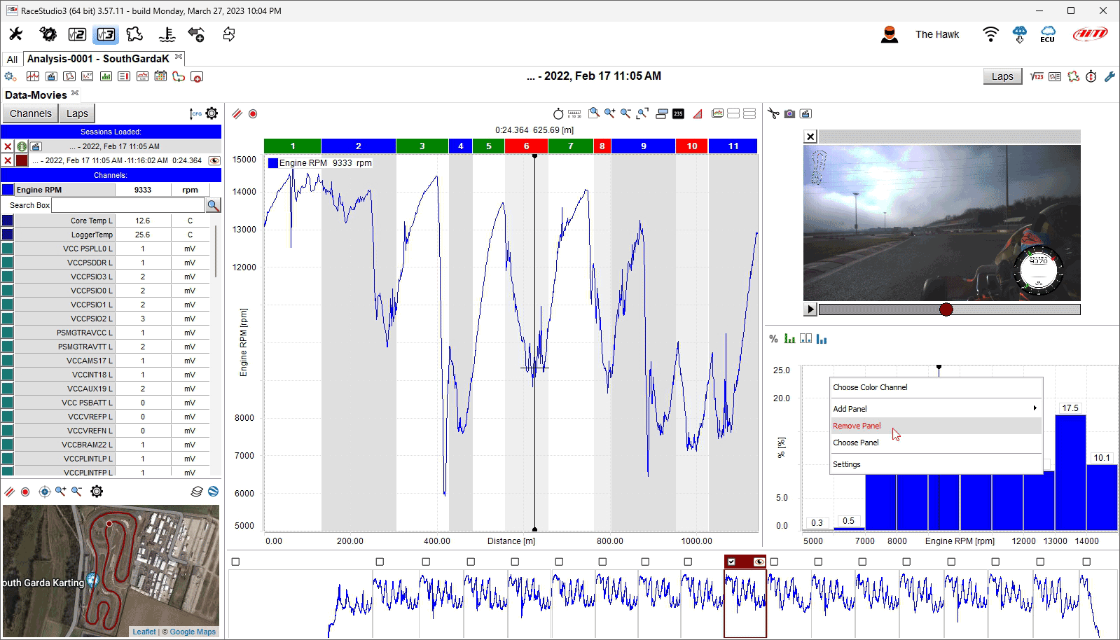
The window is removed
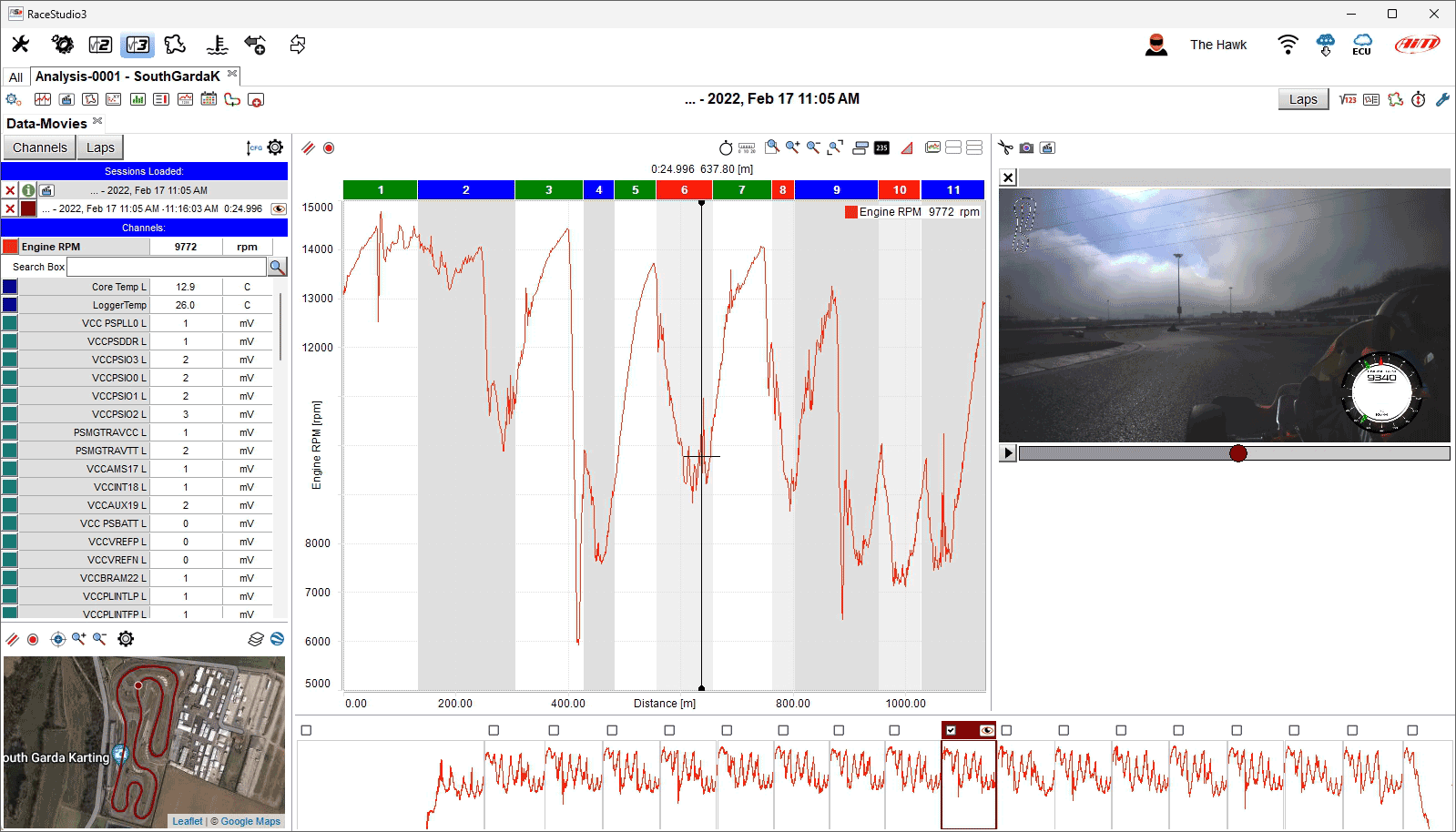
Showing/Hiding a Panel Using the Space Bar
Any panel can be shown/hidden pressing the space bar. To enable this function: - right click on the panel - select "Settings" option - enable the checkbox "Hide/show when Space Bar gets pressed" on the dialog window that appears - press "OK"
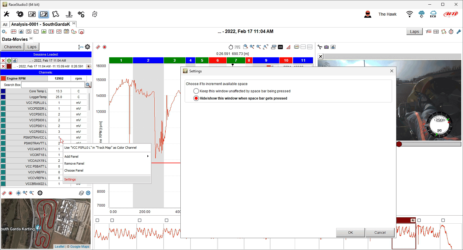
Once the setting fixed, the panel is shown/hidden when the space bar is pressed; in the image below we fixed this setting on "Channel table" panel that is in effect hidden.
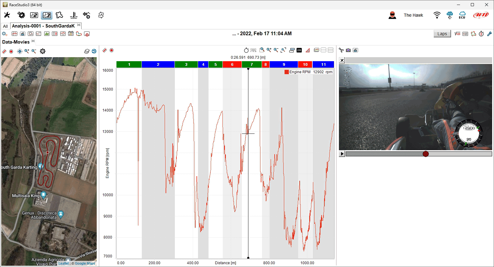
The Analysis Base
Analysis can be performed in time mode or in distance mode, as it has always been in RaceStudioAnalysis 1 and 2. The RaceStudioAnalysis 3 introduces a new mode called Global Timing. This new mode is best used when analyzing data sessions coming from the same event.
Data of Laps and Sessions
The "Session" button allows to temporarily disable one of the sessions open for analysis, without closing it. This can, for example, result to be useful when analyzing data from many vehicles. The same button menu allows you to enable disabled session back in. An icon allows an immediate perception of the enabled/disabled sessions.
The "Laps" button allows to select the laps to open for analysis.
You have the option show all laps of all sessions, to be precise you’ll be selecting all valid laps, i.e. excluding IN and OUT laps. This can be useful while looking for trends in a specific channel.
All other options are to show one, three or five laps. They can be:
the best laps, i.e. the laps with the lowest lap times, handy while looking for lap performances
the laps with the best segment, i.e. the laps in which you ran the lowest segment time, useful while looking for segment performances
the first laps, handy while looking at things that happen at the beginning of the session, for example water in the cooling system that warms up
the last laps, handy while looking at things that happen at the end of the session, for example, again, water in the cooling system that is expected to stabilize.
Analysis Profiles
A profile is a set of windows showing your data.
Properly, a profile is made of layouts. There are some default analysis layouts (see Getting Useful Information), available for a prompt use. You can create your Custom Layouts. You can identify layouts with tabs in the main analysis window.
Properly, a layout is made of panels. You can identify panels with windows inside any tab.
Layouts and panels can be modified. For example, layouts can be arranged over multiple monitors (drag and drop tabs into another monitor to allow this).
The icon in the main analysis toolbar allows the user to change analysis profile main settings.
Pressing this icon a menu is prompted where you have some options.
In the Profiles Manager dialog window you can manage profiles: see the complete list of your profiles, save/delete/reset profiles, import/export, to/from local path or AiM Cloud.
In the Colors and Accessories Settings dialog window you can change the main settings of the profile currently in use.
In the Layout Settings dialog window you can modify the settings for all the panels of the currently shown layout.
The Save Profile and Save Profile As menus trigger the saving of the currently loaded profile, while Reset to AiM Default Profile sets the currently loaded profile as brand new.
In the Analysis Window Behaviour dialog window you can set all the parameters that are not saved with the profile, i.e. what you set here is in common among all profiles.
Profiles Manager
Profiles can be loaded, cleared, exported and shared one by one. There’s a default "AiM Profile" with all default windows that RaceStudio 3 creates for you, if you want to, basing upon data channels available in the loaded sessions.
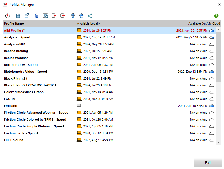
Any of the above operations can be performed on one only profile at a time.
As you can see in the above picture, the window features a table of three columns. Leftmost, the profile name. Proceeding rightwise, the other two columns tell you about the availability of the profile either on the local machine or on the AiM Cloud. What’s saved on the AiM Cloud can be accessed on every machine of yours. The table features the last saving date both locally and on the AiM Cloud, please pay attention to this while copying a profile in either direction.
Colors and Accessories Settings
This dialog window allows you to customize the general settings that rule the behaviour of all layouts and panels.
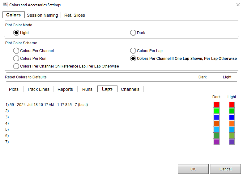
Colors
The "Plot Color Mode" lets you choose among two different working modes, mainly bound to the colors of the background.
The "Plot Color Scheme" refers to how you want channel data to be colorized.
The "Reset" line allows you to go back to AiM default color settings.
The colors tab allows you to select the desired color for all the items in the layouts. To change the colour of a single item in a colour plot mode, click on the related box.
a colour palette appears
select the desired colour or move the pointer in the nuanced palette
the result appears bottom of the nuanced palette
press “OK” on both “colours”
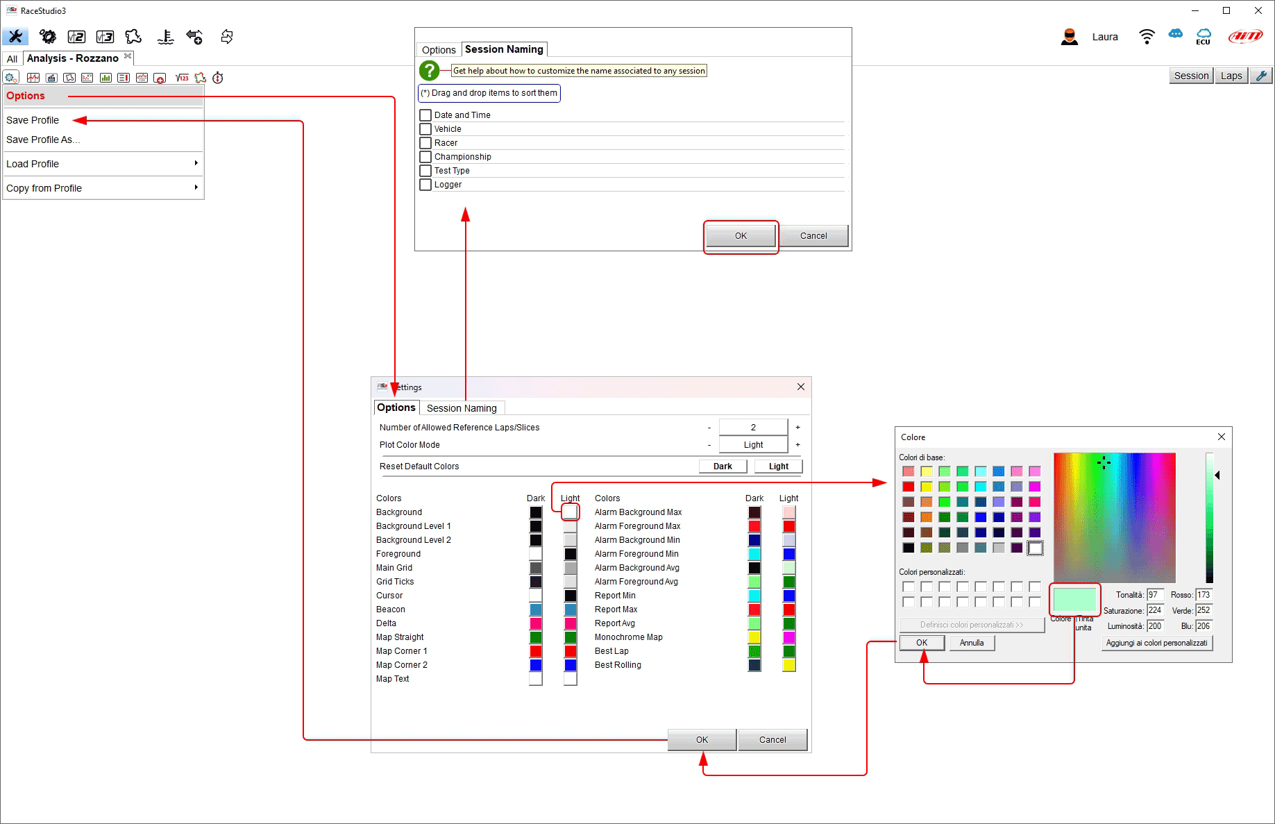
Analysis Sessions Naming
You can customize the way RaceStudio 3 associates a name to every session.
Flag a field to use it, unflag it not to.
Drag and drop the fields so to sort them, top fields will be used first.
Please be careful to the fact that improperly choosing fields you could be getting duplicated names, that is the same name for two sessions. For example: if you choose the only racer name as session naming fiels, and you then select two sessions from the same racer, the two sessions will share the same name.
You can access the session naming window through the leftmost options button in the main analysis toolbar, together with main profile settings. Session naming panel allows the user to name a session sorting its characteristics in a preferred order dragging and dropping them;
Reference Slices
You can, in the analysis window, show a number of laps. All their data will be shown, but only a limited number of laps will feature the complete visualization of, for example, channel tags, associated videos, … Well, that exact limited number can be set here.
Layout Settings
Using the icon shown here above you can decide plot settings of all the panels included in a layout. Each panel features its setting tab.
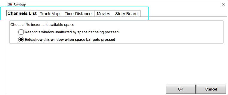
Analysis Window Behaviour
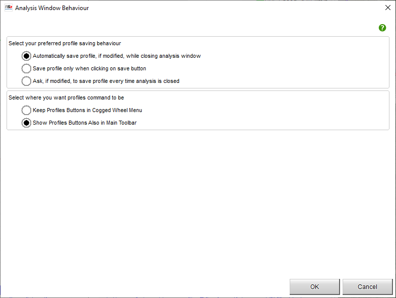
This dialog window features settings that affect the analysis window and that do not depend upon profiles. They go across all profiles.
You can define a "saving behaviour", i.e. a possible automatic strategy for the saving of the profile, in few words: always auto save, never auto save, ask me if to save.
You can define if you want main profiles commands always available in the main analysis toolbar.


Analysis Math Channels
Clicking this icon, you’re shown the math channels selection dialog window.
Here below all buttons are explained.
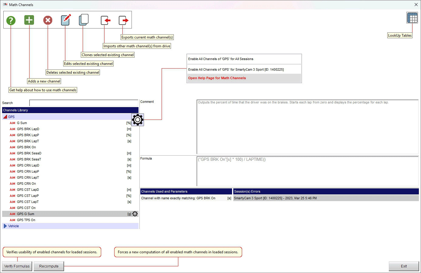
Selecting "Open help page for math channels" the software re-directs you to an online help page that is being completed. This function is better explained here Analysis Math Channels.
How to Use a Math Channel
The first window that’s prompted when clicking on math channels icon is the one that shows you the list of all math channels in your library and that let you apply any number of math channels to your sessions.
Such a math channels library is populated of both channels created by AiM (default channels) and channels created by yourself.
Channels List
Please identify such a list in the left part of math channels usage window. All your available math channels are listed here. Channels collect into groups, channels in each group are listed alphabetically sorted. Channels list can be filtered through a search box right above it. The search text filters on channel name, units of measure and comment.
Each list item shows up to two icons on the left, the name of the channel, channel units of measure and a cogwheel icon on the right.
Icons on the left let you identify which are default channels from AiM, and which are the channels you enabled. The cogwheel, when clicked, prompts a context menu in which you can enable the channel for either all sessions, or all sessions coming from a specific logger.
Enabling a channel means that from now on the channel will be added either to all the sessions you open or to the sessions coming from a specific logger.
Left of the view channels are grouped by type in the channels library; using the search box it is possible to search for a channel in the library. The search box filters by channel name, measure unit, comment and description. Please note: switching from one measurement system to another or importing a channel created with different measure units RSA3 computes and shows the channel using the measure units You decided.
Clicking on the setting icon right of each channel it is possible to enable that channel for all sessions or for a single device as well as to be re-directed to the paragraph dedicated to that specific channel in the online help page.
In the central part of the dialog window are shown the channels applied to the current session.
For every channel you select in the channels library, the boxes right of the view show a comment (on top), the computation formula (central) and two lists(bottom right): the first showing used parameters and the second with notes or warnings while applying the channel to loaded sessions. All needed channels are listed using an unit of measure.
Using the buttons at the top of the math channels usage window, you can:
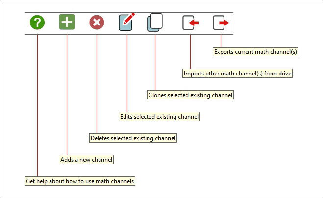
Open this help page.
Add a new channel. You’ll be starting a channel from scratch.
Delete a channel. You can delete an existing channel.
Edit a channel. You can modify an existing channel.
Clone a channel. You’ll be creating a channel from an existing one.
Import a previously exported channels list. You can also import math channels from RS2Analysis.
Export a list of channels. You’ll be choosing which channel or group of channels you want to export, as well as exporting all of them.
Last item on the right of the toolbar, the button to show the LookUp Tables Manager.
Channels Description
For every channel you select in the channels list, the remaining part (right) of the math channels usage window shows a comment (on top), the computation formula (right below) and (bottom right) two lists: the first with all the channels such a channel relies upon, the second with notes or warnings while applying the channel to loaded sessions.
We need to notice that all needed channels are listed using a unit of measure. It’s important to notice that this unit is the one the computation formula generates with. In other words, suppose you imported a math channel written from a friend of yours, with its written formula that computes a speed in km/h, and state this speed has km/h units. When you will use such a math channel and display it on a graph, RS3A will use your speeds settings and will display the math channel according to the units YOU defined, automatically converting from the computed units to your units.
Verifying Formulas
Please identify the Verify Formulas button at the bottom of the math channel usage window. Clicking this button will trigger a verification of the channels that are enabled in the list against the sessions that were selected before opening the math channels usage window, warning you in case any of the channels can’t be applied.
Recompute Applied Channels
Please identify the Recompute button at the bottom of the math channel usage window. Clicking this button will trigger the complete recomputation of all the enabled chnnels for every session that was selected before opening the math channels usage window.
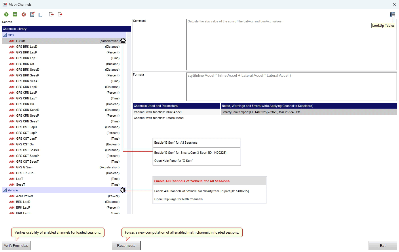
If any channel is for any reason not correct a warning is shown in the channels library as shown here below.
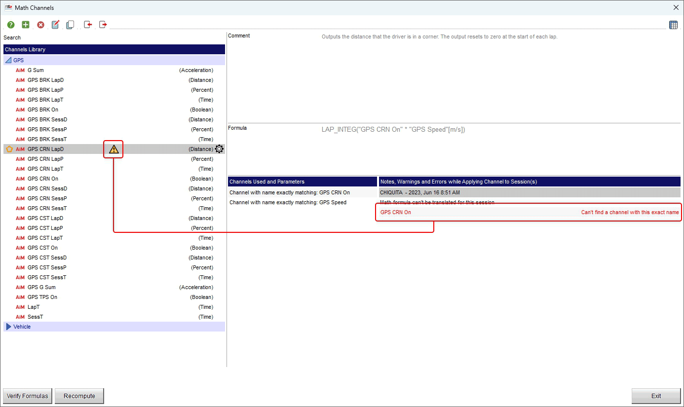
Side Notes
There’s no need to sort the channels as RaceStudio 3 creates a computation cycle that iterates the computations and solves cross references between channels.
RaceStudio 3 cannot solve loops within channels, i.e., channel “A” that uses channel “B” that uses channel “C” that uses channel “A”.
Sample Math Channels by AiM
Following here a list of all the math channels that are available by default. All these are perfectly functional channels, that can be used exactly as they are or can be considered as a starting point for customer defined math channels.
To ensure you have allowance to math channels, please doublecheck you’re using the Advanced mode of the analysis, not the Simplified one.
GPS Math Channels Group
All the math channels of this group are computed over the channels that are generated by default by any AiM device that has GPS. For example, all of them are available in case you have a Solo2.
The idea at the base is to squeeze signal out of GPS-only data, a problem that separates basic lap timing from real driver coaching. These channels work with approximations, hence they have limitations, still conserving practical coaching use. We assume a decent GPS, 10 Hz or, like the very most of recent AiM devices, 25 Hz.
Big picture: what’s the aim of all this?
Since you don’t have brake pressure, throttle position, steering angle… you’re inferring driver intent from acceleration vectors. This math is building a state machine for the driver: braking, accelerating, cornering, coasting. Then it: integrates time and distance (per lap and session) and expresses it as percentages. That’s gold for: driving style comparison, efficiency analysis, consistency… where is lap time being wasted?
Performance
GPS G Sum - Total acceleration applied to vehicle.
Formula: SQRT(LonAcc*LonAcc + LatAcc*LatAcc)
What it is: magnitude of the total acceleration vector (combined braking/accel + cornering).
Why it matters: approximates tire load usage, shows how much grip is being used, regardless of direction.
How to use it:
Compare peak G Sum between laps to look for confidence & grip usage
Look for dips mid-corner to detect lifting, coasting, or instability
Overlay fast vs slow lap: faster lap usually has higher average G Sum, not just peaks. In your data software, plot GPS LatAcc vs GPS LonAcc in an XY scatter plot. This creates a “G-G Diagram” or Friction Circle. If your G-Sum drops significantly during the transition from braking to turning (the “corners” of the circle), you are leaving grip on the table. You want the G-Sum to remain at the tire’s maximum capacity throughout the entry phase.
Triggers
These channels are “conditions” that assess a state.
GPS BRK On - A way to assess when the vehicle is under braking.
Formula: LonAcc < –0.15 g What it is: binary brake detection. What it’s doing: Uses negative longitudinal acceleration as a brake proxy. Careful: this is not “brake pedal pressed”, this is net deceleration, which includes: engine braking, aero drag, rolling resistance, but at –0.15 g, you’re probably on the brakes. Use cases: brake zone detection, brake start/end points, braking style (short & hard vs long & soft).
GPS TPS On - A way to assess when the vehicle is accelerating.
Formula: LonAcc > +0.05 g What it is: throttle proxy. What it really means: car is accelerating forward, net of drag. Why threshold is lower, in this case: acceleration builds slower than braking, small positive g often means maintenance throttle. Use cases: throttle application timing, corner exit comparison, early vs late throttle pickup.
GPS CRN On - A way to assess when the vehicle is in a corner.
Formula: abs(LatAcc) > 0.2 g What it is: corner detection. What it approximates: “car is meaningfully turning” Why it’s clever: independent of track map, automatically adapts to any circuit. Use cases: corner time, corner distance, detects esses, long sweepers, hairpins equally. Threshold tuning is huge here (more on that later).
GPS CST On - A way to assess when the vehicle is coasting.
What it is: no brake AND no throttle AND no cornering. This is one of the most powerful channels in the whole list. What it really means: “Driver is doing nothing useful.” Interpretation: hesitation, uncertainty, poor pedal overlap, early lift, waiting for grip instead of managing it. Fast drivers tend to have very low coasting %.
Statistics and Metrics
All the channels that help analyzing racer performance or that help comparing two racers looking for better behaviour. Laps statistics are primarily aimed at those who race on tracks, for which a comparison or a trend between laps is meaningful. Session statistics are instead better for those who race point to point.
GPS BRK LapT (Brake Lap Time) - Total amount of lap time spent braking.
GPS BRK LapD (Brake Lap Distance) - Total distance spent braking, in a lap.
GPS BRK LapP (Brake Lap Percentage) - Percentage of lap spent braking.
GPS CRN LapT (Corner Lap Time) - Total amount of lap time spent cornering.
GPS CRN LapD (Corner Lap Distance) - Total distance spent cornering, in a lap.
GPS CRN LapP (Corner Lap Percentage) - Percentage of lap spent cornering.
GPS CST LapT (Coast Lap Time) - Total amount of lap time spent coasting.
GPS CST LapD (Coast Lap Distance) - Total distance spent coasting, in a lap.
GPS CST LapP (Coast Lap Percentage) - Percentage of lap spent coasting.
GPS BRK SessT (Brake Session Time) - Total amount of session time spent braking.
GPS BRK SessD (Brake Session Distance) - Total distance spent braking, in session.
GPS BRK SessP (Brake Session Percentage) - Percentage of lap spent braking.
GPS CRN SessT (Brake Session Time) - Total amount of session time spent cornering.
GPS CRN SessD (Brake Session Distance) - Total distance spent cornering, in session.
GPS CRN SessP (Brake Session Percentage) - Percentage of lap spent cornering.
GPS CST SessT (Brake Session Time) - Total amount of session time spent coasting.
GPS CST SessD (Brake Session Distance) - Total distance spent coasting, in session.
GPS CST SessP (Brake Session Percentage) - Percentage of lap spent coasting.
How to actually use this to improve driving
Braking metrics (LapT, LapD, LapP)
What to look for: Faster laps usually have shorter brake time, similar or shorter brake distance, later brake onset. Coaching examples:
Same brake distance but more time could mean braking too gently
More brake distance and time could mean braking too early
High brake % but low corner G could mean over-slowing the car
Consistency: Are you braking at the same distance every lap? If your Brake Distance (LapD) varies wildly, your entries are inconsistent. Overlay: Brake On vs Speed, Brake On vs LatAcc.
Corner metrics (CRN LapT / LapD / LapP)
These are sneakily powerful. Interpretation: corner distance is basically fixed per track. Corner time is where lap time lives. If CRN LapT is high but CRN LapD is almost constant, this could mean you’re just going slower in corners. Combine with: * Avg GPS G Sum in corners * Min speed per corner Line Choice: A higher “Corner Time” with a lower “Corner Distance” might mean you are taking a very tight, slow line. Compare this with your fastest laps.
Coasting metrics (the lap-time killer)
This is your most powerful tool for finding “free” lap time. The aim is to identify moments where you are doing nothing. In racing, if you aren’t on the gas or the brakes, you are usually losing time. How to use it: Look at the GPS CST LapP (Coasting Percentage). A high coasting percentage usually indicates a lack of confidence or indecision. Improvement: Aim to reduce CST LapT (Coasting Time) toward zero. If you see coasting spikes on the trace between the end of braking and the start of throttle, work on trail braking deeper into the corner or getting to “maintenance throttle” sooner. This is where GPS-only systems really shine. High coasting usually means: early lift before braking, no trail braking, waiting before throttle, poor confidence Fast drivers: Brake - corner – throttle with almost no “dead time”. Coaching drill: “Reduce coasting % by 20% without increasing braking distance.” That alone often drops lap time.
Percentages (LapP / SessP)
These normalize for: track length, lap time, conditions. Perfect for: comparing drivers, comparing sessions, tracking improvement. Example: • Driver A: CST LapP = 12% • Driver B: CST LapP = 4% You instantly know where to look.
Thresholds: the tuning
These maths are solid: thresholds decide whether it’s truth or noise. Suggested tuning ranges (rough guide): Channel Conservative Aggressive BRK On –0.20 g –0.10 g TPS On +0.08 g +0.03 g CRN On 0.30 g 0.15 g
Tune thresholds so: straights are clean (no CRN On flicker), gentle throttle maintenance doesn’t show as coasting, brake On doesn’t trigger from aero drag at high speed.
What this enables (even with GPS only)
With this system, you can: rank drivers by efficiency, detect hesitation without pedals, find “free lap time” via coasting reduction, compare styles across different cars. You can also build driver scorecards: • Brake efficiency • Corner commitment • Throttle decisiveness
Fast lap fingerprint
This is where it gets fun. Pick the best 3 laps of a session (or best driver of the day) and compute: • The fingerprint vector • Brake LapP • Corner LapP • Coast LapP • Avg Corner G • Peak G Sum • Throttle Delay This becomes the reference driving style for this car/track, now compare any lap to it.
Trail braking detection (yes, with GPS only)
This is subtle but very doable. Concept: trail braking = simultaneous longitudinal decel and lateral accel. So you want: GPS BRK On = 1 GPS CRN On = 1 Meaningful lat G present
Trail Braking State
Formula: GPS TB On = (GPS BRK On = 1) AND (ABS(GPS LatAcc) > 0.15) Now integrate it: TB time, TB distance, TB % of corner entry. What it tells you: • No TB time: braking too straight, poor rotation • Excessive TB time: over-slowing, instability • Consistent TB distance: very good driver Overlay: • TB On vs yaw rate proxy (lat acc gradient) • TB On vs minimum corner speed
Final Considerations
What we’ve built here is not “GPS telemetry”. It’s a driver intent reconstruction engine. With clean thresholds, good KPIs and comparison tools you can improve drivers without pedal sensors, coach confidence instead of not just technique, and quantify “commitment” which is usually invisible.
Vehicle Math Channels Group
In few words: they work on the same philosophy, but now we’ve crossed from inference into truth. Long answer: having real throttle, brake, and steering lets you separate driver intent from vehicle response, which unlocks a whole new class of metrics that your GPS-only system simply couldn’t do cleanly.
What fundamentally changes vs GPS-only
With a GPS-only system you were answering: “What seems to be happening?” Now, with vehicle sensors, you can answer: “What did the driver ask for, and what did the car actually do?” That distinction is massive, though the structure (binary states → integrals → lap/session %) is still exactly right.
Aspect |
GPS-only |
Vehicle sensors |
|---|---|---|
Brake |
Decel proxy |
Actual pressure |
Throttle |
Net accel |
Driver demand |
Cornering |
Lat G |
Lat G + steering |
Coasting |
Inferred |
Explicit |
Trail braking |
Approx |
Measurable |
Under/oversteer |
Guess |
Quantifiable |
General Purpose
Max Speed - Computes the maximum of two channels, looking for the exact names of the channels.
Linear Acc - Computes the linear acceleration of the vehicle out of the speed values.
Gear - This channel demonstrates the use of the GEAR math function, that assesses the engaged gear out of RPM and Speed channels.
Damper Velocity - Example for computing the velocity of damper movement out of a suspension potentiometer.
Performance
G Sum - Total acceleration applied to vehicle.
Triggers
These channels are “conditions” that assess a state.
TPS On - Measures if any throttle is applied.
TPS Part On - Measures if throttle is patrially applied.
TPS Full On - Measures if throttle is fully applied.
BRK On - A way to assess when the vehicle is under braking.
CRN On - A way to assess when the vehicle is in a corner.
CST On - A way to assess when the vehicle is coasting.
Statistics and Metrics
All the channels that help analyzing racer performance or that help comparing two racers looking for better behaviour. Laps statistics are primarily aimed at those who race on tracks, for which a comparison or a trend between laps is meaningful. Session statistics are instead better for those who race point to point.
TPS Full LapT (TPS Full Lap Time) - Total amount of lap time spent at full throttle.
TPS Full LapD (TPS Full Lap Distance) - Total distance spent at full throttle, in a lap.
TPS Full LapP (TPS Full Lap Percentage) - Percentage of lap spent at full throttle.
TPS Part LapT (TPS Part Lap Time) - Total amount of lap time spent at partial throttle.
TPS Part LapD (TPS Part Lap Distance) - Total distance spent at partial throttle, in a lap.
TPS Part LapP (TPS Part Lap Percentage) - Percentage of lap spent at partial throttle.
BRK LapT (Brake Lap Time) - Total amount of lap time spent braking.
BRK LapD (Brake Lap Distance) - Total distance spent braking, in a lap.
BRK LapP (Brake Lap Percentage) - Percentage of lap spent braking.
CRN LapT (Corner Lap Time) - Total amount of lap time spent cornering.
CRN LapD (Corner Lap Distance) - Total distance spent cornering, in a lap.
CRN LapP (Corner Lap Percentage) - Percentage of lap spent cornering.
CST LapT (Coast Lap Time) - Total amount of lap time spent coasting.
CST LapD (Coast Lap Distance) - Total distance spent coasting, in a lap.
CST LapP (Coast Lap Percentage) - Percentage of lap spent coasting.
TPS Full SessT (TPS Full Session Time) - Total amount of session time spent at full throttle.
TPS Full SessD (TPS Full Session Distance) - Total distance spent at full throttle, in a session.
TPS Full SessP (TPS Full Session Percentage) - Percentage of session spent at full throttle.
TPS Part SessT (TPS Part Session Time) - Total amount of session time spent at partial throttle.
TPS Part SessD (TPS Part Session Distance) - Total distance spent at partial throttle, in a session.
TPS Part SessP (TPS Part Session Percentage) - Percentage of session spent at partial throttle.
BRK SessT (Brake Session Time) - Total amount of session time spent braking.
BRK SessD (Brake Session Distance) - Total distance spent braking, in session.
BRK SessP (Brake Session Percentage) - Percentage of lap spent braking.
CRN SessT (Brake Session Time) - Total amount of session time spent cornering.
CRN SessD (Brake Session Distance) - Total distance spent cornering, in session.
CRN SessP (Brake Session Percentage) - Percentage of lap spent cornering.
CST SessT (Brake Session Time) - Total amount of session time spent coasting.
CST SessD (Brake Session Distance) - Total distance spent coasting, in session.
CST SessP (Brake Session Percentage) - Percentage of lap spent coasting.
What you’re already doing very well
State machine is consistent, we kept: BRK / TPS / CRN / CST logic, Lap vs Session separation, Time / Distance / Percent trio. That’s perfect as it allows apples-to-apples comparisons between: GPS-only logs and Full CAN logs. Throttle state split Separating: TPS Off, TPS Partial, and TPS Full lets you distinguish: modulation skill, commitment, power-limited vs grip-limited exits.
What becomes possible only with these sensors
This is where things get spicy.
Braking quality (not just braking time)
You now have brake pressure, so you can measure: peak brake pressure, confidence, brake capability usage. Brake build rate. Formula: DERIV(Brake Pressure)
Fast build means decisive
Slow build means hesitation or low confidence
brake release quality
smooth release means stable entry
step release means ABS-triggering, understeer
This lets you coach how they brake, not just how long.
Steering + Lat G = real understeer detection
What Kus really tells you:
Positive means understeer
Negative means oversteer
Near zero means neutral
But here’s the key insight: use Kus vs throttle state.
High Kus + partial throttle means power understeer
High Kus + braking means entry understeer
Negative Kus + trail braking means rotation
GPS-only can’t do this at all.
Throttle modulation quality
With TPS Part / Full you can measure: Partial throttle in corners Time spent TPS Part while CRN On
Interpretation: * Long partial throttle means waiting, lack of confidence * Short partial means decisive on/off driver
Throttle pick-up point Distance from: end of braking, min speed, peak lat G. This directly quantifies exit technique.
Coasting now means something precise
With pedals: CST = truly zero input This is now a hard inefficiency metric, not a proxy. High CST with full sensors is almost always: poor corner planning, early lift, fear of entry speed. If a driver argues… the data wins.
Other Channels
Combined Pedal Overlap (trail braking truth)
Vehicle-TB On: (BRK On = 1) AND (CRN On = 1) AND (TPS On = 0) And: Vehicle-Pedal Overlap: (BRK On = 1) AND (TPS On = 1) Now you can distinguish: trail braking, left-foot braking, pedal overlap errors. Brake → Throttle dead time (killer metric) Dead Zone = time between BRK Off and TPS On This correlates scarily well with lap time. Fast drivers: near zero, sometimes negative (overlap).
G efficiency
We already have “G Sum”. Add: G Efficiency = G Sum / (abs(Brake) + abs(Throttle))
Interpretation:
High means grip-limited
Low means input-limited
This tells you whether the driver or the car is the bottleneck.
Steering efficiency (low effort, high value)
Steer Efficiency = LatAcc / SteerAngle High: Good front grip Low: Understeer
Over-driving entry
Combine with Kus for gold-standard feedback. Power-on understeer detector Power US = (Kus > threshold) AND (TPS Full On = 1) AND (CRN On = 1) Now you can prove: “you’re going full throttle too early here.”
How to Improve Any Further?
Tying GPS-only and full-vehicle systems together. This is important architecturally.
You’ve accidentally built a two-tier telemetry system:
- Tier 1: Intent inference (GPS-only)
Coaching
Driver development
Track day customers
- Tier 2: Intent vs response (vehicle sensors)
Pro drivers
Setup work
Advanced coaching
Because the state logic is the same:
You can migrate users upward
You can benchmark GPS-only drivers against CAN drivers
You can detect sensor failures using GPS redundancy
That’s excellent system design. What’s still missing is a small number of derivative & correlation channels that: measure transitions and not just states. That’s where lap time lives.
Tractive Power Estimation
Overview
This document describes a practical methodology for estimating engine power using on-track telemetry data. While direct dynamometer testing remains the most accurate way to measure engine power, telemetry-based estimation is extremely valuable during testing and racing, where dyno access is limited or unavailable. It is important to frame this correctly: • You are not directly measuring engine power. • You are estimating available tractive power at the tire contact patch under real operating conditions. This distinction is critical—and beneficial. Tractive power estimation is often more useful than dyno power for: • Lap time analysis • Comparing vehicle configurations • Validating setup or hardware changes When used consistently and honestly, this approach provides robust comparative insights, even if absolute horsepower values are imperfect.
Physical Model
The tractive power balance can be expressed as: Engine Power Estimate P_engine=((F_inertia+F_aero+F_rolling+F_grade) * v)/n_drivetrain
Where:
v= vehicle speed
n_drivetrain= drivetrain efficiency
Force Components
Inertial force: F_inertia=m*a
Aerodynamic drag: F_aero=0.5 * rho * C_d * A * v^2
Rolling resistance: F_rolling=C_rr * m * g
Grade force (if applicable): F_grade=m * g * sin(theta)
Required Telemetry Channels
Core Channels • Vehicle speed (GPS or wheel speed) • Longitudinal acceleration • Engine RPM • Throttle position (if available) Optional Channels (Improve Accuracy) • Wheel slip or wheel speed differential • Air temperature and barometric pressure • Gear selection • Track slope or gradient • Lateral acceleration (to filter cornering effects)
Methodology
Step 1: Select a Controlled Data Segment Choose a segment with:
Flat, straight track section
Long acceleration in a single gear
Minimal steering input (low lateral acceleration)
Consistent throttle input (preferably full throttle)
This minimizes noise from cornering, traction loss, and environmental variability.
Step 2: Compute Wheel Power
Wheel power is calculated as: P_wheel=F_total * v
Where: F_total=m * a+F_aero+F_rolling Expanded: F_aero=0.5 * rho * C_d * A * v^2 F_rolling=m * g * C_rr
Step 3: Estimate Engine Power
If drivetrain efficiency is known or assumed: P_engine=P_wheel/n_drivetrain
Typical drivetrain losses: Go-kart (direct drive): 5–10% Rear-wheel-drive car: 15–20% All-wheel-drive car: 20–25%
Limitations
Telemetry-based power estimation is influenced by:
Environmental conditions (wind, temperature, pressure)
Track features (slope, camber, surface)
Vehicle setup (tires, alignment, brake drag)
Driver input (throttle modulation, shifts)
Traction and wheel slip
For these reasons, results should be used primarily for relative comparisons, not absolute power claims.
Best Practices
Validate the method using vehicles with known power
Use identical track segments for comparisons
Focus on full-throttle, single-gear accelerations
Apply filtering to reduce acceleration noise
Log environmental conditions consistently
Recommended Parameter Ranges
Vehicle Type k (Rotational Inertia) Drivetrain Efficiency (n) Cd (Cx) Frontal Area A (m²) Crr Formula car 0.08 – 0.12 0.90 – 0.94 0.90 – 1.20 1.10 – 1.30 0.010 – 0.013 Touring car (TCR / GT4) 0.10 – 0.15 0.88 – 0.92 0.30 – 0.38 2.00 – 2.20 0.012 – 0.016 Sedan race car 0.12 – 0.18 0.85 – 0.90 0.28 – 0.34 2.10 – 2.30 0.013 – 0.018 Street bike 0.05 – 0.08 0.92 – 0.95 0.55 – 0.70 0.55 – 0.65 0.012 – 0.016 Race bike 0.06 – 0.10 0.93 – 0.96 0.35 – 0.45 0.45 – 0.55 0.010 – 0.014 Go-kart (chain) 0.10 – 0.15 0.90 – 0.94 0.75 – 0.95 0.85 – 1.00 0.015 – 0.020 Go-kart (CVT) 0.15 – 0.25 0.80 – 0.88 0.75 – 0.95 0.85 – 1.00 0.016 – 0.022
How to Use These Parameters
Rotational Inertia (k) m_eff=m * (1+k)
Low k: light wheels, minimal driveline inertia
High k: CVT systems, heavy clutches, large rotating masses
Drivetrain Efficiency (n) P_engine=P_wheel/n
Chain drives are highly efficient
CVTs suffer significant losses, especially at partial load
Locked differentials slightly reduce efficiency
Aerodynamics (Cd and A)
Use effective Cd, not catalog values
Downforce-heavy cars show high apparent Cd
Always treat Cd × A as a pair (CdA matters)
Tune using coast-down data where possible
Rolling Resistance (Crr)
Often underestimated. Strongly affected by:
Tire pressure
Compound
Temperature
Load and camber
Race slicks may exhibit lower Crr than road tires.
Safe Default Values
Vehicle k n CdA (m²) Crr Formula 0.10 0.92 1.20 0.012 Touring 0.12 0.90 0.75 0.014 Sedan 0.15 0.88 0.75 0.016 Street bike 0.06 0.94 0.38 0.014 Race bike 0.08 0.95 0.22 0.012 Kart (chain) 0.12 0.92 0.80 0.018 Kart (CVT) 0.20 0.85 0.80 0.020 These values typically provide a strong first-pass estimate.
Validation Tip (Highly Recommended)
When validating against dyno data:
Match high-speed, high-gear data first
Ignore low-speed discrepancies initially
Tune parameters in this order:
CdA
Crr
k
This sequence prevents compensating for the wrong physical effects.
Rotational Inertia Effects
Rotational inertia from wheels, brakes, drivetrain components, and engine internals effectively increases the vehicle mass during acceleration. Effects:
Increased apparent mass during acceleration
Most noticeable in lower gears
In practice, this is handled by using an effective mass: m_eff=m * 1+k) Typical values for the rotational inertia coefficient krange from 0.05 to 0.25, depending on vehicle type. This simplification is acceptable as long as it is applied consistently.
Drivetrain Losses
Drivetrain losses originate from:
Gearbox
Differential
Bearings
Lubrication and oil temperature
If drivetrain losses are not modeled, the result is wheel power, not engine power. This is perfectly acceptable—but must be clearly stated. Many professional analyses intentionally publish wheel power and keep drivetrain efficiency as an internal correction to avoid ambiguity.
Conclusion
Telemetry-based tractive power estimation is a powerful engineering tool when used with proper framing and discipline. While absolute power accuracy is limited, the method excels at identifying trends, validating changes, and supporting performance development under real-world conditions.
How to Create/Edit a Math Channel
The math channel create/edit window is where you craft a math channel that will be usable in the main math channels window.
In the left part of channel creation window you have to set:
Name. A unique name to be used whe the channel is applied.
Frequency. How “often” you want the formula to be evaulated.
Interpolation Method. Three radiobuttons that let you choose how the used channels will be resampled.
Group. This text field is used to collect channels in the main list of available channels.
Comment. This will be shown in the channel description in the main list.
Formula. The math expression that will be computed.
Function. Here you tell the RaceStudio 3 engine what you’re using this channel for. It will be of help when computing units of measure within other channels.
Unit of measure. You need to tell the math engine which is the output of your formula (that can be different from the values you’ll see in analysis).
We’ll be describing the syntax for building your math expressions in few rows.
In the right part of the window you can find all the shortcuts that are useful when building the formula: identifiers, operators, logbook items (they were called contants in RS2A), functions and channels functions.
Identifiers are basically all the channel names for the runs in use, and the log sheets fields.
Channel functions, operators and functions never change (please read further for the list of avaibale functions).
Logsheet items (constants per sessions) are defined in a dedicated part of the software and they will be run dependent. To make a quick example, you can define a logbook item named “ballast” and enter its value separately per every run. The math channel engine will get the value you enter in every run.
Math syntax
Our first advice is to look at the sample channels to get a little bit of practice on how to build your formulas.
“Speed” - means you want the formula to take the values of a channel named “Speed”. Double quotes are always needed, so the pointed channel name can also feature spaces.
“Speed”[mph] - same as before, but here you want the math engine to convert it to mph.
CHF(Water Temperature) - means you want the formula to take the values of a water temperature channel, whichever this name could be.
CHF(Water Temperature)[C] - same as before, but here you want the math engine to convert it to C.
$Humidity$ - means that you want to take humidity from the weather service and use it for your computations.
Available Logical Functions
All these functions (except IF) output 0 or 1. AND, OR, NOT, XOR and IF need conditions. Theorically, a condition is 1 (for true) or 0 (for false). In practice, all values different from 0 are interpreted as 1 (true).
EQ - EQ(Equal, to)
Outputs 1 if the channel value matches a specific value, 0 otherwise. Example EQ(Gear, 2) would be telling you when/where your vehicle uses the 2nd gear. This condition, in the formula field, can also be written as “Gear == 2”.
GE - GE(GreaterOrEqual, to)
Outputs 1 if the channel value is greater than, or equal to, a specific value, 0 otherwise. Example “EQ(WaterT[F], 180)” would be telling you when/where your water temperature is greater than, or equal to, 180 F. This condition can also be written with “>=” operator, i.e. “WaterT[F] >= 180”.
GT - GT(Greater, than)
Outputs 1 if the channel value is greater than, a specific value, 0 otherwise. It can also be written using the “>” operator.
LE - LE(LowerOrEqual, to)
Outputs 1 if the channel value is lower than, or equal to, a specific value, 0 otherwise. It can also be written using the “<=” operator.
LT - LT(Lower, than)
Outputs 1 if the channel value is lower than, a specific value, 0 otherwise. It can also be written using the “<” operator.
NE - NE(Different, from)
Outputs 1 if the channel value is different from a specific value, 0 otherwise. It can also be written using the “!=” operator.
AND - (Condition1) AND (Condition2)
Outputs 1 if both conditions are different from 0, 0 otherwise.
OR - (Condition1) OR (Condition2)
Outputs 1 if any condition is different from 0, 0 otherwise.
XOR - (Condition1) XOR (Condition2)
Exclusive OR, outputs 1 if either one of the two conditions is different from zero and the other condition is equal to zero , 0 otherwise.
NOT - NOT(Condition)
Inverts a condition, so it outputs 1 if the condition is zero, 0 otherwise.
IF - IF(condition, ifTrue, ifFalse)
Given a condition, when this is different from zero, the channel equals what passed as second parameter, otherwise the channel equals what passed as third parameter. Example IF(“GPS LonAcc”[g] < 0, -“GPS LonAcc”, 0) would give you the absolute value of the inline acceleration when this is lower than 0, otherwise it would output 0.
Available Mathematical Functions
POW - POW(ChanOrVal, Exponent)
Power. You can compute the value of “ChanOrVal” (raised) to the (power of) the “Exponent”.
SQRT - SQRT(ChanOrValGreaterOrEqualToZero)
Square root. You can compute the
LN - LN(ChanOrValGreaterThanZero)
Logarithm (Euler base).
LOG - LOG(ChanOrValGreaterThanZero)
Logarithm (base 10).
ABS - ABS(ChanOrVal)
Absolute value. The result is the input value if positive, the input value made positive when negative.
EXP - EXP(ChanOrVal)
Exponential.
CEIL - CEIL(ChanOrVal)
Returns the closest bigger integer. Examples: 3.1 returns as 4.0, 3.8 returns as 4.0, -3.1 returns as -3.0, -3.8 returns as -3.0.
FLOOR - FLOOR(ChanOrVal)
Returns the closest smaller integer. Examples: 3.1 returns as 3.0, 3.8 returns as 3.0, -3.1 returns as -4.0, -3.8 returns as -4.0.
DERIV - DERIV(ChanOrVal)
Derivative.
INTEG - INTEG(ChanOrVal)
Integral.
LAP_INTEG - LAP_INTEG(ChanOrVal)
Integral, with its value resetting at start/finish line crossing.
CR_INTEG - CR_INTEG(Chan, Condition)
Conditional Reset Integral, with its value resetting when given condition is different from 0.
CR_LAP_INTEG - CR_LAP_INTEG(Chan, Condition)
Conditional Reset Integral, with its value resetting when given condition is different from 0 and at start/finish line crossing.
AVG - AVG(ChanOrVal, ChanOrVal)
Outputs the average of the values passed as input. Pay attention to the fact that you can pass more than two parameters. Example AVG(“SpeedFL”, “SpeedFR”, “SpeedRL”, “SpeedRR”) would compute the average value of all the four corners speeds.
LAP_AVG - LAP_AVG(ChanOrVal, ChanOrVal)
Outputs the average of the values passed as input, within every single lap. Pay attention to the fact that you can pass more than two parameters. Example LAP_AVG(“SpeedFL”, “SpeedFR”, “SpeedRL”, “SpeedRR”) would compute the average value of all the four corners speeds.
MAX - MAX(ChanOrVal, ChanOrVal)
Outputs the maximum of the values passed as input. Pay attention to the fact that you can pass more than two parameters. Example MAX(“SpeedFL”, “SpeedFR”, “SpeedRL”, “SpeedRR”) would compute the maximum value of all the four corners’ speeds.
LAP_MAX - LAP_MAX(ChanOrVal, ChanOrVal)
Outputs the maximum of the values passed as input, within every single lap. Pay attention to the fact that you can pass more than two parameters. Example MAX(“SpeedFL”, “SpeedFR”, “SpeedRL”, “SpeedRR”) would compute the maximum value of all the four corners’ speeds.
MIN - MIN(ChanOrVal, ChanOrVal)
Outputs the minimum of the values passed as input. Pay attention to the fact that you can pass more than two parameters, as well as AVG and MAX.
LAP_MIN - LAP_MIN(ChanOrVal, ChanOrVal)
Outputs the minimum of the values passed as input, within every single lap. Pay attention to the fact that you can pass more than two parameters, as well as AVG and MAX.
Available Trimming Functions
These function are meant to be used to trim (or limit) the value of a input channel to specific threshold values. HIGH_PASS features a lower limit, LOW_PASS features an upper limit, while BAND_PASS features both.
HIGH_PASS - HIGH_PASS(ChanOrVal, LowThreshold)
LOW_PASS - LOW_PASS(ChanOrVal, HighThreshold)
BAND_PASS - BAND_PASS(ChanOrVal, LowThreshold, HighThreshold)
Available Filtering Functions
FIR - FIR(Chan, Number_From_1_To_3)
Finite Impulse Response (FIR) are a class of filters, basically every output sample is the result of the weighted sum of N samples before. There’s a wide literature upon FIR filters, we implemented a rather strong low pass filter, tailoring the needs of our data acquisition. The strength can be decided passing 1 to 3 as a second parameter (1 is mild, 3 is strong).
ROLL_AVG - ROLL_AVG(Chan, Number_From_3_To_10)
Rolling average (sometimes, in literature, named moving average). Every output sample is the average value of the closest 3 to 10 (second parameter) samples passed as input. It is a mild filter, useful to compute a channel value upon its trend over the considered interval. All samples in the average feature the same weight.
EMA - EMA(Chan, alpha)
Exponential moving average. The first parameter needs to be a channel, while the second is any number from 0 to 1. Output(t) = alpha*Chan(t)+(1-alpha)*Chan(t-1)
MEDIAN_FILT - MEDIAN_FILT(Chan, Number_From_3_To_10)
Rolling average (sometimes, in literature, named moving average). Every output sample is the average value of the closest 3 to 10 (second parameter) samples passed as input. It is a mild filter, useful to compute a channel value upon its trend over the considered interval. All samples in the average feature the same weight.
Available Timing Functions
LAPTIME - LAPTIME()
Outputs, in seconds, the rolling time within the lap.
SESSIONTIME - SESSIONTIME()
Outputs, in seconds, the rolling time within the session.
TIME_SHIFT - TIME_SHIFT(Channel, ShiftMilliSeconds)
The output of this function is the channel itself, just shifted in time, shift time being passed as second parameter.
Available Specific Purpose Functions
SLIP - SLIP(RPM, Speed)
The output is basically the ratio between speed and rpm, just normalized to appear as percentage. Theorically these two values are strictly bound by the drive line, so, highlighting a deviation from linearity shows where slippage occurs.
BIKE_ANGLE - BIKE_ANGLE(Speed, Gyro)
The output is an estimation of bike lean angle. “Estimation” means that it’s not the true exact value, but that it can be a very good and quick tool for a quick comparison between different setups.
BIKE_ACCLAT - BIKE_ACCLAT(Speed, Gyro)
This channel has been kept for compatibility purpose with RS2A, having been computed as “GPS LatAcc” within GPS channels.
BIKE_CORNRAD - BIKE_CORNRAD(Speed, Gyro)
This channel has been kept as is for compatibility purpose with RS2A, having been inserted by default within GPS channels as “GPS Radius”.
GEAR - GEAR(RPM, Speed, minGearN, maxGearN)
Useful when no gearbox sensor is available on the vehicle. The output of this channel is the gear used, given as input the values of rpm, speed and first/last gear used. Normally first gear is 1, but there are cases in which the 1st gear is used just for a stand start and never inserted any more… in these cases passing 2 as first gear can help the algorithm to better perform in identifying used gear. Same for last gear… if your gearbox features 7 gears but the track configuration makes 6th and 7th gears useless, you need to input 5 as last gear.
UWA - UWA(Angle)
Unwrapped angle. An example is worth a thousand words. Three channels taken from an oval session: speed, heading angle (decreases as the track is counterclockwise, jumping from -180 to 180 while crossing the southwise direction), unwrapped angle (keeps decreasing lap after lap).
Available Advanced Logics Functions
COND_VALID_AT_LEAST - COND_VALID_AT_LEAST(ConditionChannel, TrueOrFalse, AtLeast, InLen)
This function outputs 1 if the given condition is true (you can also choose false) for at least a given number of samples in a given samples number, say 2 samples in 5 total samples.
BISTABLE - BISTABLE(StartTrueOrFalse, RaiseConditionChannel, FallConditionChannel)
This function makes, upon a starting value, a positive step every time the rase condition channel is non zero, and a negative step every time the fall condition channel is non zero.
EDGE_COUNTER - EDGE_COUNTER(ConditionChannel, RisingOrFallingOrBoth)
This function simply counts (and accumulates) how many times you have an edge in the given channel. The edge can be: raising, falling or both. You can use it for example to compute how many gear shift you do: EDGE_COUNTER(“Gear”, Both).
LAP_EDGE_COUNTER - LAP_EDGE_COUNTER(ConditionChannel, RisingOrFallingOrBoth)
This function behaves exactly like the EDGE_COUNTER function, except that it resets the count at every lap (passage on start/finish line).
Available Trigonometry Functions
The purpose of the following lines is not to explain trigonometry, but to detail that you can pass as argument a numeric value or a channel. SIN, COS, TAN need radians as input, so you need to take care of converting angles from degrees to radians. ASIN, ACOS, ATAN, ATAN2 output radians, so you need to pay attention to angle conversion. Please notice that the difference between ATAN and ATAN2 is that ATAN resolves angles between -90 deg to 90 deg, while ATAN2 resolves from -180 to 180.
Trigonometric ratios are the ratios between edges of a right triangle.
COS - COS(ChanOrValRadians)
Cosine (denoted cos), defined as the ratio of the adjacent leg (the side of the triangle joining the angle to the right angle) to the hypotenuse.
ACOS - ACOS(ChanOrValBetweenMinusOneAndPlusOne)
Inverse of the previous function.
SIN - SIN(ChanOrValRadians)
Sine (denoted sin), defined as the ratio of the side opposite the angle to the hypotenuse.
ASIN - ASIN(ChanOrValBetweenMinusOneAndPlusOne)
Inverse of the previous function.
TAN - TAN(ChanOrValRadians)
Tangent (denoted tan), defined as the ratio of the opposite leg to the adjacent leg.
ATAN - ATAN(ChanOrValBetweenMinusOneAndPlusOne)
Inverse of the previous (TAN) function, working from -90 to 90 deg.
ATAN2 - ATAN2(ChanOrVal_X, ChanOrVal_Y)
Inverse of the previous (TAN) function, working from -180 to 180 deg.
Available Custom Purpose Functions
FMI_LIMITER - FMI_LIMITER(RPM, Limit, NOfPoints, Threshold)
F.M.I. asked for this specific function to be added, as it is used in some Moto3 classes.
LookUp Tables
We are introducing here a special functionality of the analysis that is very close to what custom sensors do for the configuration. You can define a “curve” of your own according to which, given the value of one or two channels, you define which value to have as output.
2D LookUp Tables
You can imagine the curve, in this case, as a line on a plot, with x as input and y as output.
3D LookUp Tables
You can imagine the curve, in this case, as a surface in space, with x and y as inputs and z as output.
How To Use LookUp Tables with LogSheets
Define the needed LookUp Tables, in this example there will be two of them, named “A” and “B”.
The lookup tables can be simple, what’s important is to ensure that all the lookup tables you plan to use share the same functions (for input and output).
Create a math channel that uses a LUT function in its formula but, instead of having a formula like LUT(A, “RPM”), that would be perfectly valid, features a formula like LUT($Engine Model$, “RPM”).
The first formula will use the lookup table names “A”, passing it a channel with name “RPM”.
The second formula will pass the “RPM” channel exactly the same way, but it will use what’s written into the log sheet item named “Engine Model” as a name for the lookup table to be used.
Log sheet items are saved separately for every session, so you can, defining a math channel that is valid for all the sessions, make it behave differently for every session.
DLLs
Synchronizing your Data
The increasing performances of GPS in the last years and the improvements in our data model allowed us a new feature we called Smart Synch. These two images can witness what we’re saying here.
Showing linked data and video will be as simple as selecting a lap and moving a cursor in the time/distance plot, in the map or in the video window.
Track Maps in Analysis
The "Track Maps" button () prompts you some opportunities.
Choose Track Map and Segments Selector to open a dialog window that allow you to manually set the track map that’s associated to the currently analyzed session. AiM offers you a full feature track database that already includes the very most of the race tracks of the world, so it’s very likely that you can find the track matching your driven lines here.
Choose Create New Track Map to create a new user track map selecting coordinates from a lap driven in the currently analyzed session. Use this option in case you can’t identify any AiM created track map that fits your recorded driven lines.
The menu Get Help for Track Maps in Analysis brings you to this help page.
All the other menus give you the possibility of dividing in segments the currently used track map. Please keep in mind that the division in segments affects:
segments shown in Time-Distance Panel
segments shown in Track Map Panel
segment times in Split Report Panel
channels data for segments in Channels Report Panel
Choose Set Division to Segments per Corners/Straights to divide segments according to AiM defaults, hence separating straight lines, left and right corners. This can be handy for separating data according to vehicle behaviour.
Choose Set Division to N Segments, with N from 2 to 5 to divide the track in N segments. This can be handy while coaching, to help the learning process using shorter parts of the track.
Choose Set Division to Track Splits Segments to use the exact position of track official splits (when available) for creating segments. This can be handy while comparing your segment times with the ones that will be measured by the officials.
Split Divisions
Pressing this icon above Track map and sector selector panel is prompted. Here you can manage this division as shown below.
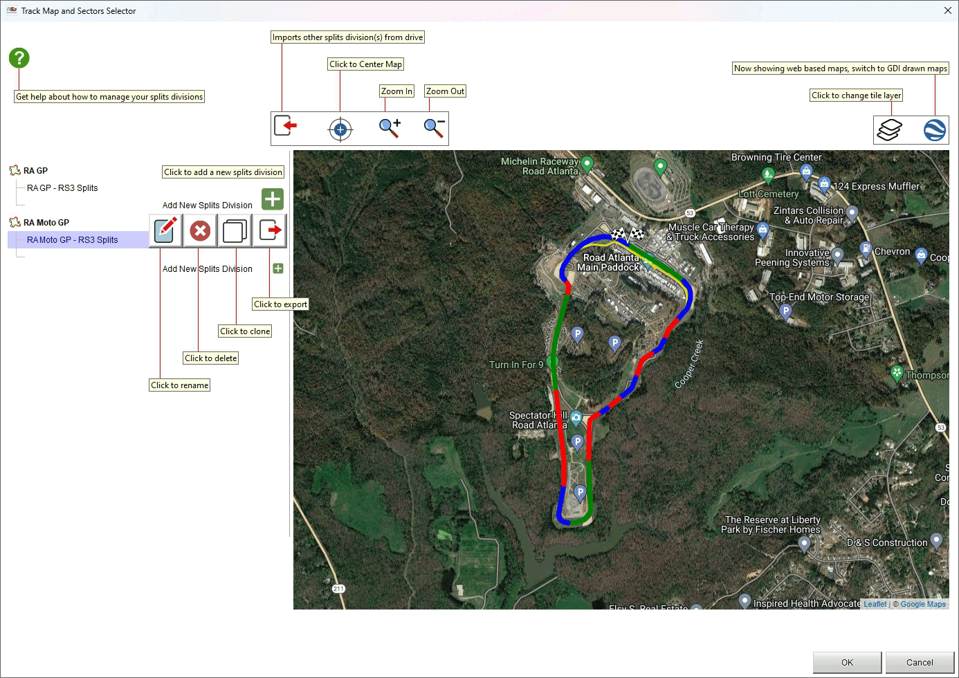
As for any track map you can import the split division from the device, centre and zoom it in/out using the top left keyboard as well as decide the map tile provider and switch among web mapping and GDI drawn map using the top right keyboard.
Split division can be renamed, deleted, cloned and exported using the icons that appears mousing over the splits.
Please note: clicking the question mark top left of the software panel you are re-directed to an online software help page.
Create a New Track Map
Clicking the above showed icon it is possible to create a new track map from available data. Bottom right of the panel all available track laps are shown: scrolling them it is possible to select the one to use to create a track map.
Pressing the bottom left "+" button you can add new splits.
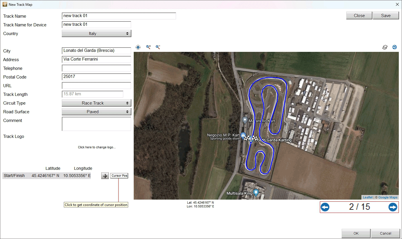
Predictive Reference Lap in Analysis
Look at what in Predictive Reference Lap for a complete perspective on predictive lap times.
To save a predictive reference lap file, go to any Channels and Laps List Panel window, click on the “Laps” button to show all the laps of the session, then right click on the lap you want to create a reference on, and select the menu “Laps Manager” then “Create Reference Lap”.
You will be shown a dialog window in which in order for you to choose a file name and a comment. Please read section Saving Predictive Reference Lap into a File few lines below here.
In the analysis software you have no other interaction possible with predictive reference laps. This because the functionality is fully covered by the Time Compare.
Saving Predictive Reference Lap into a File
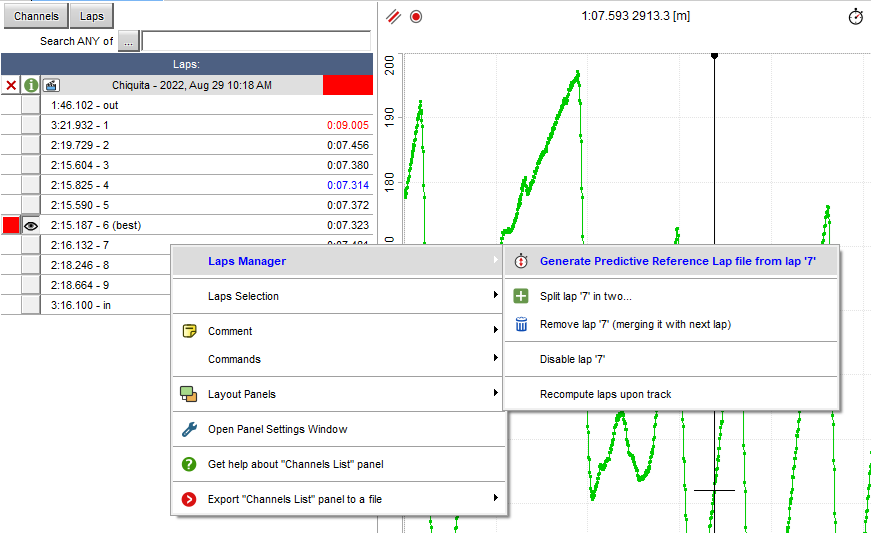
For the file name, a maximum of 8 chars are allowed, to comply with the filesystem of the device.
In the comment, try to be exhaustive on where the reference comes from, i.e. “Bob’s morning best”, or “Wet track, soft compound”, as the comment will help you selecting the correct file to be sent to your device.
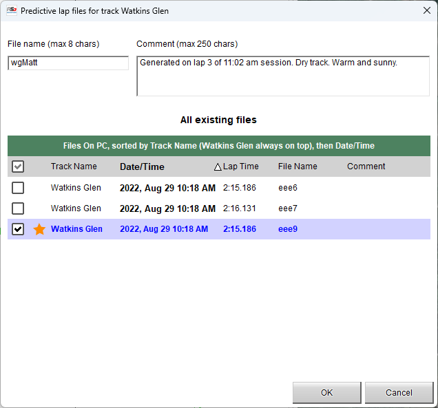
Predictive Reference Lap Files Manager
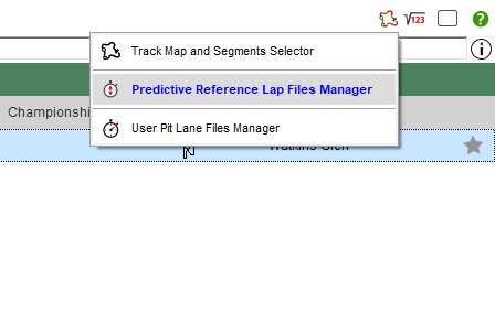
When you’re visualizing either the sessions database or sessions in analysis window, the track map icon allows you to instance the Predictive Reference Lap Files Manager. This is a window through which you can manage *.prl files. You can edit, delete, import or export them.
Please notice that you can see the *.prl files you saved for all track configurations.
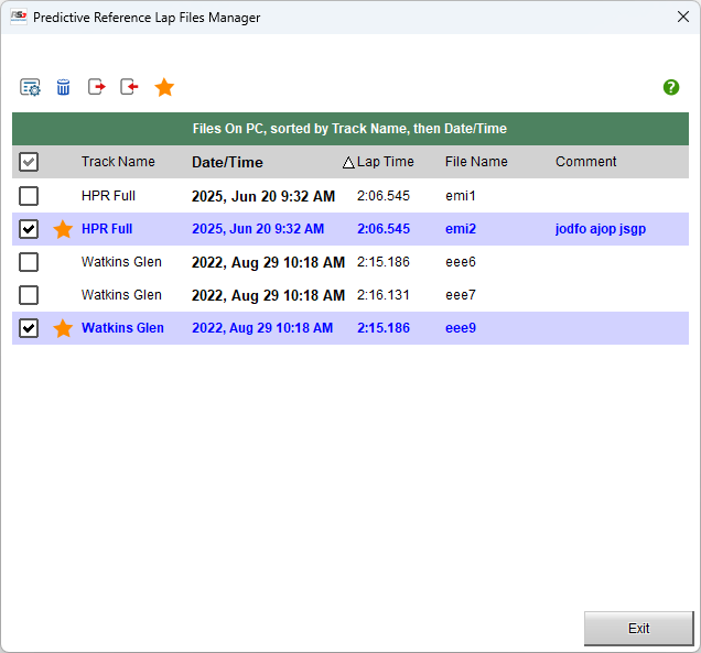
User Pit Lane in Analysis
Look at what in User Pit Lane for a complete perspective on pit lanes management.
When you open a session for analysis, in case the pit IN and OUT points information are available the pit lane computation are done by default and shown in…
both the StoryBoard Panel
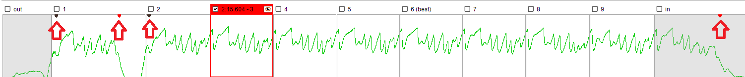
and the Time-Distance Panel.
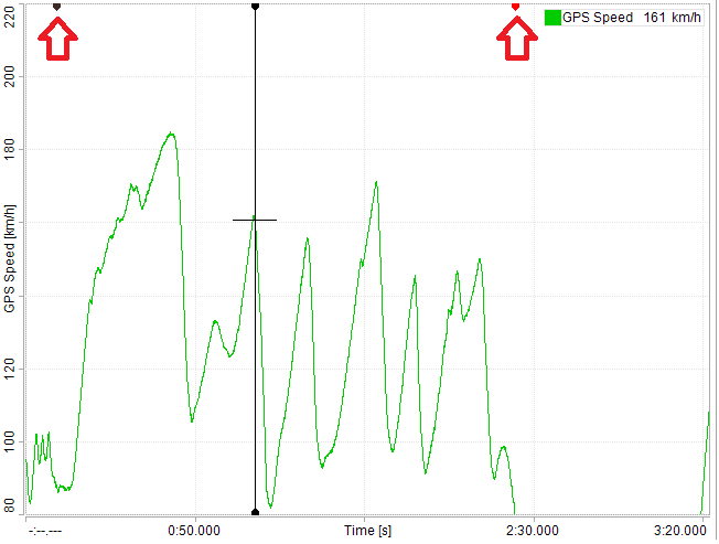
Normally all the pit lane timings are automatically managed. In case either the pit IN or the pit OUT are missed, it means that their position must be moved a little bit. To perform this operation, move the cursor where you want one of these points to be.
Right clicking in the Time-Distance Panel or in the Track Map Panel you can move the pit in or pit out detection point to the cursor point. If you move either one of them, new trigger points will be automatically computed.
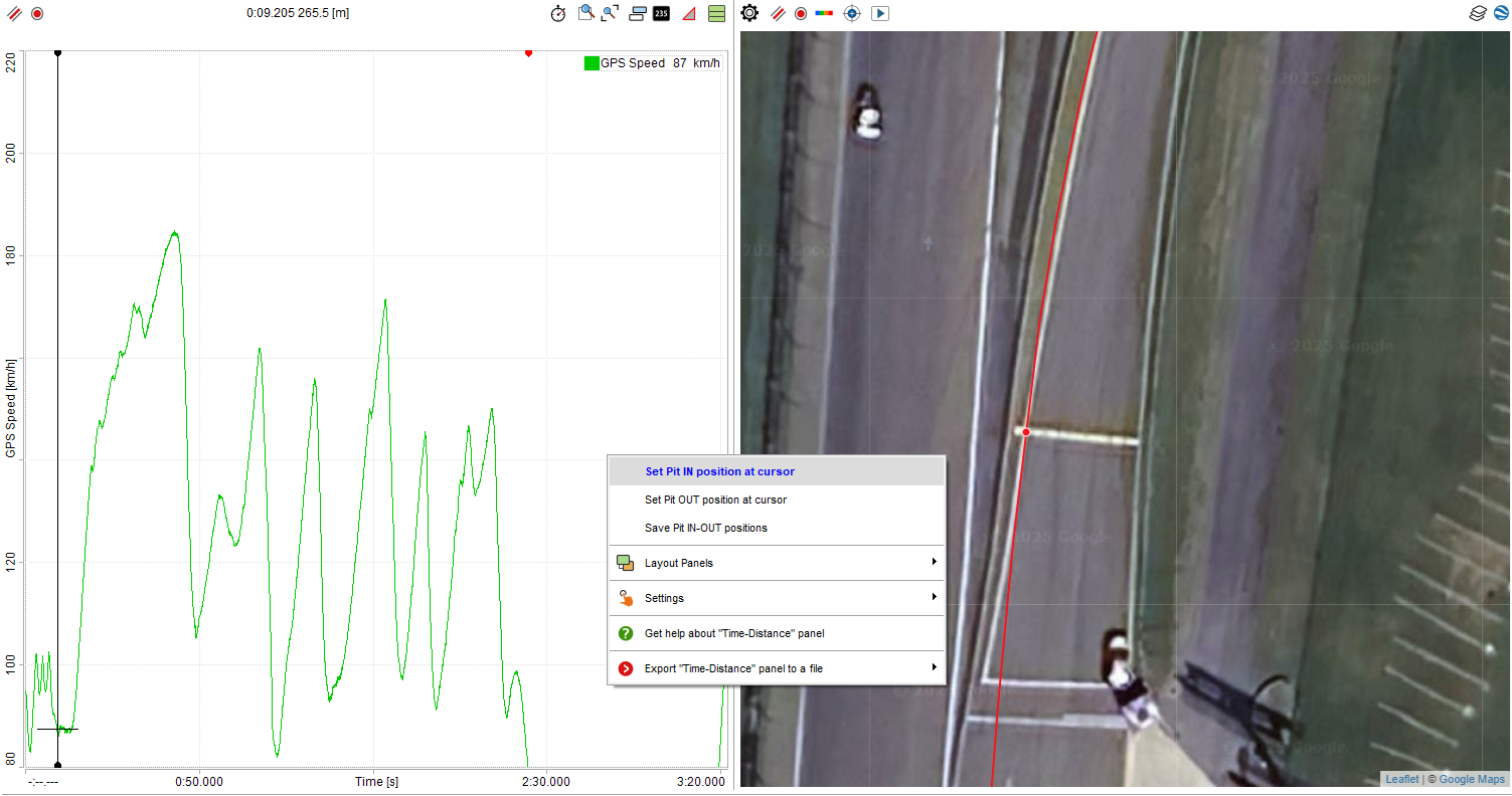
In the right click menu, you can choose to save the eventually modified coordinates into a new user pit lane file.
You will be shown a dialog window in which in order for you to choose a file name and a comment. Please read section Saving User Pit Lane into a File few lines below here.
Take care: you will need to transmit eventually saved file to your device(s) in order for the device to use them, see more about this in User Pit Lane in Device.
Saving User Pit Lane into a File
For the file name, a maximum of 8 chars are allowed, to comply with the filesystem of the device.
In the comment, try to be exhaustive on where the reference comes from, i.e. “Bob’s morning best”, or “Wet track, soft compound”, as the comment will help you selecting the correct file to be sent to your device.
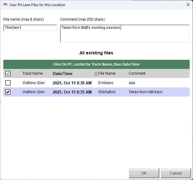
Default User Pit Lane File Picker
When you’re visualizing the sessions in analysis window, the track map icon allows you to instance the User Pit Lane File Picker.
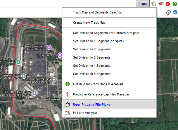
Please notice that in this window you can see all *.upl files you saved for the track location of the selected session(s).
This is a window through which you can manage *.upl files. You can edit, delete, import or export them.
Most important, in case you have more than one pit lane file for a given track start/finish line position, you can select which will be the default one. To do this, just select one file and click OK.
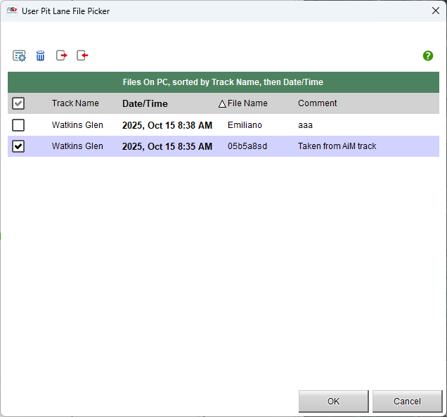
User Pit Lane Files Manager
When you’re visualizing the sessions database, the track map icon allows you to instance the User Pit Lane Files Manager.
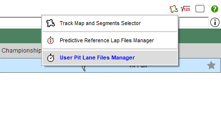
This is a window through which you can manage *.upl files. You can edit, delete, import or export them.
Please notice that in this window you can see all *.upl files you saved for all the track locations.
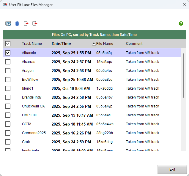
Pit Lane Analysis
This window shows all the main computations made on *.upl files. Please notice that these computations are made within analysis software itself, i.e. these are not what shown by the device during the race.
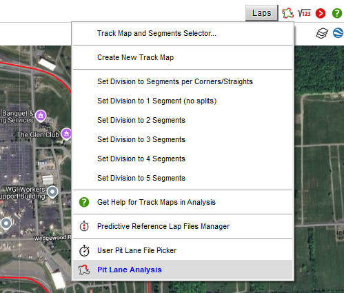
Speed at Pit In: the speed of your vehicle exactly at the pit entrance detection.
Time to Stop: the time from the entrance line to when you stop the vehicle.
Time Stopped: the time you spent at zero speed.
Time to Pit Out: the time from when you start your vehicle to the pit exit line.
Total time in Pit: the time from the entrance line to the exit line.
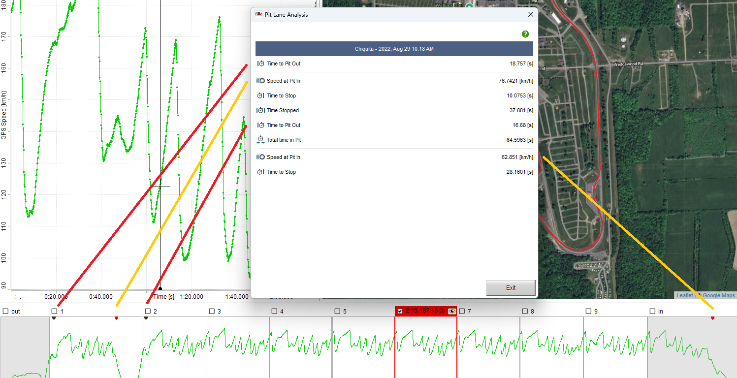
Data Tech Reports
Say you work in a team with multiple vehicles and/or racers. Take a group of sessions you want to quantitatively compare. For example, all vehicles from a race qualifying or all weekend for a given driver. This report will give you a way to.
Available comparison ranges are: sessions, laps, corner sectors, straight sectors. Apart from sessions, you can compute statistics upon the fastest N laps for every session, or the laps with the fastest N sectors for every session.
Available statistics are: minimum, maximum, average, range, delta, absolute value of average, average when not zero, integral, integral of absolute value.
Statistics can be applied to any channel, any number of channels. A very significative report can be obtained using performance channels like GPS Speed and GPS Accelerations.
For the whole session or the whole lap, performance items can be: session or lap time and any statistics on channels of your choice.
For corners sectors, performance items can be: sector time, any statistics on channels of your choice and, for the braking phase, average deceleration and braking distance as well as deceleration report items like times for speed and the times for distance. The comparison is performed on the fastest N sectors (whatever lap the sectors were made in) or on the fastest N laps of every sector.
For straight sectors, performance items can be: sector time, any statistics on channels of your choice. Also available for straight sensors are the acceleration report items like times for speed and the times for distance. The comparison is performed on the fastest N sectors (whatever lap the sectors were made in) or on the fastest N laps of every sector.
Report Map
The map window, in the left part of the data report window, shows the track map selected for the sessions in the data report itself. It also draws the sectors for corners and straights, highlighting the selected one (if any).
Clicking on a sector, you ease the data report into showing the correct statistics for the sector.
The map can be shown on a GDI background as well as on a web tiled cartography. Look for the map toolbar, right above the map itself. The rightmost icon in the toolbar will allow such a change. The leftmost buttons will instead allow you into zooming, but this operation is more easily available through the mousewheel and through mouse drag.
Report Tabs
The tab window, in the right part of the data report window, shows all the statistics for the data report.
Data report statistics are divided, tab by tab, per session, per lap, per corner sector or per straight sector. The first tab will be weather conditions one, then, according to what you enable, the sessions tab, the laps tab, then all corners tabs and the straights tabs.
Identify and select tabs at the top of the data report window. Click on them to show proper statistics.
Selecting a tab that refers to corner or to a straight, the matching sector will be highlighted on the map.
Report Statistics
All the statistics information will be displayed in the window in the right part of the data report window. Statistics are available accordingly to what you choose in the settings.
For both the whole session and the whole lap, performance items can be: session or lap time and any statistics on channels of your choice.
For corners sectors, performance items can be: sector time, any statistics on channels of your choice and, for the braking phase, average deceleration and braking distance as well as deceleration report items like times for speed and the times for distance. The comparison is performed on the fastest N sectors (whatever lap the sectors were made in) or on the fastest N laps of every sector.
For straight sectors, performance items can be: sector time, any statistics on channels of your choice. Also available for straight sensors are the acceleration report items like times for speed and the times for distance. The comparison is performed on the fastest N sectors (whatever lap the sectors were made in) or on the fastest N laps of every sector.
Basing on session recording time and date, and on session coordinates, a weather conditions window will be added.
Information items can be represented as box plots or normal distribution.
Box Plots
Box Plots are a visual picture that compares sets of data for central tendency (location) and variation (process spread). The line segmenting the box represents the median data value. Left and right of the box represent the first and third quartile, respectively. The quartiles represent the 25th and 75th percentile of the data spread. Whiskers extend to highest and lowest samples, given that those samples do not exceed the median value plus/minus 1.5 times the interquartile range. Samples that exceed the whiskers are plotted as outliers, like the following picture.
Normal Distribution
The gaussian bell of the probability density function is built on sampled data, the three vertical lines being average value, plus/minus the standard deviation.
List of Available Reports
Please identify, at the top of the list window, the main toolbar.
Apart from the leftmost button that lead you to this documentation page, you’ll see a button for importing a previously exported data report (that anyone could be sharing with you).
Other buttons will appear directly over the list items, to delete or export the items itselves. In this case, the action triggered by the buttons is made on the clicked data report list item.
As special bottom list item, you’ll find the new report creation button.
Two AiM default reports will be built by RaceStudio 3 and constantly refreshed at every RaceStudio 3 restart. This to guarantee you always have a reference point to start from. Don’t please customize them otherwise your modifications will be lost: save them with a different name to keep your settings.
Create a New Data Report
This button will prompt you another window, in which you’ll be choosing which elements will appear in the data report you’re creating.
Delete a Data Report
This button will, upon confirmation window, delete the selected data report.
Edit a Data Report
This button will prompt you another window, in which you’ll be choosing which elements will appear in the data report you’re editing.
Import a Data Report
This button will prompt you the Windows (TM) file selection window. Data reports in selected files will be imported for use in RaceStudio 3.
Export a Data Report
The selected report will be exported by default to “<user documents>/AiM-RS3-Exports/DataReports” folder. Upon finish, a Windows (TM) Explorer window will be opened on this folder.
Hints
How to duplicate a report? Just edit it, insert a new name and click OK.
Report Settings
The report settings window is basically made of the list of all the available data report items.
List items are divided in the usual sections: sessions, laps, corners, straights.
Within sections, every list item will be possibly having: enable flags, delete buttons, edit buttons.
Upon a click on any of these buttons, you will be prompted a window showing you all possible settings for the specific item. A doubleclick on the list item will default to being a click on the edit button.
At the bottom of every section, an add new item button will be available.
All the items will have an item name and a comment string, that will be shown in the data report.
Some of the items can be enabled directly flagging their checkbox in the list. For these, in the item settings window only the name and the comment strings are available.
Others must be specifically added, these latter being mainly analysis channels report items. For these kind of items you must be choosing a channel (picking names from loaded sessions ones) and you must be picking an operator among those available in analysis channels report function.
In common, there’s the elapsed time to complete the session, lap or sector.
Corners sectors feature specific items for braking analysis and deceleration report. This kind of analysis is available only if you have GPS data. The braking phase will be identified from the highest speed point to the lowest speed point in the sector.
Straight sectors feature two specific items for acceleration report: the times to speed and the times to distance.
In RaceStudio 3 Analysis home view is "Reports" function; it allows to make a quantitative analysis of different performances (vehicle or pilot) and can be applied to different vehicles of a team or to the same vehicle for an entire week end. Using this report you can compare selected channels values for the entire laps or for different track part (corners and straights). Most useful reports are these referred to GPS Speed and GPS Acceleration.
Available statistics are: min/max/average values, range, delta, absolute value of average, average when not zero, integral and integral of absolute value. You can also decide to see the values for entire laps only as well as for desired track sectors.
The comparison can be made for all laps or for a selected number of best laps, for laps with best splits or considering a fixed percentage around best lap.
By default RaceStudio 3 Analysis software provides two samples of reports named "Default AiM-1" and "default AiM-2".
To enter Reports Manager:
Select the sessions you want to see the report of
Click the above reported icon in the software main page
Select the report you prefer or choose "Data Reports Manager" to add a new one.
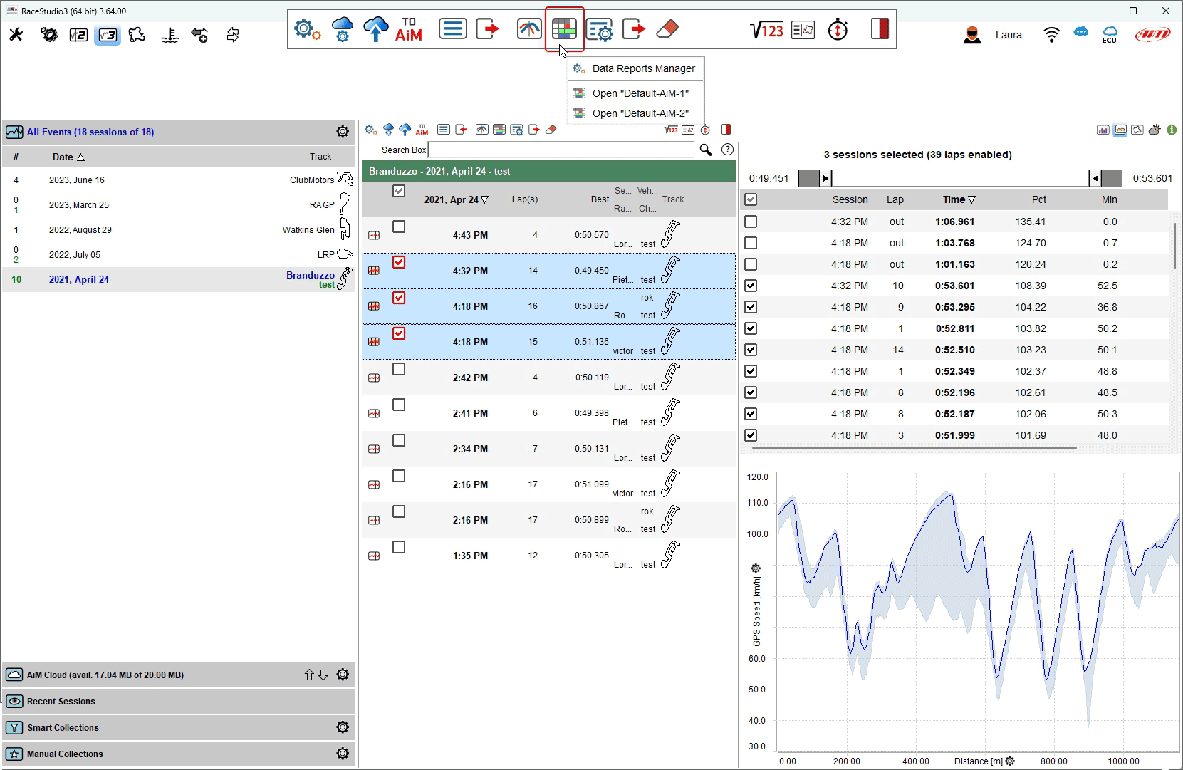
The software enters Reports page view. In the example below we selected "Default-AiM-2" example.
The view below shows:
track map CDI mode on the left (1)
report on the right (2)
mousing over the report view a tooltip showing which data is taken is prompted (3)
mousing over the graph right of the report a tooltip for each point of the graph is prompted (4).
Each part of the view can be customized as we will explain in the following pages.
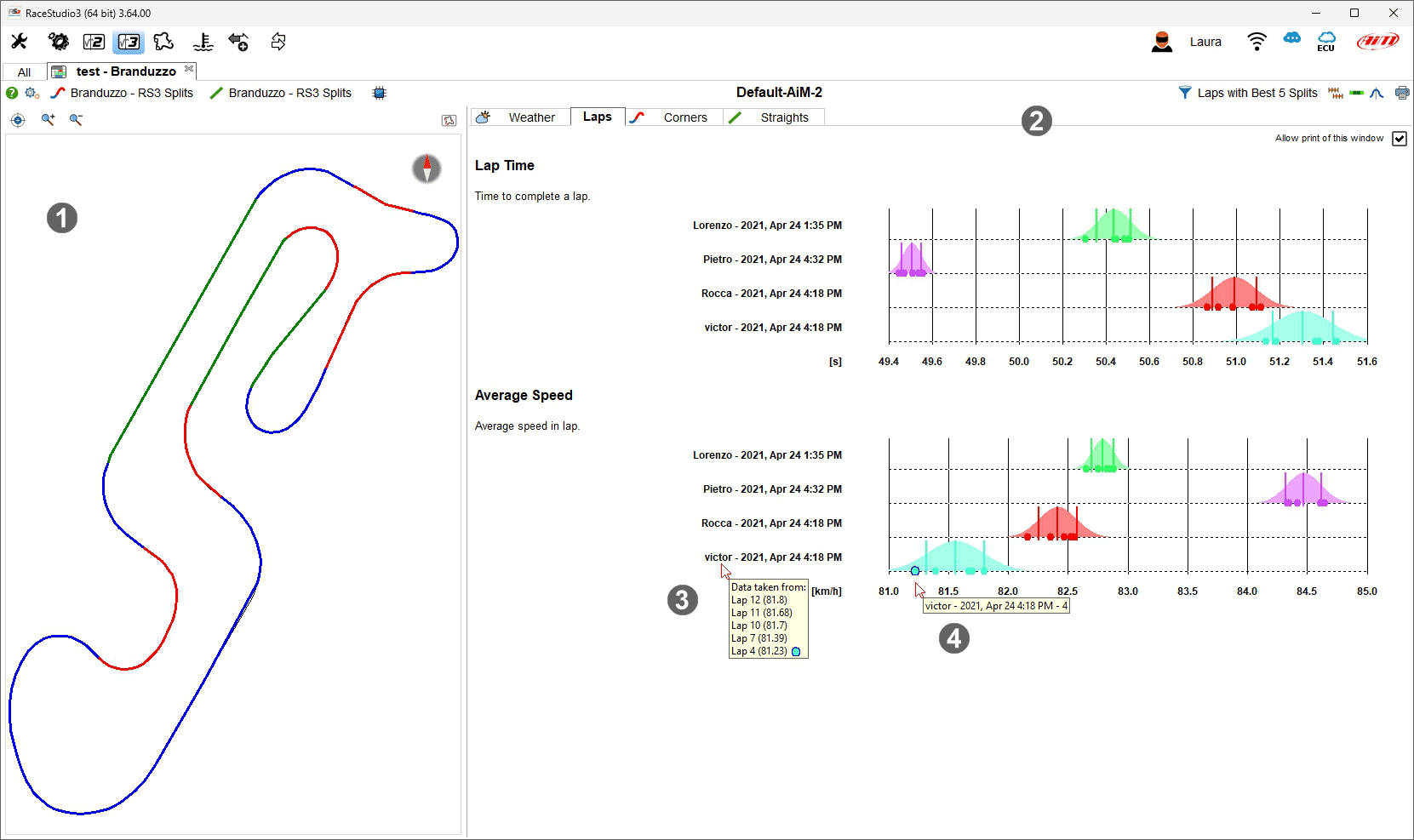
Top left and top right of Report view are two toolbars.
We start from the left toolbar (top one in the image).
through the question mark you are redirected to an online help page
the setting icon allows you to manage the reports, creating a new one included, edit the current report or switch among different reports
corners and straight split division used for the report are these you previously created or default ones
through the scratch icon you can reset the report computation.
Right toolbar (bottom one in the image):
through the funnel icon you can select the laps or the range of laps to be used for the report
- right of it is the icons that allows you to decide whether keeping the same scales for similar statistics and decide if using normal or rainbow colour
for acceleration report
graph can use normal distribution, box plot or both and data can be exported in different format through the printer icon.
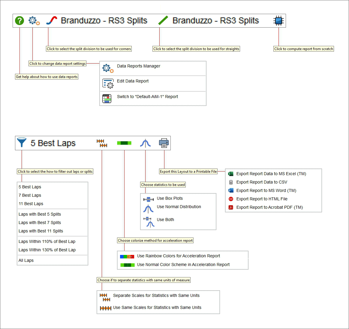
Managing, creating and editing a data report
RaceStudio 3 software provides two Reports sample named "Default-AiM-1" and "Default-AiM-2" and allows you to import others from a drive as well as create new ones.
To choose a default report model:
press the above reported icon
select "Data Report Manager" item
select the desired model in the panel that is prompted
Please note: mousing over the available reports some icons allowing you to edit, export and delete them are prompted; moreover using the top right icon on "Data Reports" panel you can import data reports from a drive
To add a new report:
press the above reported icon
select "Data Report Manager" item
- select "+" icon in the panel that is prompted and a new panel is shown: fill in "Title" and "Author" and then set up the other tabs explained
in the following pages.
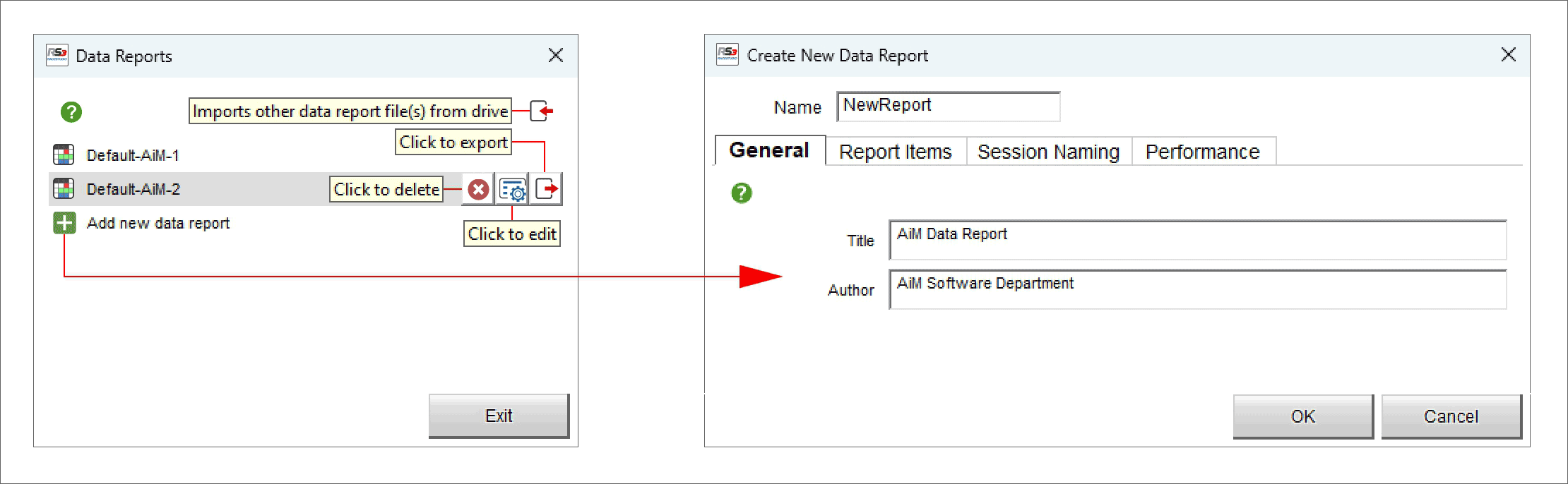
"Report Items" tab includes Sessions, Laps, Corners and Straight Items. They can be enabled with the related checkboxes or added pressing "+" icon.
Adding a new channel the corresponding setting panel is prompted:
fill in Item name and comment
select the channel on the left and the operator on the right of the panel as highlighted below
press "OK"
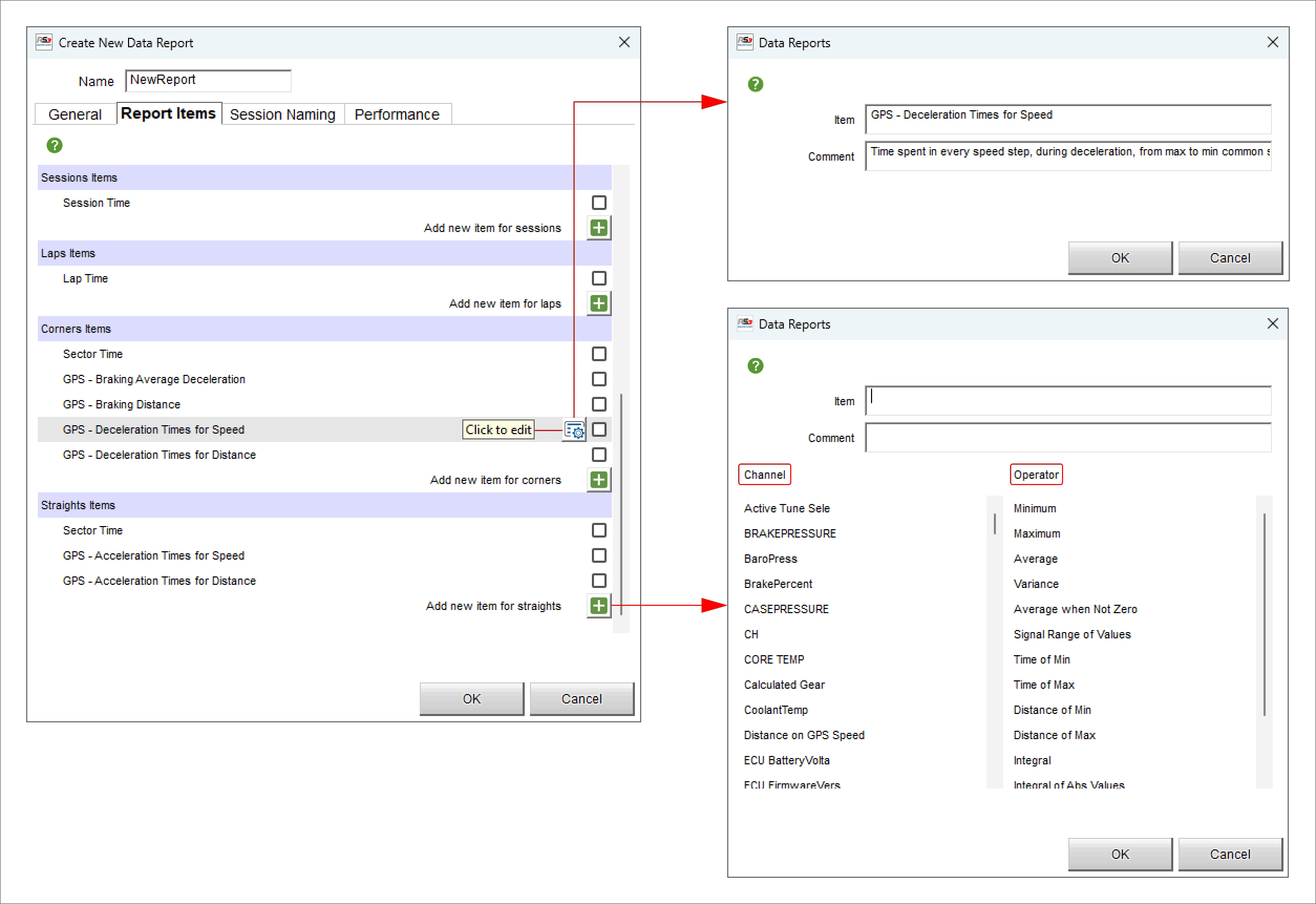
"Session naming" tab
Each session can be named using pre-defined fields you can enable/disable and displace in the dedicated tab. After having enabled the voice you want to use drag and drop it in the desired position and the session name will be changed as shown here below.
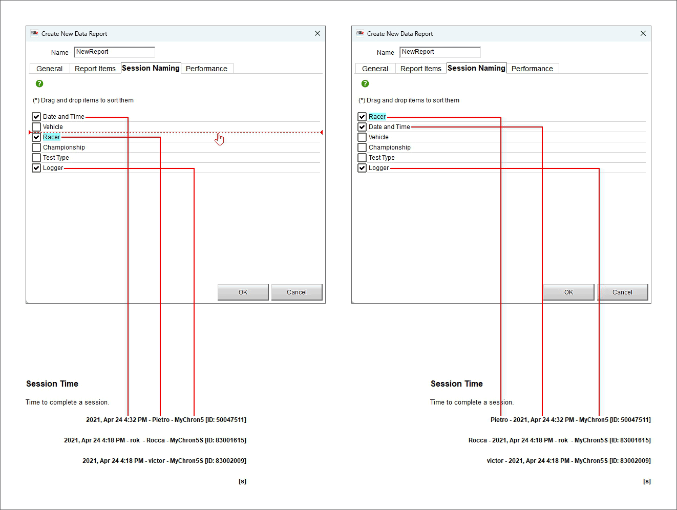
Unmatched Channels
When you create and save a report, you go picking channels from a given session or a set of sessions.
When you open a previously created session and you’re using a different sessions set, it might happen that RaceStudio 3 is not able to identify, in the used sessions set, the correct channels.
In the unmatched channels window there’s a left list with all the unmatched channels. Selecting a row in this left list the right list gets populated with all the possibile sessions channels that best match the chosen channel on the left.
You just need to go through all the channels in the left list and pick a channel on the right. This way the report can be correctly populated. Otherwise there could be some report statistics that are not populated.
You can access the unmatched channels window only if there are any unmatched channels in the data report, through a dedicated icon in the data report main toolbar.
Filtering data for laps and splits report
As shown here below, using the above reported icon it is possible filter data to be used for the report. Available options are:
5, 7 and 11 best laps
Laps with best 5, 7 and 11 splits
Laps within 110% or 130% of best laps
All laps
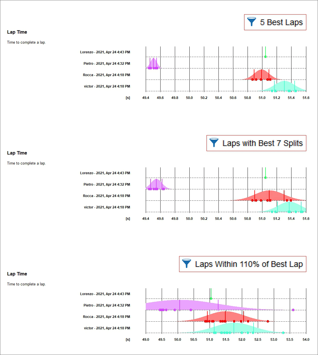
Management of scales for statistics with same units
Using the above reported icons the graphs can have on the x axis:
the same scales for statistics with the same units (top in the image below) or
different scales for statistics with the same units (bottom in the image below)
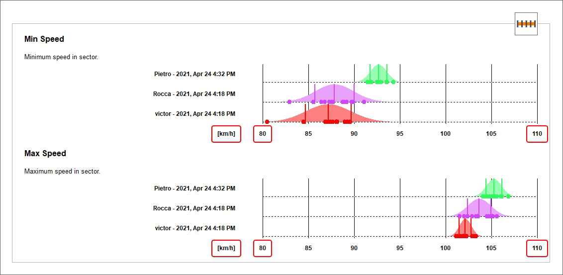
Choosing the statistics to be used
Using the above reported icons (from left to right normal graph, box plot, both) it is possible to represent data with different graphs:
- normal graph (top): using sampled data a gaussian bell of the probability density function is built; the three vertical lines are:
average value, plus/minus the standard deviation
- box plot (central): are a visual picture that compares sets of data for central tendency (location) and variation (process spread);
the line segmenting the box represents the median data value; left and right of the box are first and third quartile, respectively; quartiles represent 25th and 75th percentile of the data spread while whiskers extend to highest and lowest samples, given that those samples do not exceed the median value plus/minus 1.5 times the interquartile range; samples exceeding the whiskers are plotted as outliers
Both (bottom)
Report Sessions Naming
You can customize the way RaceStudio 3 associates a name to every session.
Flag a field to use it, unflag it not to.
Drag and drop the fields so to sort them, top fields will be used first.
Please be careful to the fact that improperly choosing fields you could be getting duplicated names, that is the same name for two sessions. For example: if you choose the only racer name as session naming fiels, and you then select two sessions from the same racer, the two sessions will share the same name.
You can access the session naming window through the leftmost options button in the main data report toolbar, together with main report settings.
Preliminary Work
Using RaceStudio 3 Analysis, you need to build two “splits divisions”, as RaceStudio 3 Analysis calls them, one for corners, one for straights. Each of these will be useful to generate a part of the report.
When you select a name for the splits division, remember that inserting the words “Corners” and “Straights” in the splits division name will make the report select them automatically. Also, in case you need several reports for several classes, using the “Championship” field as class name in the download window, and using the class name in the splits division name will make the report select the correct splits divisions automatically. For example, if you have a class name like “XS” and you create two splits divisions named “XS - Straight” and “XS - Corners” will help the report selecting them automatically. Normally one (only) division is needed for many if not all classes, so name them at your will, following the example in the screenshots right above here. The ideal way of tuning the splits divisions is to select the best 5 (or N) laps of all the needed sessions and to show the within the Time-Distance plot.
For corners, the parts that will be used of the division are the “not green”. Tune them so to start before the maximum speeds and to finish after the minimum speeds, for all laps.
For straights, the parts that will be used of the division that will be considered are the green ones. Tune them so to start before the minimum speeds and to finish after the maximum speeds, for all laps.
Exporting data reports to printable files
All reports can be exported in different formats, to say:
Microsoft Excel[™]_ (exports report data)
CSV (exports report data)
Microsoft Word[™]_ (exports a printable file)
HTML (exports a printable file)
Adobe Acrobat[™]_ PDF (exports a printable file)
Choosing the export command you will be prompted several export possibilities. Basically Excel(TM) and CSV ones will export the data, while all others, like Word(TM) or PDF, will export a printable report. The export will work through two external applications that needs to be downloaded separately. Such a download operation will be managed and guided by RaceStudio 3. The first application is needed to export in Word(TM) or HTML format. It is a simple executable merely copied into RaceStudio 3 install folder. The second application is needed to create PDF files. It will need to be installed on the PC. RaceStudio 3 will, upon user confirmation, download the installer and launch it, but users will need to go through the installer completion by themselves.