Latest news Spark Release
2.0.29 - March, 19th 2026
Usability improvements
Automatic connection
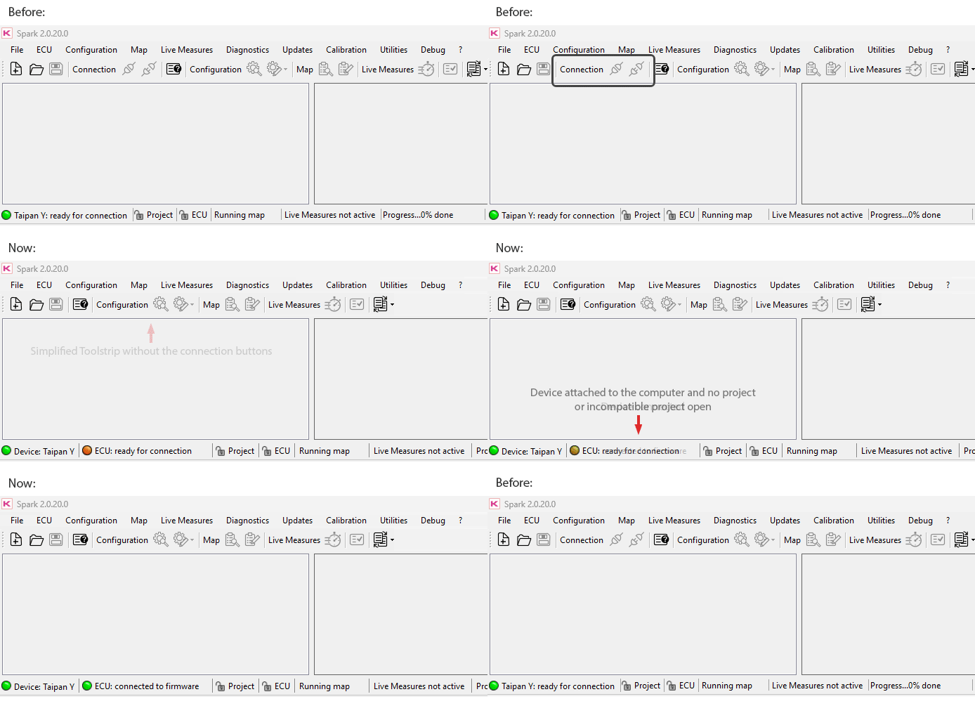
Changes to the layout from the previous version
Calibration forms usability improved
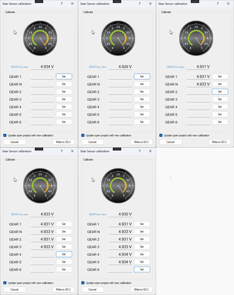
The forms used for calibrating various sensors has been modified to support the insertion of data through the Enter key. Thanks to this improvement the user can proceed with every step of the process without the need of any mouse input, Spark will automatically insert the data inside the current box and activate the right one for the next step.
ECU erase process simplified
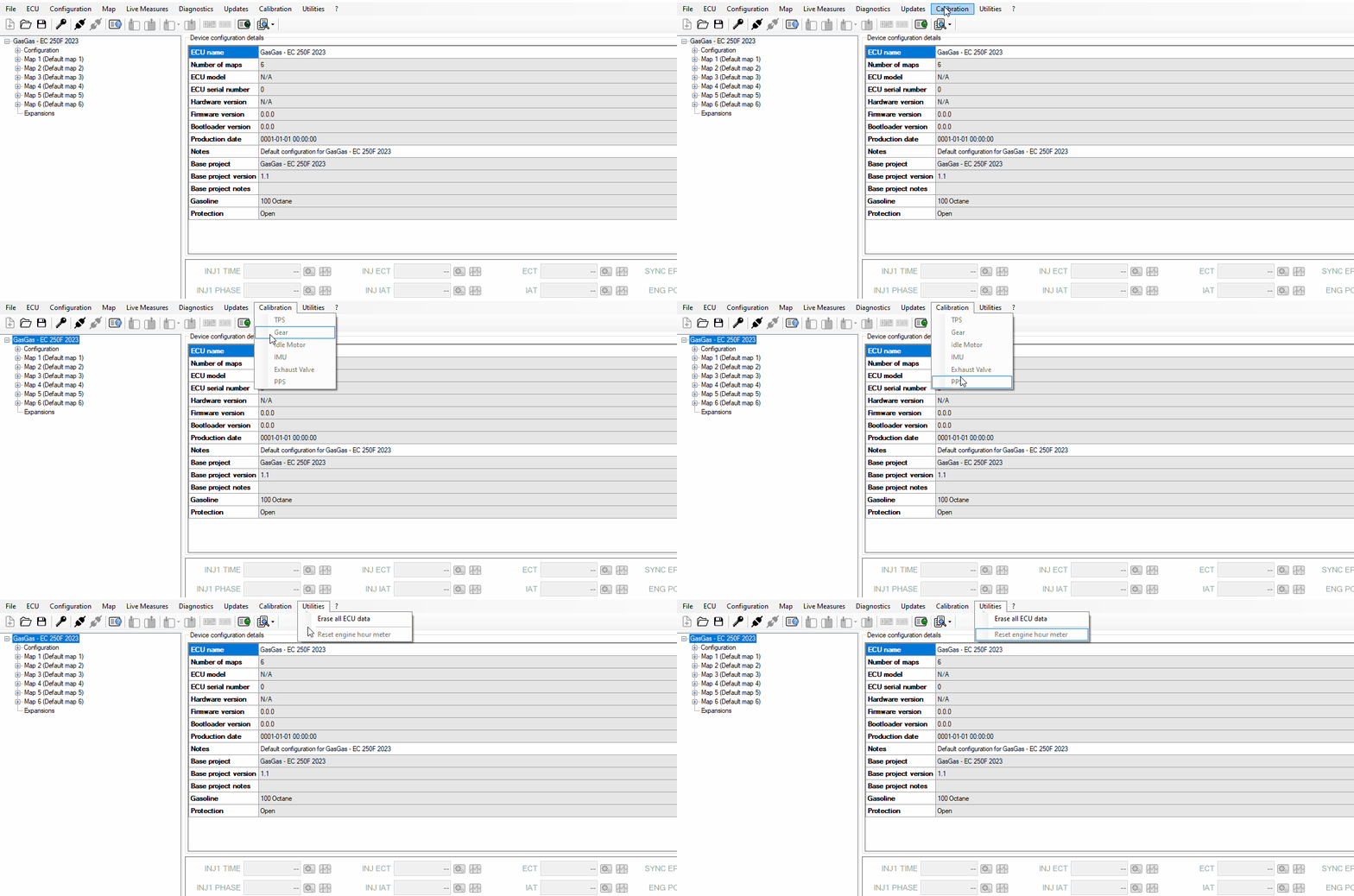
Previously the erase of the ECU required specific steps to unlock the command (compatible project opened and ECU disconnected), now it is possible to erase the ECU memory in any situation, despite the status of the project and the connection.
Open last project shortcut
To quickly open the latest opened project it is now possible to use the keyboard combination Ctrl+P.
Projects handling simplified
Various checks and alerts have been removed to simplify the opening and closing of projects, and to switch from a project to a different one more easily.
Table Zoom function
Tables now can be zoomed in and out using the mouse wheel combined with the Ctrl keyboard key, exactly like the relative 2D chart.
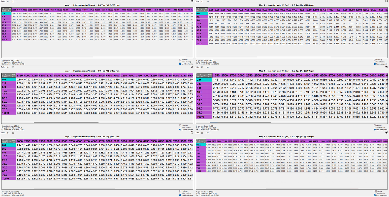
Table zooming function
The default font size for the tables is now configurable through the General section of the Preferences, updating the value inside will automatically update the font of the opened table.
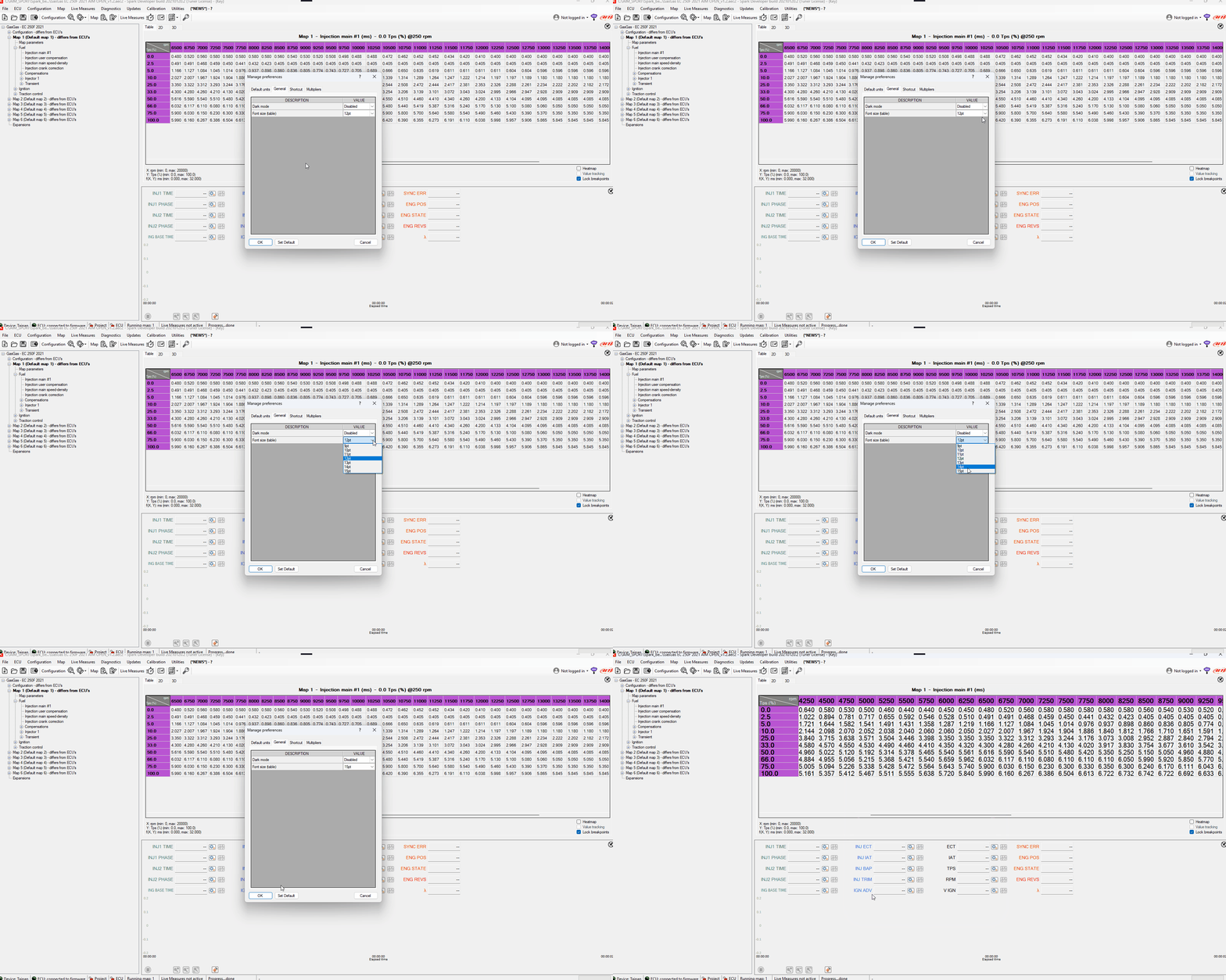
Table zoom preference
Table Heatmap function
To improve tables readability the user can now activate the heatmap function of the editing view, thanks to this functionality anomalous values can be immediately spotted and corrected due to the color strong contrasts.
The heatmap can be activated through the appropriate shortcut combination (default is Ctrl + H), or activating the checkbox in the bottom right corner of the table view as shown in the video:
Table with heatmap switched on
To distinguish modified and written cells with the heatmap on, two triangluar-shaped indicators have been added:
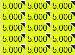
Modified cell indicator
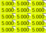
Written cell indicator
2.0.20 - January, 27th 2026
Another step toward a more user-friendly experience
New icons on the toolbar
Icons on the toolbar have new layout while their functions remains the same; added some texts to group them so to make their functions clearer.

Example Toolbar with Tuner licence
Live Measures start and stop shows one only icon that changes according to the status.
When Live Measures is inactive this icon is shown

When Live measures is active this icon is shown

Dark Mode
Added the possibility to use Spark in Dark version. You can toggle the Dark Mode inside “preferences”, as shown in the video.
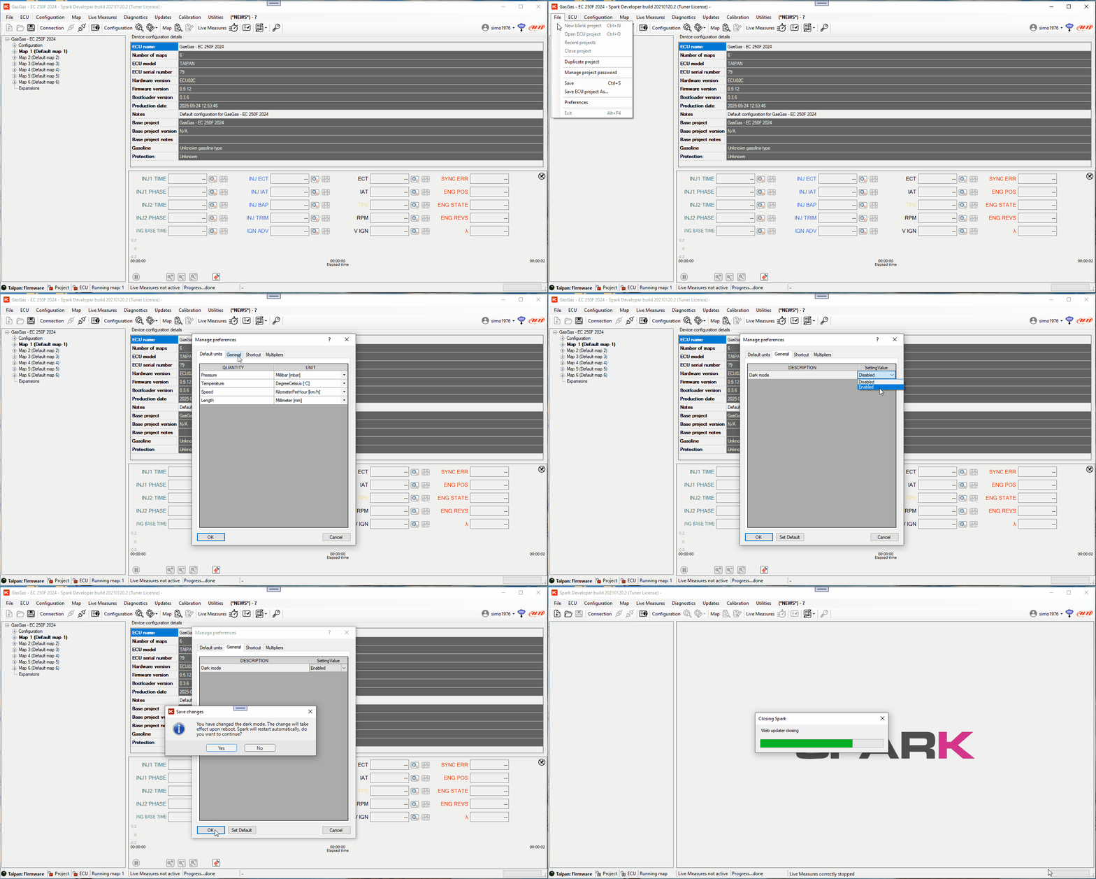
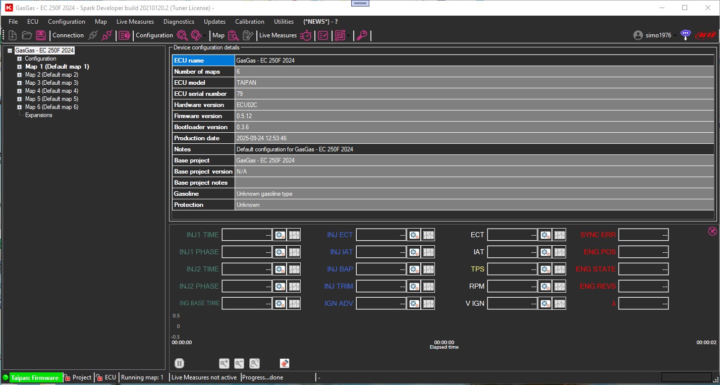
After restart the Dark Mode will be active.
2.0.17 - November, 4th 2025
PANTHERA MOTORS
From the collaboration with Pantera Motors a project dedicated to them was born with our TAIPAN ECU
Write ECU
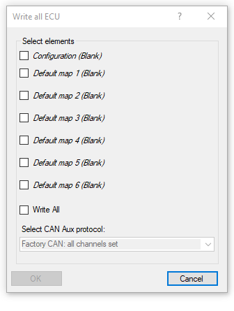
The means of “Blank” in brackets indicates that the ECU is empty and needs to be written the first time for the desired functionality to be available. Enabling “Configuration” checkbox “Select CAN Aux protocol” is available. This is mandatory for the configuration only.
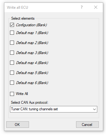
The window shown above highlights the following aspects:
Configuration and map 1 have been written at least once (they have no more Blank spaces) and are different from these on the ECU (highlighted by “Differs from ECU” on the treeview).
Map 2 is as the one on the ECU so cannot be written.
The remaining maps have never been written on the ECU and have the label “Blank”.
“OK” button enables if at least one checkbox is selected only and starts the writing on the ECU
Recent projects
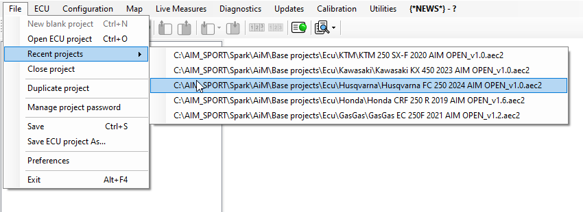
In “File” Menu “Recent projects” voice is now available and it shows the list of the last 5 open projects.
New Tab multipliers in Manage Preferences
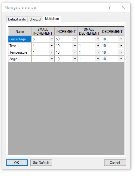
A new tab dedicated to multipliers has been introduced; they act on the customizable increment/decrement, small increment/ small decrement for the values connected to tables and 2D graphs shortcuts.
Help Button
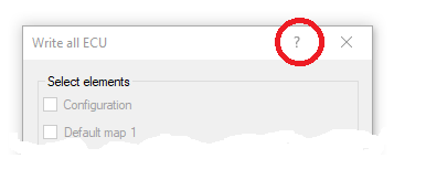
On some window, like Write Ecu, Customize DAQ, Calibration , etc Help button has been introduced; it open an help browser page that explains the functionalities.
2.0.12 - September, 18th 2025
New configurable shortcut
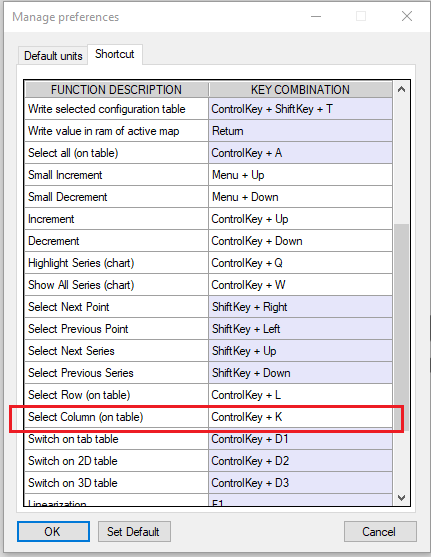
Added new shortcut that allows column selection on the tables. This setting is user customizable.
“Read ECU Identity” function always available
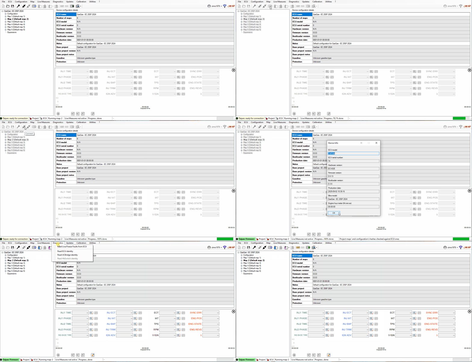
This function is always available, also with the ECU connected
“Differs From ECU” information
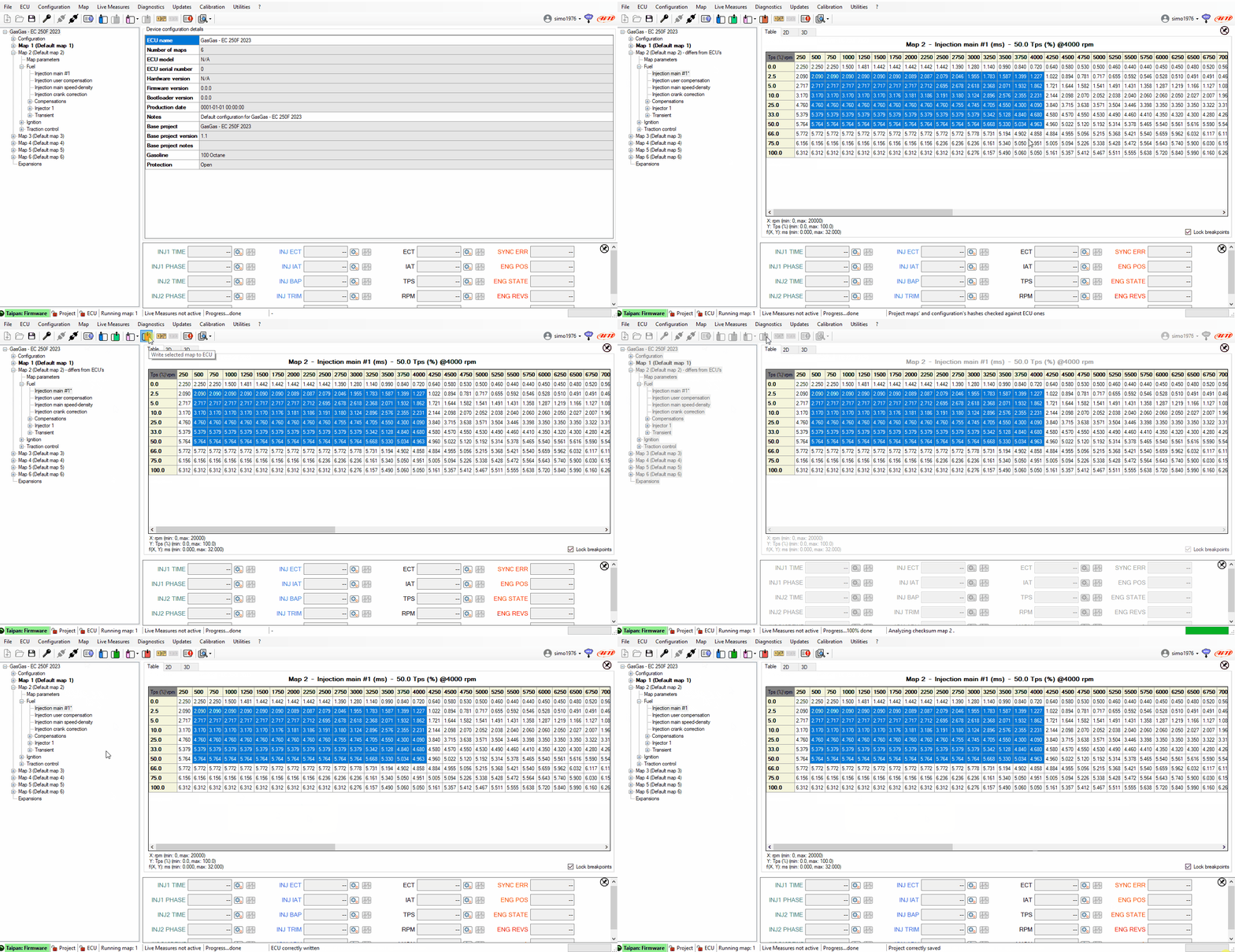
Modifying any parameter of the project with the ECU connected tree view shows that the section is different (configuration or maps) from what stored in ECU flash. This information is shown until when you write it on ECU Flash. Asterisk means that modifications have not been saved in the project yet.
2.0.10 - June, 20th 2025
PYTHON
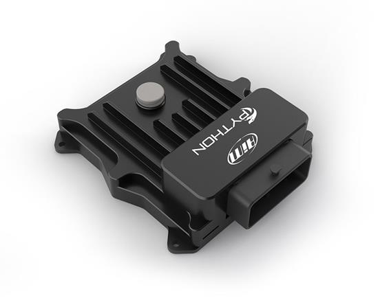
Added the new Plug&Play ECU for Legend Car
PPS1 and PPS2 Calibration
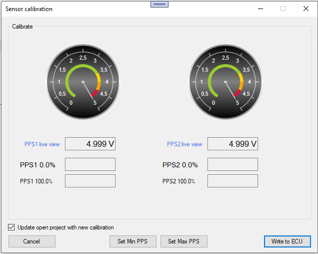
Dedicated PPS1 and PPS2 calibration. The Set Min and Set Max buttons set the values on both pedals based on the value received from the respective sensor.
Shortcut Custom
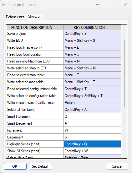
New tab Shortcut is added to allow you to custom some shortcuts. In the image above the shortcuts for increment and decrement have been changed. The user can change each blank row but not the others.
Edit Table Function keys
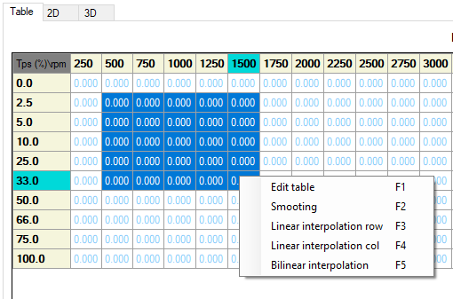
To access the options already present on the right mouse button click, you can use the function keys from F1 to F5
3D Visualization
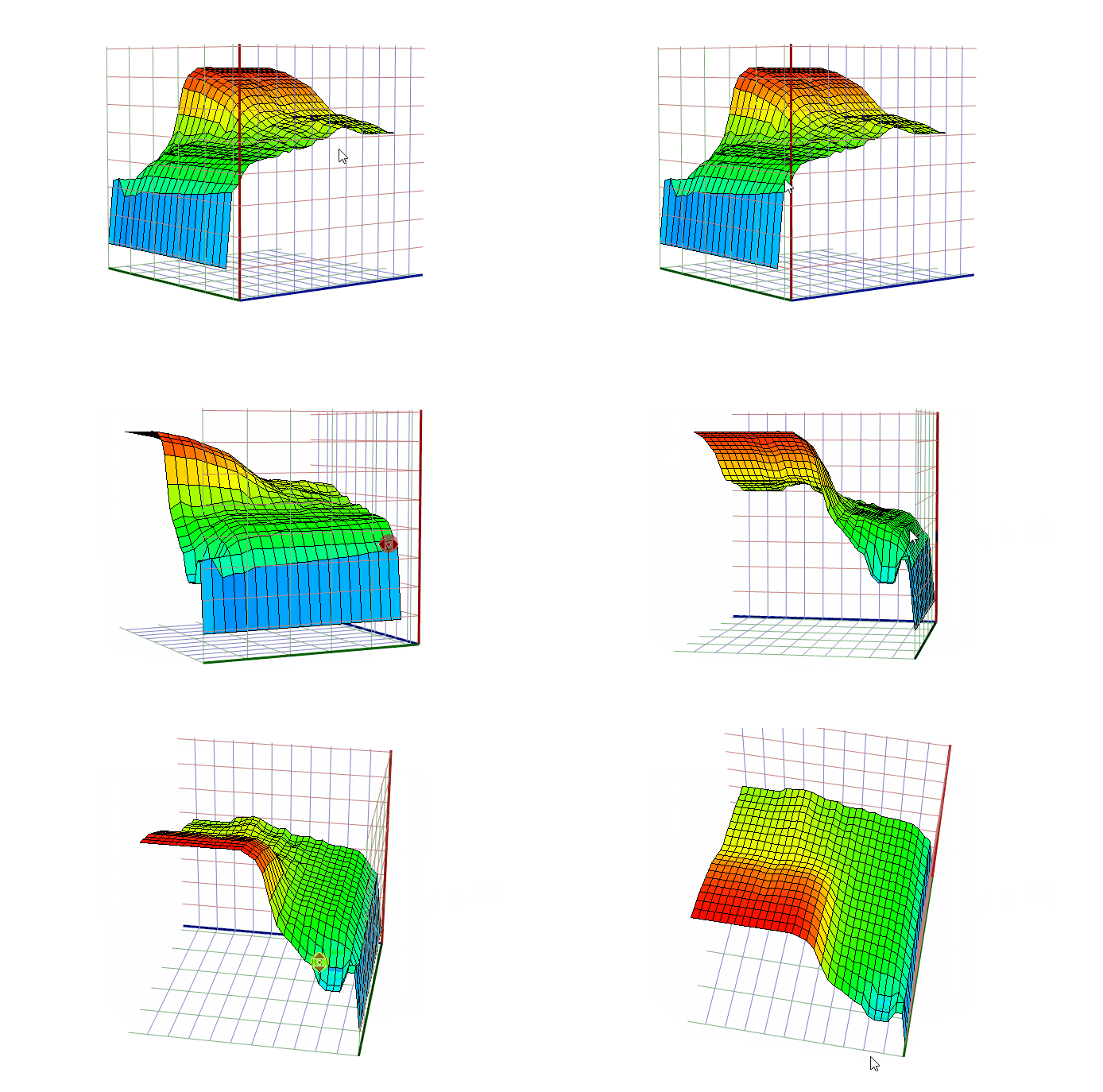
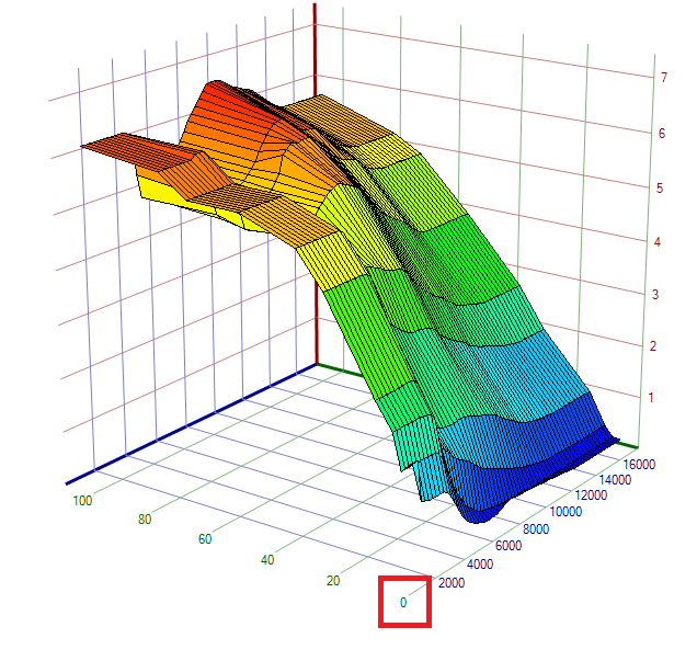
3d view has been added for each table in addition to the existing 2d one. The graph can be rotated, zoomed, moved as described in the legend in the tab.
Compare and modify two project
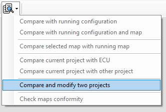
From the compare button is possible copy the difference between two project.
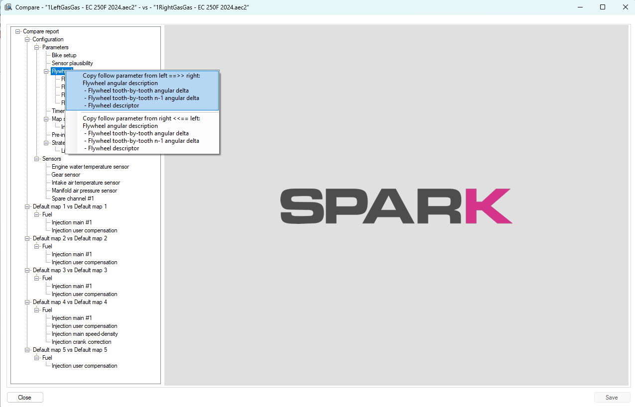
From the right mouse button you can copy from left to right and reverse one or more difference
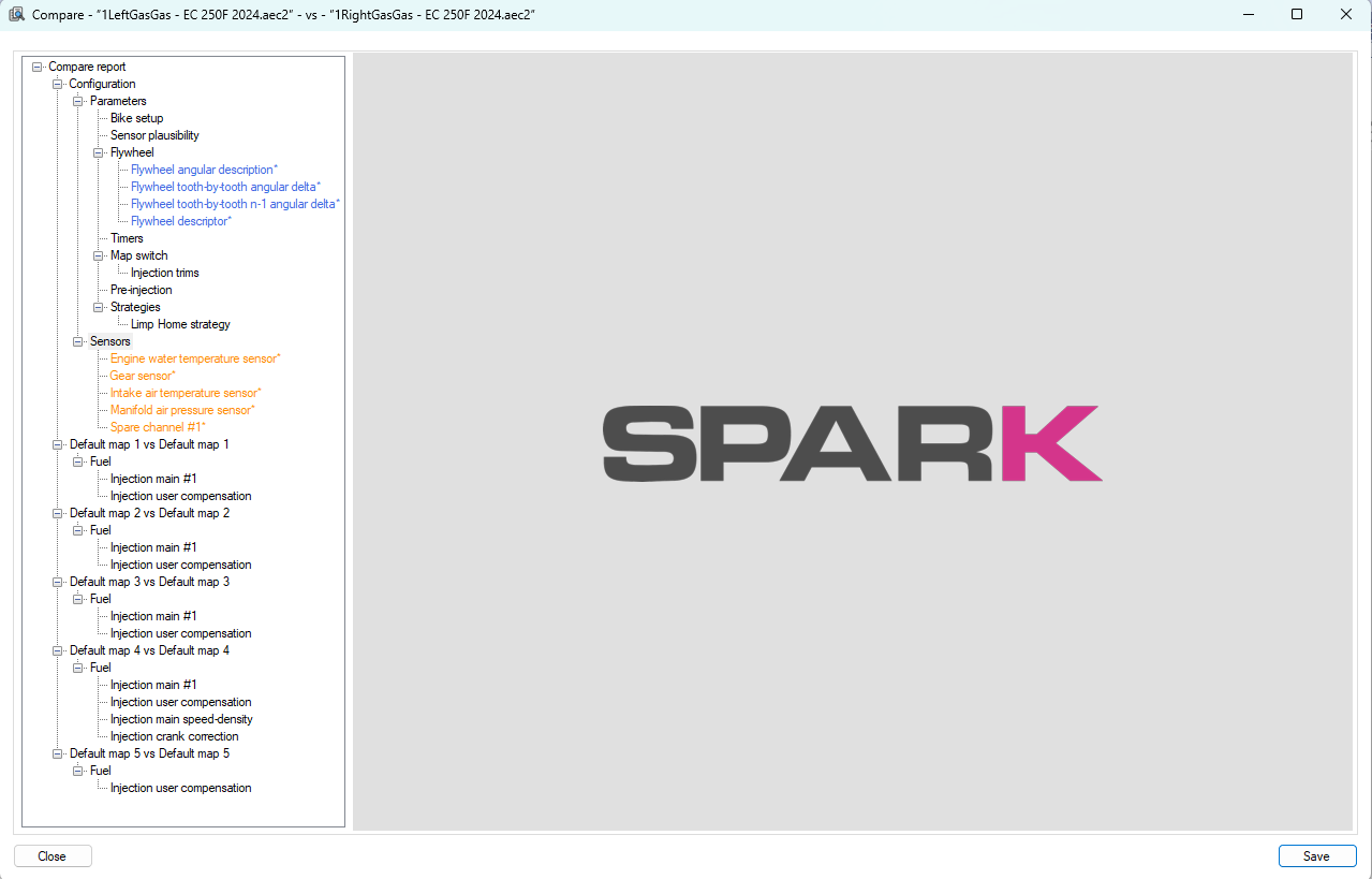
The diffences copied becomes blue or orange to indicate the side of copy. At the end is possible save all difference in one shot.
1.2.82 - October, 15th 2024
HBS CAN Baud rate programming
To manage the baud rate change you need to:
connect HBS to UC Bridge and run Spark software: the software will recognize HBS open an Handlebar Switch project, connect to HBS and change the baud rate to 500 kbit/s under CAN configuration, as shown below
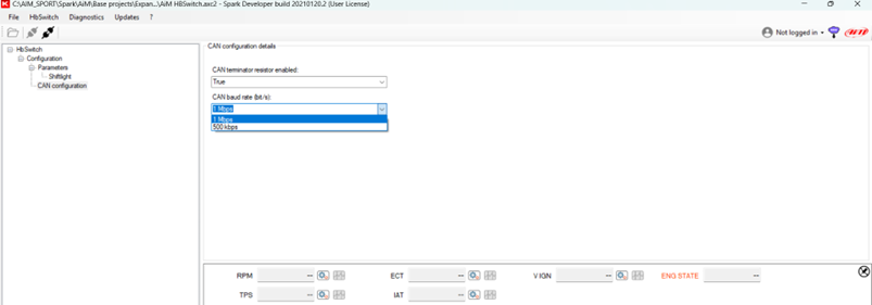
Please note:
once the configuration with the new bit rate is sent, it will no longer be possible to communicate with the HBS using Spark software but the system will correctly work connected to Taipan K. To go back to the previous Baud rate configuration, follow the procedure detailed in the specific document in the Firmware/Software DOCUMENTATION section for TaipanK
1.2.81 - September, 3th 2024
Limp Home Strategy
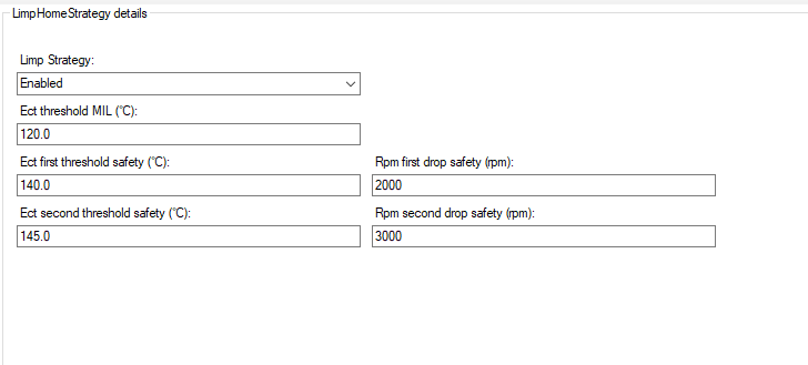
New Limp Home strategy introduced for Taipan (firmware version up to 0.5.40) and TaipanY (firmware version up to 0.1.25). The first temperature threshold turns on the MIL light. The second and the third reduce the rpm limiter of the setted amounth .
1.2.78 - June, 25th 2024
Taipan K
Added the new Plug&Play ECU for two strokes bikes:
KTM SX 250 2024
Husqvarna TC 250 2024
Gas Gas MC 250 2024
Added ‘IMU Calibration’ and ‘Check Exhaust Valve’ functions that can be recalled from Options menu.

‘IMU Calibration’ allows the user to calibrate Pitch and Roll angles writing data in the ECU through ‘write to ECU’ button.
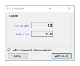
Once the calibration performed the software notifies it in the Status bar:

‘Check Exhaust Valve’ option allows the user to verify Exhaust valve calibration status.
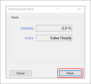
Once ‘Check button pressed the final status will be notified in the panel as follows:
‘Valve OK’ in blue or
‘Vlve Fault’ in red
1.2.74 - April, 17th 2024
Smoothing
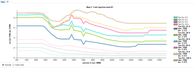
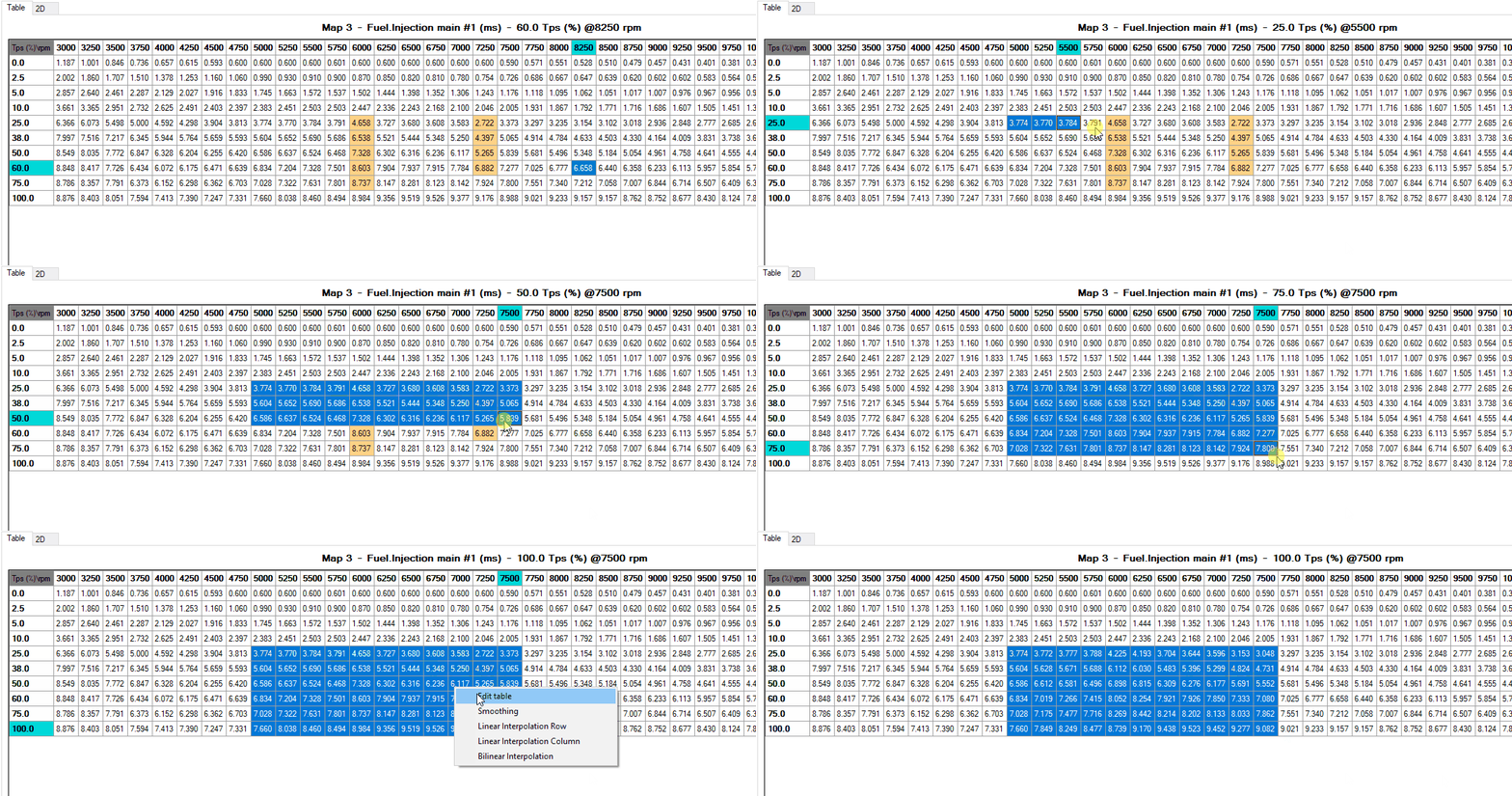
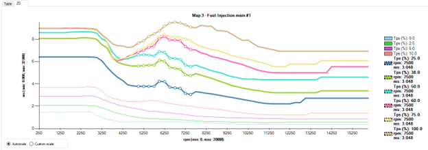
Selecting at least three contiguous cells the right click enables ‘Smoothing’ menu: if you select it, the smoothing algorithm is applied.
Graph with starting data:
Selection of ‘Smoothing’ functionality
Graphic effect on the data:
Shortcut CTRL+L
Selecting a single cell and pressing ‘CTRL+L’ all cells of the row will be selected.

Configurable Live measures view
‘Live measures’ menu will show two additional items:

‘Create new Live measures’ lets you create templates of measures you can save and recall from the option ‘Stored live measure’. This function allows to create different templates to be used in different situations.
‘Stored live measures’ shows the list of all the previously created templates. This menu allows templates modification and deletion as well as activation of live measures.
Note that the ‘Tuner default” template cannot be modified.
When you select ‘Create new live measures’ option the corresponding window below is prompted. Here below is an example of use.
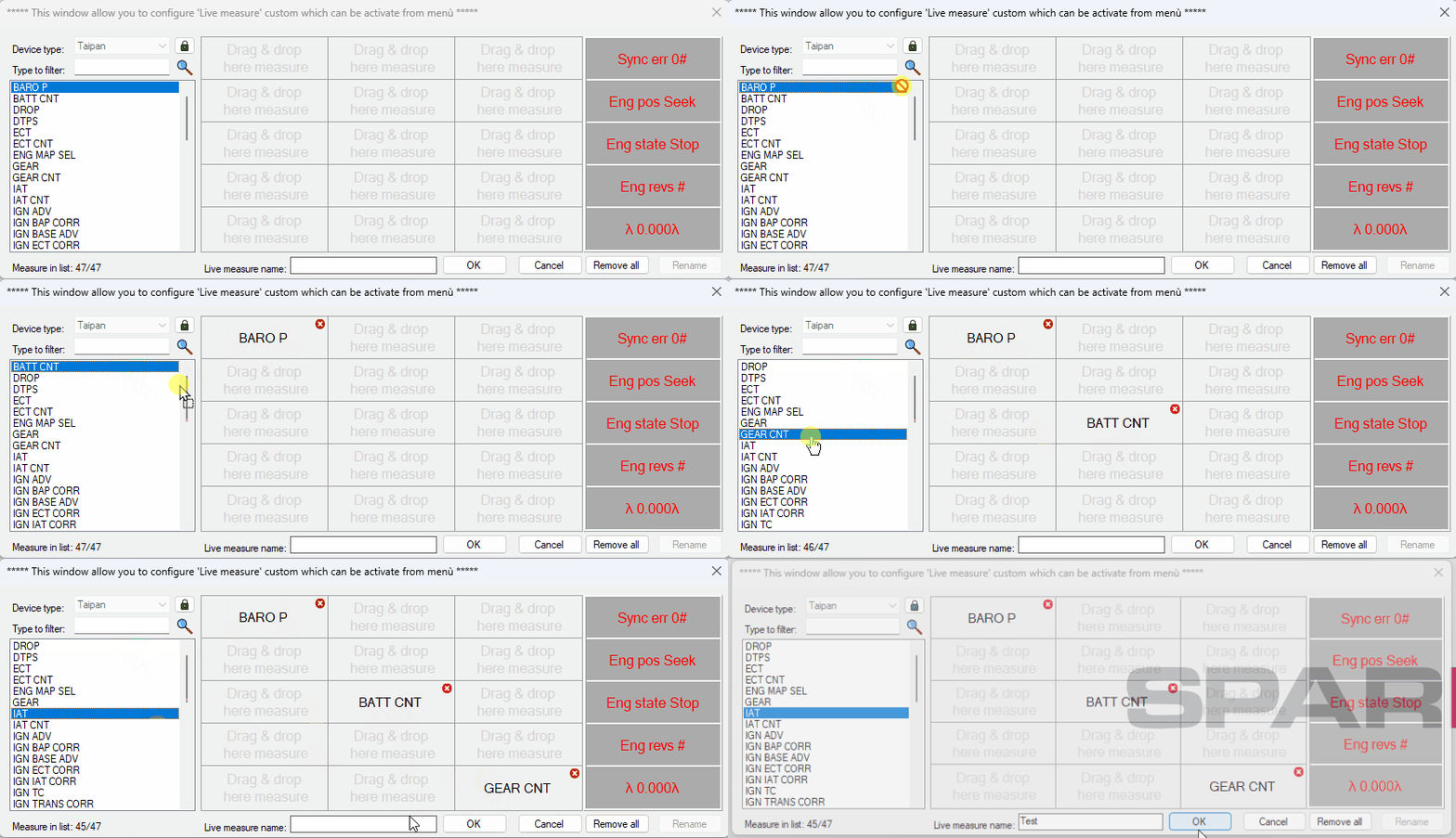
In ‘Device type’ drop down list the connected ECU will be proposed but pressing the padlock key (not available in modify mode) it will be possible to change it. Changing the ECU, the measures already placed in the grid will be deleted and measure list will be filled with these of the selected ECU. The last column on the right remains fixed for conformity with live measures window. Measures can be placed in the grid also double clicking them; in this case they will be placed sequentially by row starting from the first free cell.
‘Type to filter’ text box filters the measures according to the typed text.
The template can be saved after having selected at least one measure and having define a name in “Live measure name” box. After having created a new configuration the options “Activate”, “Modify” and “Delete” appear in the related drop-down menu.

‘Activate’, is only active if the ECU is connected and it appears only for the compatible configurations; the configuration in object will be shown bold and live measures window will be replaced with the one selected.

‘Modifiy’ allows to modify measures sequence and the name of the configuration replacing the previous one.
‘Delete’ deletes the current configuration and it will not be possible to recover it.
All above described functionalities are only available for “tuner” user.
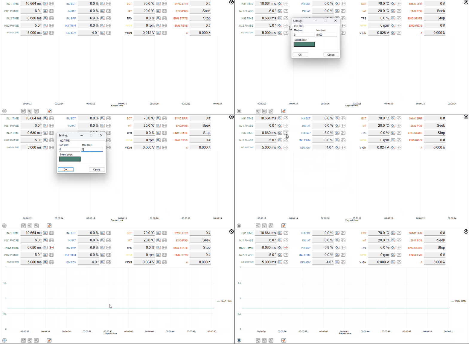
Live measures Setting and Plot
Setting button allows to modify color as well as min and max values of the graph “Y” axis concerning the selected measure. Using plot button, the name of the measure is shown in bold and underlined and the measure will be plotted in the same way.
What’s new

An additional menu has been introduced under the existing one “?”; it connects to “what’s new” page so to give an overview of the news concerning the new software just installed. The menu adds the text {News} before “?” menu and it will remain bold until the first time it is clicked. Once clicked, restarting the software it will return “?”.
1.2.68 - January, 19th 2024
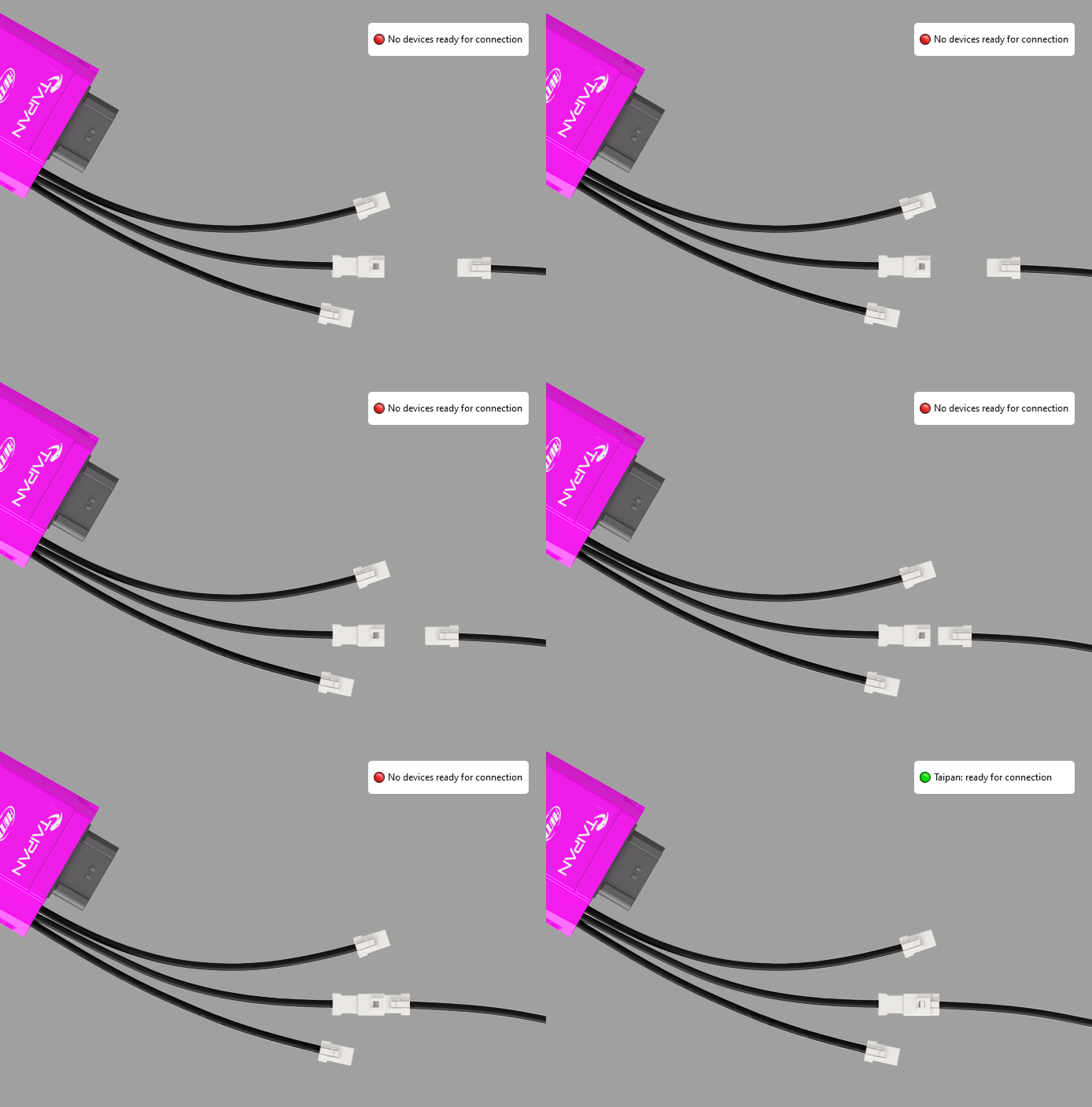
Improved handshake ECU connection
Handshake for the identification of connected ECU has been speed up; unplugging and plugging in an ECU through the JST programming connector Spark answer is quicker.
Grouped bike list for same bike models
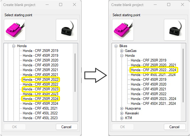
We grouped bikes with the same project reducing the number of items in the list and making the research easier. In the example above Honda CRF 250R from 2022 to 2024 were 3 items (left image) while now they are grouped in one item only (right image).
Pin/Unpin “Table 2D control” and “DAQ control”

All the functions described below have also been implemented for the control of 2D tables.
Unpin icon
Pressing this icon DAQ window unhooks from Spark main one allowing the user to replace and resize it as desired, saving all functions.
Pin icon
Once the window unhooked the icon switches to “Pin” icon indicating that if pressed DAQ window re-hooks to the main one.
Gauge Gear Calibration
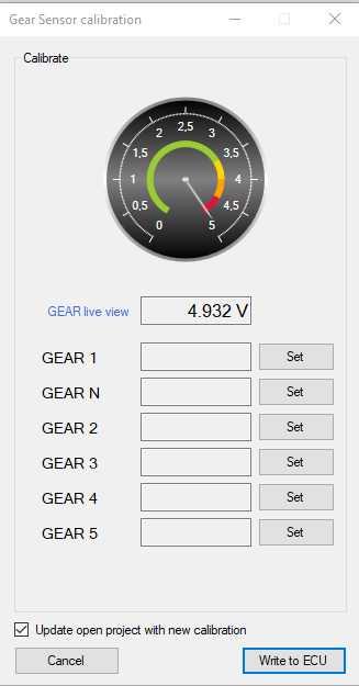
In gear calibration window a gauge has been added to give you an easier feedback about GEAR value (volt).
Interpolation on: row, column and bilinear
Linear interpolation row
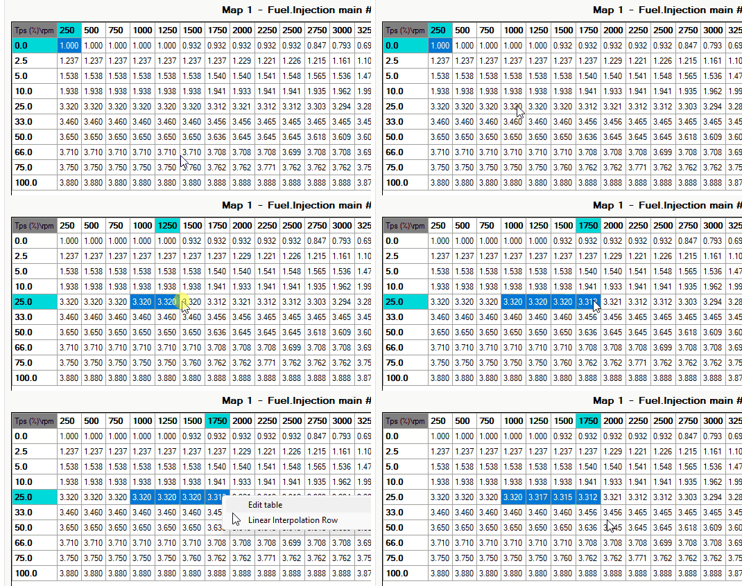
Selecting one or more rows of values, mouse right button enables “Linear interpolation row” menu item and values are interpolated according to horizontal breakpoints and selected columns.
Linear interpolation column
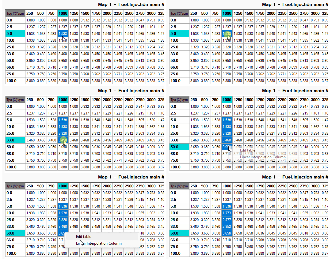
Selecting one or more columns of values, mouse right button enables “Linear interpolation column” menu item and values are interpolated according to vertical breakpoints corresponding to selected columns.
Bilinear interpolation
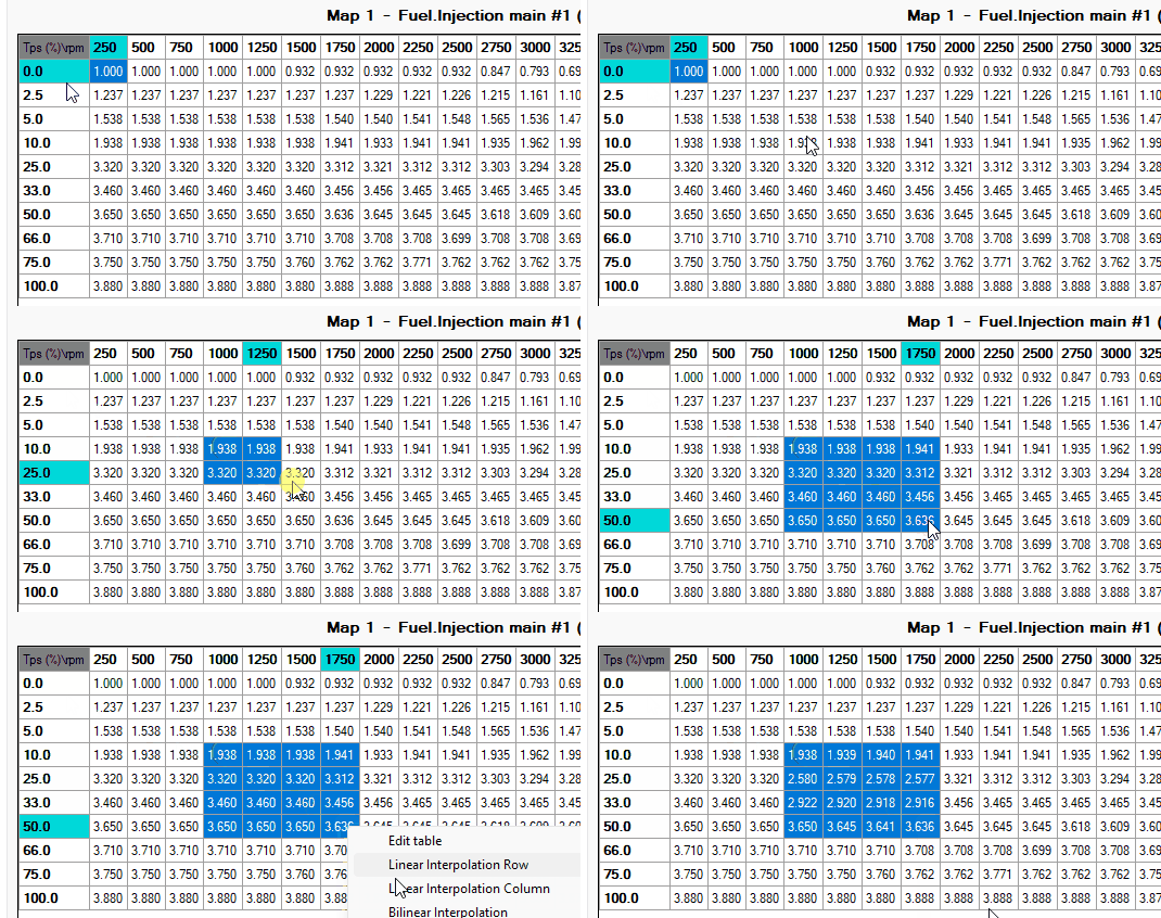
Selecting a range that includes rows and columns you can decide the desired interpolation to be made: for rows, for columns or bilinear.
Choosing bilinear option the software performs first an interpolation for rows, than for columns always taking into accounts the values of horizontal and vertical breakpoints.
Edit table: add/add%/set and linearization horizontal/vertical/bidirectional
Selecting range value and pressing right mouse button on table, you can edit value with follow option:
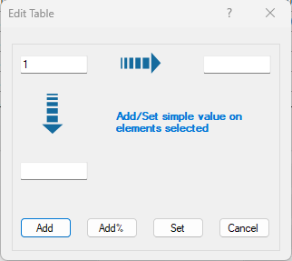
Entering a value in the top-left cell allows for performing addition, addition percentage, or setting the individual value across all selected items in the table.
Entering a value in either the horizontal or vertical cell respectively enables choosing to perform addition, addition percentage or setting on linearized values of the selected items horizontally or vertically.
Entering values in all three cells allows for bidirectional addition, addition percentage or setting operations.
2D graph custom scale
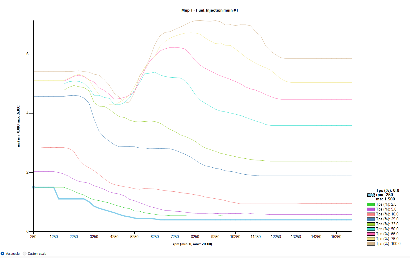
Was introduced a possibility to set custom scale on the graph through the option button positioned on the left bottom. This feature allow you to modify each point in details inside of an area of your interest. You can navigate from autoscale to custom scale and reverse, and when you are in custom scale the last setting saved will be restored. When you choose “Custom scale” will appear a setting button and if is the first time you are setupping nothing will happened till you set different value from default.
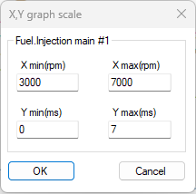
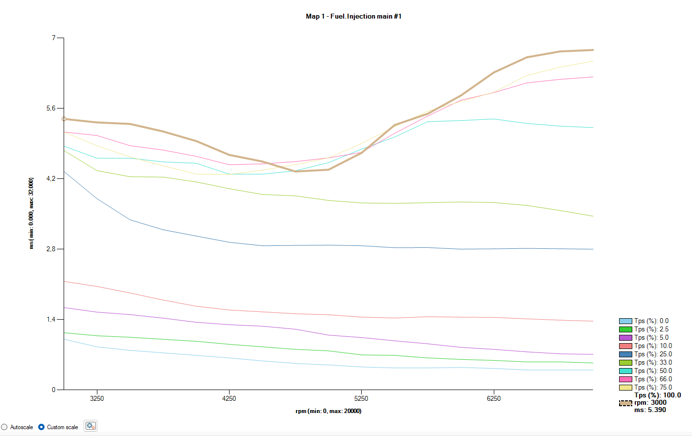
This form allow you to set each coordinate you want. Consider that the visualization will change on press OK and each time you come back on this graph the visualization will be custom. If you want to come back on autoscale have to select option button corrispondent. Follow an example of visualization about setting on the left.
1.2.64 - December, 13th 2023
Cell Track
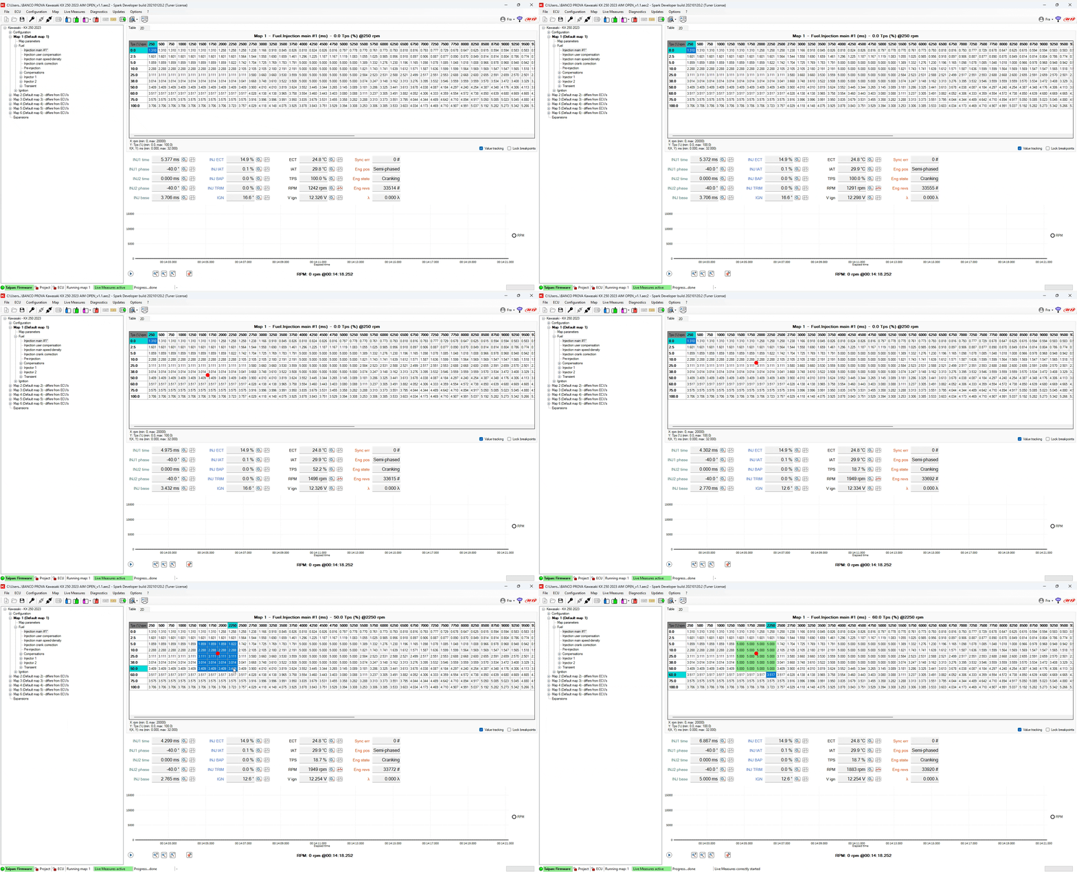
In main and crank tables has been added a pointer that combine the value from DAQ in coordinates values on the table. For example in main table combine TPS and RPM and place the red pointer on the table to identify the zone you want modify as gif above shows you.
Gauge TPS Calibration
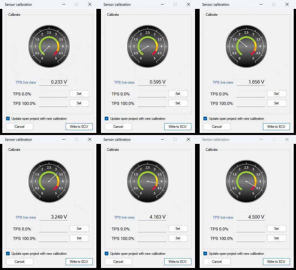
In the sensor calibration window is added a gauge to give you an easier feedback about TPS value.
Add management for T500 ECU
Introduced managment for T500 ECU.
